

Scale and Proportion in Architecture: A Visual Guide to Designing Better Buildings
A focused guide to scale and proportion in architecture covering the difference between these two principles, historical proportional systems from the classical orders to Le Corbusier's Modulor, real building examples from the Parthenon to contemporary parametric projects, and practical methods for applying proportional logic to your own designs.
 Elif Ayse Sen27 May 202614 Mins read280

Table of Contents Show
Scale and proportion in architecture are two distinct but connected design principles that determine how a building relates to the human body, its surroundings, and its own internal parts. Scale measures a structure against external references like people or neighboring buildings, while proportion governs the size relationships between a building’s own elements. Together, they shape whether a space feels comfortable, imposing, intimate, or disorienting.
Walk into a cathedral and you instinctively look up. Step into a Japanese teahouse and your shoulders drop, your voice softens. Neither reaction is accidental. Every ceiling height, column width, and window placement in those spaces was calibrated to produce a specific response. The architects behind them understood something that still holds true: getting scale and proportion right is the difference between a building that works and one that just stands there.
This guide breaks down how scale and proportion function in architecture, traces their history from the Parthenon to parametric design, and offers practical methods you can apply to your own projects. If you have ever wondered why some buildings feel “off” despite looking fine on paper, the answer almost always traces back to these two principles.
What Is Scale and Proportion in Architecture?

Scale and proportion in architecture are often lumped together, but they describe different relationships. Scale refers to how a building or element relates to something outside itself, usually the human body or its surrounding context. A door is “scaled” to a person when its height and width allow comfortable passage. A building is “scaled” to its neighborhood when it sits comfortably alongside existing structures without overwhelming or disappearing among them.
Proportion, by contrast, is entirely internal. It describes the size relationships between parts of the same design. The ratio of a window’s width to its height, the relationship between a column’s diameter and its total length, the division of a facade into solid wall and openings: these are all proportional decisions. A building can have excellent internal proportions at any size, from a garden shed to a skyscraper.
⚠️ Common Mistake to Avoid
Many designers confuse proportion with scale, assuming that scaling a small building up will automatically preserve its proportions. A door that looks balanced on a single-story house may appear oddly undersized on a four-story facade if the proportional relationships between door height, floor height, and overall elevation are not recalibrated. Always verify proportions at every scale jump during design development.
Think of it this way: proportion is about harmony within a design, while scale is about the relationship between the design and the world around it. A residential living room might have perfectly proportioned windows relative to its walls, yet those same windows would look strange on a civic building because the scale has changed. The two principles work in tandem. You cannot solve one while ignoring the other. For a deeper look at how they operate together, see this guide to proportion and scale in architecture.
How Scale and Proportion Differ: A Clear Breakdown

The difference between scale and proportion in architecture becomes clearer with a simple test. If you are comparing a building element to the human body or to its surroundings, you are talking about scale. If you are comparing parts of the same building to each other, you are talking about proportion.
Comparison of Scale vs Proportion
The following table summarizes the key differences between these two principles:
| Aspect | Scale | Proportion |
|---|---|---|
| Definition | Size of a building relative to people or context | Size relationships between parts of the same design |
| Reference point | External (human body, neighboring buildings, site) | Internal (one element compared to another within the design) |
| Measurement | Perceived size based on comparison | Mathematical ratios between dimensions |
| Example | A 3-meter ceiling feels tall for a bedroom, normal for a lobby | A window width that is 1:2 relative to its height |
| What it affects | Emotional response, sense of comfort or awe | Visual harmony, rhythm, and compositional balance |
| Can change without altering the other? | Yes (a small room can feel monumental with the right details) | Yes (a well-proportioned building can still feel out of scale) |
Size is absolute: an 80-inch door is a measurement. Proportion is the relationship between parts, such as a 1:2 window ratio. Scale is interpretive: how the size and proportions read against people, neighboring elements, and context. Architects constantly juggle all three. Size for function, proportion for harmony, and scale for perception.
Types of Scale in Architecture

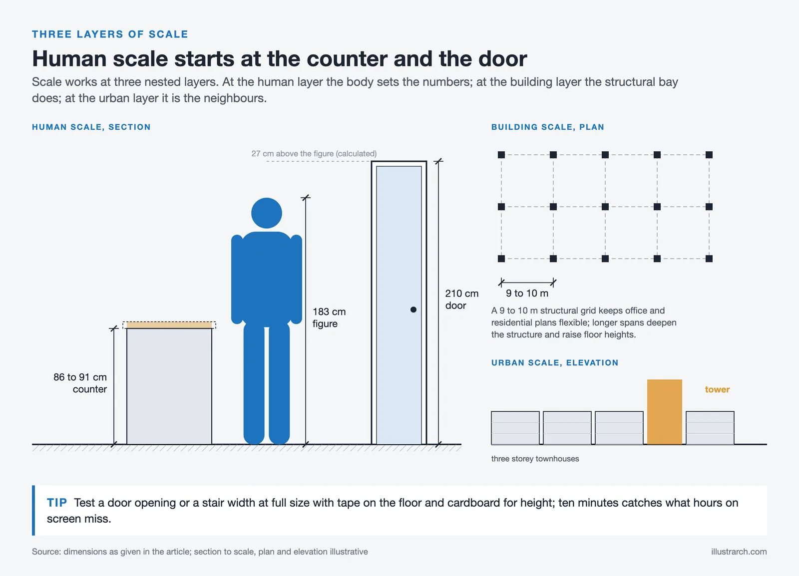
Architects work with scale at three nested layers, each affecting how people experience a building. Understanding these layers helps you make decisions that feel right at every zoom level, from the doorknob to the skyline.
Human Scale
Human scale deals with the direct relationship between a building and the people inside it. This is the layer where reach, eye level, grip, and walking stride matter. A counter height of 86 to 91 cm, a handrail at 86 to 97 cm, a standard door at 210 cm tall: these dimensions come from the proportions of the human body. When human scale is handled well, spaces feel intuitive. You do not notice the ceiling height because it matches the room’s purpose. A reading nook with a lower ceiling feels protective and focused. A courtroom with a higher ceiling signals authority and formality.
💡 Pro Tip
When designing interiors, test critical dimensions at full scale before committing. Build a quick mock-up of a door opening or stair width using tape on the floor and cardboard for height. Ten minutes of physical testing catches scale problems that hours of screen time miss. Experienced architects use VR walkthroughs and 1:50 section models for this same reason.
Building Scale
Building scale concerns the rhythm of bays, floor-to-floor heights, and facade modules that define a structure’s character. At this layer, decisions about structural grid spacing, window patterns, and material module sizes set the building’s visual identity. A 9-to-10-meter structural grid works well for flexibility in office or residential programs. Push the span longer and the structure deepens, which increases floor-to-floor heights, curtain wall area, and mechanical runs. Scale at this level ripples through both cost and carbon. For a detailed look at how building scale operates, read this article on why scale matters in architecture.
Urban Scale
Urban scale zooms out to block length, street width, and skyline profile. These moves affect walkability, shade patterns, and how a project meets the city. A skyscraper might be beautifully proportioned in isolation but feel out of scale in a neighborhood of three-story townhouses. Conversely, a low-rise building can look insignificant among towers if its facade articulation does not hold its ground. Urban scale requires architects to think beyond their site boundary. Setbacks, cornice lines, and street wall continuity all affect whether a new building reads as a good neighbor or an intruder.
Historical Proportional Systems That Shaped Architecture

Throughout history, architects have used formal mathematical systems to organize proportional relationships. These systems give designers a shared vocabulary that can be applied, adapted, or consciously broken. Understanding them is not about copying the past; it is about having tools in your kit that have been tested across thousands of years.
Classical Orders: Doric, Ionic, and Corinthian
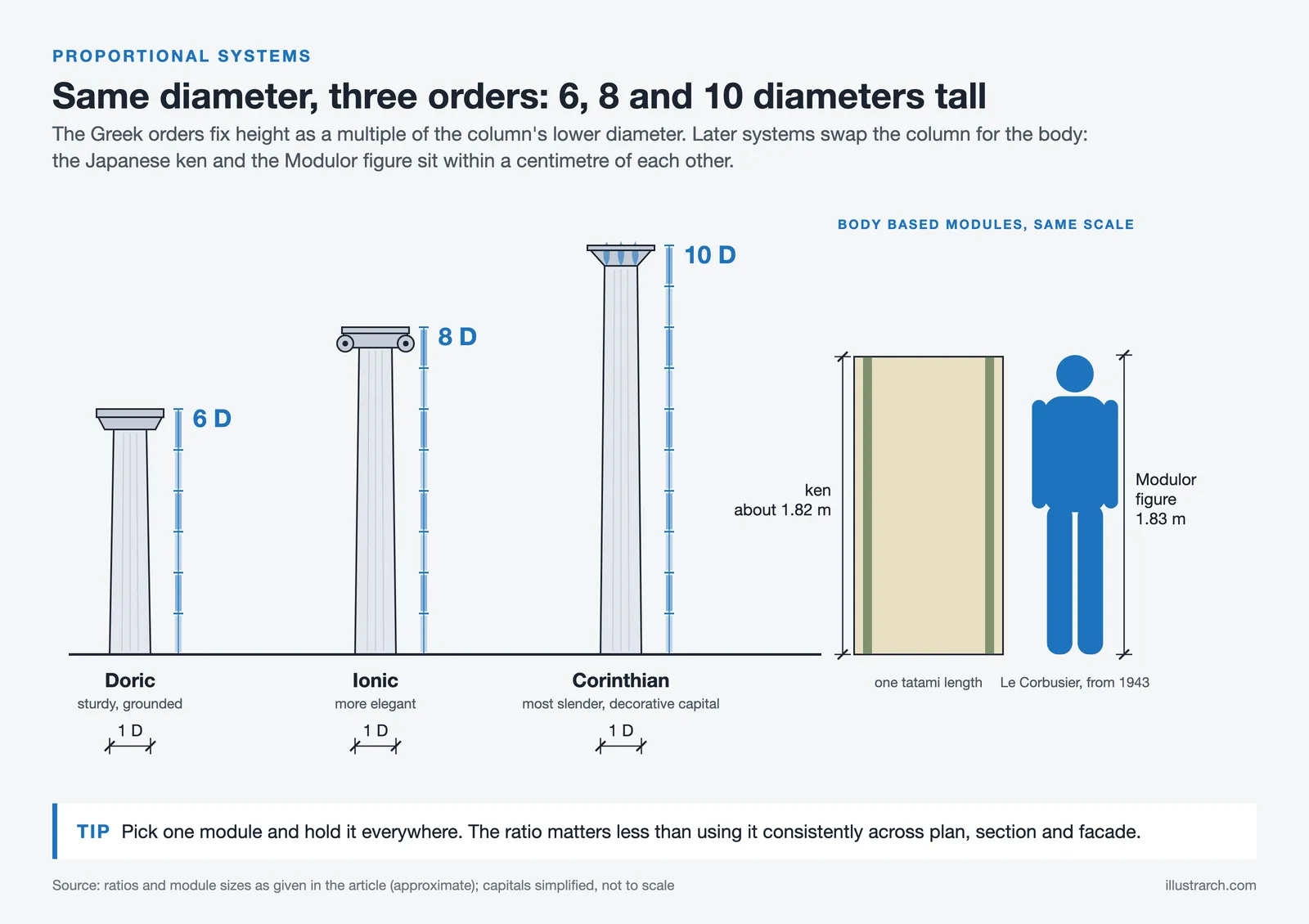
The ancient Greeks developed three systems of column proportions, each producing a distinctly different character. Doric proportions feel sturdy and grounded, with a column height roughly 6 times its base diameter. Ionic proportions appear more elegant, stretching to about 8 diameters. Corinthian proportions are the most slender at roughly 10 diameters, with highly decorative capitals. These ratios governed not only columns but also the entablature, spacing between columns, and overall temple dimensions. The Parthenon in Athens used a consistent 9:4 ratio across its facade, governing the relationship between width and height, column spacing, and column diameter. This level of proportional discipline is what gives the building its visual coherence, even across 2,400 years of wear.
📌 Did You Know?
The columns of the Parthenon are not perfectly straight. They curve outward slightly, a technique called entasis, to counteract the optical illusion that straight columns appear concave when viewed against a bright sky. The stylobate (floor platform) also curves upward by about 6 cm across its 70-meter length. These corrections show that Greek architects designed for how the eye perceives proportion, not just for mathematical accuracy on paper.
The Golden Ratio in Architecture
The golden ratio, approximately 1:1.618 and symbolized by the Greek letter Phi, is one of the most discussed proportional systems in architecture. It describes a relationship where dividing a line so that the longer segment compared to the shorter equals the whole line compared to the longer segment produces a ratio of about 1.618. This proportion appears in natural forms from sunflower seed spirals to the branching patterns of trees, which may explain why spaces designed around it tend to feel intuitively balanced.
Buildings associated with the golden ratio span cultures and centuries: the Great Pyramid of Giza, Notre-Dame Cathedral in Paris, the Taj Mahal, and many Renaissance churches and palazzos. However, honest scholarship notes that some of these associations are debated. Architectural historian Keith Devlin has argued that claims about the Parthenon specifically targeting 1.618 are “not supported by actual measurements,” with many scholars attributing its design to a 4:9 ratio system instead. The golden ratio remains a useful design tool, but it is one framework among several, not a universal formula for beauty. For a deep look at real examples, explore the golden ratio in architecture.
Le Corbusier’s Modulor System
The most systematic modern attempt to build an architectural proportional system came from Le Corbusier. Beginning in 1943, he developed the Modulor, a measurement framework based on the human body, the Fibonacci sequence, and the golden ratio. The system starts with a standing person 1.83 meters tall and divides that height at the navel and other key body points according to golden ratio segments. These divisions produce two interlocking measurement series (a “red” and a “blue” sequence) that architects could apply to everything from door handles to entire facades.
Le Corbusier applied the Modulor extensively in the Unité d’Habitation in Marseille (completed 1952), where ceiling heights, apartment widths, balcony depths, and corridor dimensions all derive from Modulor measurements. Albert Einstein, upon seeing a presentation of the system, reportedly commented that it was a proportional tool that “makes the bad difficult and the good easy.” While the Modulor was not widely adopted outside Le Corbusier’s own practice, it remains a reference point in any discussion of proportional design in modern architecture.
🎓 Expert Insight
“A range of harmonious measurements to suit the human scale, universally applicable to architecture and to mechanical things.”
Le Corbusier, Le Modulor (1948)
This description captures the Modulor’s ambition: connecting every dimension in a building back to the human body through a single proportional logic. Whether you adopt the Modulor or not, its core principle holds. Proportional systems are most effective when they root architectural dimensions in something tangible and relatable.
Japanese Ken Module and Other Cultural Systems
Proportional thinking does not require the golden ratio specifically. What matters is internal consistency. Japanese architecture traditionally relied on the ken module (approximately 1.82 meters, or the width of a tatami mat), which governed room sizes, corridor widths, and structural bay spacing. Root-two rectangles (1:√2) have been used across Islamic geometric patterns and are the basis for modern ISO paper sizes. Each system proves the same point: when a building’s parts relate to each other through a coherent mathematical framework, the result feels resolved. For more on how these systems connect, see this article on proportion in architecture.
Examples of Scale and Proportion in Architecture

Theory becomes meaningful when you see it working in real buildings. The following examples show how architects have used scale and proportion across different periods and building types to create specific spatial experiences.
The Parthenon, Athens (438 BCE)
The Parthenon remains the textbook example of proportional design. Its architects Ictinus and Callicrates applied a 9:4 ratio consistently across the building: the stylobate measures about 30.9 by 69.5 meters, and the height of the facade (about 13.7 meters) relates to its 30.9 meter width by the same ratio, as does the spacing between columns relative to their diameter. The result is a building where every visible element relates mathematically to every other element. At the same time, optical corrections like entasis and a curved stylobate ensure these proportions read correctly to the human eye, not just on a ruler. You can explore the full architectural context of this building on the Acropolis of Athens page.
Gothic Cathedrals: Monumental Scale, Vertical Proportion
Gothic cathedrals like Chartres and Notre-Dame deliberately manipulated scale to produce awe. Nave heights of 30 to 40 meters, combined with narrow widths, created vertical proportions that drew the eye upward. The effect was intentional: these spaces were designed to make visitors feel small and reverent. Pointed arches, ribbed vaults, and flying buttresses were structural innovations that allowed builders to push proportions far beyond what Romanesque architecture could achieve. The proportional system was not arbitrary. Masons used geometric constructions, often based on the square and the equilateral triangle, to set the relationships between width, height, and depth.
Frank Lloyd Wright’s Prairie Houses: Human-Centered Scale

Wright rejected the European tradition of monumental scale in residential architecture. His Prairie houses used low-pitched roofs, deep overhangs, and horizontal bands of windows to keep buildings grounded and connected to the landscape. Interior ceiling heights dropped in transitional spaces (hallways, entry sequences) and rose in primary rooms, creating a compression-and-release rhythm that made living areas feel more generous than their actual dimensions. Wright’s proportional decisions served human comfort rather than abstract mathematical ideals.
🏗️ Real-World Example
Fallingwater (Pennsylvania, 1939): Wright’s cantilevered terraces step back level by level at ratios that echo the natural rock ledges of the surrounding landscape. The house integrates with its site so effectively because the proportions of the built elements match the proportions already present in the natural environment. The largest cantilevered terrace extends approximately 4.5 meters over the waterfall below.
Contemporary Examples: BIG, Foster + Partners, and Parametric Proportion
Contemporary firms continue to apply proportional thinking, often through digital tools. Foster + Partners’ Apple Park in Cupertino works at the site-planning scale, setting its ring building within 175 acres of parkland so that building and landscape read as one composition. Bjarke Ingels Group (BIG) frequently uses stepped or twisted massing where each floor plate relates to the next through consistent proportional increments, creating a sense of order within complex geometries. Parametric design software now allows architects to embed proportional rules into the design model itself, so that changes propagate automatically while maintaining the intended ratios.
Why Scale and Proportion Matter for the Human Experience
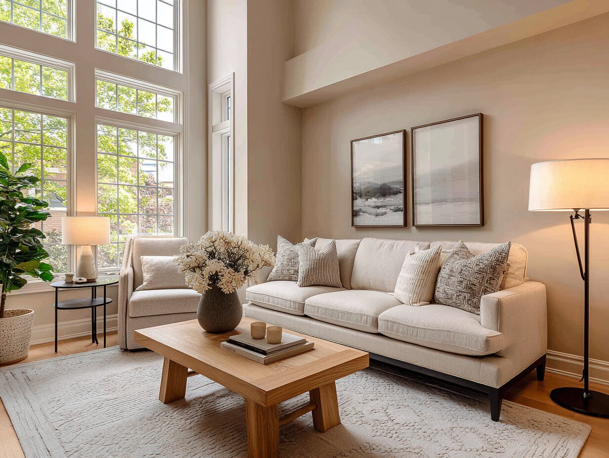
Scale and proportion are not abstract academic concepts. They directly affect how people feel, behave, and move through spaces. Research in environmental psychology confirms what architects have observed for centuries: spaces that are correctly scaled make people feel safe and comfortable, while disproportionate spaces create unease or disorientation.
A room with excessively high ceilings can make occupants feel insignificant or overwhelmed. A room that is too small can feel claustrophobic. Corridors that are too narrow create anxiety; corridors that are too wide feel institutional. Every one of these effects traces back to scale and proportion decisions made during design.
The emotional impact goes beyond comfort. A civic staircase sized for gatherings communicates “this is for the public.” A porch scaled for two chairs signals hospitality and private conversation. Window heights can respect privacy norms or invite exposure. Facade rhythms can echo local building traditions or deliberately break from them. Each choice sends a message, and scale and proportion are the grammar of that message. For a deeper look at how architects and furniture designers coordinate these decisions, see this article on architectural scale and furniture proportions.
💡 Pro Tip
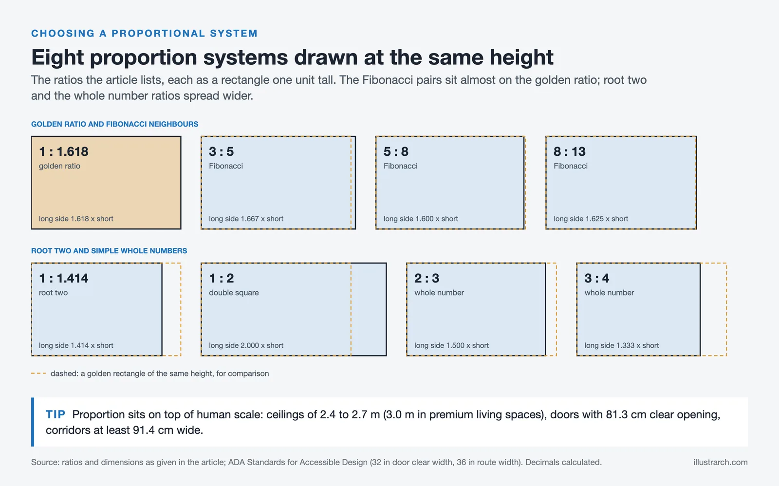
When reviewing facade compositions, draw regulating lines early in the schematic design phase rather than trying to retrofit proportional systems onto a nearly finished elevation. Starting with a proportional framework (whether based on the golden ratio, root rectangles, or simple whole-number ratios like 3:5 or 5:8) saves hours of adjustments later and produces more visually coherent results.
How to Apply Scale and Proportion in Your Own Designs

Understanding scale and proportion is useful only if you can put it into practice. The following methods are drawn from professional practice and can be applied at any project stage, from early concept sketches to construction documentation.
Start with the Human Body
Anchor your design to human dimensions first. Eye height (seated and standing), reach height, comfortable step dimensions, and sightlines set the foundation. From there, build outward: room dimensions, window sills, and ceiling heights should all relate back to how people occupy the space. Le Corbusier’s Modulor formalized this approach, but you do not need to adopt his specific system. The principle is simple: start from the body and work outward.
Use Proportional Ratios Consistently
Pick a proportional system and apply it across multiple elements. Common options include the golden ratio (1:1.618), Fibonacci-adjacent whole numbers (3:5, 5:8, 8:13), root-two rectangles (1:1.414), or simple whole-number ratios (1:2, 2:3, 3:4). The specific system matters less than consistency. When window widths, bay spacings, and room dimensions all share a common proportional logic, the building reads as a unified composition rather than a collection of unrelated parts. You can explore how the golden ratio is applied in architectural design for practical methods.
Test at Multiple Scales
A proportional decision that works on a floor plan may fail in section or elevation. Check your design at plan scale, section scale, and from eye-level perspectives. BIM tools like Revit and ArchiCAD allow parametric relationships between elements, so if you define a window height as a fraction of the floor-to-floor height, changes propagate automatically. Physical models at 1:50 or 1:100 scale remain one of the most reliable ways to assess whether proportions feel right in three dimensions.
Study Buildings You Admire
Measure the proportional ratios from published drawings or photographs of buildings you find visually successful. Divide facade width by height, window width by window height, solid wall area by glazing area. Over time, you will develop an intuition for which ratios produce the effects you are looking for. This analytical habit is one of the most effective training methods for proportional design, and it costs nothing beyond time and attention.
📐 Technical Note
Standard residential ceiling heights range from 2.4 m (8 ft) to 2.7 m (9 ft) for typical rooms, with 3.0 m (10 ft) or higher for primary living spaces in premium construction. ADA/accessibility standards require minimum door widths of 81.3 cm (32 in) clear opening and minimum corridor widths of 91.4 cm (36 in). These dimensions represent baseline human-scale requirements that proportional systems should respect, not override. Refer to ADA Standards for Accessible Design for complete specifications.
Video: Proportions in Architecture Explained
This university-level lecture by architect Sebastian von Thaden covers the major proportional systems used in architectural design, from classical orders to modern applications, in a clear and visual format.
Scale and Proportion in Interior Design
The principles of scale and proportion extend directly into interior spaces. Furniture, lighting, and decor must relate to the room’s architectural dimensions to create a cohesive environment. A large sofa in a small living room does not just crowd the space physically; it disrupts the proportional relationship between the object and its container, making the room feel smaller than it actually is.
Interior designers frequently use golden-ratio-adjacent rules for furniture sizing. A coffee table roughly two-thirds the length of the sofa (a 2:3 proportion, a simple stand-in for the 1:1.618 golden ratio) creates visual balance. Low-profile furniture in rooms with limited ceiling height adjusts the proportional relationship between objects and the surrounding volume, making the space feel more generous. High-ceilinged rooms benefit from tall bookcases, large-scale artwork, or pendant lighting that fills the vertical space and brings the proportions into a comfortable range. For more on this topic, see space design principles.
Different cultures approach interior proportion differently. Traditional Japanese interiors prioritize low furniture and a close relationship to the floor, with room sizes governed by the tatami module. European palace interiors scaled furniture up to match vast rooms with ornate ceilings. Contemporary compact urban apartments demand modular, multi-purpose furniture that maintains proportional balance within tighter constraints. The challenge is always the same: making objects and space relate to each other and to the people who use them.
Digital Tools for Testing Scale and Proportion

Modern architects have access to tools that earlier generations could only dream of. BIM software, virtual reality, and parametric design platforms allow proportional relationships to be tested, adjusted, and validated before construction begins.
BIM platforms like Revit and ArchiCAD support parametric constraints, meaning you can define proportional rules that automatically maintain relationships as dimensions change. If the floor-to-floor height increases, window heights that are defined as a fraction of that dimension adjust automatically. This prevents the common problem of proportional drift, where small changes accumulate and destroy the original design intent.
Virtual reality walkthroughs let architects experience scale from the occupant’s perspective before anything is built. A plan might show a perfectly proportioned lobby, but walking through it in VR reveals whether the ceiling feels too high, the columns too thick, or the entrance too narrow. Physical models remain valuable for the same reason: they give you a three-dimensional, eye-level view of proportional relationships that screens cannot fully replicate. For a look at how massing studies help architects test these relationships early, see this guide to architectural massing diagrams.
✅ Key Takeaways
- Scale measures a building against external references (people, context), while proportion governs the internal size relationships between its own parts.
- The three layers of scale (human, building, and urban) must be coordinated for a building to feel comfortable and contextually appropriate.
- Historical systems like the classical orders, the golden ratio, and Le Corbusier’s Modulor provide tested proportional frameworks that architects can apply, adapt, or consciously break.
- Proportional consistency matters more than which specific system you choose. Pick a ratio framework and apply it across multiple elements for visual coherence.
- Testing scale and proportion at full size (physical models, VR walkthroughs, on-site mock-ups) catches problems that plan drawings and screens cannot reveal.
Final Thoughts

Scale and proportion in architecture are not decorative add-ons. They are the structural logic of visual experience. Every building that has ever stopped someone in their tracks, whether a Greek temple or a contemporary museum, achieved that effect through deliberate decisions about how parts relate to each other and to the people who use them. The tools have changed, from string and plumb line to parametric software, but the fundamental question remains the same: does this space feel right? When you can answer that question with confidence, and explain why, you are working with scale and proportion rather than against them.
Technical specifications and dimensional standards referenced in this article should be verified against local building codes and accessibility requirements for your specific project and jurisdiction.
- difference between scale and proportion in architecture
- dimension scale and proportion in architecture
- examples of scale and proportion in architecture
- proportion and scale in architecture
- proportions and scale in architecture
- scale and proportion in architecture
- scale and proportion in architecture definition
- what is scale and proportion in architecture








Interior Design for Commercial Spaces: Enhancing Functionality and Brand Identity
Commercial interior design has to serve brand, function and regulation at once....
 Begum Gumusel4 Mins read

Overlapping Concrete Walls and One Roof Shape a House in Okinawa
IGArchitects built Overlapping Spaces in Okinawa from reinforced concrete walls, columns and...
 illustrarch Editoral Team1 Mins read

Futuro House Production Revived in Finland After Decades-Long Hiatus
A Facebook listing for abandoned moulds led to the first new Futuro...
illustrarch Editoral Team3 Mins read

Building Your Dream Home in NSW: What You Should Know About Montgomery Homes
Montgomery Homes has been building across Sydney, Newcastle, the Hunter, Wollongong and...
illustrarch Editoral Team4 Mins read


Leave a comment