

Concept Diagram Architecture: Hand-Rendered vs Digital Diagrams in a Portfolio
Hand-rendered and digital diagrams send different signals to portfolio reviewers. This piece compares both on speed, editing, legibility at small sizes and consistency, with a side by side table and advice on when to combine them.
 Furkan Sen10 August 20265 Mins read159

Table of Contents Show
Concept diagram architecture works in either medium, and neither one is automatically stronger in a portfolio. Hand-rendered diagrams read as thinking in progress and prove you can draw, while digital diagrams hold their clarity at small sizes and stay consistent across a full set. Reviewers respond to legibility and intent, not to the tool behind the line.
Most portfolio reviews are fast. A hiring manager scrolls, an admissions reader clicks through a PDF, and each page gets seconds rather than minutes. That pressure settles the hand versus digital question more decisively than any argument about craft. The diagram that survives a quick scroll on a laptop screen is the one that belongs in your book.
What Is a Concept Diagram in an Architecture Portfolio?

A concept diagram is a stripped down image carrying the organizing idea of a project: a stacking logic, a movement loop, a privacy gradient, a response to sun or slope. It is not a plan and not a render. Its job is to make one design decision understandable at a glance, before the viewer reaches anything drawn to scale.
Inside a portfolio, that image does something a render cannot. It shows how you reasoned. A polished perspective proves you can operate software. A clear parti proves you knew what you were after before the software opened. Our breakdown of architectural diagram types for students covers the wider family of diagrams, and the step by step process behind building one is worth reading before you commit to a medium for the whole book.
Hand-Rendered vs Digital Diagrams Compared
The useful comparison is not about which looks nicer. It is about how each medium behaves under revision, under print, and under a viewer who is moving quickly.
Comparison of Hand-Rendered and Digital Concept Diagrams
The table below sets out the differences that actually change what happens on a portfolio page.
| Factor | Hand-Rendered | Digital |
|---|---|---|
| First version speed | Minutes, no setup | Slower, needs file and style setup |
| Revision after a crit | Usually redrawn from scratch | Edited in place, layers reused |
| Legibility at thumbnail size | Drops fast, thin pen lines close up | Holds, line weights stay controlled |
| Consistency across projects | Hard, depends on the day and the pen | Easy, one palette and one line system |
| What the reviewer infers | Drawing ability, process, individual voice | Production skill, graphic control, office readiness |
| File behaviour | Scans add weight, compression softens lines | Vector output stays light and sharp at any size |
What Hand-Rendered Diagrams Do Better

Hand drawing wins at the front of a project, where the idea is still moving. You can test six organizing moves on one sheet of trace in the time a vector file takes to set up, and the roughness keeps you from polishing an idea you have not resolved yet. That looseness is readable, and reviewers know the difference between a sketch made during design and a sketch faked afterwards to look spontaneous.
Freehand work also carries weight in academic applications. The Harvard GSD Master of Architecture I requirements state that the portfolio exists to show creativity, design aptitude and an ability to think in three dimensions, and that applicants without previous architectural training can demonstrate that aptitude through freehand drawing, painting, sculpture or photography. Drawing by hand is not a nostalgic gesture in that context. It is accepted evidence.
💡 Pro Tip
Scan hand diagrams at 600 dpi in grayscale rather than photographing them, then pull the paper tone to white with a levels adjustment and drop the grey point so the pen line goes properly black. A phone photo carries shadow gradients and a slight keystone that no amount of cropping fixes, and those two flaws are the reason most hand diagrams look weaker in a PDF than they do on the desk.
Where Digital Diagrams Win
Digital diagrams pay off after the idea settles. Once a concept survives its first crit, you will redraw it for a board, then a portfolio spread, then a smaller version for a website. Vector artwork made in a tool like Adobe Illustrator handles that repetition without loss, because the same file exports at any size and every swatch and line weight can be changed globally when you decide the palette was wrong.
Consistency is the quieter advantage. A portfolio with five projects contains dozens of diagrams, and when they share one colour system and one line hierarchy, the book reads as a single body of work. File size matters too: the GSD asks applicants to upload the portfolio as a single PDF and routes anything over 32 MB into a separate submission field, according to its application FAQ. Vector diagrams keep you comfortably under limits like that. Stacks of high resolution scans do not.
🏗️ Real-World Example
8 House by BIG (Copenhagen, 2010): the whole project is explained by a short sequence of simple massing diagrams, a perimeter block pushed down in the middle to form a bowtie, then wrapped by a continuous path that climbs from street level to the upper floors. The diagrams use flat colour and almost no detail, which is exactly why they travel so well through publications and lecture slides.
Does Mixing Both Hurt Your Portfolio?
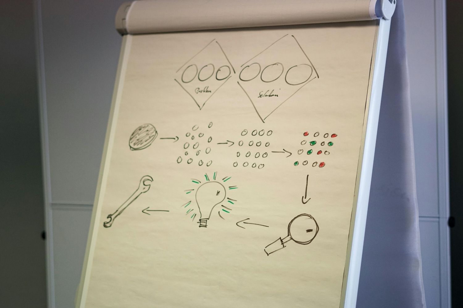
Mixing does not hurt when the split follows a visible rule. Give hand drawing the early pages of each project, where you are showing exploration, and give digital the analytical diagrams that need labels, legends and precise geometry. A reader picks up that logic within two spreads and stops noticing the change in medium.
The version that does hurt is unplanned. One pencil diagram on page four, one vector diagram on page nine, a scanned marker sketch on page eleven with a different paper tone, and the book starts to look like an archive rather than an edited document. If you scan hand work, keep the paper tone identical across every scan and match the ink to the darkest grey in your digital palette.
⚖️ Pros & Cons at a Glance
✔️ Pros of a hybrid approach: shows process and production skill in one book, keeps ideation fast, gives every project a natural visual arc from sketch to resolved analysis
✖️ Cons of a hybrid approach: doubles the number of decisions about tone and colour, exposes weak drawing next to clean vector work, adds scanning and clean-up time before every deadline
Architectural Diagram Examples and What Reviewers Notice First

Strong architectural diagram examples share a habit worth copying: one message per image. If a diagram tries to carry circulation, program and structure at once, the viewer reads none of them. Split it. Three small diagrams in a row usually communicate more than one dense composite, and they fill a spread better.
Before a diagram goes into the book, run the thumbnail test. Shrink the page to about 25 percent on screen. If the main move still reads, the line weights and colour contrast are right. If it turns to grey mush, the diagram is too detailed for its size, whatever medium made it. Competition entries published on ArchDaily are a good place to see how firms handle that balance, and our collection of successful architectural diagrams by architects breaks down specific cases. Placement matters as much as the drawing itself, which is covered in our guide to portfolio layout, grid and typography.
Which Concept Diagram Belongs in Your Portfolio?
Match the medium to the reader. For graduate applications, hand work is an asset, because admissions committees are reading for design thinking and raw ability rather than office output, and a portfolio full of identical vector graphics can flatten out that signal. For internships and job applications, digital carries more weight, since the practice needs to see that you can produce clean documentation under deadline. Our guide to the architecture portfolio for internship applications goes deeper into what firms screen for.
If you are still unsure, use the medium you control best and keep it consistent, then add two or three pages of the other kind as evidence of range. A confident set of hand diagrams beats a shaky vector set, and the reverse is equally true. Browsing portfolio examples by students and young architects alongside our guide to building a strong architecture portfolio will show you how both approaches look when they are handled well.
Ten years ago this question carried real weight, because the two media demanded different skills and most students genuinely had to choose. Tablets and vector tracing have quietly closed that gap, and the argument now sits closer to editing than to technique. What a reviewer registers in the second they spend on your diagram is whether one idea came through, and that has never depended on the pen.








Hand-Rendered vs Digital Diagrams: What Works Better in a Portfolio?
A practical breakdown of hand-rendered and digital diagrams in architecture portfolios, covering...
 Sinan Ozen6 Mins read
Architecture Portfolio Layout: Designing Pages with Grid and Typography
A focused look at architecture portfolio layout, from setting up a column...
 Elif Ayse Sen8 Mins read
How to Present Your Work in an Architecture Portfolio Interview
Reaching the interview means your work earned a closer look, but presenting...
Furkan Sen7 Mins read

Best Presentation Tools for Architecture Portfolios: A Practical Guide
A breakdown of the top presentation tools used by architects and architecture...
Sinan Ozen8 Mins read


Leave a comment