

Architectural Presentation Boards: Layout & Composition Guide
A focused look at how to lay out architectural presentation boards, covering grid systems, visual hierarchy, white space, typography, and board sizing, with real examples of collage, minimalist, and monochrome sheets.
 Elif Ayse Sen14 January 20237 Mins read959

Table of Contents Show
Architectural presentation boards are structured layouts that arrange drawings, renders, and text to communicate a project clearly to juries and clients. A strong board relies on a consistent grid, a clear visual hierarchy, generous white space, and readable typography, so viewers grasp the concept in seconds rather than hunting for information.
Presentations are visual tools that you can use to represent your architectural projects and accomplishments. They are created for both juries and submissions during the student years and for clients throughout professional life. In this second part of our “Successful Architectural Presentation Boards” series, we focus on how layout and composition, not just content, decide whether a board reads well or falls flat.
Using architectural presentation boards, architects present their various scaled projects. The value of a board rarely comes from a single stunning render. It comes from how every element sits together on the sheet. Regardless of the scope of your project, from interior design to urban planning, your reference usually stems from the concept, and the board layout, color scheme, font choices, and design language should all follow that concept. If you are still deciding what drawings and text belong on the sheet, our guide on what should be included in an architectural presentation covers the content checklist in detail. This article stays on the boards themselves: how to lay them out.

It is crucial to arrange the poster contents in accordance with their subjects. You do not want the jurors evaluating your presentation to study analyses while also reviewing your concept. Well-planned layouts, divided by a straightforward design language, let you present a project with all of its phases in the most effective way possible.
Anatomy of a Presentation Board Layout
Before looking at styles, it helps to understand the parts that every board layout has to control. Each element plays a role, and getting the balance right is what separates a professional sheet from a crowded one. The table below breaks down the core building blocks of a presentation board layout, what each one does, and a practical tip for handling it.
Board Element, Purpose, and Layout Tip
| Board Element | Purpose | Layout Tip |
|---|---|---|
| Underlying grid | Aligns every drawing and text block to a shared structure | Set a 6 to 12 column grid before placing anything |
| Hero image | Anchors attention and sets the mood of the project | Give it the most space, usually top or center |
| Technical drawings | Show plans, sections, and elevations at true scale | Keep a consistent scale bar and line weight |
| Text and titles | Explain the concept without repeating the visuals | Limit to two type sizes and keep copy short |
| White space | Separates content groups and prevents clutter | Protect margins, resist filling every gap |
💡 Pro Tip
Before you place a single drawing, sketch three or four thumbnail layouts at postage-stamp size. If the composition reads clearly when it is only a few centimeters wide, it will hold up at full board scale. Most weak boards are locked in during the first fifteen minutes, when everything gets dropped in without a plan.
How to Build a Strong Presentation Board Layout
A board layout works when the eye moves through it in the order you intend. Three tools control that movement: the grid, visual hierarchy, and white space. Get these right and even simple content looks resolved.
Grid Systems and Alignment
A grid is the invisible skeleton behind good architectural presentation boards. Dividing the sheet into columns and rows gives every drawing, caption, and title a logical place to sit, and shared alignment lines make the whole board feel deliberate. Designers borrow this discipline from editorial layout, and you can read more about how color relationships reinforce that structure once the grid is set. Start with a modular grid, then let images span multiple cells while text stays within single columns.
⚠️ Common Mistake to Avoid
Centering everything on the page is one of the most common layout errors. It feels safe, but it flattens the hierarchy and gives the eye no clear entry point. Instead, align content to grid lines and let asymmetry create tension and focus. A board where every block is centered usually looks like a poster, not a considered design.
Visual Hierarchy and Reading Order
Visual hierarchy tells the viewer what to look at first, second, and third. On a jury board, that order usually runs from the hero render or concept diagram, to the plans and sections, and finally to the supporting analysis. You build hierarchy through size, contrast, and position, so the most important image is the largest and sits where the eye naturally lands. The principles of visual hierarchy documented by the Interaction Design Foundation apply directly to architectural sheets, even though they were written for screens.
White Space and Breathing Room
White space is not wasted space. It groups related drawings, separates unrelated ones, and gives dense technical content room to be read. Boards that fill every corner exhaust the viewer and bury the concept. Consistent margins around the edge of the sheet also frame the work and signal control. Treating white space as an active design element is one of the fastest ways to make a student board look professional.
Typography That Supports the Drawings
Type is where many boards quietly fall apart. The goal is legibility, not decoration. Pick one or two typefaces at most, usually a clean sans-serif for labels and a companion for body text, and stick to a small set of sizes for the title, section headings, and captions. A reliable hierarchy might use a large project title, a medium heading, and a small caption size, with clear jumps between them. For guidance on matching fonts that read well together, the Google Fonts guide to pairing typefaces is a practical starting point, and Smashing Magazine covers the finer points of technical typography such as spacing and alignment.
📌 Did You Know?
Jurors and clients often decide how they feel about a board within the first few seconds of looking at it. That first impression is driven almost entirely by composition and contrast, not by the quality of individual renders. A tidy, well-organized sheet with modest drawings frequently reads better than a chaotic sheet full of beautiful images.
Board Size and Format
Layout decisions depend on the physical size and orientation of the sheet, so settle the format early. Competitions and schools usually specify a size, most often an ISO A-series format such as A1 or A0, and sometimes a fixed orientation. The ISO 216 paper standard keeps proportions consistent as you scale between sizes, which is why a layout designed on A3 usually holds together when printed at A1. Confirm portrait or landscape before you build the grid, because switching later forces you to redraw the entire composition.
📐 Technical Note
ISO A-series sheets share a 1 to the square root of 2 aspect ratio (roughly 1:1.41), so each size is exactly half the area of the next one up. When exporting, set your document to the true print size at 150 to 300 DPI rather than scaling a smaller file up, which softens line work and text.
Different Types of Architectural Presentation Boards
Architectural presentation boards come in different types to suit different projects. The right choice depends on the project, the identity of your brand or office, and the formats requested from you if you are a student. The sections below look at three common approaches through real examples, each with its own take on layout and composition.
Presentation Sheets with Unique Collages
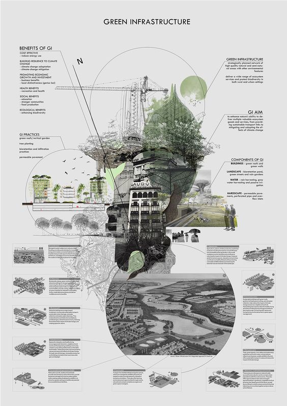
If you have unusual collages, use them in your presentations. Architectural presentations are a chance to show your talents, and if you are confident in abstraction and graphic design, a collage-driven sheet can carry a whole board. You do not always need a rigid template. When you can express an idea abstractly with a strong collage, the composition itself becomes the layout. As we saw across two presentations by the same architect, the technique can stay consistent even when the topic and purpose of the board change.
Minimalist Design Presentation Sheets
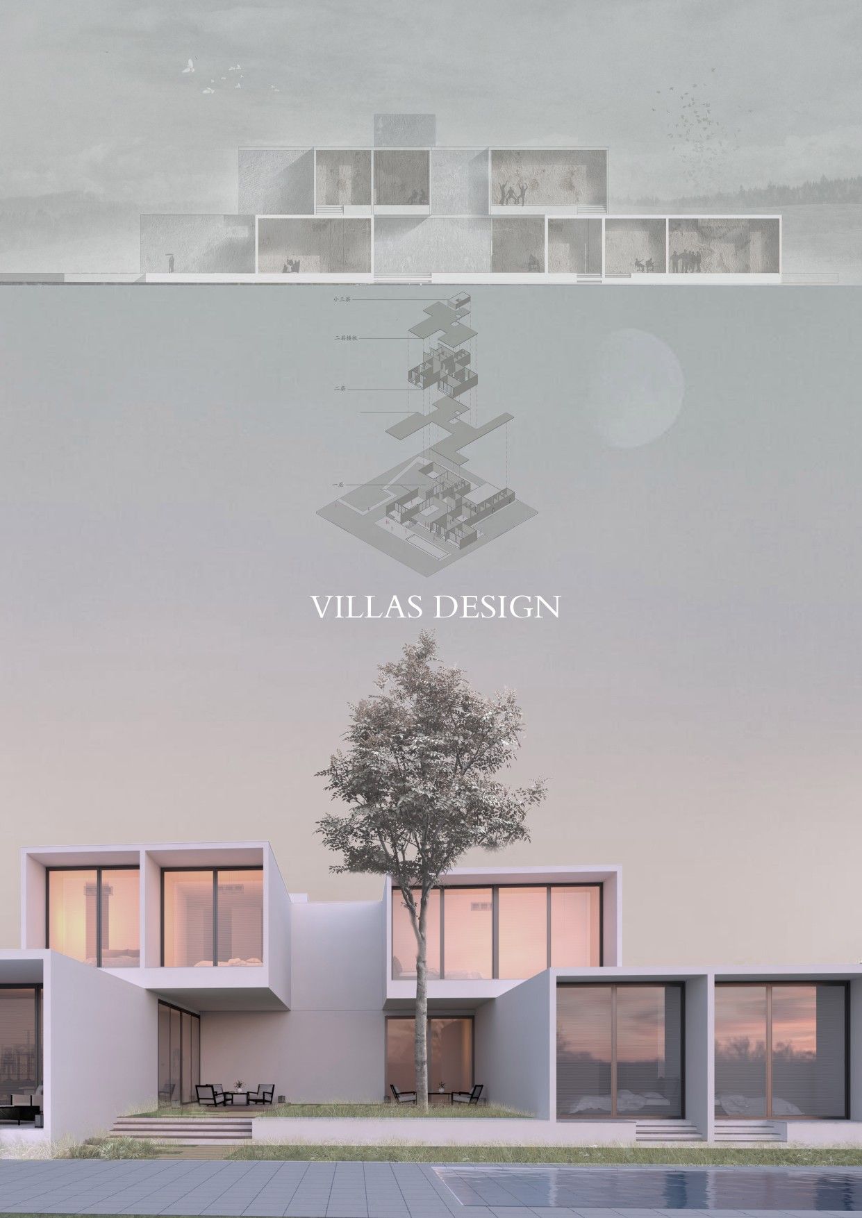
You can cover the weaker aspects of a project by highlighting only the right details and features in your project presentations. The common thread in minimalist boards is that the projects look genuinely professional no matter how they are prepared. If you want your design to look cleaner and more error-free, think simple. A minimalist board leans on white space and a tight grid rather than volume of content.
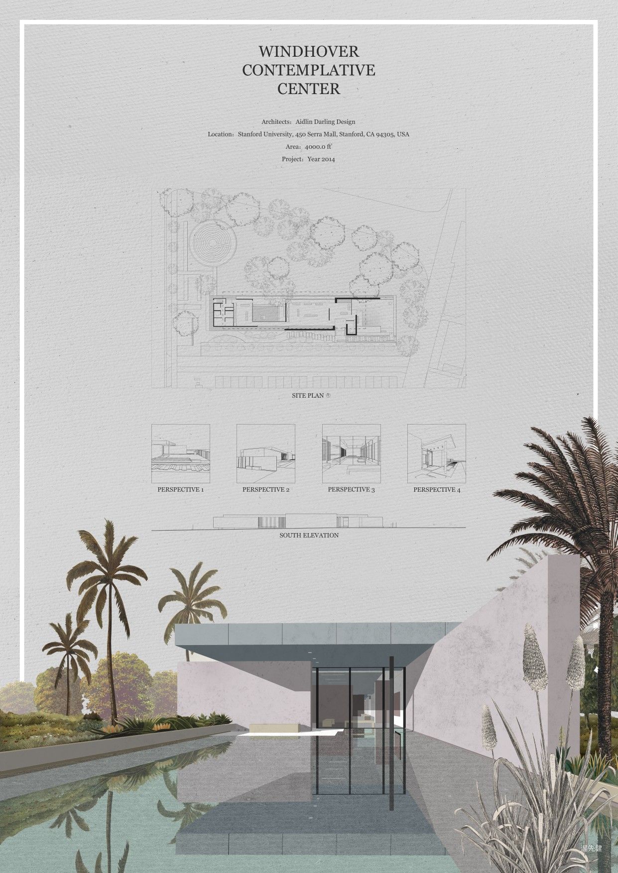
Simple, minimalist thinking can be harder than complex design, but the results speak for themselves. Boards with minimalist designs usually center on a few quality renders that are consistent in color and style. A minimalist layout offers real advantages in professional practice, where clarity matters more than spectacle, though it may suit competition entries or final submissions less well when a jury expects density of information.
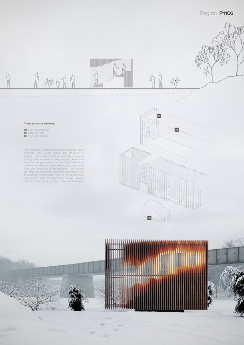
One-Colored Presentation Sheets
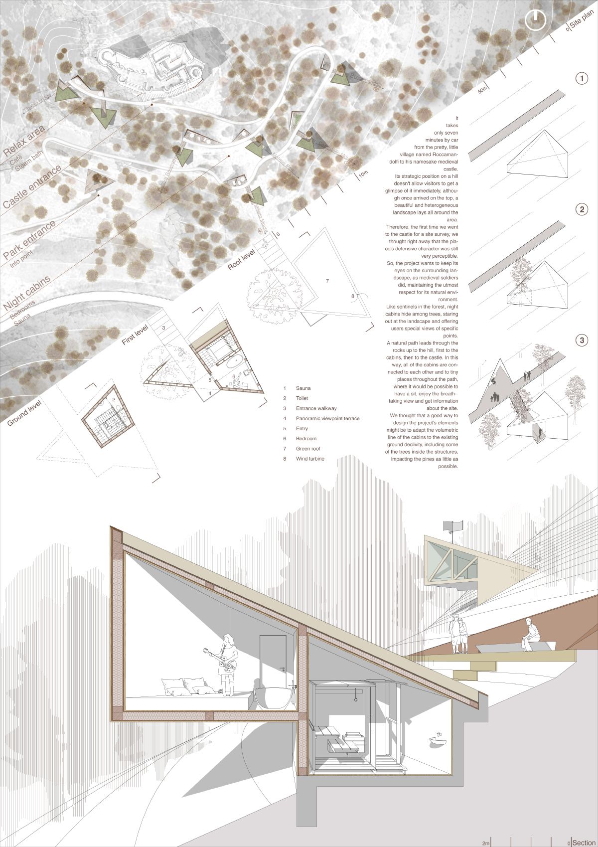
Monochrome presentations are a method some architects prefer. Although the first thing that comes to mind with monochrome is black and white, you can also complete the drawings in one dominant color and reach strong results. As the examples show, this approach helps the viewer read the drawings clearly and keeps the concept in focus, because color never competes with content for attention.
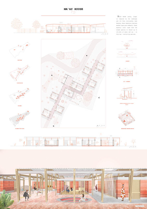

For more layout inspiration and real project sheets, the architectural representation archive on ArchDaily collects a wide range of board styles worth studying before you settle on your own.
Frequently Asked Questions
What is the standard size for an architectural presentation board?
Most schools and competitions ask for ISO A-series sizes, commonly A1 or A0 for physical boards and A3 for portfolio versions. Always confirm the required size and orientation in the brief before you design, since the grid and layout depend on it.
How many drawings should go on one presentation board?
There is no fixed number, but each board should carry one clear idea. A common approach is one dominant hero image plus three to six supporting drawings and short captions. If a viewer cannot read the board in about thirty seconds, it likely holds too much.
What software is best for making presentation boards?
Adobe InDesign and Illustrator are standard for final layout because they handle grids and typography well, while Photoshop is used for editing renders. Many architects also lay out boards in tools like Affinity Publisher. The layout principles matter more than the specific program.
What is the most common presentation board mistake?
Overcrowding is the most frequent error. Trying to fit every drawing onto one sheet destroys hierarchy and readability. Editing content down and protecting white space almost always produces a stronger board than adding more.
Putting It All Together
Strong boards are designed, not assembled. Once you treat the grid, hierarchy, white space, and typography as deliberate choices rather than afterthoughts, even modest projects start to read like professional work. The styles shown here, from collage to minimalist to monochrome, are simply different ways of applying the same underlying discipline.
Your Next Step: Pull up your last presentation board and check one thing first, whether every element aligns to a shared grid. If it does not, rebuild the layout on a proper column grid before touching anything else, and the rest of the composition will fall into place more easily.





Architecture Crit Presentation: How to Present Your Project With Confidence
The crit is where a good project can fall apart and an...
 Sinan Ozen6 Mins read
Why Do Architects Use Architectural Models Instead of Just Drawings?
Physical architectural models remain a core tool even in a digital studio....
 Furkan Sen6 Mins read
How to Make an Architecture Mood Board: A Step-by-Step Guide
A practical walkthrough for building an architecture mood board, covering how to...
Furkan Sen6 Mins read
How to Build an Architecture Physical Model From Scratch
Building an architecture physical model from scratch takes the right scale, tools,...
Furkan Sen6 Mins read



Leave a comment