

What to Include in an Architectural Presentation: 7 Key Elements
A practical checklist of what to include in an architectural presentation, from the concept statement and site analysis to drawings, diagrams, renders, materials, and layout, with tips for students and professionals.
 Elif Ayse Sen20 September 20227 Mins read804

Table of Contents Show
An architectural presentation should include a clear concept statement, site analysis, architectural drawings such as plans and sections, explanatory diagrams, quality renders, material callouts, and a clean layout. Together these elements tell the story of your design and help clients, juries, and reviewers understand the project quickly.
Architectural presentations mean representing your projects in your own way and in your own language. Every architect needs a presentation to communicate their projects, ideas, and concepts in both academic and professional settings. The elements you choose form your design and presentation language, and that language shapes how your architectural vision reads to other people. A strong presentation lifts an already good project, while a weak one can make even a resolved design look incomplete.
This guide covers what to include in an architectural presentation and how each element earns its place on the sheet. The advice applies whether you are an architecture student preparing a studio review, a competitor assembling boards, or a professional pitching to a client.
What to Include in an Architectural Presentation
Before working through each element in detail, the table below summarizes the core components, what each one communicates, and a practical tip for handling it. Use it as a checklist when you plan your sheets or slides.
Core Elements at a Glance
| Element | What It Shows | Tip |
|---|---|---|
| Concept statement | The main idea driving the design | Keep it to one or two sentences |
| Site analysis | Context, access, sun, views, constraints | Use annotated maps, not raw data |
| Plans and sections | Spatial organization and scale | Order them from large to small scale |
| Diagrams | Your design logic and process | One idea per diagram |
| Renders and images | Atmosphere, material, and experience | Fewer strong images beat many weak ones |
| Materials and details | How the building is built and finished | Pair samples with a detail drawing |
| Layout | The reading order of everything above | Guide the eye with a clear grid |
Start With the Concept and Design Narrative
The concept is the backbone of any architectural presentation. It is the idea that explains why the building looks and works the way it does, and it should appear early so everything that follows makes sense. A juror or client who understands your concept in the first thirty seconds will read your drawings with that idea in mind.
Write the concept as a short, plain statement rather than a paragraph of theory. Support it with one or two conceptual sketches or a parti diagram that shows the core move: a shifted volume, a carved courtyard, a folded roof. When your narrative is clear, the rest of the sheet becomes evidence for a single argument instead of a collection of unrelated images.
📌 Did You Know?
The term “parti” comes from the French phrase “prendre parti”, meaning to make a decision. In architecture it refers to the central organizing idea of a scheme, and a single well drawn parti diagram often communicates a concept faster than a full page of text.
Site Analysis and Context
Site analysis shows that your design responds to a real place. Include the information that actually shaped your decisions: orientation and sun path, prevailing wind, access points, neighboring buildings, topography, views, and any zoning or heritage constraints. Present these as annotated diagrams layered over a site plan rather than as tables of raw numbers.
The goal is to connect cause and effect. If you rotated the massing to catch a view or pulled the entrance back to create a forecourt, the site analysis is where you prove that choice was deliberate. Professional bodies such as the Royal Institute of British Architects treat context analysis as a core stage of design, and reviewers expect to see it reflected in your presentation.
Architectural Drawings: Plans, Sections, and Elevations
Architectural presentation means transferring all the details of the buildings you have designed to your audience in the clearest way possible. Architectural drawings carry the technical truth of the project, so they must be clean, consistent, and error free at every scale. For non-architects, plans and sections can be hard to read, so weight them toward student work, competitions, and technical reviews rather than a client pitch heavy on imagery.

Order your drawings from the largest scale down. Begin with a 1/1000 or 1/500 master plan to set the project in its surroundings, then move to floor plans and sections at 1/100 or 1/200 depending on how much the project needs to be read. Close with real size or large scale details such as 1/5, where point and system details become legible. Tools like Autodesk software help keep line weights and scales consistent across a set, and reference libraries such as ArchDaily’s drawing archive show how published projects handle the same problem. Keep every drawing in one graphic language, and make sure the line work reads cleanly. See our guide to architectural elevation drawings for more on presenting facades.
📐 Technical Note
Always place a graphic scale bar and a north arrow next to plans and site drawings. Printed sheets and PDFs are often resized, which breaks numeric scales like 1/100, but a graphic scale bar stays accurate at any output size. A visible drawing scale also lets reviewers judge room sizes without measuring.
Diagrams That Explain Your Thinking
Diagrams sit between raw drawings and finished images. They translate design logic into simple visual steps: circulation, program stacking, structure, environmental strategy, or how the massing grew from the site. A good diagram removes everything that is not needed to make one point, which is why the best ones look almost too simple.
Keep each diagram to a single idea and use a consistent visual key across the set, so a color or arrow means the same thing every time. When diagrams share a language with your plans, the audience can move between abstract logic and built form without losing the thread. This is often where a jury decides whether your project is thought through or merely drawn.
Quality Renders and Images
Quality renders and project images complete an architectural presentation by showing atmosphere, light, and material that drawings cannot convey. If visualization is not your strength, consider a rendering or visual storytelling course, or collaborate with a dedicated rendering artist. A few carefully composed images carry more weight than a dozen rushed ones.

Vary the type of image so the set reads as a story: an exterior view for context, an interior for experience, and a detail shot for material and light. Design media such as Dezeen are useful references for how published projects frame views and choose moments to photograph or render.
Materials and Detail Callouts
Materials tell the audience how the building will actually feel and how it is put together. A short material palette, real or digital samples, and one or two enlarged construction details answer the practical questions a client or juror will ask: what is it made of, and how does it come together. Even in a concept heavy presentation, a small materials strip signals that you have thought past the image.
Tie each material back to the concept where you can. If your idea is about warmth and craft, timber and brass samples reinforce it far better than a generic finishes list. Pair a physical sample with a labeled detail drawing so the abstract choice and the built reality sit side by side.
Layout Design and Composition
Successful architectural presentations depend on layout. Complex, crowded sheets are hard to read, so build simple templates that both clients and judges can follow. When a layout tries to hold too many elements at once, the project becomes harder to understand. Crowded boards are sometimes chosen to look “rich”, but density usually works against the reader.
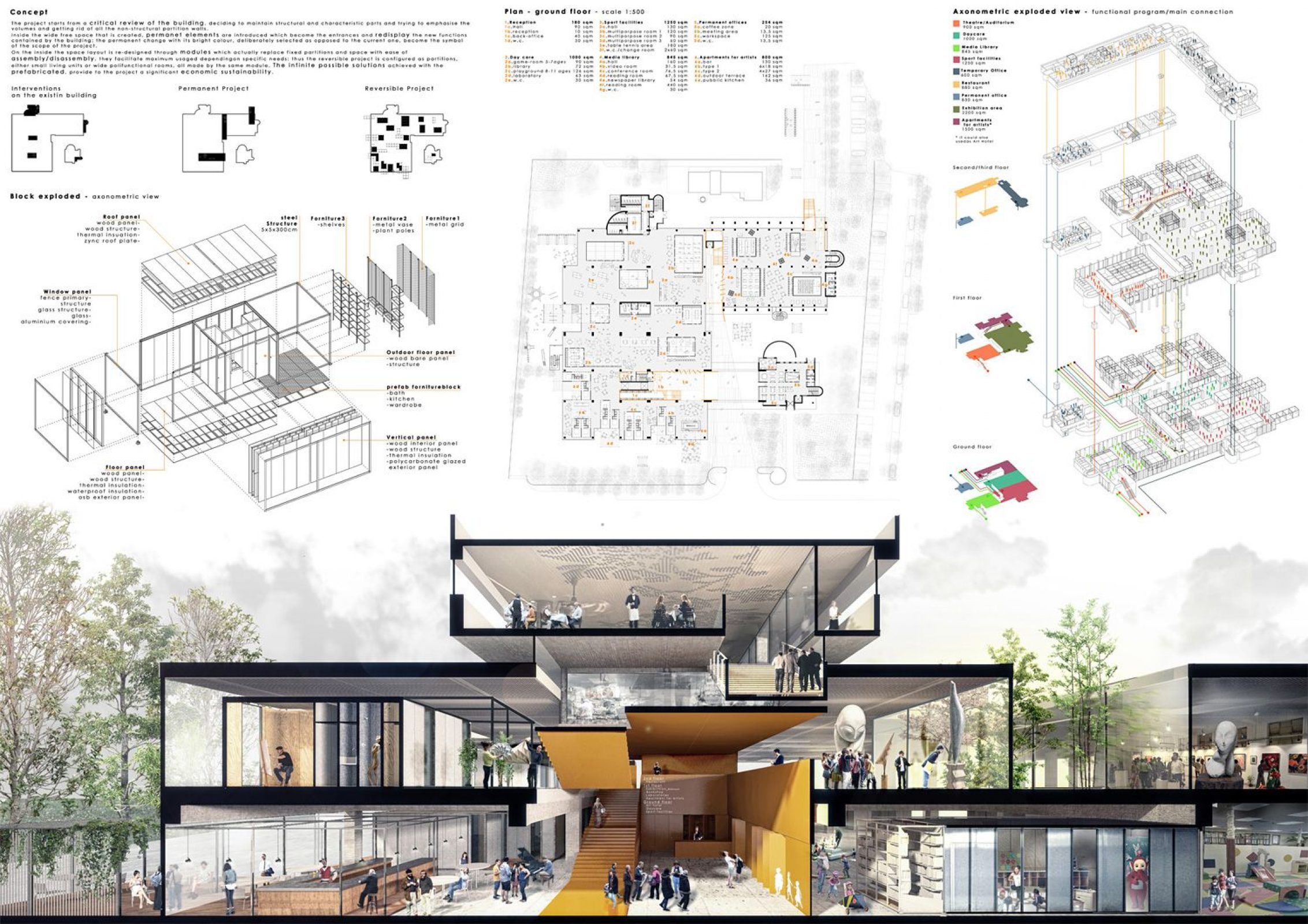
Set a simple grid, align elements to it, and use white space to separate sections. Design tools such as Canva and dedicated page layout software make it easy to keep margins, type, and image sizes consistent across multiple sheets. For a worked example of how these components come together on a single board, see our breakdown of successful architectural presentation boards.
💡 Pro Tip
Design your layout at final print size from the start, then step back three meters from a test print before the review. If the concept and hero image do not read from that distance, the sheet is too busy. Juries scan boards from across a room long before they read the fine print.
Background and Explanatory Text
Is the background an important element? The honest answer is both yes and no. If a subtle background helps the layout read and you trust your graphic skills, use it carefully. Most of the time, colored backgrounds fight with the project visuals, which is a common weakness in student and competition work. A clean white background usually serves the drawings and renders best.
⚠️ Common Mistake to Avoid
Do not fill dead space with a dark or high contrast background to make a sheet look full. It flattens depth in your renders and pulls attention away from the design. If a board feels empty, the fix is better spacing and a stronger hierarchy, not a heavier background.
Explanatory text is part of the same job. A short concept paragraph, clear labels, and any text a competition requires help you convey the project in your own words. Choose a simple sans serif font at a readable size and keep it consistent across every sheet. Text should support the images, not compete with them.
Download Architectural Presentation Sheets
Where to Go From Here
Your Next Step: Pull together your current project and lay every element from the checklist table onto a single test sheet, then remove anything that does not help someone understand the design in under a minute. What remains is the core of a strong architectural presentation, and it is far easier to add polish to a clear base than to rescue a crowded one.
Frequently Asked Questions
What should be included in an architectural presentation?
A complete architectural presentation includes a concept statement, site analysis, architectural drawings such as plans, sections, and elevations, explanatory diagrams, quality renders, a material palette with details, and a clean layout that sets the reading order. Together these elements explain both the idea and the built reality of the project.
How many boards or slides should an architectural presentation have?
There is no fixed number, since it depends on the project and the brief. A studio review might use three to five boards, while a professional pitch may be a short slide deck. Focus on covering each core element clearly rather than hitting a target count, and cut any sheet that repeats information.
Do professional client presentations need technical drawings?
Not always in full. Clients who are not trained to read plans and sections often respond better to renders, diagrams, and a clear concept. Keep detailed technical drawings for reviews, competitions, and permitting, and use simplified plans or diagrams when the audience is non-technical.
What is the best software for an architectural presentation?
Drawings usually come from CAD or BIM tools, renders from a visualization engine, and final composition from page layout or graphic design software. The specific tool matters less than consistency, so pick a set you can control well and keep type, scale, and color uniform across every sheet.
How do you make an architectural presentation stand out?
Lead with a clear concept, keep the layout simple, and let a few strong images carry the atmosphere. A presentation stands out when every element supports one idea and the audience can follow the story without effort, not when the sheet is packed with content.


1 Comment





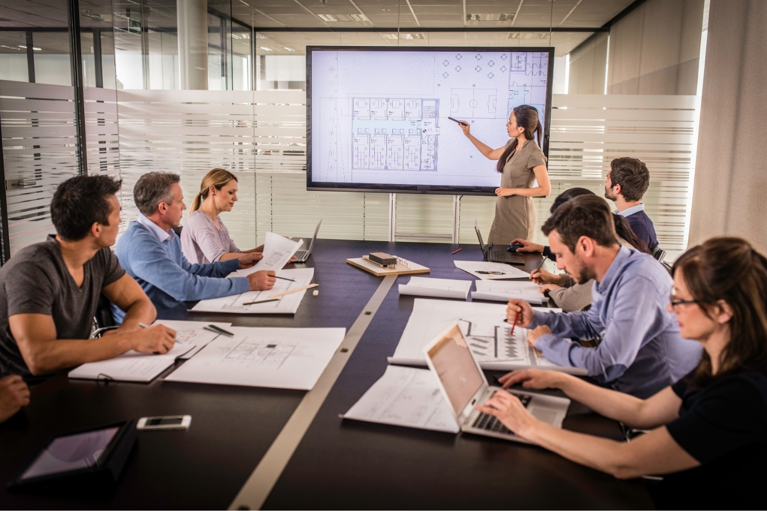
Architecture Crit Presentation: How to Present Your Project With Confidence
The crit is where a good project can fall apart and an...
 Sinan Ozen6 Mins read
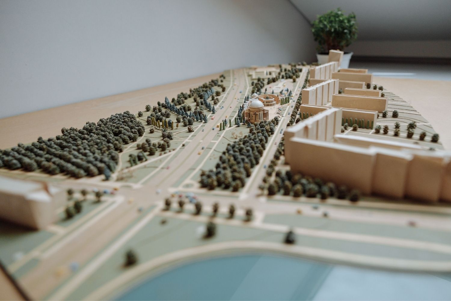
Why Do Architects Use Architectural Models Instead of Just Drawings?
Physical architectural models remain a core tool even in a digital studio....
 Furkan Sen6 Mins read
How to Make an Architecture Mood Board: A Step-by-Step Guide
A practical walkthrough for building an architecture mood board, covering how to...
Furkan Sen6 Mins read
How to Build an Architecture Physical Model From Scratch
Building an architecture physical model from scratch takes the right scale, tools,...
Furkan Sen6 Mins read


Thank you, for your detailed explanation. I hope to connect with. Am from Nigeria