

Turkish Blue: How Turquoise Became the Color of Islamic Architecture
Turkish blue, the turquoise-to-cobalt range that defined Islamic architecture, turned mosque walls into surfaces that read like fragments of sky and water. Trace its path from Seljuk brick accents to Persian domes to the luminous Iznik tilework of the Ottoman 16th century.

Table of Contents Show
Turkish blue is the deep turquoise-to-cobalt range that came to define Islamic architecture across Anatolia, Persia, and Central Asia. The color reached its peak in Ottoman Iznik tilework of the 16th century, where copper and cobalt glazes turned mosque walls into surfaces that read as fragments of sky, water, and paradise. Walk into a great mosque in Istanbul, Isfahan, or Samarkand and the same impression takes hold before you read a single inscription. The walls glow blue. That glow is not decoration added at the end of a project. It carried meaning, signaled patronage, and solved a real design problem about how stone interiors could feel like something closer to heaven. This is the story of how one family of blues moved from gemstone to glaze to the signature surface of an entire architectural tradition.
What is Turkish blue and where does the color come from?
 Turkish blue describes a spectrum rather than a single shade. At one end sits turquoise, a bright blue-green produced from copper oxide in the glaze. At the other end sits a darker cobalt, the rich navy that Ottoman potters prized for outlines and ground fields. Between them lie the colors of turquoise that builders mixed across centuries, from pale sky tones to saturated teal. The name itself records a journey. The English word turquoise comes from the Old French for “Turkish stone,” because the gemstone reached European markets through Turkish trade routes from the mines of Persia. The mineral had been worked in the region for more than two thousand years before it lent its name to the color. So the turquoise color we associate with Anatolian and Persian buildings is tied, in language and in history, to the same trade corridors that carried the stone west. In practice, architects worked with two pigment sources. Copper compounds gave the turquoise color and its lighter variations. Cobalt, often imported, gave the deep turkish royal blue used for borders, calligraphic bands, and dense floral grounds. A single tile panel could hold both, which is why “Turkish blue” rarely means one swatch. It means a balanced range that shifts as light moves across a glazed surface.
📌 Did You Know?
The English word “turquoise” derives from the Old French pierre turquoise, meaning “Turkish stone,” because the gem reached Europe through Turkish trade networks even though the mines themselves were largely in Persia. The color name preserves a route, not an origin.
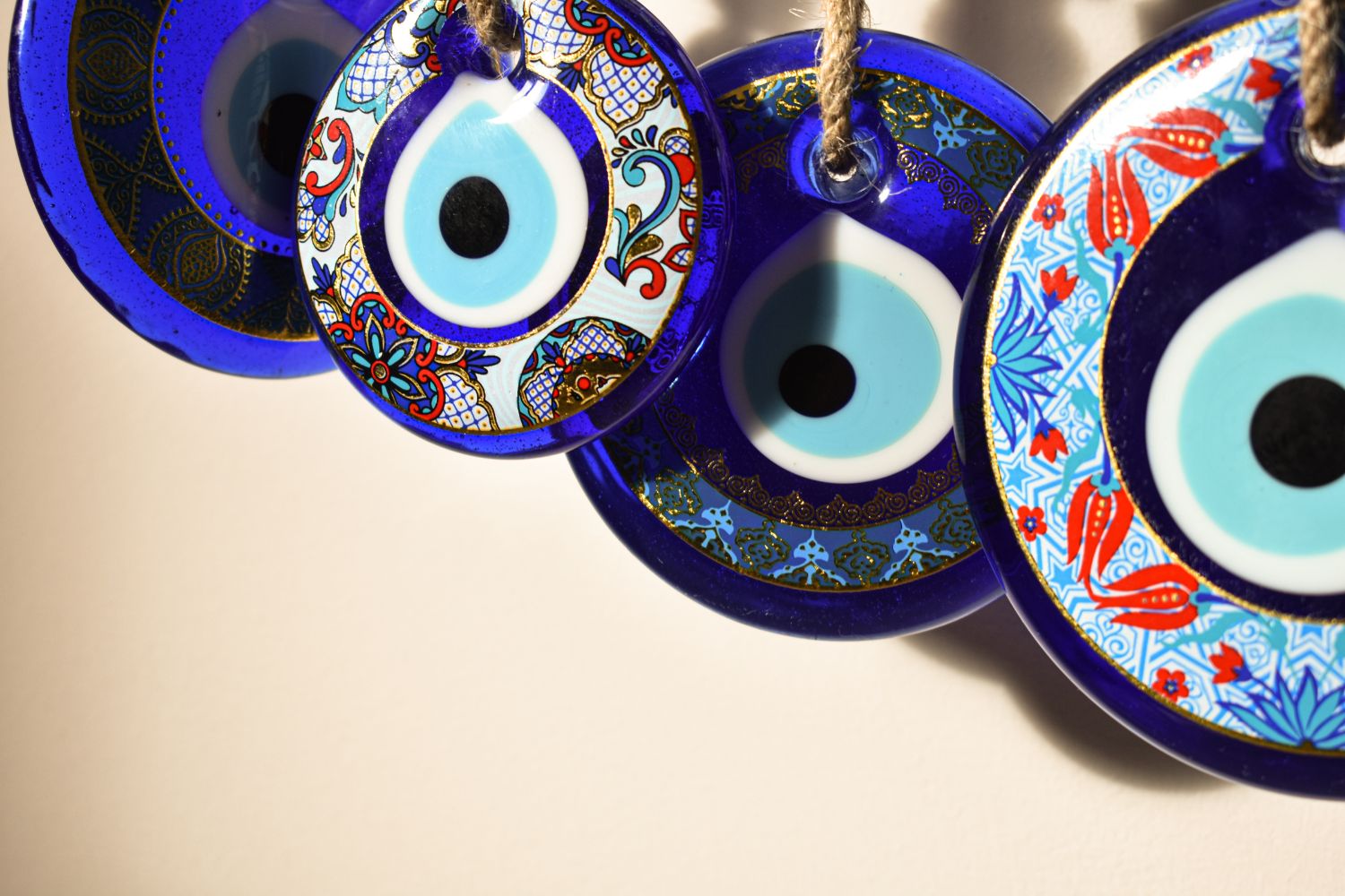
Why did turquoise carry so much meaning in Islamic design?
 Color in Islamic architecture was never neutral, and blue carried a specific cluster of associations. Turquoise read as the color of water and sky, the two elements most tied to the Quranic image of paradise as a garden flowing with rivers beneath a clear vault. Covering a dome or a prayer hall in blue let builders gesture toward that promised garden without depicting it directly, which suited a tradition that favored pattern and geometry over figural scenes. The color also picked up protective meaning. Across Anatolia and Iran, turquoise was linked to good fortune and to defense against the evil eye, the same belief that survives today in the blue nazar amulet. According to ArchDaily’s analysis of the symbolic use of color in Islamic architecture, blue stood for spirituality and the heavens, functioning as a visual bridge between the earthly and the divine. A blue dome was meant to dissolve the ceiling and pull the eye upward into something larger than the room. This symbolism mattered to patrons as much as to worshippers. A sultan who clad a building in costly blue glaze was signaling devotion, wealth, and a claim to the heavenly order all at once. The same shared spatial language that runs through mosque interiors, examined in the contrast between Islamic and Gothic approaches to sacred geometry, treated color as part of structure rather than as an afterthought applied to finished walls.
🎓 Expert Insight
“Blue stands as a reminder of the skies and the alluring distances of higher knowledge, often associated with contemplation and reflection.” (ArchDaily, The Symbolic Use of Color in Islamic Architecture)
This reading explains why architects reserved the deepest blues for domes and upper registers, the zones a worshipper looks toward during prayer, rather than for floors or thresholds.
How did Seljuk builders first establish turquoise architecture?
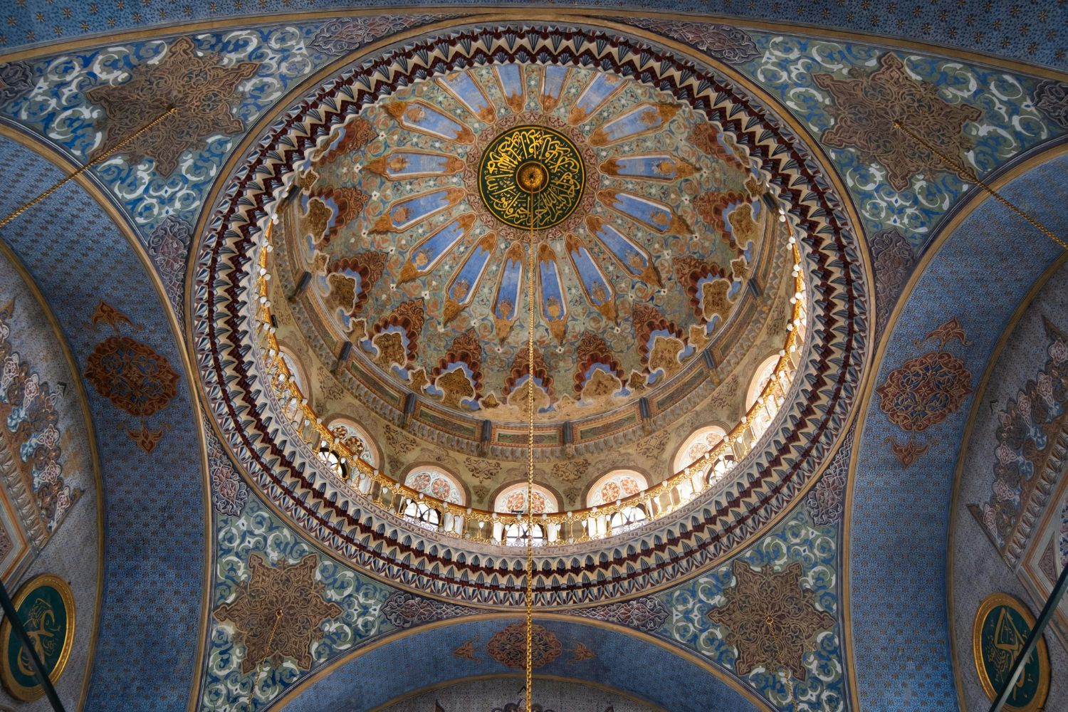
 The story of turkish blue in building starts well before the Ottomans, with the Seljuks who ruled much of Anatolia and Persia from the 11th to the 13th centuries. Seljuk craftsmen worked turquoise and cobalt into brick architecture, setting glazed tiles among unglazed brick so that bands of blue cut across warm earth tones. Iranian architects of this early Islamic period favored turquoise above other colors and paired the tiles directly with structural brickwork. This produced a distinctive look. Rather than coating an entire surface, Seljuk builders used blue as accent and inscription, threading turquoise through portals, minarets, and dome drums. The technique tied color to construction, since the tile and the brick were laid in the same courses. It also set a regional preference that later dynasties inherited and expanded. Persian architecture carried this forward through the later Safavid era, when cities such as Isfahan, Yazd, and Shiraz raised domes sheathed almost entirely in glazed turquoise. The Imam Mosque of Isfahan, built between 1611 and 1630 under Shah Abbas I, shows how far the idea traveled, with its seven-color tilework and blue dome reading as a piece of sky set down inside the city.
🏗️ Real-World Example
Imam Mosque of Isfahan (Isfahan, 1611-1630): Built under Shah Abbas I, the mosque rotates its prayer hall roughly 45 degrees toward Mecca while keeping its portal aligned with Naqsh-e Jahan Square. Its double-shelled dome, clad in turquoise and cobalt haft-rangi tiles, is one of the clearest demonstrations of blue used at architectural scale.
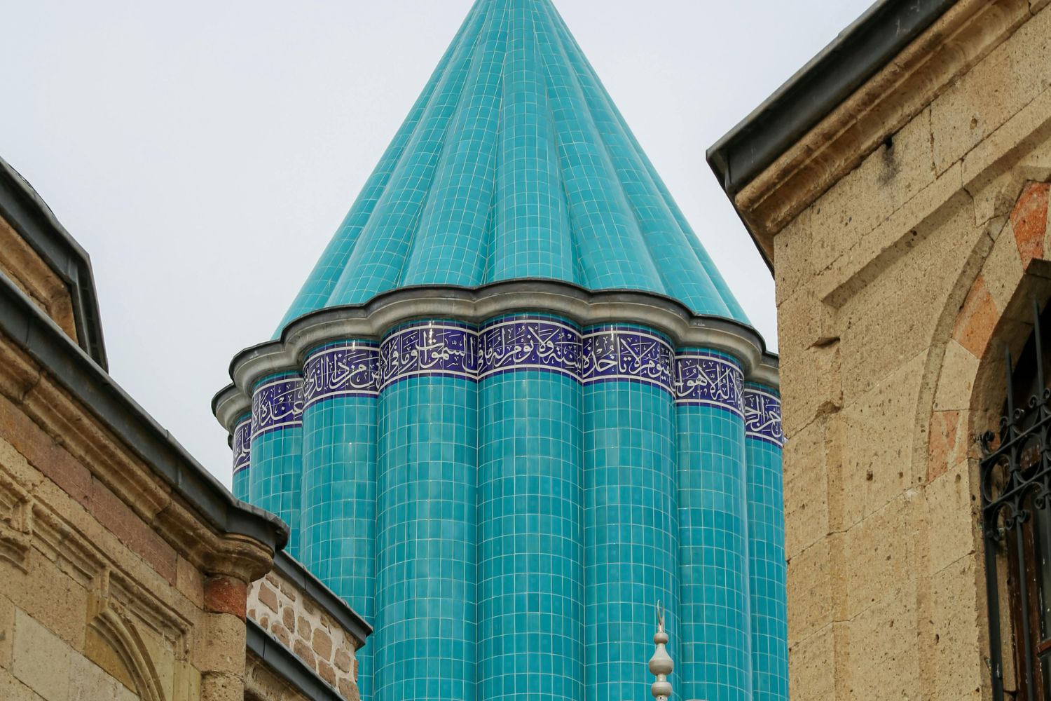
How did Iznik tiles perfect the Turkish blue palette?
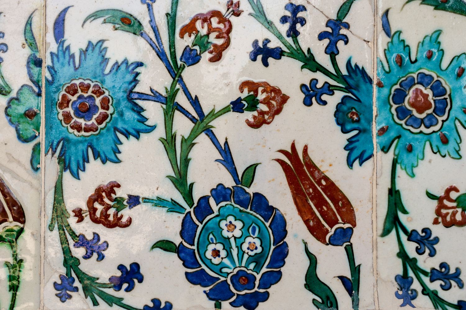
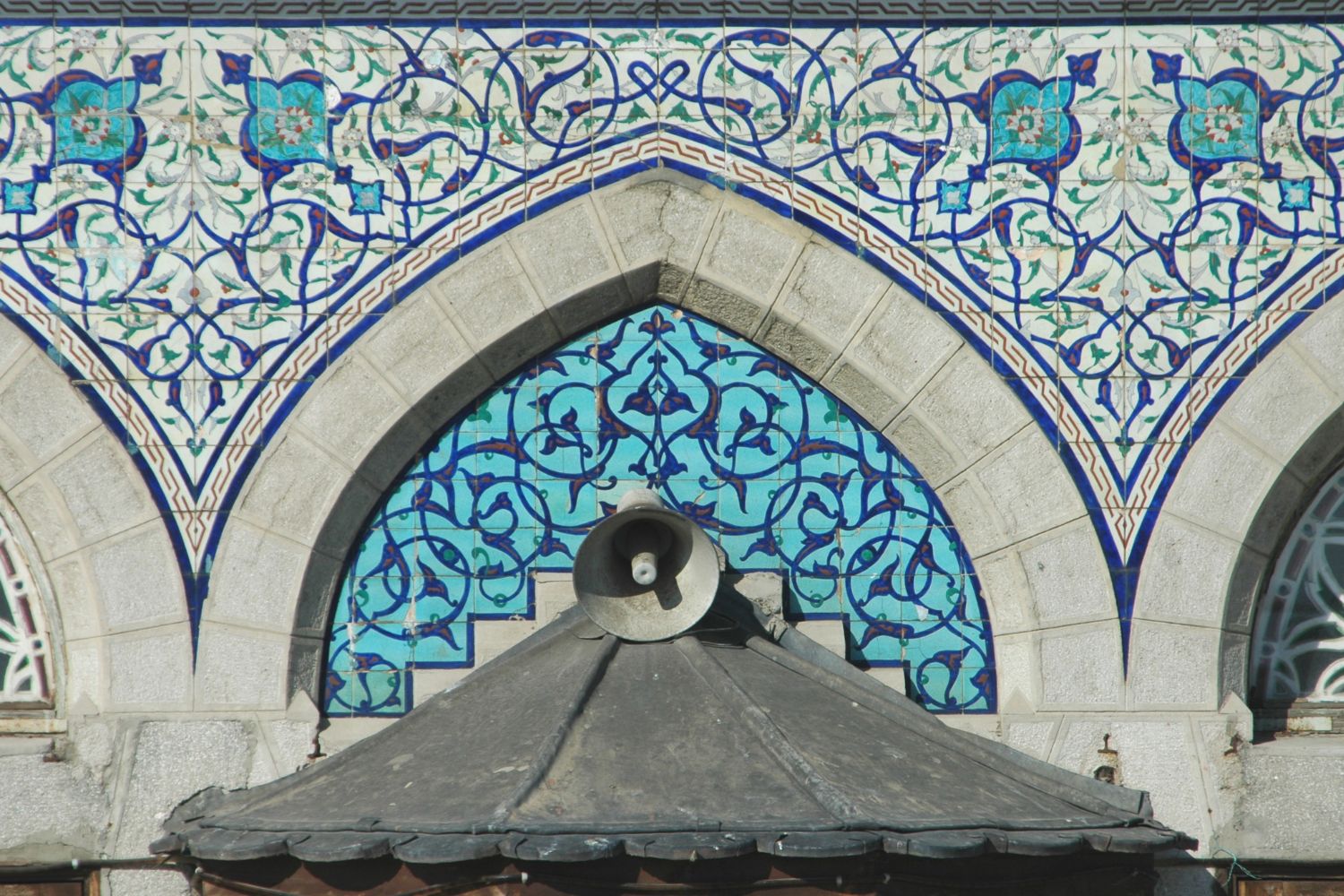 The sharpest expression of turkish blue came from the Ottoman tile workshops of Iznik, a town in northwest Anatolia. From the late 15th century into the 17th, Iznik potters refined a ceramic body and glaze system that gave blue a clarity earlier traditions could not match. The result became the visual signature of classical Ottoman mosque interiors. Their key advance was the body itself. As Iznik pottery records show, craftsmen built tiles from fritware, a composite of quartz sand, ground glass, and a little clay, coated with a brilliant white slip. That white ground acted like a backlight. Against it, cobalt blue and copper turquoise read as pure and luminous rather than muddy, and a thick transparent glaze locked the colors in place.
How did the Iznik color range expand over time?
The palette did not appear all at once. Early Iznik work, around 1480 to 1520, used cobalt blue on white alone, echoing imported Chinese porcelain that the Ottoman court prized. By the 1520s potters added turquoise and purple, and around 1560 they introduced the famous raised bole red along with emerald green. Blue remained the anchor of the scheme throughout, the color every other tone was balanced against.
📐 Technical Note
Iznik turquoise comes from copper compounds in the glaze, while the deep ground blue comes from imported cobalt. The fritware body, roughly quartz with frit and clay, fired hard and stayed dimensionally stable, which let potters produce large matching panels that could wrap a curved wall without color drift between tiles.
Which color terms describe Turkish blue today?
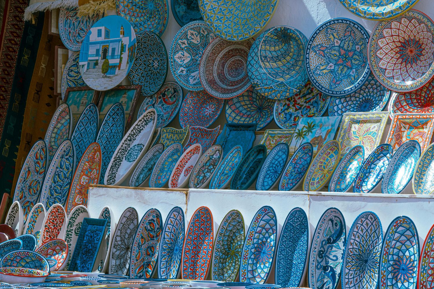
Modern designers still reach for this heritage when they specify color. Terms like turkish blue color, turkish blue colour, and turkish royal blue all point back to the same Iznik and Persian range. Even consumer objects carry the lineage, from a blue turkish mosaic lamp sold in bazaars to the soft grey-blue coat of the turkish angora blue cat. When a brand publishes a turquoise color code for a Mediterranean or Ottoman-inspired scheme, it is sampling, knowingly or not, from a palette that mosques codified centuries ago.
Comparison of Turkish blue across three eras
The table below sets out how the same color family was handled in three major periods of Islamic architecture.
| Era | Main Use of Blue | Technique | Notable Trait |
|---|---|---|---|
| Seljuk (11th-13th c.) | Accent bands, inscriptions | Glazed tile set in brick | Turquoise threaded through structure |
| Persian Safavid (16th-17th c.) | Full dome and portal cladding | Cut and mosaic tilework | Sky-like turquoise domes |
| Ottoman Iznik (16th-17th c.) | Interior wall panels | Fritware tiles, white slip ground | Luminous cobalt and turquoise clarity |
Where can you see Turkish blue at its peak?
 The most concentrated display sits in Istanbul, at the Sultan Ahmed Mosque, known in English as the Blue Mosque and completed in 1616. Its interior holds tens of thousands of Iznik tiles in blue and turquoise, lit by hundreds of windows so that the surfaces shift through the day. The building was raised directly across from Hagia Sophia and the sacred geometry that shaped Ottoman mosques, and its blue interior was part of a deliberate effort to rival that older monument. The Blue Mosque was, by some accounts, the last great building to receive tiles directly from the Iznik workshops at their height, according to records of Iznik ware and its decline. After 1600 the workshops lost imperial backing, quality slipped, and by around 1800 production had stopped. The peak of turkish blue was, in that sense, a window of roughly a century. Beyond Istanbul, the color runs through the wider legacy of Ottoman architecture, which blended Seljuk, Byzantine, and Persian sources into a single tile and dome language. The master architect Mimar Sinan used Iznik panels to sharp effect, and his crowning work, the Selimiye Mosque in Edirne, pairs a vast structural dome with blue-toned tilework that grounds the soaring interior.
💡 Pro Tip
When studying these interiors in person, visit at two different times of day. Iznik turquoise and cobalt respond strongly to changing light, and a panel that looks flat at noon can turn luminous in late afternoon as low sun rakes across the glaze. The color was designed for that movement, not for a single fixed view.
Frequently Asked Questions
What is Turkish blue?
Turkish blue is a color range running from bright turquoise to deep cobalt that became the signature palette of Islamic architecture in Anatolia and Persia. It draws its name from the turquoise gemstone, traded west through Turkish routes, and reached its height in Ottoman Iznik tilework of the 16th century.
Why is turquoise so common in mosques?
Turquoise read as the color of water and sky, both tied to the Quranic image of paradise, and it also carried protective meaning against the evil eye. Cladding domes and walls in blue let builders suggest a heavenly garden through color and pattern rather than figural images.
What made Iznik blue tiles special?
Iznik potters used a white fritware body of quartz, frit, and clay coated with a bright white slip. That white ground made cobalt and copper turquoise read as clear and luminous, and a thick transparent glaze sealed the color, giving a brilliance earlier brick-and-tile traditions could not reach.
Is Turkish blue the same as turquoise?
Not exactly. Turquoise is one part of the Turkish blue range, the bright blue-green made from copper. Turkish blue as a whole also includes the darker cobalt or royal blue used for outlines and dense grounds, so the term covers a balanced spectrum rather than a single shade.
The Bigger Picture
The spread of turkish blue shows how a single color can become a structural idea. Seljuk masons treated it as a thread in brick, Persian builders stretched it across whole domes, and Ottoman workshops perfected it on interior walls, yet all three were chasing the same effect, a surface that felt like sky brought indoors. The gemstone gave the color its name, but architecture gave it meaning, turning a mineral hue into one of the most recognizable signatures in the built world.


Chartres Cathedral: Light, Structure, and the Birth of Gothic Space
Table of Contents Show Why Chartres Cathedral Still Defines Gothic ArchitectureStructural Innovations...

The Great Mosque of Cordoba: Layers of Faith in Architectural Form
Explore the architectural layers of the great mosque of Cordoba, from Abd...

Neuschwanstein Castle: Romanticism and Fairy Tale Architecture in the Bavarian Alps
A detailed look at Neuschwanstein Castle's architectural design, from its Romanesque Revival...

St Paul’s Cathedral: Christopher Wren’s Baroque Triumph in London
A focused look at St Paul's Cathedral in London, covering Christopher Wren's...

Leave a comment