

Most Popular Tile Colors in the U.S. Right Now: A Designer’s Guide
A room-by-room breakdown of the most popular tile colors across American homes right now, from warm off-whites and sage greens in bathrooms to terrazzo-inspired tones in kitchens and deep aqua hues for pool surfaces. Includes NKBA survey data, designer picks, and practical advice for choosing colors that last.
 Furkan Sen29 May 202611 Mins read10
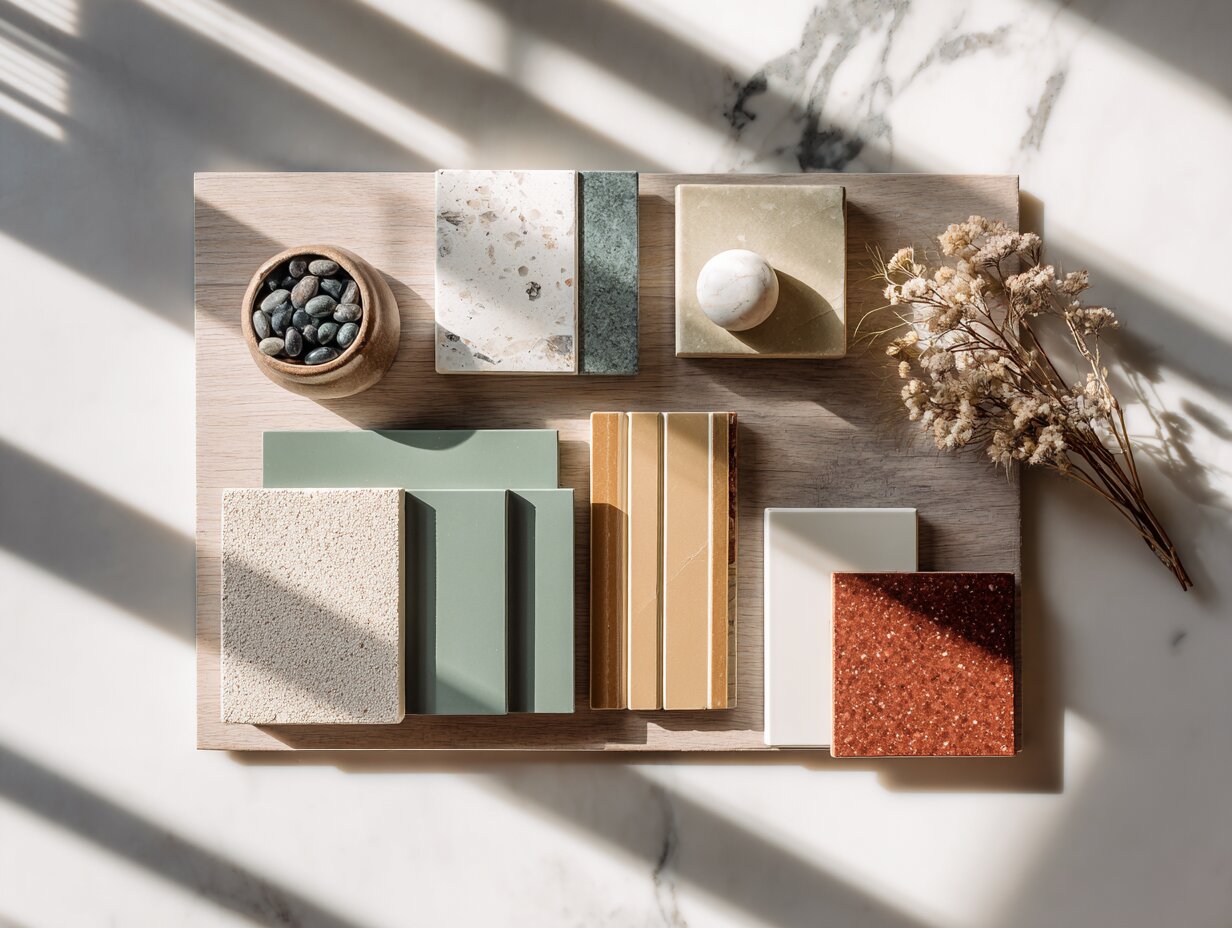
Table of Contents Show
Popular tile colors across American homes are moving away from cool grays and stark whites toward warmer, nature-inspired palettes. Off-white, sage green, warm taupe, and soft terracotta now lead bathroom, kitchen, and floor tile selections, according to data from the NKBA’s 2026 Bath Trends Report and leading tile industry forecasts.
Why Tile Color Matters More Than You Think
Tile is one of the few materials in a home that serves double duty. It protects surfaces from moisture and daily wear, and it anchors the entire visual character of a room. A bathroom with warm beige tiles feels like a retreat. The same bathroom in stark white porcelain reads clinical. That single color decision shapes how every fixture, piece of furniture, and light source interacts with the space.
Color also has a direct impact on resale value. According to the 2025 Cost vs. Value Report by Remodeling Magazine, midrange bathroom remodels return 74 to 80 percent of their cost at resale. Tile selection plays a major role in that return because buyers notice outdated or polarizing color choices immediately. Neutral and warm-toned tiles consistently test better with buyers across regions, which is why understanding the psychology of color preferences in interior design matters so much for long-term decisions.
Beyond aesthetics, tile color affects practical concerns. Light tiles show dirt and grout stains faster, while very dark tiles can highlight water spots and dust. The most popular tile color choices right now tend to fall in the mid-range of the value spectrum, balancing beauty with livability.
What Is the Most Popular Tile Color Right Now?

The answer depends on the room, but overall, warm neutrals dominate. The NKBA’s 2026 Bath Trends Report, based on a survey of nearly 700 industry professionals, found that 96 percent of respondents identified neutrals as the most popular bathroom tile colors. Off-white led at 58 percent, followed by light brown and tan at 54 percent, and white at 40 percent. Darker options like dark brown (30 percent), black (18 percent), and dark gray (18 percent) trailed significantly.
This data confirms a clear pattern: American homeowners are gravitating toward tones that feel warm, grounded, and connected to natural materials. The shift away from cool gray, which dominated much of the 2010s, is now well established.
🔢 Quick Numbers
- 96% of designers identified neutrals as the most popular bath tile colors (NKBA 2026 Bath Trends Report, 2025)
- 89% of homeowners are seeking flooring with smaller or no grout lines, driving demand for large-format tiles (NKBA, 2025)
- 66% of industry experts reported that patterned and textured tiles are gaining prominence (NKBA, 2025)
- Midrange bathroom remodels return 74–80% of cost at resale (Remodeling Magazine Cost vs. Value Report, 2025)
Most Popular Bathroom Tile Colors

Bathrooms have become the most design-focused room in many American homes. The spa-at-home trend, which accelerated during the pandemic, continues to shape tile choices. According to the NKBA survey, spa-like design was the most requested bathroom trend in the U.S. in 2025, cited by over 70 percent of surveyed experts.
The most popular bathroom tile colors right now cluster around three families:
Warm off-whites and creams: These replace the sterile, blue-toned whites that dominated a decade ago. Think of shades like ivory, linen, and warm alabaster. They pair well with natural wood vanities and brushed brass or gold fixtures, which are also trending upward. Pantone’s 2026 Color of the Year, Cloud Dancer, reflects this same shift toward softer, warmer whites.
Light browns and taupes: Shades like mushroom, clay, and sand have surged in popularity. They bring warmth without committing to a strong color and work across transitional, modern, and organic design styles. These tones look especially good with stone-look porcelain, which mimics travertine or limestone at a fraction of the maintenance cost.
Sage and olive greens: The NKBA report showed brown-based greens as a rising force, with sage chosen by 64 percent and olive by 43 percent of surveyed designers. Bolder greens like teal (19 percent) and emerald (16 percent) remain niche. Sage works particularly well in bathroom designs where grout color plays a supporting role, creating a tone-on-tone effect that feels calm and intentional.
💡 Pro Tip
When choosing popular bathroom tile colors, always view samples in your actual bathroom lighting before committing. A tile that looks like a perfect warm beige under showroom LEDs can shift to a flat, pinkish tone in a bathroom lit by a small north-facing window. Bring samples home and check them at morning, midday, and evening light conditions.
Bathroom Tile Color Combinations That Work
Single-color bathrooms are fading. Most designers now recommend a primary tile in a neutral tone paired with an accent tile that introduces texture or a slightly different shade. For example, warm taupe large-format floor tiles paired with a sage green zellige-style shower wall creates depth without visual noise. Another strong combination is cream porcelain walls with a terracotta-toned mosaic niche in the shower.
The key principle is keeping contrast gentle. Instead of pairing opposite ends of the color spectrum, successful popular tile colors for bathrooms sit next to each other on the warm side of the wheel. This creates spaces that feel layered and considered rather than busy.
Popular Kitchen Tile Colors
Kitchens use tile differently from bathrooms. Backsplashes carry the most visual weight, and here, homeowners are getting bolder. While the rest of the kitchen might stay in neutral territory with white or wood-toned cabinetry, the backsplash has become the personality statement.
The most popular kitchen tile colors in 2026 include:
Warm white and cream for full backsplashes, especially in subway or stacked layouts. The shift from classic white subway to slightly warmer, hand-glazed versions in cream, ivory, or off-white continues. These tiles pair well with both light and dark cabinetry.
Green remains the most requested accent color for kitchen backsplashes. Sage, olive, and forest green tiles bring an organic quality that connects to the broader biophilic design movement. Zellige-style tiles in green shades are particularly popular because their hand-crafted surface variation adds character that mass-produced tiles lack. For more inspiration on how kitchen design shapes daily living, the kitchen layout guide covers how spatial planning supports these color decisions.
Terrazzo-inspired tiles are making a strong comeback for kitchen floors and statement backsplashes. Modern terrazzo porcelain comes in neutral speckling (beige or white base with soft-colored chips) or bolder versions with high-contrast aggregate patterns. These tiles add visual interest without needing a complex layout pattern.
⚠️ Common Mistake to Avoid
Matching your backsplash tile exactly to your countertop creates a flat, washed-out look instead of the cohesive effect most homeowners expect. A backsplash should complement the countertop, not duplicate it. If you have white quartz counters, choose an off-white or cream tile with some texture variation rather than a pure white match. The slight contrast gives the eye something to register and makes both surfaces look more intentional.
Most Popular Floor Tile Color

Floor tiles need to balance visual appeal with hard practicality. They endure foot traffic, pet claws, dropped kitchen tools, and cleaning products. The most popular floor tile color choices reflect this dual demand.
Warm taupe and sandy beige lead floor tile selections nationally. These mid-tone neutrals hide dirt and scratches better than pure white or very dark tiles while keeping rooms feeling open and bright. Wood-look porcelain in warm oak and walnut tones continues its multi-year run as one of the top floor tile categories, offering the look of hardwood with the durability of porcelain. If you are weighing floor material options, the guide to common floor system materials covers how tile compares to wood and vinyl structurally.
Large-format tiles (24 by 24 inches and above) are the preferred format. According to the NKBA survey, 80 percent of industry professionals believe large-format flooring will dominate bathroom remodels over the next three years. The reason is practical: fewer grout lines mean less cleaning and a more continuous visual surface that makes rooms feel larger.
For open-plan homes, which now account for a significant share of new construction and renovations in the U.S., a single floor tile color running continuously from the kitchen through the living and dining areas creates spatial flow. Warm stone-look porcelain in travertine or limestone tones works especially well for this approach.
🎓 Expert Insight
“Bath design is becoming deeply personal. Beyond considerations like resale value, designers are focusing on how spaces support a homeowner’s individual rituals, preferences, and self-care routines.” — Bill Darcy, Global President and CEO, NKBA
This shift toward personalization explains why there is no single dominant tile color anymore. Instead, the market has moved to a range of warm neutrals and nature-inspired tones that can be tailored to individual tastes.
Popular Pool Tile Colors

Pool tiles operate under different rules than interior tiles. Water, sunlight, and reflection all influence how color reads. The most popular pool tile colors lean toward blues and greens, but the specific shades have evolved considerably.
Deep cobalt and navy blue remain the top choices for pool interiors. These darker blues make water appear deeper and more luxurious, and they hold their visual intensity better than lighter blues under direct sunlight. Glass mosaic tiles in cobalt tones are especially popular for their reflective quality, creating a shimmering effect as water moves.
Aqua and turquoise tones have regained ground. After a period where all-white or pale gray pool interiors trended in luxury builds, many homeowners are returning to classic aqua hues that make water look inviting and Caribbean-inspired. These medium-toned blues work well across pool sizes and are forgiving with water chemistry color shifts.
Natural stone looks are growing in the pool tile segment. Porcelain tiles that mimic travertine or sandstone, installed on pool decks and waterline areas, create a cohesive connection between the pool and surrounding hardscape. These tiles perform well because porcelain resists salt, chlorine, and UV degradation better than many natural stones. For broader ideas on pool area design, the pool planning guide covers how tile choices fit into the bigger picture.
💡 Pro Tip
Before finalizing pool tile colors, request a wet sample and view it submerged in water under direct sunlight. Tile color shifts dramatically when wet and under water. A tile that looks navy blue dry may read as a medium teal once installed. Most reputable pool tile suppliers will provide wet-test samples for this exact reason.
Most Popular Ceramic Tile Colors
Ceramic tile remains one of the most affordable and widely available tile materials in the U.S. market. While porcelain has taken over for floors and high-moisture areas, ceramic holds strong in wall applications, backsplashes, and accent areas where water exposure is lighter.
The most popular ceramic tile colors follow the same warm-neutral trend seen across all tile categories. White and off-white ceramics still dominate for wall applications, particularly in bathrooms where a clean, spa-like backdrop is the goal. But the whites that sell best today have a warm undertone, not the blue-white that was standard in the early 2010s.
Handmade and artisanal-look ceramic tiles are one of the strongest growth segments. These tiles feature deliberate variations in glaze color, surface texture, and edge finish that make each tile slightly different. In cream, sage, blush, and warm gray, these artisan ceramics bring a crafted, human quality to walls that machine-perfect tiles cannot replicate. The tile pattern and layout guide shows how pattern choices amplify or soften the impact of these color selections.
Ceramic vs. Porcelain Tile Color Availability
The following table compares how popular tile colors are typically available across ceramic and porcelain formats:
| Color Family | Ceramic Availability | Porcelain Availability | Best Application |
|---|---|---|---|
| Warm white/cream | Very wide | Very wide | Walls, backsplashes, floors |
| Sage/olive green | Growing fast | Moderate | Backsplashes, accent walls |
| Warm taupe/sand | Wide | Very wide | Floors, shower surrounds |
| Terracotta/clay | Moderate | Growing | Floors, outdoor areas |
| Deep blue/navy | Moderate | Limited | Accent walls, pool tiles |
| Wood-look brown | Limited | Very wide | Floors (living, bedroom) |
How to Choose a Tile Color That Lasts
Trends move. A tile floor does not. Most tile installations stay in place for 15 to 25 years, which means your color choice needs to outlast several trend cycles. Here are the factors that separate a lasting choice from one you will regret.
Start with your fixed elements. Countertops, cabinetry, and major fixtures are expensive to replace. Your tile color should work with these surfaces rather than against them. If your kitchen has warm wood cabinets, choose a tile in the same temperature family. Mixing warm cabinets with cool blue-gray tile creates a visual disconnect that is hard to correct without replacing one or the other.
Consider the room’s natural light. North-facing rooms receive cooler, bluer light that makes warm tiles look more neutral and cool tiles look even colder. South and west-facing rooms get warm, golden light that intensifies warm tones. A tile that looks perfect in a south-facing showroom may feel entirely different in your north-facing bathroom. Understanding how color works in architecture at a broader level helps you make smarter material selections.
Think about maintenance before aesthetics. White floor tiles in a mudroom will look dirty within hours. Very dark tiles show every water spot and dust particle. The most practical tile colors for high-traffic areas sit in the middle of the light-dark spectrum: warm beiges, taupes, and medium grays that hide imperfections without making the room feel dark.
📌 Did You Know?
The tile industry in the U.S. is part of a market valued at $228 billion, according to the National Kitchen and Bath Association. American homeowners installed approximately 3.26 billion square feet of ceramic tile in 2023, according to the Tile Council of North America (TCNA). That figure continues to grow as porcelain technology makes it possible to replicate natural stone, wood, and concrete at lower costs and with better durability.
Tile Color Trends That Are Fading
Knowing what is losing popularity is just as useful as knowing what is rising. Several tile color trends that dominated the last decade are now in clear decline across the U.S. market.
Cool gray is the most notable exit. Gray subway tile, gray floor tile, and gray everything defined the 2015 to 2020 era. While gray is not completely gone, it has shifted from a dominant neutral to one option among many. The grays that still sell well have warmer undertones (greige, warm charcoal) rather than the blue-toned cool grays that defined the previous era.
Pure stark white is also losing ground in bathrooms. The all-white bathroom, while still popular in modern and minimalist interiors, is being replaced by warmer tones that feel less sterile. Off-white and cream achieve the same bright, clean look without the clinical feeling. For context on how broader design aesthetics are shifting, the interior design concept guide covers the wider movement toward earth tones and layered textures.
Highly patterned encaustic-look tiles, which peaked around 2018 to 2020, have cooled significantly. Homeowners who installed bold patterned tiles often found them visually fatiguing over time. The pattern trend has not disappeared, but it has shifted toward subtler expressions like tone-on-tone geometrics and soft checkerboard layouts in neutral colors.
Tile Color by Room: A Quick Reference

Room-by-Room Popular Tile Color Summary
The table below summarizes the most popular tile color choices by room type across U.S. homes:
| Room | Top Colors | Trending Accent | Format Preference |
|---|---|---|---|
| Primary bathroom | Off-white, warm taupe, cream | Sage green, soft terracotta | Large-format porcelain |
| Kitchen backsplash | Warm white, cream | Green zellige, terrazzo | Handmade or subway |
| Kitchen floor | Warm taupe, wood-look | Terrazzo, stone-look | Large-format porcelain |
| Living area floor | Wood-look warm oak, sand | Travertine-look | Large-format plank |
| Pool interior | Cobalt blue, aqua | Iridescent glass | Glass mosaic |
| Entryway/mudroom | Medium gray, warm stone | Geometric pattern | Durable porcelain |
Video: 2026 Top Ten Tile Trends
This presentation from Interior Design Magazine and Coverings spokesperson Alena Capra covers the top tile design and color trends shaping American homes, from warm neutrals and metallic accents to nature-inspired greens.
Final Thoughts
✅ Key Takeaways
- Warm neutrals (off-white, cream, taupe, sand) are the most popular tile colors across all room types in the U.S., with 96% of designers confirming neutrals lead bathroom selections.
- Cool gray tile is declining. The grays that remain popular have shifted to warmer undertones like greige and warm charcoal.
- Sage and olive green are the fastest-growing accent tile colors, particularly in bathrooms (64% of designers recommend sage) and kitchen backsplashes.
- Large-format porcelain tiles (24″ and above) are the preferred format for floors and showers, driven by homeowner demand for fewer grout lines and easier maintenance.
- Pool tile colors still center on blue tones, but cobalt and navy are replacing lighter aqua as the dominant choice for a more luxurious water appearance.
- Tile color decisions should account for natural light direction, fixed elements like cabinetry, and long-term maintenance rather than short-term trends alone.
The current generation of popular tile colors reflects a broader shift in American interior design. Homeowners want materials that feel warm, personal, and connected to the natural world. The clinical perfection of all-white rooms and the universality of cool gray have given way to palettes with more character and warmth. If you are planning a bathroom remodel or kitchen renovation, choosing tiles in these warm, earthy families gives you the best balance of current appeal and long-term livability.
Tile prices, availability, and color selections vary by region and supplier. Always request physical samples and consult with a local tile professional before making final selections for your project.
- most popular bathroom tile colors
- most popular ceramic tile colors
- most popular floor tile color
- most popular kitchen tile color
- most popular tile color
- popular bathroom tile colors
- popular kitchen tile colors
- popular pool tile colors
- popular tile color
- popular tile colors
- popular tile colors for bathrooms
- what is the most popular tile color






Global Tile Trends Designers Should Know in 2026
From the warm terracotta and olive palettes replacing cool grays to the...
 Sinan Ozen8 Mins read

Modern Interior Lighting: 7 Design Ideas That Transform Spaces
Lighting is one of the most powerful tools in modern interior design,...
Furkan Sen11 Mins read

2026 Modern Furniture Trends Interior Designers Are Obsessed With
Modern furniture trends 2026 are moving beyond minimalism into something warmer and...
Furkan Sen9 Mins read

Japandi Style Guide: Japanese Minimalism Meets Modern Furniture
Learn what japandi style really means and how it brings together Japanese...
Furkan Sen12 Mins read


Leave a comment