

Designing Physical Brand Touchpoints for Architecture Studios

Table of Contents Show
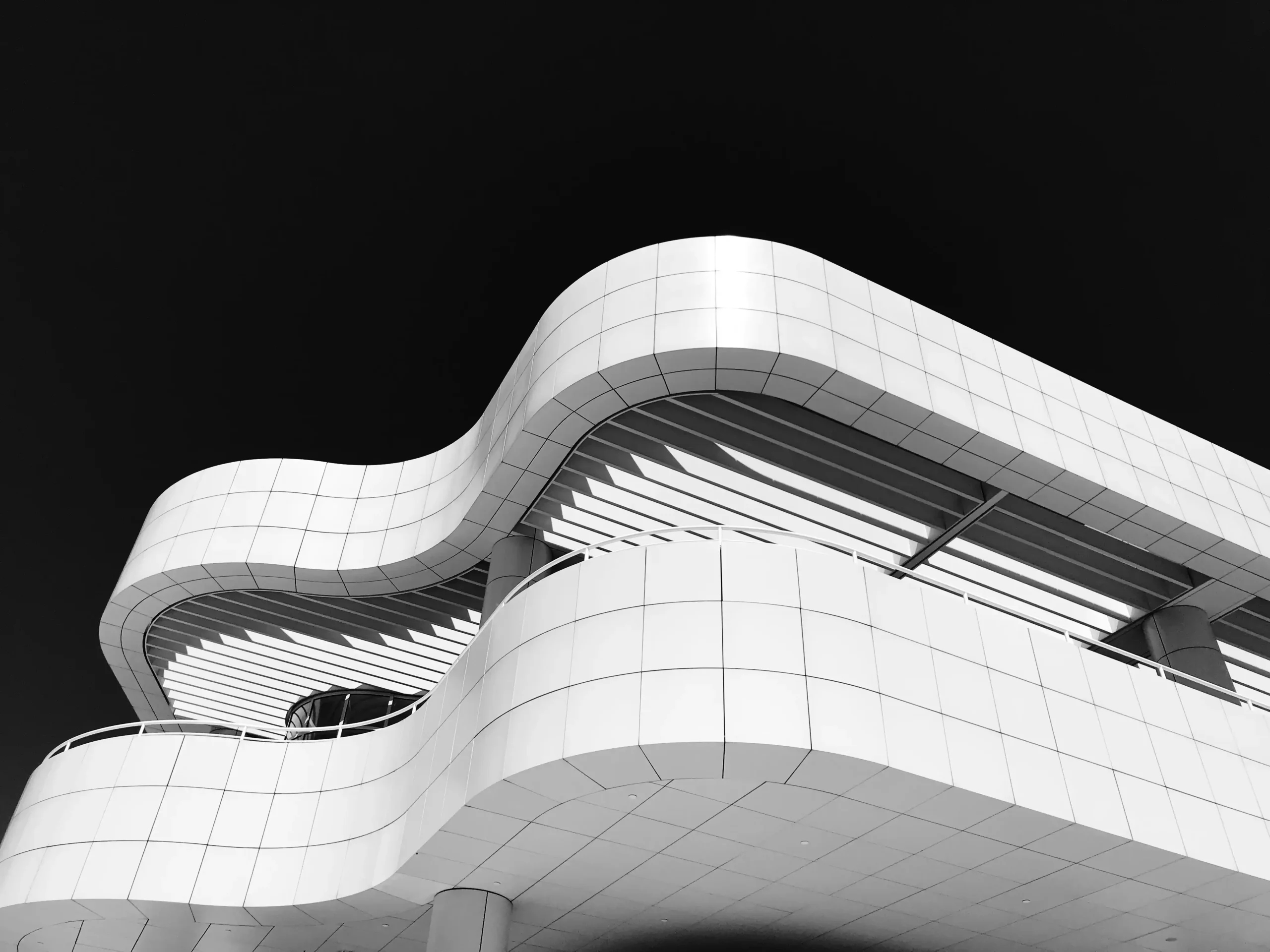
Architecture studios spend a great deal of time shaping how spaces are experienced. Yet the same level of care is not always applied to the small physical details that represent the studio outside the office.
A client may first encounter a practice through a portfolio, website, or social media profile. But many meaningful impressions happen in person: at a site visit, a public consultation, a lecture, a competition presentation, or a community workshop.
These moments are full of physical touchpoints. A printed agenda, a presentation folder, a site vest, a name badge, a notebook, or a simple piece of branded apparel can quietly communicate how a studio thinks. When designed with restraint, these objects can support identity without feeling promotional.
For architects and designers, the challenge is not to place a logo on everything. It is to create a small set of useful objects that feel aligned with the studio’s values, process, and visual language.
Think Beyond the Logo
A physical brand touchpoint should not rely only on a logo. In architecture, identity often comes through proportion, material choices, spacing, typography, and tone. The same principles can guide small branded items.
For example, a studio known for adaptive reuse might choose recycled paper folders, muted ink colors, and simple line drawings rather than glossy materials. A practice focused on hospitality interiors may use warmer textures and softer typography. A landscape architecture office might work with earthy tones, durable field notebooks, and weather-ready items.

The goal is consistency. If a studio’s portfolio is minimal and carefully edited, its event materials should not feel visually loud. If its work is experimental and graphic, its physical materials can carry more energy.
Small details matter. The weight of a card, the scale of a symbol, the placement of a wordmark, and the color of a stitch can all affect how an object is perceived.
Match the Object to the Setting
Not every branded item makes sense for every studio. A useful starting point is to map the environments where the studio meets people in person.
A residential architect may need elegant leave-behind folders for client meetings. A firm working on civic projects may focus on clear public workshop materials, maps, and signage. A design-build studio may benefit from durable site apparel and practical tools that support team visibility.
For outdoor charrettes, site walks, or festival-style design events, custom trucker hats can be a practical option because they provide shade, are easy to recognize in a crowd, and leave enough front-panel space for a restrained studio mark.
The same logic applies to other items. Tote bags may be useful at exhibitions where visitors collect brochures and prints. Clipboards can help at site surveys. Simple notebooks can support workshops where participants sketch ideas or record feedback.
When the object has a real purpose, it feels integrated into the experience rather than added for decoration.
Use Materials as Part of the Message
Architects often speak through materials. Concrete, timber, brick, glass, steel, textile, and stone all carry associations. Physical brand items can reflect a similar material sensitivity, even at a small scale.
A studio with a sustainability focus might choose organic cotton, recycled paper, water-based inks, or long-lasting reusable items. A practice with a refined residential portfolio may prefer neutral colors, soft textures, and understated finishes. A firm that works on cultural or educational buildings might use bold graphic systems that help people navigate events and exhibitions.
Material choices do not need to be expensive to feel thoughtful. A limited palette, good typography, and careful spacing often communicate more than complex production.
It is also worth considering how an item will age. Objects used on construction sites, walking tours, or workshops should be able to handle wear. A faded print or flimsy material can weaken the impression quickly.
Durability is part of design quality.
Keep the Visual System Flexible
A strong physical identity system should work at different scales. The same studio mark may appear on a large exhibition banner, a small card, a folder, a shirt, or a cap. Each format has different constraints.
Fine lines that look elegant on a website may disappear when embroidered. Long studio names may need alternate lockups for narrow spaces. Complex diagrams may work well on posters but not on small objects.
This is where a flexible visual system helps. A studio might develop a primary logo, a simplified monogram, a short wordmark, a pattern derived from project drawings, or a set of graphic lines inspired by plans and sections.
These elements can be used selectively. A notebook might feature a subtle grid. A workshop folder might use a project diagram. A site garment might use only a small monogram for clarity.
Architectural branding often becomes stronger when it allows variation within a coherent structure.
Design for People, Not Just Presentation
Physical touchpoints are often created for visibility, but they should first be designed for people. A public workshop handout should be easy to read. A name badge should help conversation. A site garment should be comfortable and appropriate for the setting. A folder should protect documents without being awkward to carry.
This human-centered approach mirrors good architectural thinking. Objects should support behavior, movement, weather, access, and use.
Consider a community planning workshop. Participants may include residents, officials, consultants, students, and local business owners. Clear signage, readable maps, and simple materials can help people feel oriented. If the design team is easy to identify, participants know who to approach with questions.
In this context, branded materials are not only about recognition. They help structure the event and reduce confusion.
Avoid Over-Branding
One of the most common mistakes in physical branding is using too many elements at once. Large logos, multiple colors, slogans, patterns, and social handles can quickly make an item feel cluttered.
Architecture audiences often respond well to restraint. A small mark, a considered color, or a refined typographic detail can be enough.
This does not mean everything must be minimal. Some studios have expressive identities that suit bold graphics. The key is intention. Every visual choice should have a reason and a relationship to the studio’s work.
A helpful test is to place the item next to the studio’s portfolio, website, and project boards. If it feels like it belongs to the same practice, the direction is likely working. If it feels like a generic event giveaway, it may need more editing.
Build a Small, Useful Set

A studio does not need a large collection of branded objects. In many cases, a focused set is more effective.
For example, an architecture practice might develop:
- A clean presentation folder for client meetings.
- A field notebook for site visits and workshops.
- A simple apparel item for outdoor events or construction-related settings.
- A printed card with contact details and a concise studio statement.
- A reusable tote for exhibitions, lectures, or design fairs.
This kind of set can cover several real-world scenarios without becoming excessive. It also makes it easier to maintain quality. Fewer items mean more attention can be given to materials, production, and consistency.
Studios can also update these objects over time. A new public project, anniversary, exhibition, or research initiative may inspire a limited graphic variation while still staying within the broader identity system.
Conclusion
Physical brand touchpoints are small, but they can shape how people remember an architecture studio. When they are useful, well made, and visually aligned with the practice, they support the studio’s identity in a quiet and practical way.
The most effective approach is not to brand everything. It is to choose objects that fit real settings, reflect the studio’s design values, and improve the experience of the people using them.
For architects and designers, these details are another extension of spatial thinking. They show that design care does not stop at the building, the presentation board, or the screen. It continues through every material encounter.


Why Is the Architecture Physical Model Still Taught in Schools?
Digital tools run modern architecture, yet schools still put students at the...

Schematic Design and Design Development: Key Differences Explained
Schematic design and design development are sequential architectural phases that answer different...

The 10 Longest Bridges in the World
The world's longest bridges are dominated by Asian high-speed rail viaducts, led...

Apaulinha: Nine Architect-Designed Homes Across the Alentejo Landscape
In the rural territory of Grândola, close to Melides and Portugal’s Atlantic...

Leave a comment