

How to Make an Architecture Mood Board: A Step-by-Step Guide
A practical walkthrough for building an architecture mood board, covering how to gather references, edit a tight material and color palette, arrange the board, and pick tools like Milanote, Pinterest, and Adobe Color.
 Furkan Sen15 July 20266 Mins read2
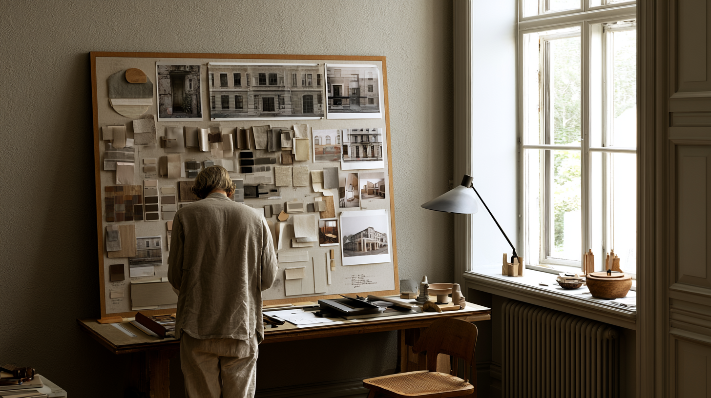
Table of Contents Show
An architecture mood board is a visual collage of images, materials, colors, and textures that captures the intended atmosphere of a design project. To make one, gather references that reflect your concept, group them by theme, refine the selection, and arrange everything into a single board that guides your design decisions.
Every strong building starts as a feeling before it becomes a drawing, and a mood board is where that feeling takes shape. For students and practicing designers, it turns scattered inspiration into one reference point that keeps a project consistent from the first sketch to the final render. Done well, it also saves hours of second-guessing later.
What Is an Architecture Mood Board?
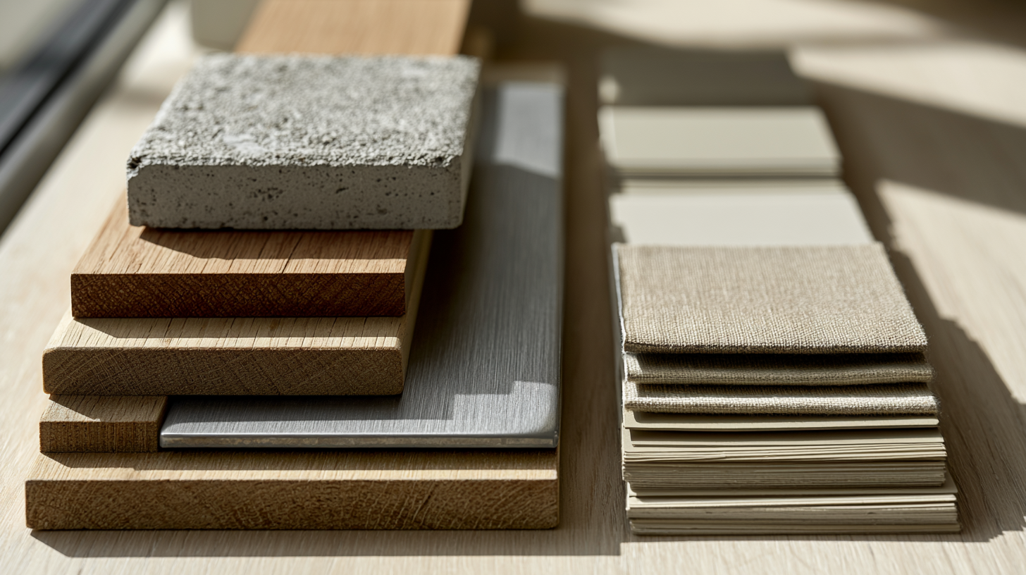
An architecture mood board is an edited arrangement of visual cues that communicates the look, feel, and material character of a project before any detailed design work begins. It sits between raw inspiration and a defined concept, helping you translate an abstract idea into something you can point to and discuss. Where a floor plan answers how a space works, the board answers how it should feel.
Architects use these boards at the earliest stage, often alongside sketches and a written brief. The board pulls together photography, precedent buildings, color samples, and texture references so the design intent stays readable to clients, tutors, and collaborators. If you want to see how a single organizing idea drives the rest of the process, this overview of architectural concept design pairs well with mood board work.
Why an Architecture Mood Board Matters
A good architectural mood board does three things at once. It clarifies your own thinking, it aligns everyone on the team, and it reduces costly client misunderstandings. When a client says they want a “warm, modern” home, a board removes the guesswork by turning that vague phrase into specific tones, woods, and light qualities everyone can agree on.
Mood boards also speed up the rest of the project. With a fixed visual direction in place, decisions about cladding, finishes, and lighting become faster because each option is measured against the board instead of against memory. Professionals at firms like Foster + Partners and BIG rely on visual references early to keep large teams pointed at the same target. The same logic applies whether you are designing a pavilion or a single room.
📐 Technical Note
When building the color section of a board, the 60-30-10 rule keeps palettes balanced: roughly 60 percent dominant tone, 30 percent secondary, and 10 percent accent. This same ratio carries cleanly from the board into renders and presentation panels, so your final sheets read as a continuation of the concept rather than a fresh start.
How to Make an Architecture Mood Board in 6 Steps
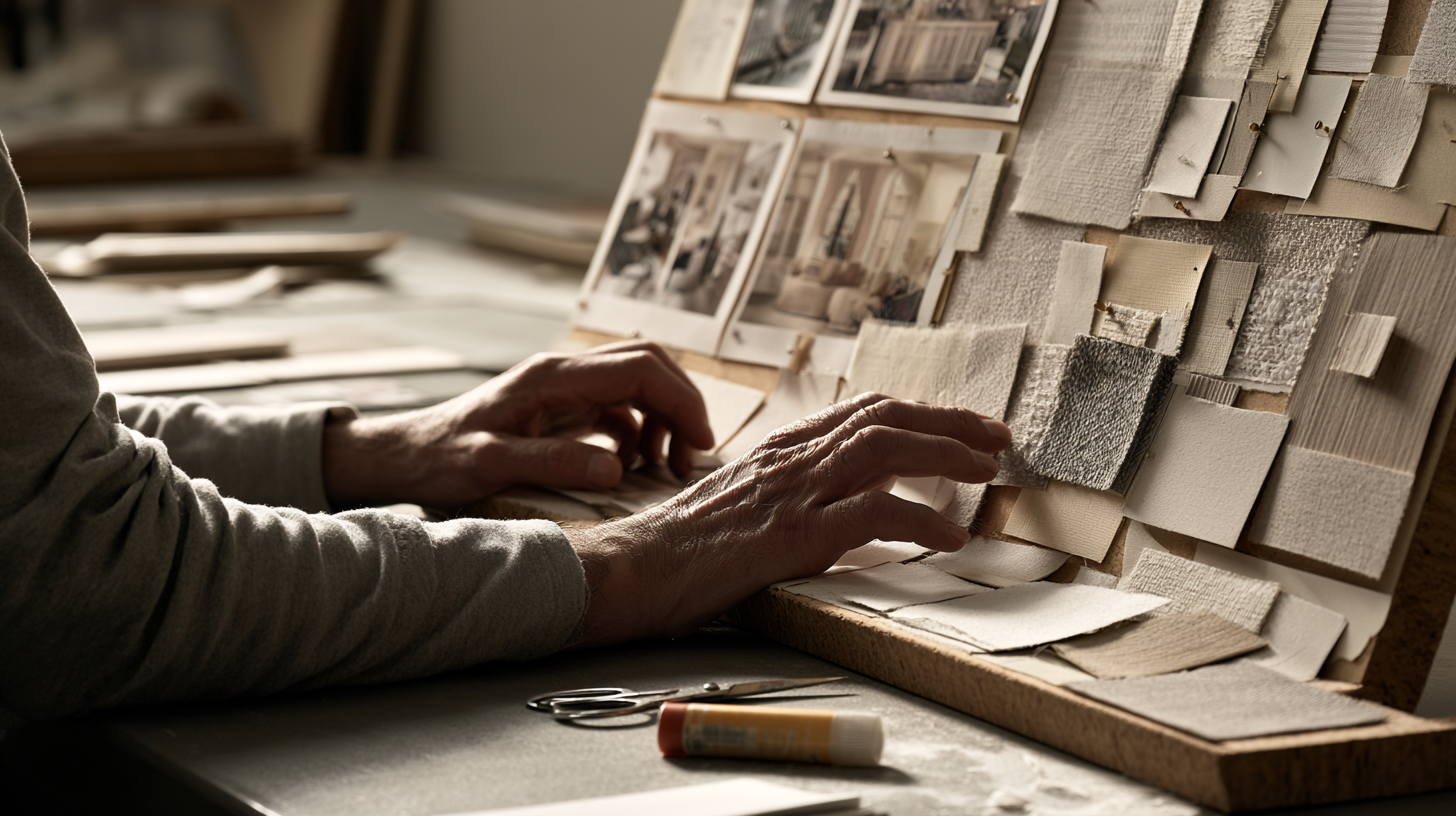
The process below works for a digital board or a physical pin-up wall. Move through it in order, since each step narrows your options and makes the next decision easier.
Step 1: Define the Concept and Brief
Start with words before images. Write down two or three adjectives that describe the experience you want, plus the practical constraints of site, climate, and program. A board with no brief behind it drifts into a pretty but useless picture wall. If you need a refresher on where this fits, review the stages of the architecture design process so the board supports, rather than replaces, real planning.
Step 2: Collect References Widely
Pull images from many sources: built precedents, landscapes, textiles, art, and even food or film stills. The goal at this stage is range, not polish. Save everything that resonates, then worry about editing later. Pinterest, ArchDaily, and your own site photographs are all fair game.
💡 Pro Tip
Experienced designers rarely fill a board with finished buildings alone. Adding non-architectural references, such as a weathered fabric, a coastline, or a single dramatic photograph, often communicates atmosphere far better than another glossy facade. These outside cues are what stop your board from looking like everyone else’s.
Step 3: Build a Material and Color Palette
Once you have a pool of references, distill the surfaces and tones into a focused palette. This is the heart of any architecture material mood board, where concrete, timber, stone, metal, and glass are shown next to the colors that tie them together. Reading up on the role of color in architecture and on a working color palette for presentations will help you choose tones that hold up in both daylight and artificial light.
Step 4: Edit Down to the Essentials
This is the step most beginners skip. Cut your collection by at least half, keeping only the images that reinforce the concept. A tight board of eight to twelve strong references reads better than forty competing ones. Be ruthless, and remove anything you cannot justify.
⚠️ Common Mistake to Avoid
The most frequent error is treating the board as a dumping ground, cramming in every image you like. That dilutes the message and confuses the viewer. A mood board is an editing exercise as much as a collecting one, so the restraint you show is part of the design itself.
Step 5: Arrange and Group by Theme
Lay out the survivors with intent. Group materials together, keep color swatches as a clear band, and give your single strongest image room to dominate. Use a loose grid or a deliberate focal point, and leave white space so the eye can rest. Composition here mirrors the composition skills you will use in a strong architecture portfolio.
Step 6: Annotate and Share
Add short captions that explain why each piece is on the board. A note like “rough sawn oak for warmth at entry” turns a vague image into a design instruction. Then share the board with your team or client and invite feedback before you commit to detailed drawings.
💡 Pro Tip
When presenting to a client, label the board with the two or three concept words from Step 1 right at the top. It frames everything below and stops the conversation from sliding into personal taste. Clients respond to a clear narrative far more than to a silent grid of pictures.
Best Tools to Build an Architecture Mood Board
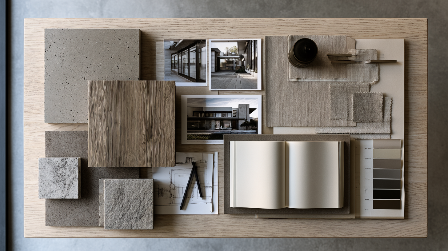
You can work on paper, but most designers now build digital boards for easy sharing and revision. The table below compares the options most useful for an architecture mood board presentation.
Tool Comparison at a Glance
| Tool | Type | Best For |
|---|---|---|
| Milanote | Visual board app | Structured, shareable boards with notes |
| Inspiration platform | Fast, wide reference gathering | |
| Adobe Color | Palette generator | Extracting tones from a photo |
| InDesign or Figma | Layout software | Polished boards for final panels |
For a purpose-built option, Milanote’s architecture moodboard template lets you drag in images, swatches, and files on one canvas and comment with collaborators. To pull an exact palette from a reference photo, Adobe Color reads dominant and accent tones in seconds. For broad early gathering, a project board on Pinterest is hard to beat, and ArchDaily offers practical advice on visual communication.
Concept, Presentation, and Material Mood Boards
Not every board does the same job, and naming the type sharpens its purpose. A concept mood board for architecture is the most abstract, capturing atmosphere and the core idea rather than specific products. It is the board you make first, often messy and exploratory.
A presentation mood board is the refined version shown to clients or juries, with clean layout, captions, and a clear hierarchy. An architecture material mood board zooms in on tactile choices, pairing real samples or close-up photos of timber, stone, and finishes. Many projects use all three in sequence, moving from loose idea to polished communication as the design firms up. Knowing which one you are building keeps the content and the effort proportionate to the stage.
Putting It All Together
Your Next Step: Open a blank board, write your three concept words at the top, and spend twenty minutes pulling references without judging them. Editing comes later, but momentum starts with that first messy collection. The board you finish today becomes the reference you reach for through every later decision.
Frequently Asked Questions
How many images should an architecture mood board have?
Aim for roughly eight to twelve strong references on a finished board. Fewer than that can feel thin, while more than fifteen usually dilutes the message. The point is a clear visual direction, so favor a tight, edited set over a crowded one.
What is the difference between a mood board and a concept board?
A mood board focuses on atmosphere, color, and material feel, answering how a space should look and feel. A concept board explains the organizing idea and logic behind the design. They overlap, and many architects combine both, but a mood board leans visual while a concept board leans explanatory.
Can I make an architecture mood board for free?
Yes. Free tiers of Milanote, a Pinterest account, and Adobe Color cover everything a student needs. A physical board with printed images and pinned material samples also works well and costs almost nothing beyond printing.
When in the design process should I create a mood board?
Build it at the very start, right after writing the brief and before detailed drawings begin. An early board sets the visual direction that guides later choices about form, material, and finish, which keeps the whole project consistent.


The Power of Ambience: Role of Restaurant Design on Customer Experience
A restaurant's ambience, its lighting, layout, and decor, quietly shapes how guests...
 illustrarch Editoral Team2 Mins read
Color Forecast 2026: Tile Palettes Influencing International Design
Warm earth tones, soft whites like Pantone's Cloud Dancer, and grounded greens...
 Sinan Ozen5 Mins read
Porcelain vs Ceramic Tiles: Which One Should Architects Specify?
A side-by-side breakdown of porcelain and ceramic tile covering water absorption rates,...
Furkan Sen6 Mins read
The Impact of Japanese Minimalism on Global Tile Aesthetics
A look at how centuries-old Japanese design principles, from wabi-sabi imperfection to...
Furkan Sen7 Mins read


Leave a comment