

The Impact of Japanese Minimalism on Global Tile Aesthetics
A look at how centuries-old Japanese design principles, from wabi-sabi imperfection to ma spatial awareness, are actively reshaping tile aesthetics in kitchens, bathrooms, and commercial interiors around the world, with specific examples from leading tile manufacturers and architectural projects.

Table of Contents Show
Japanese minimalism is a design philosophy rooted in Zen Buddhism and the wabi-sabi appreciation of imperfection, and it has become one of the strongest forces shaping tile aesthetics worldwide. Its emphasis on muted earth tones, tactile surfaces, and restrained pattern use now appears in residential bathrooms, commercial lobbies, and hospitality interiors across five continents.
Tile manufacturers in Italy, Spain, and Brazil have spent the last decade absorbing lessons from Japanese minimal style, producing collections that trade heavy ornamentation for quiet texture and natural color variation. The result is a global tile market where restraint sells as well as spectacle, and where the fingerprints of Kyoto’s ceramic heritage show up on surfaces installed thousands of kilometers from Japan. This shift did not happen overnight. It followed a longer arc that connects traditional Japanese tiles to contemporary production lines, and understanding that arc helps architects and designers make sharper material choices.
The Roots of Japanese Minimalism in Ceramic Tradition
Japan’s relationship with ceramics stretches back over 16,000 years to the Jomon period, making it home to some of the oldest fired clay objects ever discovered. But the aesthetic that most directly feeds today’s tile trends emerged much later, during the Muromachi (1336-1573) and Momoyama (1573-1600) periods, when Zen monks and tea masters began to value simplicity over opulence.
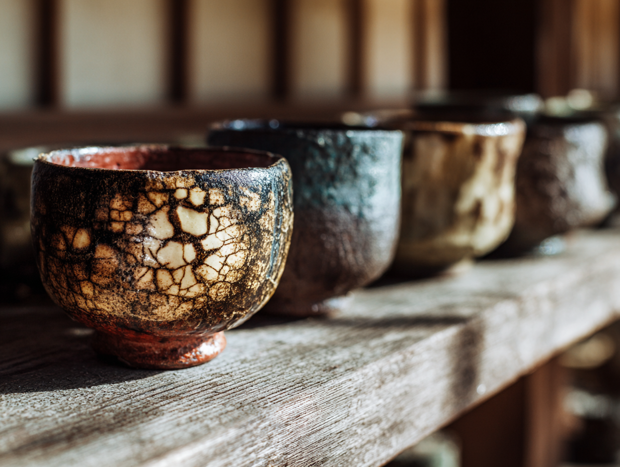
Sen no Rikyu, the 16th-century tea master, championed vessels made from rough clay and old roof tiles, a style that became known as Raku ware. These handbuilt bowls rejected the polished symmetry of Chinese imports in favor of irregular forms, accidental glaze patterns, and surfaces that recorded the heat of the kiln. That same sensibility now drives a significant share of global tile design: the idea that a surface gains character through visible process rather than flawless uniformity.
Traditional Japanese tiles, or kawara, served practical roles on temple and residential rooftops for centuries. Their subdued gray and charcoal tones, combined with simple curved profiles, reflected a broader cultural preference for materials that age gracefully rather than resist aging. This principle carries directly into the warm, earthy tile palettes that dominate contemporary interiors.
🎓 Expert Insight
\n
For the full picture, see our complete guide to concept ideas for interior design.
“The most beautiful things are those that allow time and use to become part of their surface.” — Kenya Hara, Art Director, MUJI
Hara’s design philosophy, which guides one of Japan’s most globally recognized brands, captures exactly why tile designers worldwide now pursue surfaces that look better with age rather than worse.
How Japanese Minimalism Style Translates to Modern Tiles
Three core principles from Japanese minimalism style translate most directly into tile design: wabi-sabi (the beauty of imperfection), ma (the conscious use of empty space), and kanso (simplicity and elimination of clutter). Each principle solves a specific design problem in tiling.
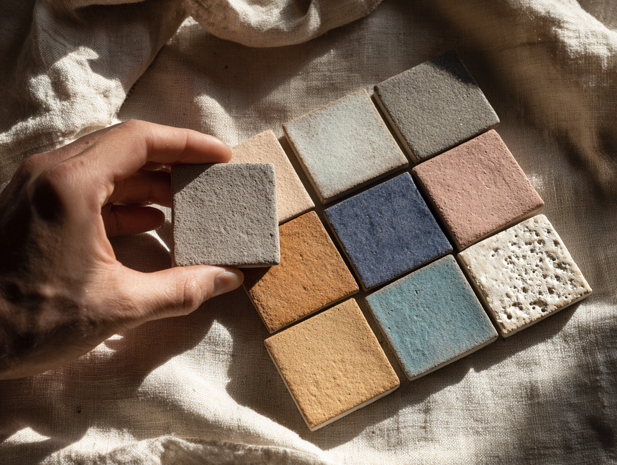
Wabi-sabi shows up in the growing demand for tiles with visible glaze variation, soft crazing, and handmade-look edges. Italian manufacturers like Mutina and Cedit now produce entire collections specifically engineered to replicate the tonal inconsistencies found in traditional Japanese ceramics. Spanish tile giant Porcelanosa has released lines with deliberate surface irregularities that echo the textures of wood-fired kilns. These are not defects. They are calculated references to a minimalist architectural tradition that values the honest expression of materials.
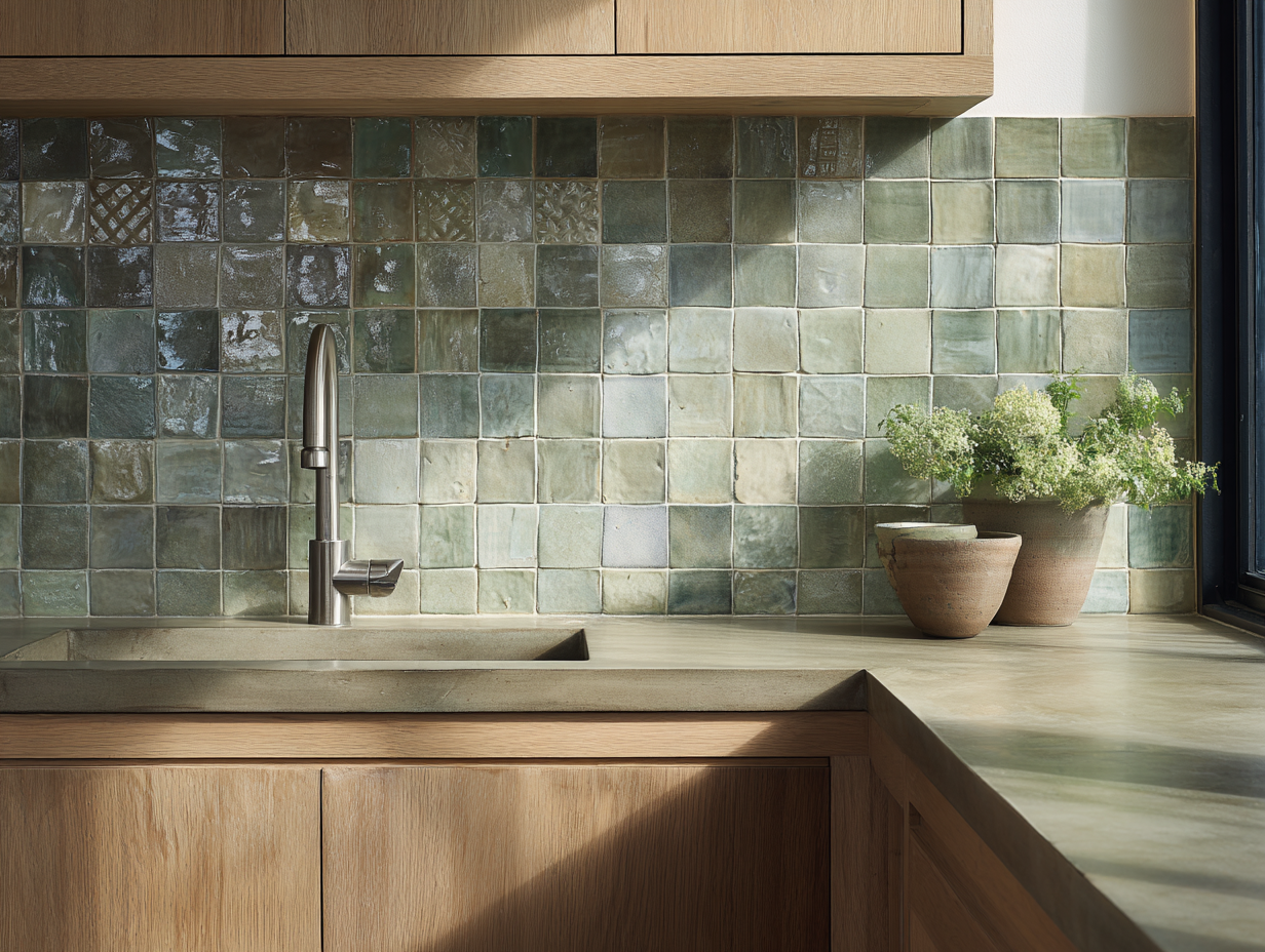
Ma, often translated as “negative space,” influences tile layout and grout strategy. In a Japanese minimal style interior, tiles are often set with wider grout lines or paired with large areas of untiled plaster wall. The tile itself does not try to cover every surface. Instead, it marks specific zones, a bathing area, a kitchen backsplash, a hearth surround, while leaving breathing room around it. This approach contrasts sharply with the Western tendency to tile floor-to-ceiling, and it is gaining traction among designers who want their material choices to carry more visual weight by appearing less frequently.
Kanso, the principle of eliminating the unnecessary, drives the shift toward monochromatic tile palettes. Rather than mixing four or five colors in a single space, designers influenced by Japanese minimalism tend to work with one or two tones, often in the warm-neutral range: stone gray, clay beige, ash white, or deep charcoal. The absence of color competition lets texture and form take center stage.
What Makes Japanese Tiles Different from Other Traditions?
Japanese tiles occupy a distinct position among global ceramic traditions. Where Portuguese azulejos rely on vivid narrative illustration and Moroccan zellige draws power from dense geometric repetition, Japanese tiles build their identity on restraint. The color palette stays narrow. Patterns, when they appear, tend toward organic abstraction rather than rigid symmetry. And surface texture frequently matters more than printed decoration.
Several characteristics define the Japanese tile aesthetic that is now influencing global production:
| Characteristic | Japanese Approach | Typical Western Approach |
|---|---|---|
| Color range | Earth tones, indigo, muted greens | Full spectrum, bright whites |
| Surface finish | Matte, textured, glaze variation | High gloss, uniform finish |
| Pattern logic | Organic, asymmetric, sparse | Geometric, repeating, dense |
| Edge treatment | Irregular, hand-cut feel | Rectified, precision-cut |
| Design priority | Texture and material honesty | Visual impact and scale |
This difference is not about quality or sophistication. Both traditions produce exceptional work. The distinction lies in intention. Japanese tile trends prioritize the tactile over the visual, inviting the user to touch a surface and notice how light moves across its irregularities rather than simply registering a pattern from across the room.
💡 Pro Tip
When selecting tiles inspired by Japanese aesthetics, request physical samples and examine them under raking light (light hitting the surface at a low angle). Subtle glaze variation and surface texture, the qualities that define this style, are nearly invisible in catalog photos but dramatically apparent in person.
Japanese Tile Trends in Global Residential and Commercial Spaces
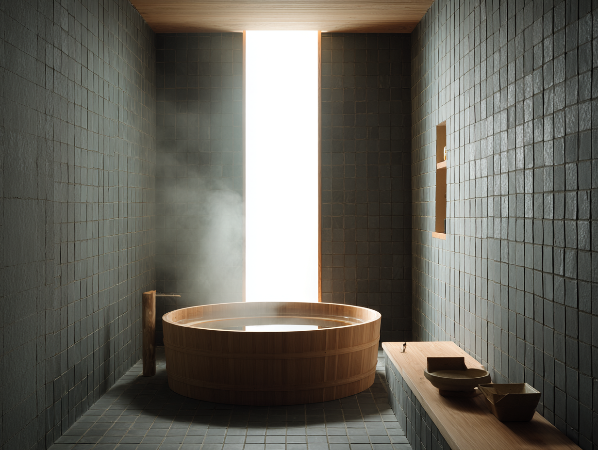
The influence of Japanese minimalism on tile selection is visible across several distinct market segments. In residential bathrooms, the shift away from high-gloss white subway tile toward matte, earth-toned formats with organic texture is one of the clearest examples. Homeowners and designers are gravitating toward formats like 75x150mm and 100x300mm, sizes common in Japanese domestic interiors, because they create a quieter rhythm than the standard 100x200mm subway tile. For a broader view of how tile color preferences are shifting, the kitchen floor tile trends analysis tracks similar movements toward warmer, more restrained palettes.
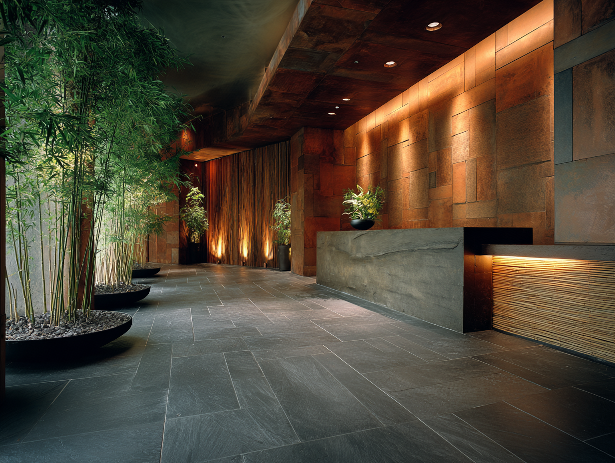
In hospitality, Japanese-inspired tile work appears most often in spa facilities, hotel lobbies, and upscale restaurant interiors. The Ace Hotel Kyoto, designed by Kengo Kuma, used locally produced tiles with ash glazes and uneven surfaces throughout its public areas, setting a reference point that hotel groups in New York, London, and Sydney have since tried to replicate.
Commercial retail is another growth area. Flagship stores for brands like Aesop consistently draw on Japanese minimal style for their interiors, often specifying handmade-look ceramic wall tiles in muted palettes that let the product, not the architecture, hold the customer’s attention. This commercial application reinforces a key lesson of Japanese minimalism art: the best background is one that supports without competing.
🏗️ Real-World Example
Nezu Museum (Tokyo, 2009): Designed by Kengo Kuma, this museum uses dark slate-toned tiles on its approach pathway that transition into lighter, warmer ceramics inside the gallery spaces. The tile selection mirrors the surrounding bamboo grove’s color shift from deep green to golden, demonstrating how Japanese tile choices often respond to landscape rather than following an isolated interior scheme.
The Japandi Effect on Tile Manufacturing
The global rise of Japandi style, the fusion of Japanese and Scandinavian design, has accelerated tile manufacturers’ interest in Japanese aesthetics. At Cersaie, the world’s largest tile trade fair held annually in Bologna, the number of exhibitors showing Japan-influenced collections has increased steadily since 2018. Manufacturers now routinely reference terms like wabi-sabi, shibui (subtle beauty), and kintsugi (golden repair) in their product marketing.
This cross-pollination works in both directions. Japanese manufacturers like INAX (a division of LIXIL Group) have expanded their international distribution, making traditional Japanese tile formats and glazes accessible to architects who previously had to source them through specialty importers. LIXIL’s global reach means that tiles produced in kilns near Tokoname, a ceramic city with over 900 years of production history, now appear in projects across Europe and North America.
At the same time, European and Brazilian manufacturers have hired Japanese-trained ceramic designers or partnered with Japanese studios to develop collections that feel authentic rather than derivative. The goal is not to copy Japanese tiles but to absorb the underlying principles, restraint, texture over pattern, earth-toned palettes, and apply them to locally produced formats.
Applying Japanese Minimalism to Your Tile Selections
For architects and interior designers working on projects that call for a minimal Japanese house aesthetic or simply a quieter material palette, a few practical guidelines help translate philosophy into specification.
Start with color. Limit the tile palette to two or three tones within the same family. Warm grays, sand beiges, and off-whites work well together without creating visual noise. If you want to introduce an accent, consider a single stripe of deep indigo or forest green, both colors with strong roots in Japanese ceramic tradition, rather than a contrasting pattern tile.
Think about format. Smaller tiles (under 150mm in any dimension) laid with slightly wider grout lines create the handcrafted rhythm associated with Japanese interiors. If large-format tiles suit the project better, choose a surface with visible texture or tonal variation to avoid the clinical flatness that contradicts the wabi-sabi philosophy.
Consider the relationship between tiled and untiled surfaces. In a Japanese garden, stone paths are surrounded by gravel and moss, not more stone. The same principle applies indoors. Pairing a tiled shower wall with lime-plastered adjacent walls or raw concrete creates the kind of material dialogue that defines Japanese minimalism style at its best.
Finally, look at how the tile ages. Japanese aesthetics prize surfaces that develop patina over time. Unglazed or lightly glazed tiles in natural clay tones will darken and soften with use, gaining character instead of looking worn. High-gloss, heavily sealed surfaces resist aging but also resist the passage of time itself, which runs counter to the core ideas behind minimalist architecture.
The Bigger Picture
The most lasting influence of Japanese minimalism on tile design may not be any single product or finish. It may be the permission it gives designers to do less. In a global market that has long rewarded novelty and visual complexity, Japanese ceramic philosophy offers a counter-argument: that a wall covered in quiet, subtly irregular tiles can hold more presence than one clad in the most elaborate pattern. As tile manufacturers, architects, and homeowners continue to absorb that lesson, the surfaces of buildings worldwide will keep reflecting a philosophy first shaped in the tea rooms and kiln yards of Japan.


The Power of Ambience: Role of Restaurant Design on Customer Experience
A restaurant's ambience, its lighting, layout, and decor, quietly shapes how guests...

Color Forecast 2026: Tile Palettes Influencing International Design
Warm earth tones, soft whites like Pantone's Cloud Dancer, and grounded greens...

Porcelain vs Ceramic Tiles: Which One Should Architects Specify?
A side-by-side breakdown of porcelain and ceramic tile covering water absorption rates,...

Mediterranean Tile Patterns: Why They Are Returning Worldwide
Mediterranean tile patterns are experiencing a strong global comeback driven by demand...

Leave a comment