

Color Palette in Architectural Presentations
An architectural color palette is one of the most critical elements in creating compelling architectural presentations. Learn how color theory, harmony types, and digital tools help architects choose the right palette for every project — from competition boards to professional client presentations.

Table of Contents Show
Architectural presentations are very critical for the best transfer of projects. In addition to developing presentation techniques to make architectural presentations in the best way, an architectural color palette plays a decisive role. In this article, we will talk about how to build the right color palette for architecture presentations, the psychological effects of colors, and the best tools for creating an architect color palette that elevates your design work. Whether you are an architecture student or a professional, understanding architecture colour palette principles will significantly improve how your projects are perceived.
Why an Architectural Color Palette Matters
Color in architecture, like light, affects people in a space quite significantly. Color choices have a great impact on human psychology and perception of space. An effective architectural colour palette is one of the most important issues not only in physical spaces but also in architectural presentations. Choosing the best colors in architectural presentations allows you to manage the parts of your presentation that you want to highlight. You will also be able to manage the perspective of the project with your color choices. According to color theory, every hue carries emotional weight — and architects who understand this can communicate more powerfully through their work.
Importance of Color Palette in Architectural Presentation
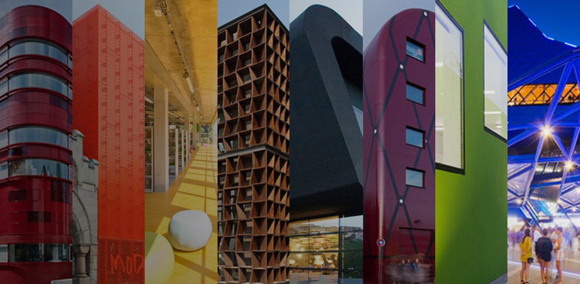
If our subject is architectural presentations and improving these presentations, it is definitely not possible not to talk about color palette for architecture selection. Color selection is the most important issue for visuals in architectural presentations. Because architectural presentations prepared with a good architect color palette create powerful effects that will take your project to a higher level. Some projects are suitable for creating balanced presentations by working with the color palette. However, some projects are presented by monochrome except a highlight color. For example, you can work on black-white drawings and emphasize your main elements with a red or yellow color. Color decisions or architecture color palette creations should be done according to projects’ situation. In the best architectural presentations, colors are the most important elements. If you want to make consistent presentations, you should follow similar color palettes for your each project. Due to have a successful architectural portfolio, color selections should be compatible for per page.
On the other hand, if you work for your own company or architectural firm, you need to prepare presentations on a specific architectural colour palette. Because if the style and color choices of your drawings are not consistent, you may experience difficulties in creating your architectural identity in professional life. At least, if you make your presentations through different tones of the same color or similar color palettes, it is quite good and successful for you. According to ArchDaily, consistent visual branding through color is one of the hallmarks of established architectural firms worldwide.

How to Choose the Right Architecture Color Palette
Choosing the right palette architecture is not just about personal preference — it requires a strategic approach. Here are the key considerations for selecting an architect colour scheme for your presentations:
1. Start with Your Concept: Every architectural project has a concept. Your color palette should reflect the mood and intent of that concept. A project focused on sustainability may lean toward earthy greens and natural tones, while a modern urban design might benefit from bold contrasts and cool grays. Your presentation elements should always align with the design intent.
2. Consider Your Audience: A presentation for a client requires a different tone than one for a jury in architecture school. Professional presentations often benefit from restrained, sophisticated palettes, while competition submissions might use bolder color choices.
3. Use the 60-30-10 Rule: This classic design principle works well for architecture colour palette creation. Allocate 60% to a dominant color (usually a neutral), 30% to a secondary color, and 10% to an accent color that draws attention to key elements.
4. Maintain Consistency Across Sheets: If you are creating a multi-sheet presentation, ensure that your architectural color palette remains consistent across all boards. This creates a professional, cohesive look that strengthens your presentation boards.
Psychological Effects of Colors in Architecture
Let’s examine how color choices, which are very important both in space and in architectural presentations, affect people psychologically. Understanding the power of colors in architecture will help you make informed decisions for your architect color palette:
Blue: Exudes feelings of optimism, assurance, and security. It is frequently used in commercial and business settings, including banks, offices, and businesses. In presentations, blue tones convey trust and professionalism.
Yellow: Depicts hope, curiosity, and a cheerful environment. It is widely utilized in retail establishments or dining establishments to attract customers. In an architecture color palette, yellow serves as an effective accent to highlight key features.
Red: This hue denotes vitality, enthusiasm, and impulse. Because it conveys a certain compulsive and consumer want, it is frequently utilized in commercial settings like retailers and fast food restaurants. In presentations, red works powerfully as a highlight color on monochrome drawings.
Green: Conjures feelings of peace, tranquillity, and wellbeing. It is frequently utilized in settings related to health and wellbeing, including hospitals and spas. Green is an excellent choice for sustainability-focused project palettes.
Orange: Orange, which is produced when yellow and red are combined, conveys the ideas of passion, creativity, exhilaration, and enthusiasm. It is frequently utilized in businesses, studios, and educational settings that foster creativity. When combined with blue, it evokes impulsivity and trust, and as a result, banking institutions and offices utilize it.
Violet: It carries feelings of contentment, serenity, and gentleness. In an architectural colour palette, violet can add a sense of luxury and creativity to your presentation boards.
Neutrals (Black, White, Gray): These form the backbone of most professional color palettes for architecture. Neutrals allow your architectural renderings and drawings to take center stage while the accent colors guide the viewer’s attention.
Color Harmony Types for Architectural Presentations
Understanding color harmony is essential when building a palette architecture professionals use. Here are the most common harmony types and how they apply to architectural presentation design:
Complementary Colors: Colors opposite each other on the color wheel (e.g., blue and orange). These create high contrast and visual energy, ideal for presentations that need to stand out in competition settings.
Analogous Colors: Colors adjacent on the color wheel (e.g., blue, blue-green, green). These create harmonious, calming presentations that work well for residential and landscape projects.
Triadic Colors: Three colors equally spaced on the color wheel. This provides a vibrant yet balanced architecture colour palette that works well for complex urban design presentations.
Monochromatic: Variations of a single hue. This is one of the most popular approaches in professional architect colour schemes, offering elegance and visual consistency. Many award-winning presentation boards use monochromatic palettes with a single accent color.

Best Websites To Create an Architectural Color Palette
Working with the best color palettes is essential to bring your architectural presentations to their best versions. It is important to create a color palette for architecture and stick to it in all presentations and representations of your architectural design. Below are recommended websites where you can create color palettes that you will use in architectural presentations. It is possible to copy the color codes from the color palettes you will create with these websites and use the colors on the sites where you create your architectural presentations such as Adobe Photoshop or Adobe Illustrator. When creating a color palette, you can arrange your color wheel in many different ways, such as similar colors, complementary colors, colors that shade each other. Here are the websites to create a palette architecture designers should know and use:
Adobe Color — Adobe’s powerful color wheel tool lets you explore different color harmony rules (complementary, analogous, triadic) and export palettes directly into Adobe Creative Cloud applications.
Paletton — A specialized color scheme designer that provides real-time previews and lets you see how your architect color palette will look in real-world applications.
Session College — An educational color calculator that helps you understand the science behind color combinations while building your palette.
Coolors — One of the most popular palette generators in 2025, Coolors allows you to quickly generate, lock, and refine color schemes. Its export options make it easy to integrate with any design software.
Canva Color Palette Generator — Upload an inspiration image from your project site or reference building, and Canva will extract a ready-to-use architectural color palette from it.
Applying Your Color Palette in Digital Tools
Once you have defined your architecture color palette, the next step is applying it consistently across your digital workflow. Modern architectural visualization tools such as Lumion, Photoshop, Illustrator, and InDesign all allow you to save custom color swatches. Here are practical tips for applying your architect colour choices:
Save your palette as an ASE (Adobe Swatch Exchange) file so you can import the same colors across Photoshop, Illustrator, and InDesign. This ensures consistency in every deliverable, from presentation sheets to printed boards.
When working on 3D architectural renderings, apply your palette to post-production color grading. Adjusting the tone, hue, and saturation in post-processing to match your architectural color palette creates a unified visual identity across all project images.
For digital presentation layouts, use your dominant color for backgrounds and borders, your secondary color for diagrams and icons, and your accent color for call-outs, titles, and key labels.
Common Color Palette Mistakes in Architecture Presentations
Even experienced designers sometimes make errors with their color palette for architecture presentations. Here are the most common pitfalls to avoid:
Using too many colors: A palette with more than 4–5 colors can create visual chaos. Stick to a restrained architectural color palette and let your design do the talking.
Ignoring contrast and readability: Ensure that text colors have sufficient contrast against background colors. The WCAG guidelines recommend a minimum contrast ratio for readability — a principle that applies to printed boards as well.
Inconsistency across sheets: Switching palettes between different boards of the same project confuses viewers and weakens your architectural presentation.
Neglecting print vs. screen differences: Colors look different on screen (RGB) and in print (CMYK). Always test-print a sample of your architecture colour palette before final production.


1 Comment


Successful Architectural Presentation Boards: Design & Layout
Architectural presentation boards are essential visual communication tools for architects and students...

Architecture Presentation Boards: Best Examples & Layout Tips
Discover successful architecture presentation boards featuring landscape layouts, construction detail boards, and...

10 Best Architecture Sheets by Students | Layout Examples 2026
Discover 10 outstanding architectural presentation sheets created by architecture students. From neighborhood...

How to Use Color and Layout in Your Architecture Presentation Board
An architecture presentation board becomes a powerful storytelling tool when color, layout,...

This article really highlights the importance of color in architectural presentations. I never realized how much colors can influence people’s feelings about a space. The examples of colors like blue for security and yellow for cheerfulness were particularly interesting. I’m curious, though—how do you choose the right color palette for a specific project? Are there any tips for beginners who might be overwhelmed by all the options?