

Color Forecast 2026: Tile Palettes Influencing International Design
Warm earth tones, soft whites like Pantone's Cloud Dancer, and grounded greens lead the 2026 tile color forecast, with a look at what drives each palette, how international markets read it, and how to apply the colors without dating a project.

Table of Contents Show
The 2026 color forecast for tile points designers toward warm earth tones, soft luminous whites, and grounded greens. These palettes, shaped by Pantone’s Cloud Dancer and signals from Cersaie and Coverings, are replacing the cool grays of the past decade across bathroom, kitchen, and floor tile projects worldwide.
Tile sits at an unusual crossroads in interior design. It is a permanent surface, often specified years before the rest of a room comes together, yet it carries the strongest color statement in many spaces. That makes the 2026 color forecast more than a passing mood board. The hues gaining traction this year are the ones architects and specifiers will live with for a decade or more, which is why the global shift toward warmer, calmer, nature-driven palettes matters so much.
What follows is a practical look at the colors defining tile selection in 2026, where they come from, how different regions are reading them, and how to apply them with confidence.
What Is Driving the 2026 Color Forecast for Tile?
The 2026 color forecast is being driven by three forces working together: a cultural appetite for calm, a return to natural materials, and authority signals from the design world’s color institutions. Pantone named a soft white, Cloud Dancer, as its Color of the Year, while trend forecaster WGSN selected Transformative Teal, a grounded blue-green. Between those two poles sits the warm, earthy middle ground where most tile palettes are landing.
Industry events confirm the direction. At Cersaie 2025 in Bologna, the world’s largest ceramic tile exhibition, manufacturers leaned into warmth, texture, and craft. A few months later, Coverings 2026 in Las Vegas, with trends selected by Ceramics of Italy, Tile of Spain, and the Tile Council of North America, reinforced the same story. These are the same currents shaping the broader global tile trends of 2026, and they connect back to basic color theory about how warm and cool tones affect mood in a room.
📌 Did You Know?
\n
For the full picture, see our complete guide to concept ideas for interior design.
2026 marks the first time since Pantone’s Color of the Year program began in 1999 that a shade of white has been chosen. Cloud Dancer (PANTONE 11-4201) was announced on December 4, 2025 by the Pantone Color Institute, breaking a long run of saturated and earthy picks like 2025’s Mocha Mousse.
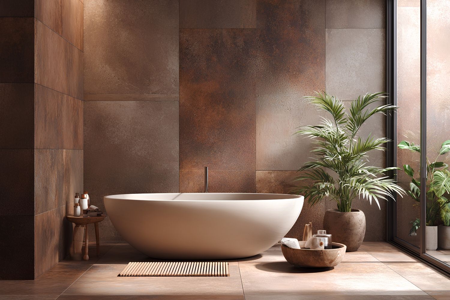
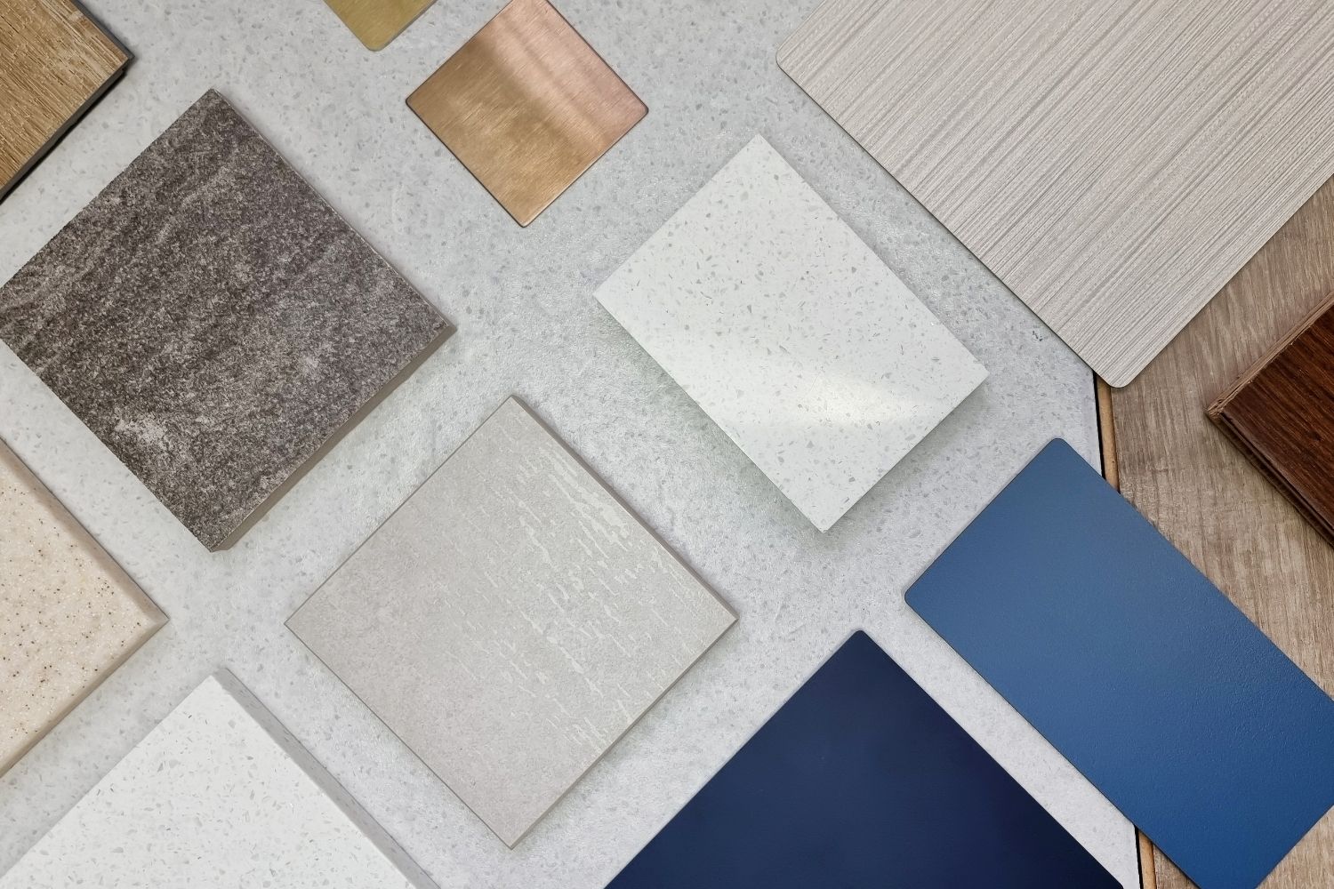
Warm Earth Tones Anchor the 2026 Tile Palette
The clearest move in the 2026 color forecast is the rise of warm earth tones. Terracotta, ochre, clay, mocha, and deep chocolate brown are taking over the spaces once dominated by millennial gray. These colors read as grounded and inviting rather than clinical, and they pair naturally with the wood-look and stone-look finishes that continue to sell well.
In bathrooms, muted terracotta and sand create a spa-like calm. On kitchen backsplashes, warm browns and creamy ivories add personality while staying neutral enough to protect resale value. The technique that separates a sophisticated result from a flat one is layering tones within a single color family rather than relying on one solid shade. This warmth is exactly why so many of the most popular tile colors in U.S. homes now skew toward off-white, tan, and soft taupe instead of stark contrast.
🏗️ Real-World Example
Ceramiche Keope CottoMilano (Cersaie 2025): Inspired by Milan’s historic Fornace Curti kilns, this collection recreates authentic terracotta texture on porcelain with an ultra-matt, velvety finish. It runs across six colorways, from warm Mattone to neutral Talco, and in formats from 120×120 cm panels down to 6×24 cm decorative strips, showing how earthy color and craft can scale to commercial projects.
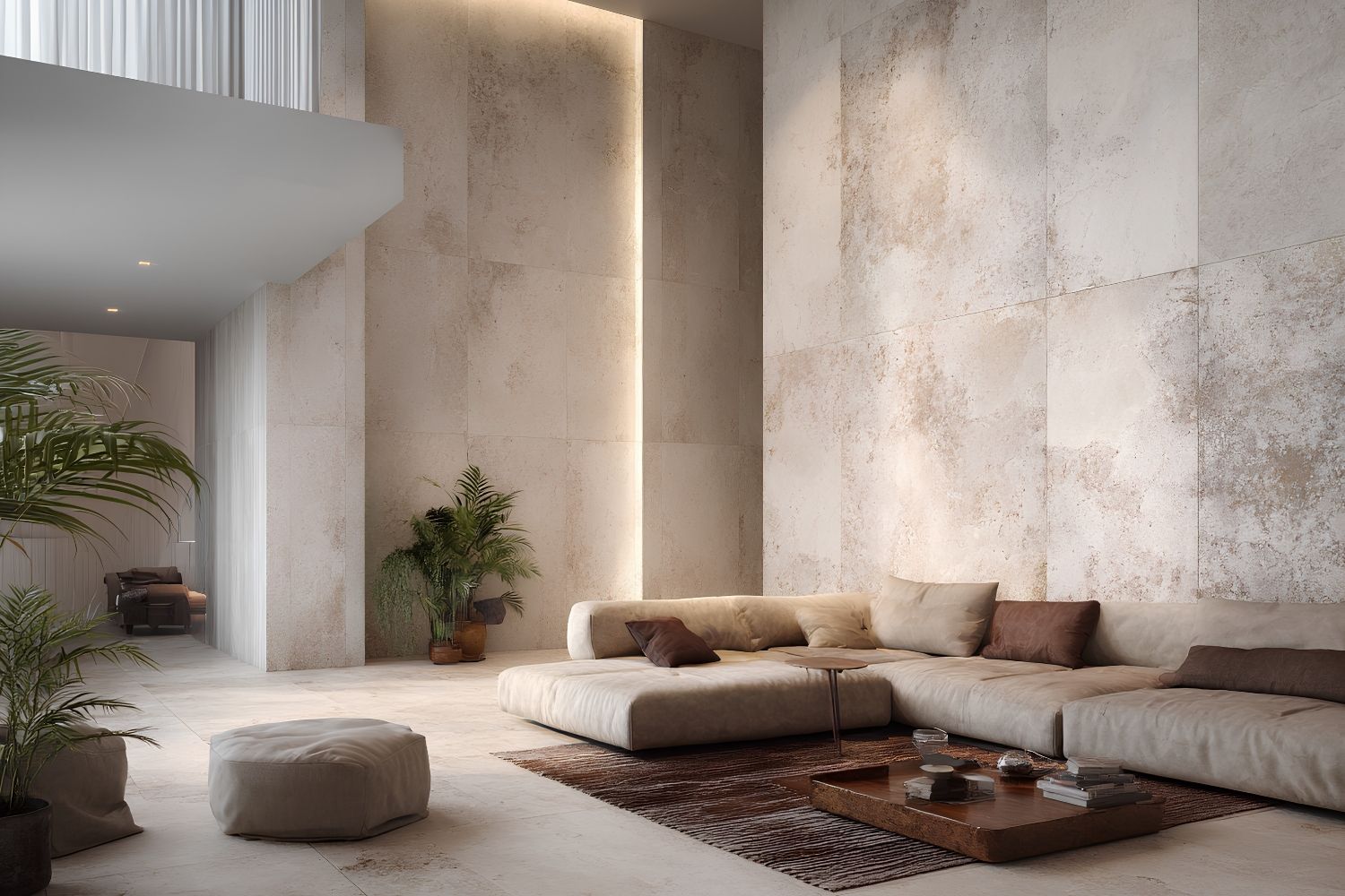
Soft Whites and the Cloud Dancer Influence
If warm earth tones own the floor and the feature wall, soft whites own everything around them. Pantone describes Cloud Dancer as a billowy, balanced white with an equal mix of cool and warm undertones, which is precisely what makes it useful in tile. A bright optical white can feel sterile against terracotta or olive, but a warmer white settles in beside them.
For designers, this translates into ivory, eggshell, and chalky off-white tiles used as the connective tissue of a scheme. They work especially well across large-format porcelain slabs, where minimal grout lines let the surface read as a continuous, quiet plane. As one architecture critic noted in The Architect’s Newspaper, interiors have been drifting toward this softened whiteout for years, so Cloud Dancer formalizes a direction that was already underway in adaptive reuse and gallery-style spaces.
Grounded Greens Move From Accent to Anchor
Green has graduated from accent color to a primary palette choice. The 2026 color forecast favors forest, jade, emerald, sage, and olive, used not just on a single shower niche but across full feature walls and kitchen surfaces. The appeal is partly psychological. Green sits closest to nature on the color wheel, and in a year defined by calm, that connection carries weight.
Deeper greens like petrol and forest create moody, enveloping bathrooms, while softer sages keep kitchens fresh without feeling cold. These choices also influence layout decisions, since a saturated green floor in herringbone or a vertical green backsplash changes how a tile pattern shapes the flow of a space.
🎓 Expert Insight
“Green has longevity. If we’re continuing design with wellness in mind, the green continues to be a part.” — Alena Capra, Coverings 2026 Industry Spokesperson
Capra’s point matters for specifiers worried about dating a project. Unlike a fleeting statement shade, green reads as a long-term, wellness-driven choice rather than a trend that expires in two years.
How International Markets Read the 2026 Palette
The same color forecast lands differently across regions. Italian producers, working through Ceramics of Italy, lean into artisanal terracotta and tactile relief surfaces. Spanish manufacturers under Tile of Spain push thin-gauge formats and warm neutrals built for export. In the United States, the NKBA’s 2026 Bath Trends Report found that 96 percent of surveyed professionals named neutrals as the most popular bathroom tile colors, with off-white leading at 58 percent. Across Northern Europe and Japan, the palette tilts toward pale, restful tones that echo the Cloud Dancer mood.
2026 Tile Color Forecast at a Glance
The table below summarizes the four palettes shaping international tile selection this year:
| Palette | Dominant Tones | Mood | Best Application |
|---|---|---|---|
| Warm Earth | Terracotta, ochre, clay, mocha | Grounded, inviting | Bathrooms, kitchen backsplashes |
| Soft Whites | Cloud Dancer, ivory, eggshell | Calm, airy | Open-plan walls, large-format slabs |
| Grounded Greens | Forest, jade, sage, olive | Restorative, natural | Feature walls, kitchens |
| Warm Neutrals | Cream, sand, cinnamon, taupe | Versatile, timeless | Floors, whole-room schemes |
Putting the 2026 Color Forecast to Work
Reading a forecast is easy. Applying it without missteps takes a little discipline. The strongest 2026 schemes treat the palette as a system rather than a single hero color, anchoring a room in a warm neutral, adding depth with an earth tone or green, and using a soft white to keep the whole thing breathing. This logic carries from a feature bathroom wall to everyday kitchen floor tile decisions.
💡 Pro Tip
Before committing to a warm 2026 palette, view samples under both 3000K and 4000K lighting in the actual space. Warm beige and terracotta shift noticeably under different LED temperatures, drifting toward pink or yellow, and testing on site prevents costly mismatches after the tiles are set.
Looking Ahead
It is worth remembering that tile outlives almost every other color decision in a building. Paint gets refreshed, textiles get swapped, but a tiled floor or wall stays put for fifteen or twenty years. Seen that way, the 2026 color forecast is less about chasing what feels current and more about choosing tones that will still feel right long after the trend cycle moves on. The warm, grounded, nature-led palettes leading this year happen to be the ones least likely to date, which may be the real reason designers are reaching for them. The same instinct is showing up in 2026 furniture trends and in ongoing material innovation in tiling, where longevity and warmth increasingly matter more than novelty.


Architecture and Interior Design: Can Architects Specialize in Both?
Architects hold most of the skills interior design needs, from space planning...

How to Make an Architecture Mood Board: A Step-by-Step Guide
A practical walkthrough for building an architecture mood board, covering how to...

The Power of Ambience: Role of Restaurant Design on Customer Experience
A restaurant's ambience, its lighting, layout, and decor, quietly shapes how guests...

What Makes American Tile Manufacturers Competitive in 2026
A breakdown of the five key factors helping American tile manufacturers compete...

Leave a comment