

Bubble Diagram for Hospital Design: Programming and Space Planning
Learn how to create a bubble diagram for hospital design that organizes emergency, surgical, diagnostic, and inpatient departments by adjacency and patient flow. This guide walks through architectural programming, space planning, zoning strategies, and step-by-step diagramming methods used by healthcare architects worldwide.

Table of Contents Show
A bubble diagram for hospital design is a conceptual planning tool that uses circles to represent hospital departments and connecting lines to show their required adjacencies, circulation paths, and functional relationships. Healthcare architects create these diagrams during the programming phase to test dozens of spatial configurations before committing to a detailed floor plan, reducing costly redesigns and improving patient flow from the earliest stage of the project.
Hospitals are among the most complex building types an architect will ever plan. A typical acute care facility contains 30 to 50 distinct functional departments, each with its own spatial requirements, equipment needs, and relationship to other departments. Emergency rooms need direct access to imaging and surgery. Operating suites need sterile supply corridors separated from patient transport routes. Inpatient units need proximity to nursing stations and vertical circulation. Organizing all of these relationships on paper, before a single wall is drawn, is exactly what a bubble diagram for hospital design accomplishes.
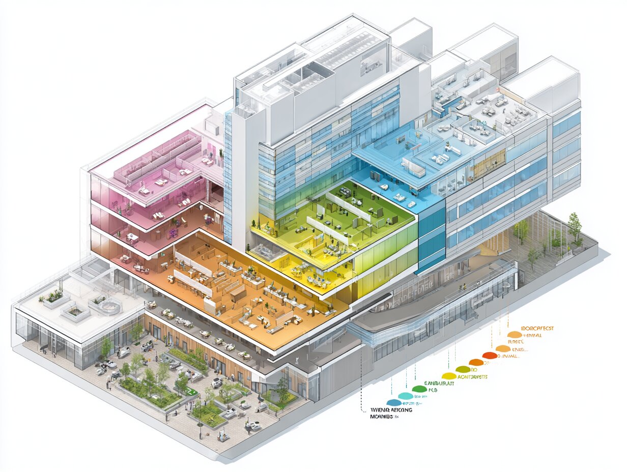
Unlike residential or commercial projects where a designer might sketch a single bubble diagram and move on, hospital planning typically produces multiple diagram iterations across different scales. A campus-level diagram maps the relationship between the main hospital, outpatient clinics, parking, and service access. A building-level diagram arranges major departments on each floor. A department-level diagram positions individual rooms within a unit. Each scale feeds into the next, creating a layered planning framework that keeps the project organized as complexity grows.
What Is Architectural Programming for Hospitals?

Architectural programming is the research and decision-making phase that happens before design begins. For hospitals, this phase defines every department the building will contain, how large each department needs to be, and which departments must sit next to each other. The output of programming is a written document, often called the Functional Program or Space Program, that lists every room, its required area, and its adjacency requirements. According to the International Health Facility Guidelines (iHFG), a well-developed program is the single most important factor in producing an efficient and functional hospital layout.
Programming for a hospital project typically involves interviews with clinical staff, administrators, and facility managers. The programming team collects data on patient volumes, surgical case counts, bed projections, and staffing models. These numbers drive the sizing of every department. For example, the SpaceMed Guide, a widely used healthcare planning reference, recommends programming one operating room for every 900 annual surgical cases and one exam room for every 1,500 annual clinic visits. These ratios translate patient demand into physical space requirements that the architect can diagram and arrange.
💡 Pro Tip
Explore more in our complete guide: read the full guide.
Before drawing your first hospital bubble diagram, build a complete adjacency matrix listing every department pair as “essential,” “desirable,” “neutral,” or “undesirable.” Skipping this step almost always results in a layout that looks logical on paper but forces patients or staff to travel unnecessary distances between high-traffic departments.
The programming document becomes the architect’s blueprint for creating the bubble diagram. Each department listed in the program becomes a bubble. The adjacency requirements listed in the program become the connecting lines or proximity rules between bubbles. Without a thorough program, the bubble diagram is just circles on paper. With a solid program behind it, the diagram becomes a spatial strategy that directly shapes the floor plan.
Why Bubble Diagrams Matter in Healthcare Architecture

Hospital layouts affect clinical outcomes. Research published by Roger Ulrich and colleagues, cited extensively by the Agency for Healthcare Research and Quality (AHRQ), has shown that the physical environment of a hospital influences infection rates, patient falls, medication errors, staff stress, and length of stay. A poorly planned layout, where the pharmacy sits far from nursing units or where the emergency department lacks direct imaging access, creates operational friction that compounds over years of daily use.
Bubble diagrams catch these problems early. Because they are abstract and quick to redraw, architects can test 10 or 15 different department arrangements in a single workshop session. Moving an emergency department bubble closer to the imaging bubble takes seconds. Rearranging that same relationship after construction drawings are complete takes weeks and significant budget. The earlier a spatial problem is identified, the cheaper it is to fix. Bubble diagrams sit at the earliest possible point in the design timeline, making them one of the most cost-effective tools in hospital planning.
🎓 Expert Insight
“Since staff footsteps and efficiency are directly related, designers are focused on positioning departments proximate to each other based on travel/transport frequency and patient acuity. Patient transport exposes both patient (infection) and staff (workplace injury) to greater risk.” — Healthcare architect quoted in Facilities Management Insights
This observation highlights why adjacency planning through bubble diagrams is not just an efficiency exercise but a patient safety strategy. Every unnecessary corridor between high-dependency departments adds transport time and infection exposure.
Bubble diagrams also serve as a communication tool. Hospital projects involve dozens of stakeholders: surgeons, nurses, administrators, infection control specialists, equipment vendors, and facility managers. A detailed floor plan can overwhelm non-architects with technical information. A bubble diagram, by contrast, strips the layout down to its essential logic: which departments are near each other, which are separated, and how people move between them. This clarity makes it easier for clinical staff to review and approve spatial strategies before the design team invests weeks in detailed drawings.
Core Departments in a Hospital Bubble Diagram

Every hospital is different, but most acute care facilities share a common set of core departments that appear in the bubble diagram. Understanding these departments and their typical adjacency requirements is essential for creating an effective diagram. The list below covers the major functional zones found in most hospital projects.
The Emergency Department (ED) is typically the most connection-heavy department in the diagram. It needs direct access to imaging (X-ray, CT, ultrasound), laboratory services, the operating suite for trauma cases, and a separate ambulance entry distinct from the public entrance. The ED also requires proximity to the main lobby for walk-in patients and a clear path to inpatient admission units. Its bubble is usually one of the largest and most centrally placed in the diagram.
The Surgical Suite requires adjacency to the central sterile supply department (CSSD), post-anesthesia care (PACU), and intensive care. It also needs a dedicated clean corridor for sterile instrument delivery and a separate soiled corridor for used materials. Vertical or horizontal proximity to the ED is critical for trauma surgery cases. The surgical bubble often sits on a different floor from outpatient departments but maintains a clear vertical connection through dedicated elevators.
The Intensive Care Unit (ICU) sits between the surgical suite and the inpatient nursing floors in most diagrams. It needs immediate access to the operating rooms, a direct path from the ED for critical admissions, and proximity to the pharmacy and laboratory for rapid test processing and medication delivery.
Diagnostic Imaging serves both inpatients and outpatients, which means its bubble often sits at the intersection of the inpatient clinical zone and the outpatient entry zone. This dual-access position is one of the most challenging adjacency puzzles in hospital planning. The imaging department needs heavy floor structures to support MRI and CT equipment, dedicated shielding for radiation, and enough space for patient holding areas.
Inpatient Nursing Units are typically stacked vertically above the diagnostic and treatment platform (the lower floors containing ED, surgery, imaging, and labs). Each nursing unit bubble connects downward to the treatment floors and horizontally to support services like nutrition, housekeeping, and linen supply. The nursing station within each unit is positioned for maximum visibility of patient rooms, which is a department-level bubble diagram decision.
Support departments like the pharmacy, laboratory, kitchen, laundry, loading dock, and central plant are often grouped together in a service zone at the back of the hospital. Their bubbles connect to clinical departments through service corridors that are separated from patient and visitor circulation. This separation is a fundamental principle in hospital planning: clean and soiled flows should never cross, and service traffic should not pass through patient areas.
Hospital Department Adjacency Matrix
The table below shows typical adjacency relationships between major hospital departments. These relationships form the basis of any hospital bubble diagram.
| Department | Essential Adjacency | Desirable Adjacency | Separation Required |
|---|---|---|---|
| Emergency Department | Imaging, Lab, Surgery | ICU, Pharmacy | Outpatient clinics, Kitchen |
| Surgical Suite | CSSD, PACU, ICU | ED, Blood bank | Public lobby, Loading dock |
| Intensive Care Unit | Surgery, ED | Pharmacy, Lab, Imaging | Outpatient zones, Service areas |
| Diagnostic Imaging | ED, Outpatient entry | Surgery, Inpatient units | Kitchen, Laundry |
| Laboratory | ED, Blood bank | ICU, Surgery, Pharmacy | Public areas |
| Pharmacy | Nursing units, ICU | ED, Surgery | Public lobby |
| Inpatient Nursing Units | Vertical access to treatment platform | Pharmacy, Nutrition services | Service loading, Mechanical plant |
How to Create a Bubble Diagram for Hospital Design

Creating a hospital bubble diagram follows a structured process that moves from data collection to spatial testing. While every healthcare architect adapts the method to their own workflow, the core steps remain consistent across projects. Below is a practical breakdown of the process.
Step 1: Complete the Architectural Program
Before any bubbles are drawn, the space program must be finalized. This document lists every department, its net area (the usable space inside the department), and its gross area (net area plus circulation, walls, and engineering space). The International Health Facility Guidelines provide standard circulation percentages for different department types. Complex departments like operating suites and ICUs typically require a 40% to 50% circulation allowance, while simpler departments like administration may need only 25% to 30%.
Step 2: Build the Adjacency Matrix
List every department down the left side of a grid and across the top. For each pair, assign a relationship value: essential (must be directly adjacent), desirable (should be nearby), neutral (no strong preference), or undesirable (should be separated). Interview clinical department heads to validate these assignments. An emergency physician will confirm whether the ED needs direct imaging access. A surgeon will confirm whether the OR suite needs a clean elevator to the CSSD. These conversations ground the diagram in operational reality rather than assumptions.
Step 3: Draw the First Bubble Diagram
Start with the highest-priority adjacencies. Place the ED bubble and immediately attach the imaging and lab bubbles to it. Add the surgical suite bubble near the ED and connect the ICU between surgery and the inpatient zone. Position support services (kitchen, laundry, loading dock, central plant) along one edge of the diagram, connected by a service corridor bubble. Scale each bubble roughly in proportion to the department’s gross area from the space program. Larger departments get larger bubbles.
📐 Technical Note
The Facility Guidelines Institute (FGI) Guidelines for Design and Construction of Hospitals, used as a code or reference standard in 43 U.S. states, require minimum clear corridor widths of 2.44 m (8 ft) for patient transport corridors and 1.52 m (5 ft) for staff-only corridors. These dimensions affect the circulation allowance in your space program and the spacing between bubbles in your diagram.

Step 4: Overlay Circulation and Zoning
Draw the major circulation spines onto the diagram. Most hospitals use a “racetrack” or “spine” circulation model where a central corridor connects all major departments. Add separate circulation paths for patients, visitors, staff, and service/logistics. In bubble diagram form, these paths appear as lines or corridors connecting bubble clusters. Color-coding helps: blue for patient circulation, green for staff, red for emergency/trauma, and gray for service/logistics.
Zoning is equally important. Divide the diagram into functional zones: the public zone (lobby, outpatient clinics, admissions), the clinical zone (ED, surgery, imaging, labs), the inpatient zone (nursing floors above the clinical platform), and the service zone (kitchen, loading dock, mechanical plant). Each zone has its own access requirements and security level. The public zone is open to all visitors. The clinical zone requires controlled access. The service zone is restricted to authorized staff. These zones should read clearly in the bubble diagram as distinct clusters.
Step 5: Test Multiple Configurations
Draw at least three fundamentally different arrangements. One might place the ED on the east side of the building with imaging directly behind it. Another might center the ED and wrap imaging and surgery around it. A third might stack surgery above the ED with a dedicated trauma elevator connecting them. Each configuration reveals different trade-offs. Comparing them side by side helps the design team and hospital stakeholders identify which arrangement best supports their operational priorities.
💡 Pro Tip
When testing configurations, assign a weighted score to each adjacency pair (for example, 3 for essential, 2 for desirable, 0 for neutral, minus 1 for undesirable). Then score each bubble diagram option by summing the weights of all adjacencies it satisfies versus those it violates. This quantitative approach removes subjective bias from configuration selection and gives stakeholders a clear rationale for the chosen layout.
Step 6: Validate with Stakeholders and Refine
Present the top two or three configurations to the hospital’s clinical and administrative leadership. Walk through patient scenarios: a trauma patient arriving by ambulance, a scheduled surgical patient entering through the main lobby, an outpatient visiting the imaging department. Trace each journey on the bubble diagram to check for logical flow, unnecessary detours, and potential conflicts between circulation paths. Refine the chosen configuration based on feedback, then use it as the foundation for the schematic floor plan.
Common Hospital Zones and Their Bubble Diagram Placement
Hospital bubble diagrams organize departments into zones that reflect access levels, patient types, and operational logic. Understanding these zones helps architects position bubbles correctly from the start.
The public zone faces the main entrance and typically occupies the front of the ground floor. It contains the main lobby, information desk, outpatient registration, gift shop, cafeteria (with public access), chapel or meditation room, and outpatient clinic waiting areas. Visitors and outpatients interact primarily within this zone without needing to enter clinical areas. In the bubble diagram, the public zone sits along the primary entry facade with clear separation from the clinical zone behind it.
The diagnostic and treatment zone (often called the D&T platform) sits behind or adjacent to the public zone on the ground and first floors. It contains the ED, surgical suite, imaging department, laboratory, cardiac catheterization lab, endoscopy, and interventional radiology. These departments handle the highest-acuity patient interactions and require the densest adjacency network. In the bubble diagram, the D&T platform is the most tightly packed cluster of bubbles.
The inpatient zone stacks vertically above the D&T platform. Medical, surgical, obstetric, pediatric, and psychiatric nursing units occupy upper floors, connected to the treatment floors by patient elevators and pneumatic tube systems. In the bubble diagram, the inpatient zone is shown as a vertical extension above the D&T cluster, with dedicated elevator cores linking the two.
The service zone occupies the back or basement level of the hospital. It includes the kitchen, laundry, loading dock, waste management, central plant (boilers, chillers, electrical switchgear), and supply storage. Its bubble cluster sits at the perimeter of the diagram, connected to clinical departments by service corridors that do not intersect patient or visitor paths.
⚠️ Common Mistake to Avoid
A frequent error in hospital bubble diagrams is placing the imaging department deep inside the clinical zone with only inpatient access. Because imaging serves both inpatients and outpatients, it needs a dual-access position: one entry from the inpatient/ED side and a separate entry from the outpatient/public side. Missing this dual-access requirement forces outpatients to walk through clinical corridors, creating wayfinding confusion and infection control concerns.
How Bubble Diagrams Differ from Other Architectural Diagrams

Hospital planning uses several types of diagrams beyond the bubble diagram, and understanding the differences prevents confusion during the design process. A circulation diagram focuses specifically on movement paths: how patients, staff, visitors, and materials travel through the building. While a bubble diagram shows which departments are adjacent, a circulation diagram shows the routes connecting them and highlights potential bottlenecks or crossover points.
A block diagram is the next step after the bubble diagram. It replaces abstract circles with rectangular shapes that begin to approximate actual room proportions and floor areas. The block diagram introduces walls, corridors, and dimensional constraints that the bubble diagram intentionally ignores. Think of the bubble diagram as the strategic plan and the block diagram as the tactical plan.
A floor plan is the final, scaled drawing that shows walls, doors, windows, equipment, and dimensions. It is the destination that the bubble diagram ultimately leads to. The design sequence for hospital projects follows a clear progression: space program, adjacency matrix, bubble diagram, block diagram, schematic floor plan, and design development drawings. Skipping the bubble diagram phase often results in layouts that look clean on paper but fail operationally because fundamental adjacency problems were never tested.
Bubble Diagram Interior Design Applications in Hospitals
Bubble diagrams are not limited to department-level planning. Interior designers working on hospital projects use bubble diagram interior design techniques at the room and zone level to organize spaces within individual departments. An interior design bubble diagram for an emergency department, for example, might position triage near the entrance, acute treatment rooms along the main corridor, a resuscitation bay closest to the ambulance entry, and a fast-track zone for minor injuries on the opposite side.
Within inpatient nursing units, interior design bubble diagrams help position the nursing station for maximum visibility, group patient rooms by acuity level, and place support spaces (clean utility, soiled utility, medication room, nourishment station) at logical points along the corridor. The same adjacency logic that governs the building-level diagram applies at the room level: clean and soiled utilities should be on opposite sides of the corridor, medication rooms should be near the nursing station, and patient rooms should be visible from the charting area.
For outpatient clinics within a hospital campus, bubble diagrams organize the reception/waiting area, exam rooms, procedure rooms, consultation offices, and staff workrooms. A well-planned interior layout reduces patient wait times by minimizing the distance between the waiting area and exam rooms while keeping staff workflow efficient through centralized workstations.
🏗️ Real-World Example
Ng Teng Fong General Hospital (Singapore, 2015): Designed by CPG Consultants with HOK, this 700-bed hospital used extensive bubble diagramming during programming to create a “hot floor” concept where the ED, operating theatres, ICU, and imaging share a single level connected by a central corridor. This adjacency strategy reduced inter-department travel distances by an estimated 30% compared to a conventional stacked layout, directly improving trauma response times and staff efficiency.
Tools for Creating Hospital Bubble Diagrams

Healthcare architects use a range of tools to create bubble diagrams, from hand sketches on trace paper to specialized software. The best tool depends on the project phase and the audience for the diagram.
Hand sketching remains the fastest method for initial brainstorming. A roll of trace paper, a few colored markers, and a printed adjacency matrix are enough to produce five or six bubble diagram options in a single afternoon. Hand-drawn diagrams feel informal and encourage stakeholders to suggest changes without hesitation, which is exactly the mindset needed during early planning.
Digital tools offer precision and easy sharing. General-purpose platforms like Figma, Miro, and Microsoft Visio allow architects to create movable bubble shapes, color-code departments by zone, and share diagrams with remote stakeholders for real-time feedback. The Illustrarch Bubble Diagram Maker is a free browser-based tool specifically designed for architectural bubble diagrams, offering labeled bubbles, connecting lines, and export options suited to design presentations.
For larger hospital projects, BIM platforms like Autodesk Revit and ArchiCAD can generate bubble diagrams as part of the early design model. Some healthcare-specific planning tools, such as SpaceMed Guide templates, integrate the space program data directly with diagram generation, allowing architects to drag and drop programmed departments into spatial arrangements while the software tracks area totals and adjacency compliance.
📌 Did You Know?
A 2015 research paper published in conference proceedings on hospital adjacency planning proposed a Newtonian gravitation model for bubble diagrams. The model treats each department as a mass and each adjacency requirement as a gravitational force, automatically pulling related departments together and pushing incompatible ones apart. The tool generates a preliminary spatial layout directly from the adjacency matrix, giving architects an instant starting point for refinement.
Key Adjacency Principles for Hospital Bubble Diagrams

Adjacency planning in hospitals follows principles shaped by decades of healthcare facility research and operational experience. These principles should guide every connection line drawn in a hospital bubble diagram.
The first principle is separation of flows. Hospitals manage at least four distinct circulation streams: patients, visitors, staff, and logistics (supplies, food, waste, linen). These flows should cross as little as possible. In the bubble diagram, this means creating distinct corridor spines for each flow type and verifying that no department forces two incompatible flows to share the same path. The most critical separation is between clean supply routes and soiled waste routes, especially around the surgical suite and CSSD.
The second principle is acuity-based clustering. Departments that handle the sickest patients (ED, ICU, surgery, cardiac catheterization) should cluster together on the same level or within one vertical connection. This cluster forms the “hot floor” or “interventional platform” that minimizes transport time for critical patients. In the bubble diagram, these departments occupy the tightest, most densely connected group of bubbles.
The third principle is future expansion. Hospitals change constantly. A department that starts with 10 beds may need 20 within a decade. The bubble diagram should position departments so that growth can happen in a predictable direction without disrupting existing adjacencies. Placing expandable departments at the building perimeter rather than in the center gives them room to grow outward. The principles of space planning in architecture apply directly here: flexibility and adaptability are as important as efficiency in the initial layout.
The fourth principle is wayfinding clarity. A hospital layout that is easy to diagram is usually easy to navigate. If the bubble diagram requires complicated crossing lines and overlapping connections, the resulting building will likely confuse patients and visitors. Simple, logical arrangements in the diagram translate to simple, logical wayfinding in the finished building. Organizing departments along a single central spine or around a central atrium creates an intuitive structure that reduces the need for excessive signage.
From Bubble Diagram to Floor Plan: The Transition Process

The bubble diagram does not become a floor plan overnight. The transition involves several intermediate steps that gradually add dimensional precision and structural reality to the abstract spatial arrangement.
After the bubble diagram is approved, the architect creates a block diagram. This replaces each bubble with a rectangular footprint sized to match the department’s gross area from the space program. The block diagram introduces corridor widths, structural grid lines, and core locations (elevators, stairs, mechanical shafts). Departments begin to take on recognizable shapes, and the architect can check whether the building footprint fits the available site.
From the block diagram, the architect develops the schematic floor plan. Individual rooms appear within each department block. Corridors are dimensioned. Equipment zones are marked. The schematic plan is still conceptual, but it is accurate enough to estimate construction costs and begin structural and mechanical engineering coordination.
The key insight is that the bubble diagram’s adjacency logic must survive every stage of this transition. If the bubble diagram placed imaging directly adjacent to the ED, that adjacency must still be present in the schematic floor plan. If the transition process forces departments apart that the diagram placed together, it signals either a site constraint that needs resolution or a flaw in the original diagram that requires revisiting. The role of bubble diagrams in architecture is precisely this: setting a spatial strategy that anchors every subsequent design decision.
Challenges Specific to Hospital Bubble Diagrams

Hospital bubble diagrams present challenges that residential or commercial projects do not. The sheer number of departments, the strict separation of flows, and the regulatory requirements governing healthcare facilities all add layers of complexity.
One challenge is vertical adjacency. Many hospital departments span multiple floors, and the bubble diagram must represent both horizontal (same-floor) and vertical (different-floor) relationships. Surgical suites on the second floor need a clear vertical connection to the CSSD in the basement and the ICU on the third floor. Showing these vertical relationships in a two-dimensional bubble diagram requires either stacked diagrams (one per floor) or connecting lines that indicate floor changes, annotated with elevator or stair connections.
Another challenge is phased construction. Many hospital projects are built in phases, with some departments opening years before others. The bubble diagram must account for interim adjacencies that change as later phases are completed. A temporary imaging suite might operate on the ground floor during Phase 1, then move to a permanent location in Phase 2. The diagram should show both the interim and final arrangements to ensure that the Phase 1 layout does not create problems for Phase 2.
Infection control adds another layer. Departments treating immunocompromised patients (oncology, transplant units) must be physically separated from departments with high infection risk (ED, isolation rooms). Air pressure differentials, anteroom requirements, and dedicated HVAC zones all influence bubble placement. These technical requirements may not be visible in the diagram but must inform every adjacency decision.
Finally, the scale of hospital projects can make bubble diagrams unwieldy. A 500-bed hospital may have 40 or more distinct department bubbles, plus circulation spines, service corridors, and external connections. At this scale, architects often work with nested diagrams: a campus diagram showing building relationships, a building diagram showing floor-level department zones, and department diagrams showing room-level layouts. Each level of the bubble diagram in architecture feeds into the next, creating a hierarchical planning framework.
✅ Key Takeaways
- A bubble diagram for hospital design organizes departments by adjacency, circulation, and zoning before any floor plan is drawn, catching costly layout problems at the earliest and cheapest stage of the project.
- Architectural programming must be completed first, defining every department’s area, function, and required adjacencies through stakeholder interviews and patient volume data.
- Hospital bubble diagrams must address four distinct circulation flows (patient, visitor, staff, logistics) and keep them separated, especially clean/soiled routes around surgical and sterile supply areas.
- The transition from bubble diagram to floor plan passes through block diagrams and schematic plans, with the original adjacency logic preserved at every stage.
- Testing at least three fundamentally different configurations and scoring them against the adjacency matrix removes subjective bias and produces a defensible layout strategy.
Final Thoughts
A bubble diagram for hospital design is more than a preliminary sketch. It is the strategic foundation for one of the most complex building types in architecture. By mapping every department, every adjacency, and every circulation flow before a single wall is drawn, the bubble diagram gives architects, clinical staff, and administrators a shared spatial language for making decisions that will shape patient care for decades. The time invested in creating, testing, and refining hospital bubble diagrams pays for itself many times over in reduced redesign costs, improved operational efficiency, and better patient outcomes.
For architects and design students studying bubble diagram examples, hospital projects represent the most demanding and rewarding application of this tool. Every line connecting two bubbles represents a clinical workflow. Every gap between clusters represents an infection control boundary. Every alternative configuration represents a different vision for how healthcare can be delivered. The bubble diagram is where that vision begins.
Technical specifications and departmental adjacency requirements referenced in this article are based on general healthcare facility planning standards. Specific projects should comply with local building codes, the FGI Guidelines for Design and Construction of Hospitals, and applicable accreditation requirements such as Joint Commission standards. Always consult a licensed healthcare architect for project-specific planning.


Bubble Diagram for Residential Projects: From Brief to Layout
A step-by-step look at how a bubble diagram organizes a residential brief...

Spatial Organization Diagrams in Architecture: Types, Examples, and How to Choose
This guide breaks down the five core types of spatial organization diagrams...

Bubble Diagram School Design: A Step by Step Guide for Educational Buildings
A practical look at bubble diagram school design for educational buildings. It...

Understanding Architectural Functional Relationship Diagrams: A Practical Guide
Functional relationship diagrams are essential planning tools that architects use during the...

Leave a comment