

Symmetry vs Asymmetry in Architecture: A Designer’s Guide to Balance
Symmetry mirrors elements across an axis for order, while asymmetry balances contrasting forms of equal weight for movement. This guide covers the key differences, when each approach fits, and how iconic buildings blend both.

Table of Contents Show
Symmetry and asymmetry in architecture are two approaches to visual balance. Symmetry mirrors elements across a central axis to create order and formality, while asymmetry distributes contrasting forms of equal visual weight to produce movement and tension. Most successful buildings use one as a foundation and the other for expression. The choice between mirrored order and dynamic imbalance shapes how a building feels before anyone steps inside. Architects have argued over these two strategies for centuries, and the question still influences everything from courthouses to private homes. Knowing how each one works, and when to reach for it, gives designers a sharper vocabulary for balance in architecture.
What Is Symmetry in Architecture?
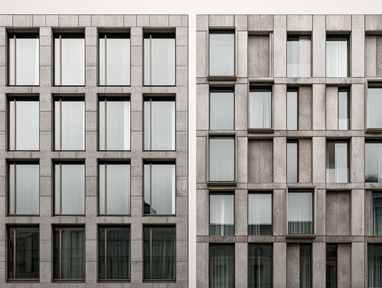 Symmetry in architecture is the arrangement of identical or near-identical elements on opposite sides of a central axis. Split a symmetrical facade down the middle and both halves match. This mirroring signals order, hierarchy, and permanence, which is why it shapes temples, government buildings, and monuments across cultures, from the Taj Mahal in Agra to the columned fronts of national parliaments. There are two main types. Bilateral symmetry repeats elements across a single vertical axis, the pattern you see in the Parthenon or the United States Capitol. Radial symmetry arranges elements around a central point, common in domed buildings and rose windows. Both rely on the kind of proportional relationships explored in math in architecture to keep a structure consistent from one end to the other. Symmetry also does practical work. A mirrored plan often distributes structural loads evenly, which can simplify engineering. It helps people orient themselves too, since a central axis points straight to the main entrance or focal space. The Roman writer Vitruvius treated symmetry as a core measure of architectural quality, and contemporary architects still return to it when a project calls for gravity and calm.
What Is Asymmetry in Architecture?
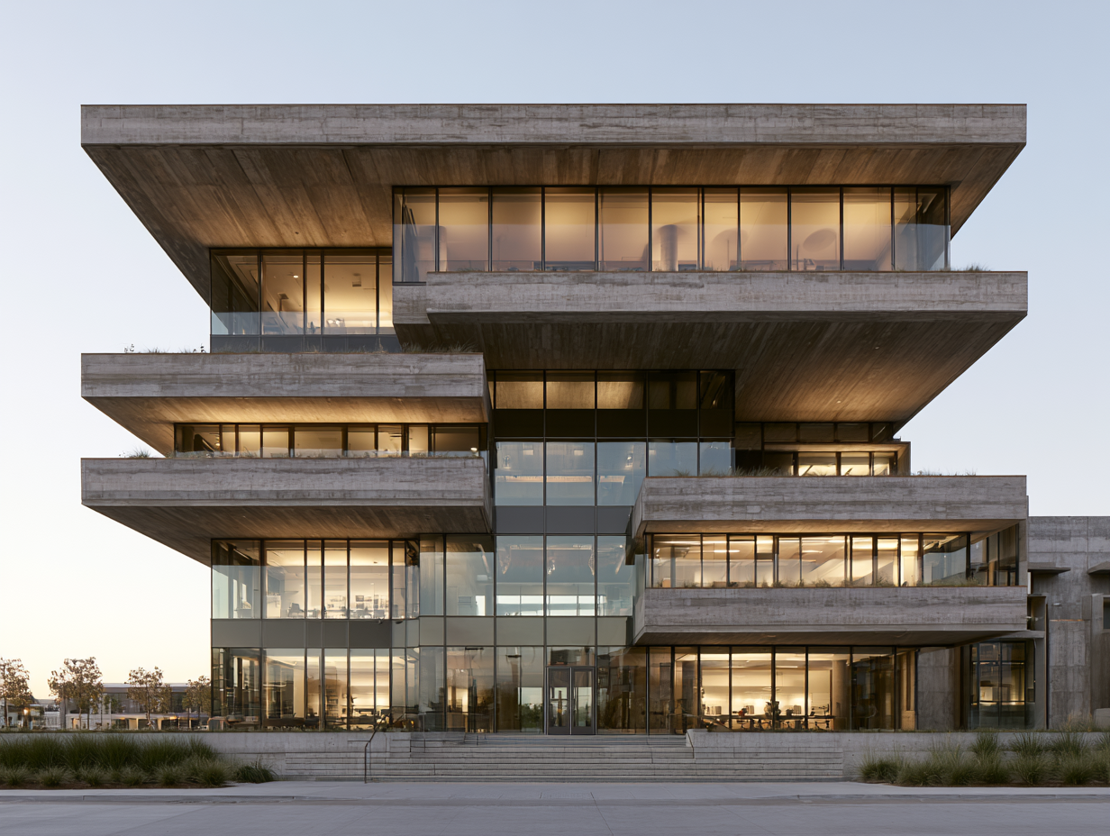
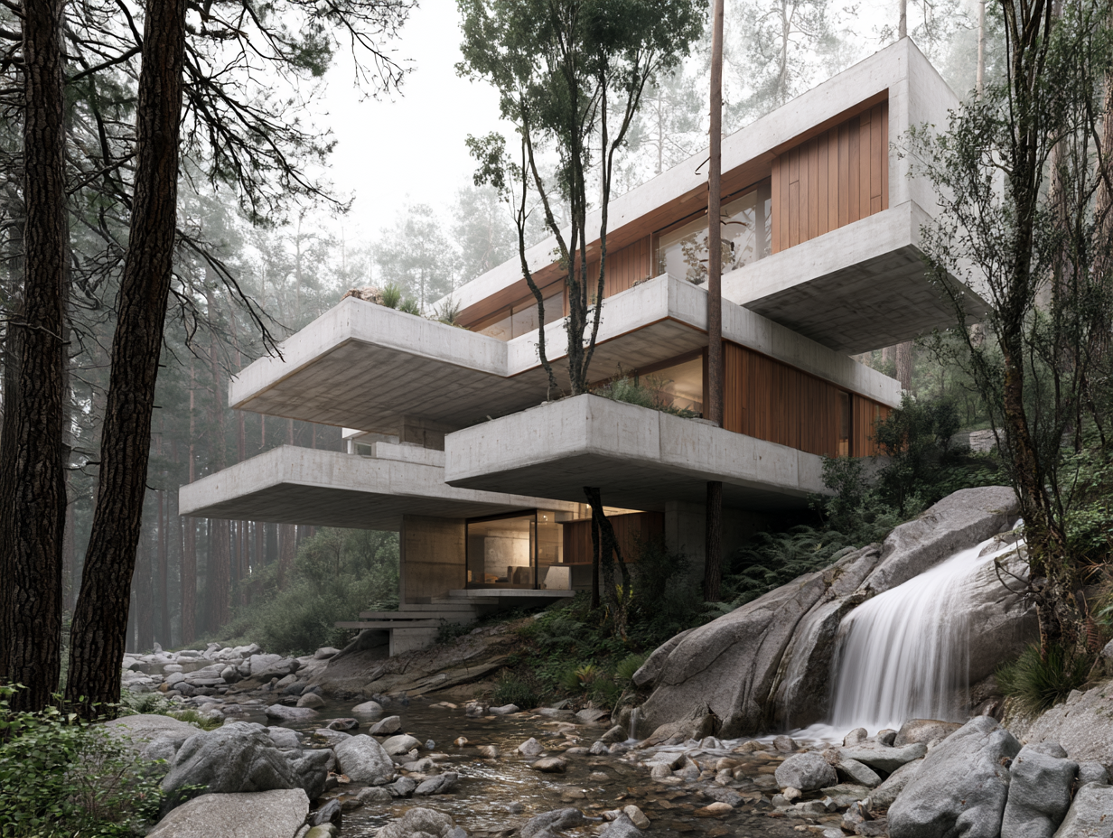 Asymmetry in architecture creates balance without mirroring. Instead of repeating identical elements, designers place contrasting forms, materials, or volumes that carry equal visual weight. A heavy stone wall on one side might be offset by a wide glass opening on the other, different in character yet balanced to the eye. This approach depends on reading visual weight rather than measuring distances. Size, color, texture, and position all affect how much attention an element pulls. A small, dark, isolated form can hold its own against a large, pale, busy one, a principle that ties into broader architectural concept ideas about composition. Modern and contemporary architects often prefer asymmetry because it feels active. Strict mirroring can read as static or overly formal, while an off-center composition suggests movement and adapts more easily to irregular sites and complex programs. Frank Lloyd Wright’s Fallingwater is the textbook case, with cantilevered terraces reaching out over a stream in different directions, yet holding together as a single resolved whole. Historians point to that balanced tension as a turning point for modern architecture. Architects such as Frank Gehry later built entire careers on asymmetrical, sculptural forms that still read as balanced compositions.
🏗️ Real-World Example
Fallingwater (Mill Run, Pennsylvania, 1937): Wright stacked reinforced concrete terraces that cantilever in opposing directions over Bear Run. No two sides match, yet the house balances by weighting horizontal planes against a tall vertical stone core. The American Institute of Architects later named it the best all-time work of American architecture.
Symmetry vs Asymmetry: The Key Differences
 Placing the two approaches side by side clarifies when each one earns its place. They differ not only in appearance but in the emotions they trigger and the problems they solve. These distinctions sit at the heart of architecture composition and guide how designers organize space.
Comparison of Symmetry and Asymmetry in Architecture
The table below breaks down how the two approaches compare across the qualities architects weigh most.
| Aspect | Symmetry | Asymmetry |
|---|---|---|
| Visual effect | Order, calm, formality | Movement, energy, tension |
| Balance method | Mirrored elements across an axis | Contrasting forms of equal visual weight |
| Common in | Classical, religious, civic buildings | Modern, contemporary, organic designs |
| Best site fit | Regular, open, level ground | Irregular, sloped, constrained sites |
| Structural tendency | Even load distribution | Needs careful engineering |
| Emotional reading | Permanence and authority | Individuality and surprise |
When Should You Choose Symmetry or Asymmetry?
Choose symmetry when a building needs to project stability, tradition, or institutional authority. Courthouses, museums, monuments, and religious buildings benefit from the formal hierarchy a mirrored plan creates. Symmetry also suits open, regular sites where nothing pushes the composition off-center. Reach for asymmetry when the program is complex, the site is irregular, or the design should feel current and individual. Mixed-use buildings, hillside homes, and projects with widely different room sizes tend to resist clean mirroring. Asymmetry lets form follow function instead of bending function to fit a symmetrical shell. That decision draws on the same design principles in architecture that govern contrast, emphasis, and rhythm. A common trap is treating the two as strict opposites you must pick between. In practice they work as a spectrum, and many of the strongest designs sit somewhere in the middle.
💡 Pro Tip
When testing a facade, photograph your elevation and flip it horizontally. If the mirrored version looks almost identical, the design leans symmetrical and will likely feel formal. If flipping it changes the character completely, you are working with asymmetry, so check that the visual weights on each side still balance before you commit.
How Great Buildings Use Both
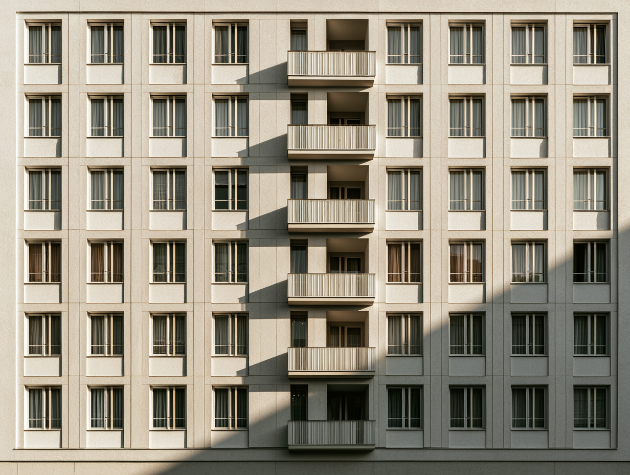
 The most memorable buildings rarely commit fully to one approach. They use symmetry as a stabilizing frame and asymmetry as a source of interest, or the reverse. A symmetrical overall massing might contain an off-center entrance sequence, while an asymmetrical composition might lean on small symmetrical bays to feel resolved. Dynamic symmetry is one bridge between the two. Rather than repeating identical units, it varies proportions according to systems like the golden ratio, producing rhythm and movement while keeping the composition coherent. The link between the golden ratio and architectural design shows how proportion can carry balance even when strict mirroring is gone. Facades are where this mix becomes most visible. A row of symmetrical windows paired with an off-center array of balconies can hold attention without tipping into chaos. Architects who study facade design strategies learn to combine the two on purpose, placing order where the eye needs rest and variation where it needs energy. The Sydney Opera House, the Guggenheim Bilbao, and countless mosques and cathedrals all balance mirrored and off-center elements inside a single design.
The Bigger Picture
The real debate may not be symmetry versus asymmetry at all. Both are tools for the same goal, which is balance, and balance is something the human eye seeks instinctively whether it meets a mirrored temple or a cantilevered house above a waterfall. The question worth asking on any project is not which approach is correct, but which one the building, the site, and the people who will use it actually need.
Frequently Asked Questions
What is the difference between symmetry and asymmetry in architecture?
Symmetry arranges matching elements on either side of a central axis, creating order and formality. Asymmetry achieves balance through contrasting elements of equal visual weight rather than mirroring. Symmetry tends to feel calm and permanent, while asymmetry feels dynamic and modern.
Is symmetry or asymmetry better in architecture?
Neither is better, since each suits different goals. Symmetry works well for buildings that need to project authority and tradition, while asymmetry fits complex programs, irregular sites, and contemporary designs. Many of the best buildings combine both within one structure.
What is an example of asymmetry in architecture?
Frank Lloyd Wright’s Fallingwater is a classic example. Its concrete terraces cantilever in different directions over a stream, with no two sides matching, yet the house stays balanced through the careful arrangement of visual weight. The Guggenheim Bilbao is another widely cited asymmetrical building.
Why is symmetry used in architecture?
Symmetry communicates order, stability, and hierarchy, which makes it well suited to temples, government buildings, and monuments. It can also simplify structural engineering by distributing loads evenly, and it helps people orient themselves toward a central entrance or focal point.


Architecture in Geometry: From Basic Shapes to Complex Forms
Geometry gives architecture its order. This breakdown shows how basic shapes like...

Best Portable Monitors for Architects: 2026 Buying Guide
Portable monitors let architects keep a dual-screen workflow on site visits, in...

Why Custom Kitchens Are Becoming a Must-Have in Modern Homes
Table of Contents Show Designed for the Reality of NYC LivingMaximizing Every...

Designing Physical Brand Touchpoints for Architecture Studios
Table of Contents Show Think Beyond the LogoMatch the Object to the...

Leave a comment