

Incorporating Geometric Precision with Architecture: Merkurhuset
Merkurhuset, an award-winning office building in Gothenburg, utilizes geometric precision to maximize a constrained site while adhering to strict zoning regulations.
 Elif Ayse Sen18 November 20235 Mins read374

Table of Contents Show
Merkurhuset is an office building in Gothenburg, Sweden, designed by Olsson Lyckefors Arkitektur, where geometric precision turned a tight, awkward plot into an asset. The project separates vertical circulation from open floors, wraps its cores in cylindrical brick, and won the 2022 Kasper Salin Prize for the result.
Most case studies of award winning offices start with a generous site and a clear brief. Merkurhuset did the opposite. The architects worked inside strict zoning rules, a narrow footprint, and a capped building height, then used those exact limits to shape a building that reads as deliberate rather than squeezed. The starting point was a careful reading of the plot and what the zoning plan would and would not allow.

How Zoning Limits Shaped Merkurhuset’s Geometry
The site set hard boundaries before a single line was drawn. Constrained dimensions and a maximum allowable height fixed the envelope, so the design had to find room to move within a small margin. Instead of fighting that margin, the team treated it as the brief itself.
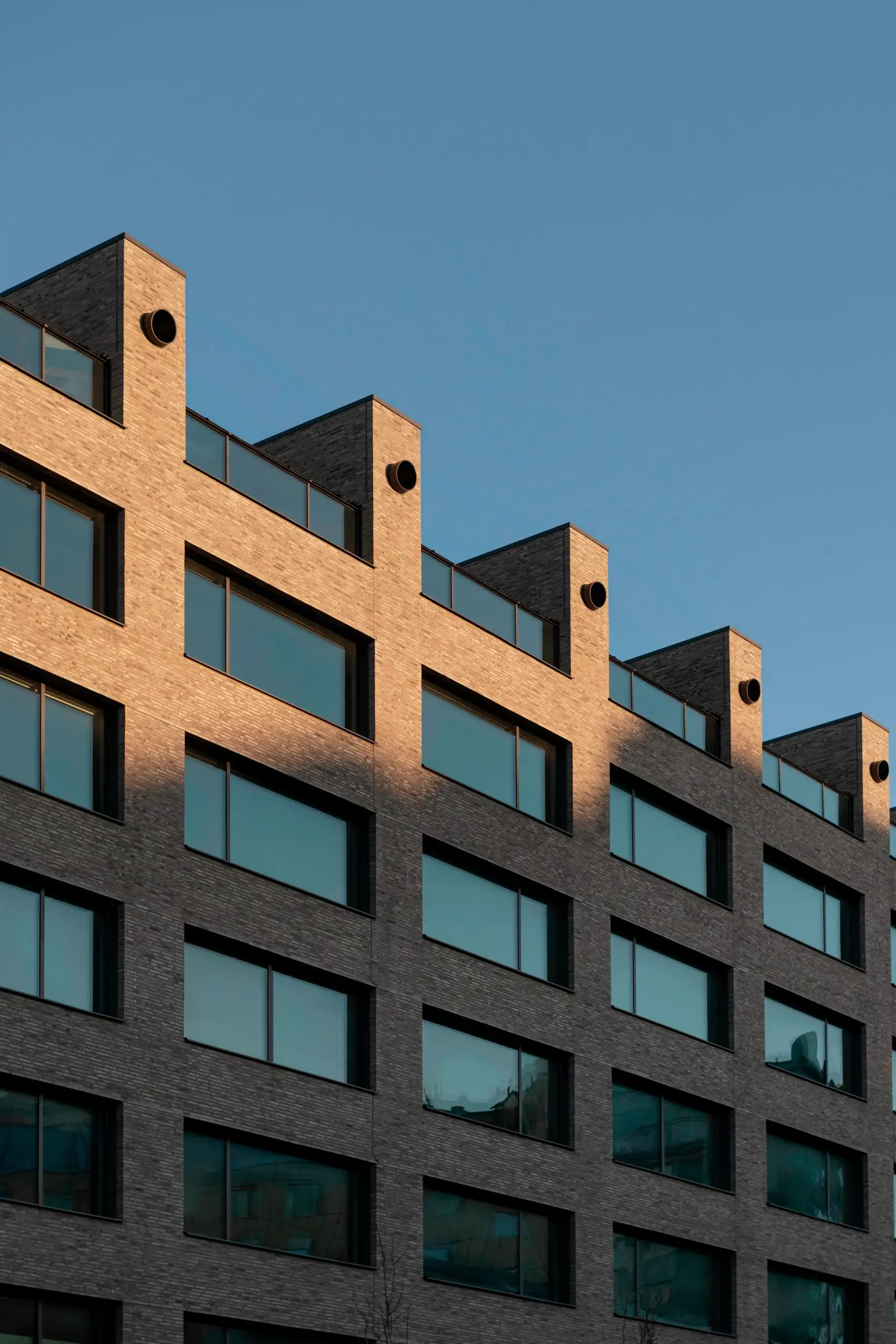
The clearest move sits on the top floor, where the outer wall tilts inward at an angle. That single gesture reads like a studio window, brings extra daylight into the upper level, and respects the height limit by pulling the volume back as it rises. Intermediate pillars run behind a transparent face, so the structure stays legible without breaking the clean line of the facade. Precision here is not decoration. Every angle answers a rule on the zoning plan.
This is a useful reminder for anyone working with a hard site. A maximum height line and a fixed boundary are not just numbers to subtract from a wish list. Read carefully, they suggest where a building should step, lean, or open. Merkurhuset treats the regulation as a design partner, and the angled crown is the most visible proof of that approach.
Learning from the Inland Steel Building
A reference from mid century Chicago guided the structural logic. The Inland Steel Building by Skidmore, Owings & Merrill, finished in 1958, pushed all vertical service elements to the edges so the interior could open up. Merkurhuset borrows that idea directly. By splitting the vertical structure from the horizontal floor plates, the building becomes an independent volume with floors free of internal columns and shafts.
The payoff is practical. Office tenants get large, logical floor areas they can divide however they like, and the exterior turns into a quiet record of frames, lifts, and stairs. The structure does the talking, which keeps the surfaces calm. For a small building, this separation matters even more than it does on a tower, because every square meter of usable floor counts when the footprint is tight.
🏗️ Real-World Example
Inland Steel Building (Chicago, 1958): SOM placed structure and services in a separate tower so the 19 floors could stay column free across roughly 10,200 square feet each. Merkurhuset applies the same separation at a smaller scale, proving the principle travels well beyond the Chicago high rise that first tested it.

Cylindrical Brick Towers and the Vertical Structure
With the cores pulled out of the floor plates, the design placed the stairwell and the lift shaft at opposite ends of the building. That choice frees the middle for open plan work areas and gives each floor two clear anchor points rather than a crowded central core.
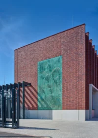
Both vertical structures rise as round masonry towers built from Danish Flensburg brick. The cylindrical form and the brick color answer two neighbors at once. They echo the nearby Rosenlundsverket heating plant and recall the rounded bay windows of the older Merkurhuset that once stood in the area. The geometry is precise, yet it carries local memory rather than reading as a generic glass box.
📐 Technical Note
Flensburg brick is a long, slim format historically fired in the Flensburg region near the Danish German border. Its narrow proportions wrap a curved wall more cleanly than standard bricks, which is why round masonry towers often specify slim formats to keep mortar joints even across a tight radius.

An Interior Built Around Raw Materials
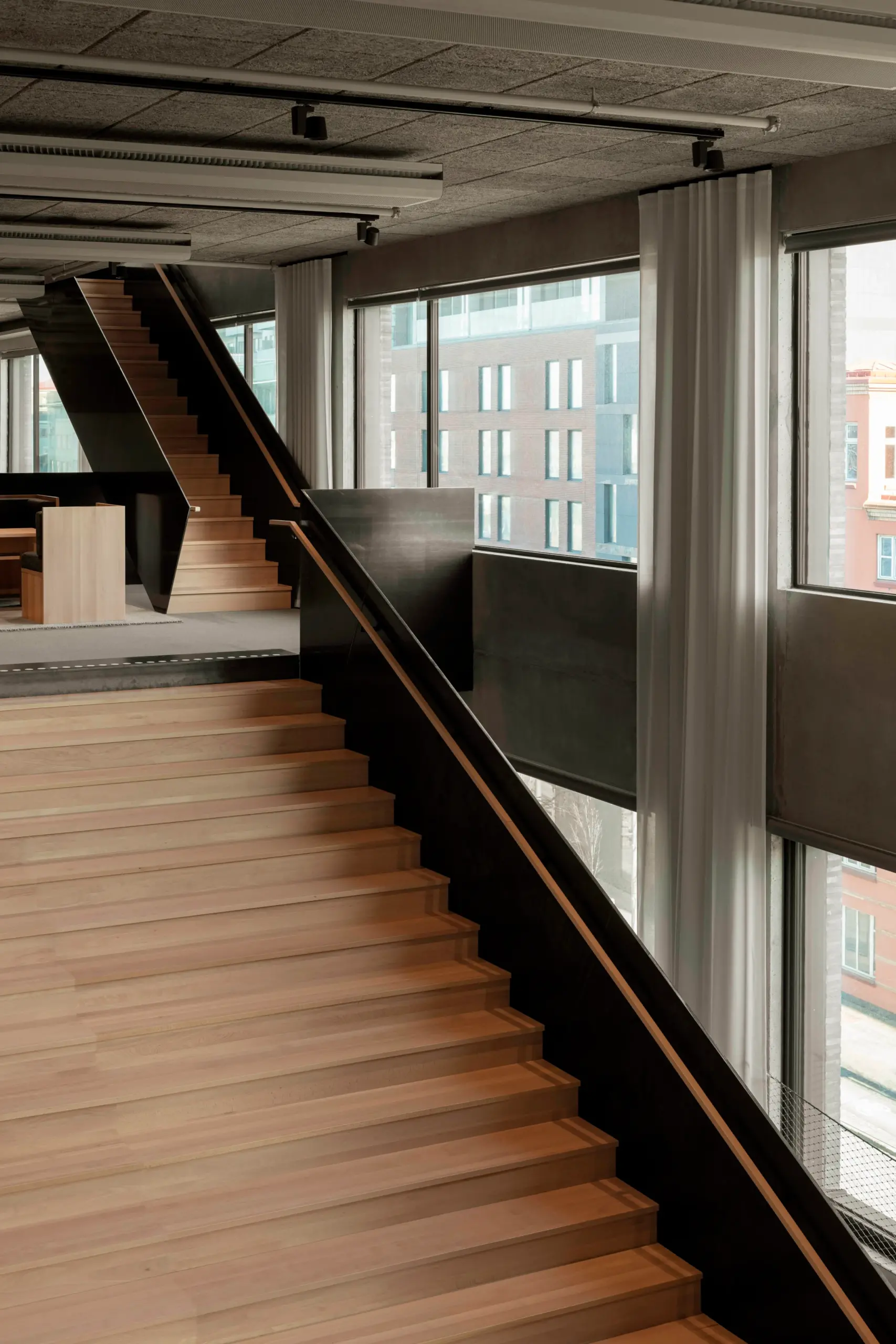
The interior came together with tenant Forsman & Bodenfors, the well known creative and advertising agency, and it draws on industrial building aesthetics. The material palette stays clean and limited, and the design lets construction materials show their own surface instead of hiding them behind finishes. This is the kind of restraint that links the project to wider Scandinavian minimalism, where honesty of material does most of the visual work.
The approach follows an outside inside logic. Concrete, brick, and structural elements that you read from the street continue indoors, so there is little distinction between the building’s shell and its rooms. Nothing extra is added for the sake of polish.
That decision has knock on benefits beyond looks. Fewer added finishes mean fewer layers to maintain, replace, or send to landfill over the building’s life, and exposed thermal mass in concrete and brick helps steady indoor temperatures. Honesty of material, in this case, doubles as a quiet form of low maintenance design.
Furniture Inspired by Donald Judd
The furniture sharpens that idea. Many pieces take cues from the spare, geometric work of artist Donald Judd, who built much of his reputation on simple wooden and metal forms. Beech wood structures serve as both seating and tables, giving a material that usually sits low in the hierarchy a clear role. The strong grain and the plain geometry keep the interior quiet but never flat, which fits the same precision found in the facade. Readers drawn to this tone may also like our look at Scandinavian modern homes.
Why Merkurhuset Won the Kasper Salin Prize
Merkurhuset received the Kasper Salin Prize in 2022. The award has run annually since 1962, given by Architects Sweden to a building of high architectural quality, which makes it one of the most respected honors in the country. A small office project rarely takes a national prize, so the recognition says a lot about how well the geometry and the construction hold together.
What likely won over the jury was the discipline. The building turns zoning limits into form, keeps its floors open through a clear structural idea, and ties its materials to the surrounding district. Function and appearance pull in the same direction rather than competing. The prize also puts Merkurhuset in the company of museums, transit stations, and cultural buildings that have taken the same honor since the 1960s, which underlines how much can be achieved on a modest commercial brief when the thinking is rigorous.
Merkurhuset is worth studying because it reframes what a difficult site can produce. The constraints that might have made another building feel cramped instead gave this one its identity, from the angled top floor to the round brick cores. For more on the firm behind it, see the Olsson Lyckefors Arkitektur portfolio, the SOM Inland Steel Building that shaped its structure, the Kasper Salin Prize record, and the work of tenant Forsman & Bodenfors. The real lesson is that precision is most convincing when it answers a problem, not when it decorates a free site.
Project Credit: Merkurhuset | Olsson Lyckefors Arkitektur (archilovers.com)




A Brief History of the Evolution of Illustrations and Art
Art and illustrations have evolved from prehistoric cave paintings to sophisticated works...
 Bahattin Duran4 Mins read

Why You Might Need a Smart Home Security System
A smart home security system integrates various devices like cameras and sensors...
Bahattin Duran5 Mins read

Best Online Tutorials for Creating Architectural Illustrations
Online tutorials for creating architectural illustrations provide guidance on modeling, rendering, and...
 Furkan Sen5 Mins read


Leave a comment