

House of Dior Opens in Osaka With a Sou Fujimoto Facade and Peter Marino Interiors
Dior has opened a four-storey flagship in Osaka's Shinsaibashi district, with a translucent facade by Sou Fujimoto and interiors by Peter Marino. The project layers art, a vertical garden, and a rooftop restaurant into one architectural environment.

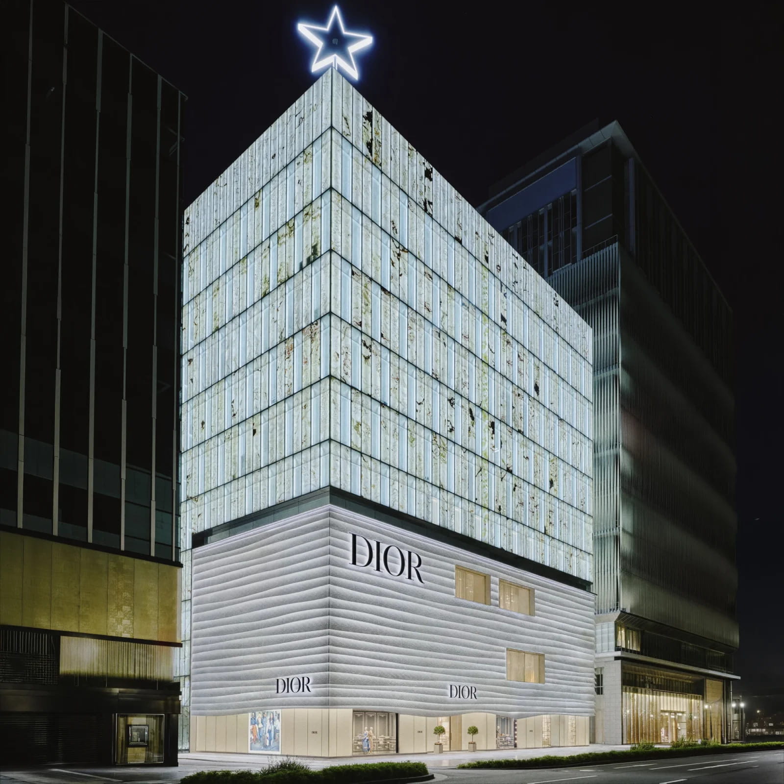
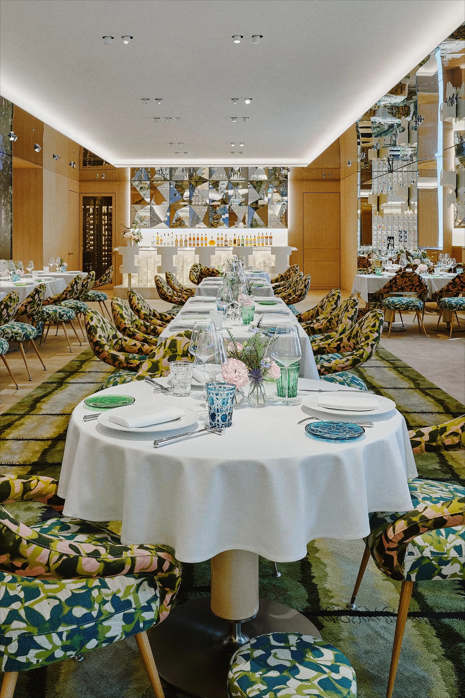
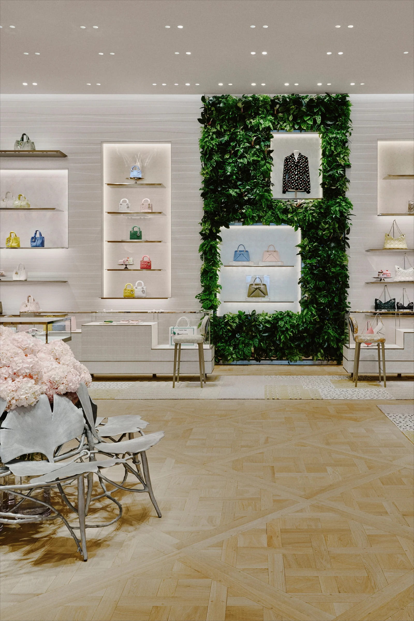
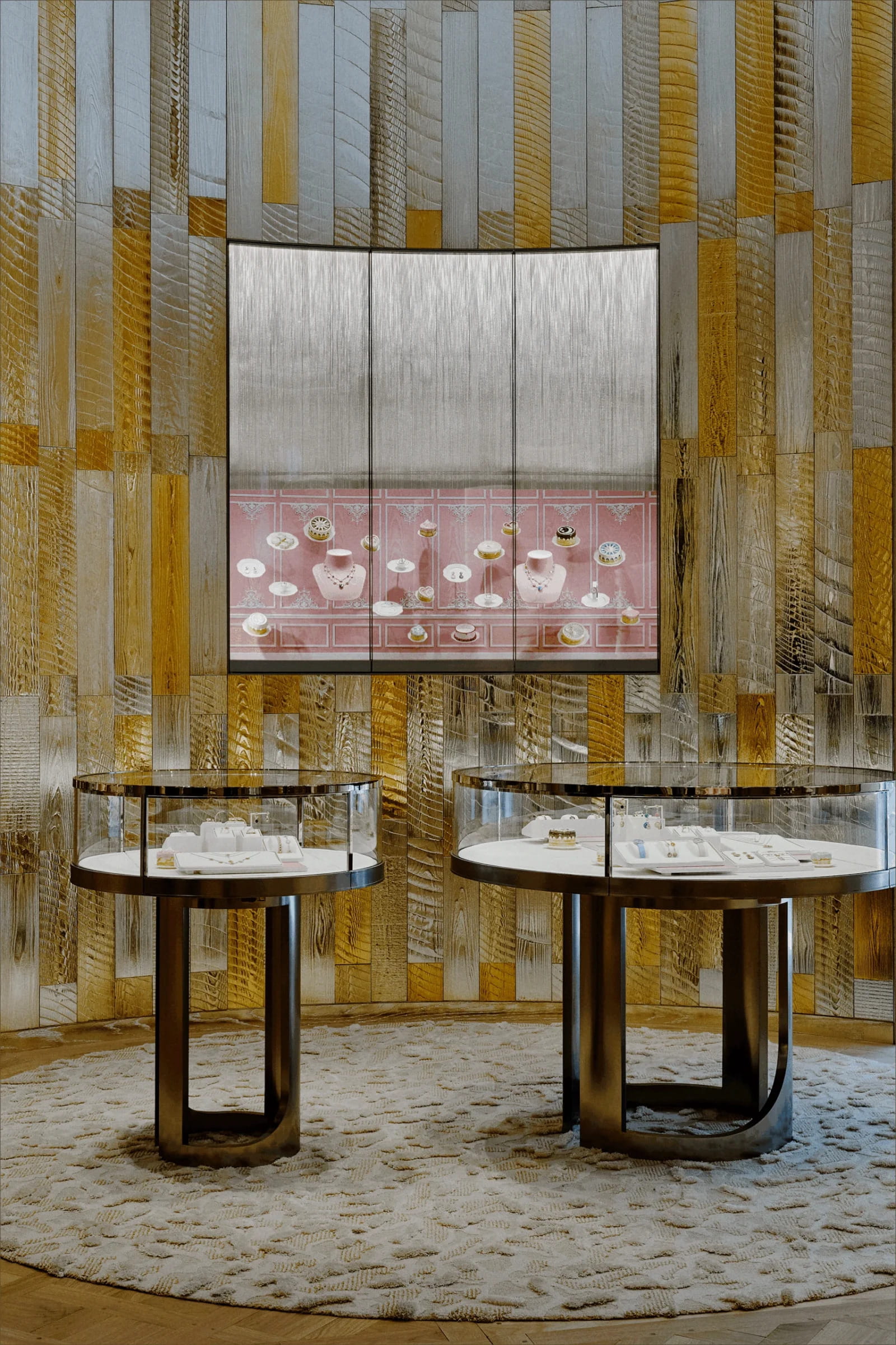
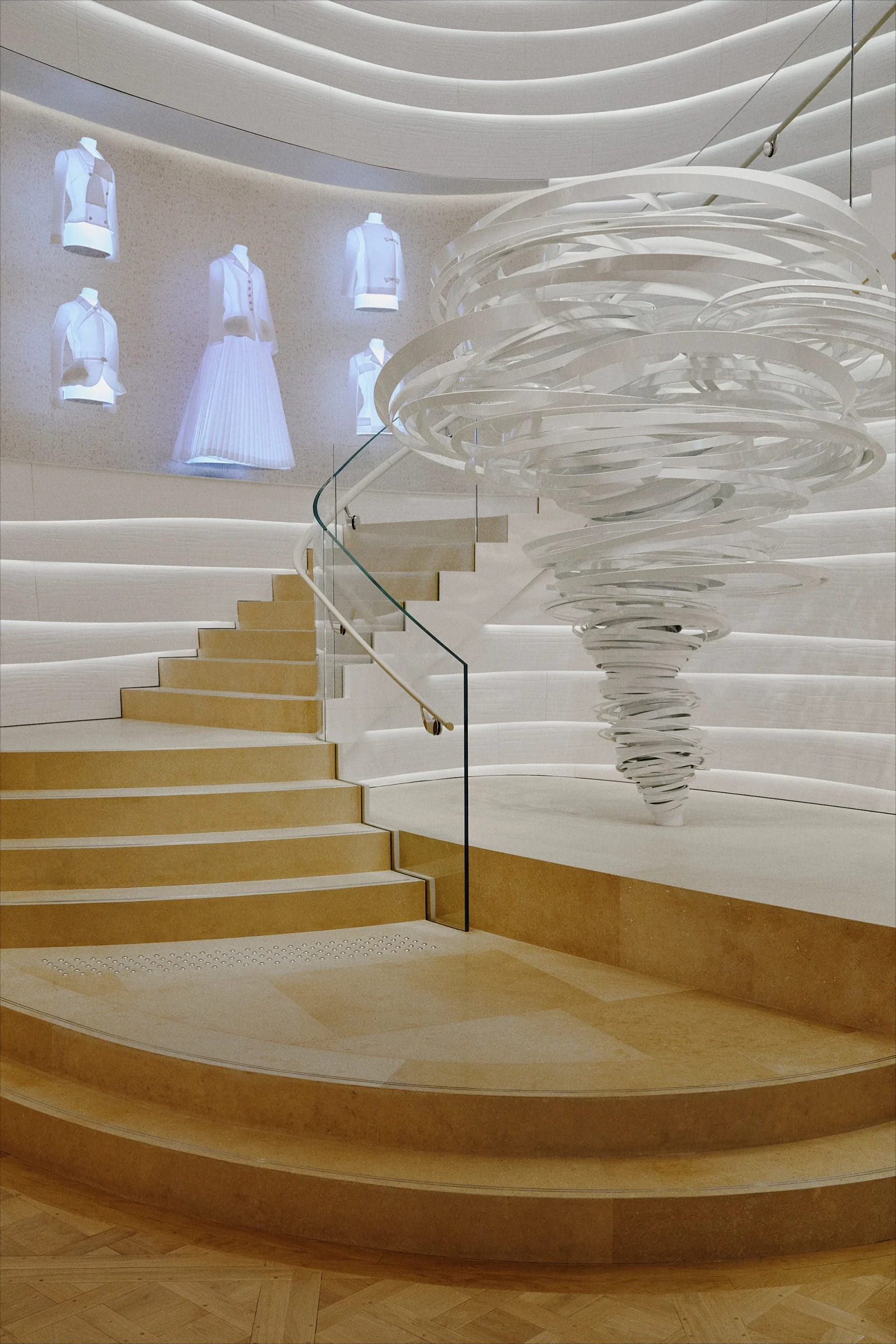
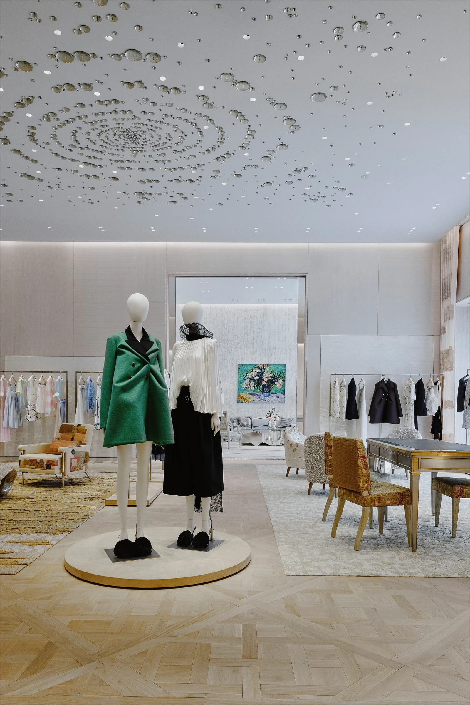
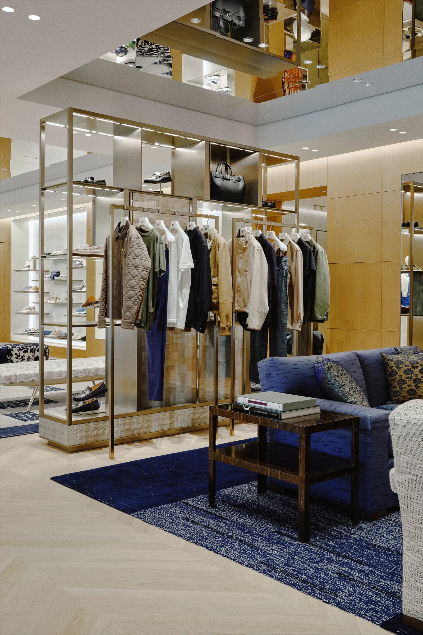
Table of Contents Show
The House of Dior Shinsaibashi is a new four-storey flagship in Osaka that combines a facade by Sou Fujimoto with interiors by Peter Marino. It treats retail space as a long-term brand environment, layering art, hospitality, and circulation into a single building rather than a conventional store floor.
Dior has opened the store in one of Osaka’s busiest commercial corridors, the Shinsaibashi shopping district, where illuminated signage and luxury storefronts compete for attention. Instead of adding to that visual noise, the new House of Dior leans on material depth and changing light. The pairing of Fujimoto and Marino, two designers with very different working methods, is the part architects will study most closely.
What Is the House of Dior Shinsaibashi?
The House of Dior Shinsaibashi is Dior’s newest architect-led flagship in Japan, located in central Osaka. The building rises four floors and separates the brand’s product categories across levels: womenswear, accessories, leather goods, jewelry, fragrances, and menswear each occupy their own space. A central staircase ties the floors together and structures how visitors move through the building.
What sets the project apart is its split authorship. Sou Fujimoto handled the exterior, while Peter Marino, a long-time Dior collaborator, designed the interiors. That division lets each designer work in the language they know best, then meet through shared material refinement and a controlled spatial sequence. The result reads less like a shop and more like a vertical gallery with retail inside it. The same blurring of architecture and fashion has shaped Marino’s earlier flagships for the brand.
💡 Pro Tip
When a flagship sits on a crowded retail strip, designers often gain more by reducing visual competition than by adding to it. A translucent or layered facade that shifts with daylight tends to hold attention longer than a bright, static storefront, because it gives passersby something that changes rather than something they read once and walk past.
Sou Fujimoto’s Translucent Facade for Dior Osaka
Fujimoto’s exterior wraps the building’s upper volume in a translucent, draped skin that references layered couture textiles. During the day the facade looks lightweight and almost fabric-like. At night it turns more porous, letting interior light bleed through and soften the building’s edge against the street. The surface does most of the work here, since the project relies on texture and depth rather than a bold structural gesture.
This fits the wider approach Fujimoto has followed for years, where the line between enclosure, atmosphere, and movement is deliberately loosened. The facade behaves less like a fixed wall and more like a filter. Its folds and stacked surfaces create different levels of opacity across the elevation, giving the store a recognizable face on the Shinsaibashi strip without resorting to oversized form. It is a reminder that strong facade design often depends on surface and light rather than scale.
How Does the Facade Respond to Shinsaibashi?
The facade answers its setting by changing through the day instead of shouting over its neighbors. Because Shinsaibashi is dense with illuminated branding, a hard, mirror-like envelope would simply add glare. Fujimoto’s layered skin diffuses light, so the building shifts from a soft daytime surface to a glowing evening presence. That slow change becomes the store’s identity, which is a quieter strategy than the screens and bright panels common in luxury retail nearby. It earns its place among the kind of standout building facades that work through atmosphere rather than spectacle.
📌 Did You Know?
Sou Fujimoto founded Sou Fujimoto Architects in Tokyo in 2000 and built his international reputation on permeable, light structures rather than heavy form. His 2013 Serpentine Pavilion in London, a cloud of thin white steel rods that visitors could climb through, made the idea of a building as an open, forest-like structure famous well before he took on projects like the Osaka flagship.
Peter Marino’s Interior: Art, Circulation, and Vertical Layering
Inside, Peter Marino treats the store as a series of distinct rooms rather than one continuous sales floor. The interiors carry several familiar Dior retail codes: pale material palettes, gallery-scaled spaces, parquet floors, sculptural staircases, and integrated artworks. What feels different in Osaka is the vertical layering. With four floors stacked tightly in an urban footprint, the building reads as more stratified than many of Dior’s earlier, lower-spread stores.
The central staircase is the organizing move. It connects all four levels visually and guides movement between departments, so the climb itself becomes part of the experience. Marino keeps circulation generous, spaces displays apart, and controls sightlines, which pushes the store toward the exhibition-like feel that luxury retail has been chasing. The aim is simple: keep visitors inside longer and let them move at a gallery’s pace. It is a clear case of retail design that behaves like a gallery, a direction many leading interior design studios across Asia have moved toward.
Art and Nature Inside the Flagship
Art is woven through the building rather than hung as decoration. Works by Christian Berard, Claude Lalanne, Alice Aycock, Tim Hailand, and Franck Evennou sit within the spatial experience, blurring the line between store and small museum. A vertical garden and floral installations by Japanese artist Azuma Makoto bring living material into an otherwise tightly controlled interior, softening the shift between gallery, hospitality, and shopping zones.
🏗️ Real-World Example
Dior Omotesando (Tokyo, 2003): Designed by SANAA, this earlier Tokyo flagship wrapped its glass volume in translucent acrylic screens that glowed at night, an approach that turned the storefront into a soft lantern on the street. It set an early benchmark for architect-led Dior retail in Japan and shows that the brand’s interest in layered, light-diffusing facades long predates the Osaka project.
Monsieur Dior and the Rise of Retail Hospitality
The top floor houses Monsieur Dior, a restaurant led by French chef Anne-Sophie Pic. Placing a full restaurant inside a flagship reflects a wider pattern in luxury retail, where fashion houses extend their footprint past selling into dining, exhibitions, and lifestyle programming. In Osaka the restaurant is built in as a core part of the building, completing its move from boutique to a destination people visit for more than shopping.
This matters for how architects plan these buildings. A store that includes hospitality needs different servicing, vertical transport, and acoustic separation than a pure retail box. The rooftop position for dining is a common solution, since it gives the restaurant views and a sense of arrival while keeping kitchen logistics away from the selling floors below.
Why Osaka? Dior’s Long Relationship With Japan
The opening deepens a connection between Dior and Japan that goes back to Christian Dior himself, who referenced Japanese craft and textiles in his work. More recent projects in Tokyo and Kyoto pushed that relationship further through architecture and exhibition-driven retail. The Shinsaibashi flagship continues the trajectory but adds a stronger architectural statement by pairing Fujimoto and Marino, two designers whose methods differ yet meet through material care and ordered spatial pacing. Fujimoto sits among the leading Japanese architecture offices shaping how global brands build today.
Osaka also makes commercial sense. The city draws heavy domestic and international foot traffic, and Shinsaibashi is one of its prime luxury corridors. For a brand building long-term presence rather than a short-lived pop-up, a permanent architectural anchor in that location signals commitment to the Japanese market.
Fujimoto’s Exterior vs Marino’s Interior: Two Approaches Under One Roof
The most useful way to read the project is as two design philosophies sharing a single building. The table below summarizes how each contribution works:
| Aspect | Sou Fujimoto (Facade) | Peter Marino (Interior) |
|---|---|---|
| Primary role | Exterior skin and street presence | Interior rooms and circulation |
| Design idea | Translucent draped skin that filters light | Gallery-scaled rooms linked by a central stair |
| Material focus | Layered surface, opacity, depth | Pale palettes, parquet, integrated art |
| Experience goal | A facade that shifts with daylight | Longer dwell time through spatial pacing |
| Nature element | Light and atmosphere as a filtering device | Vertical garden and Azuma Makoto installations |
Where Fujimoto works at the scale of the street and the sky, Marino works at the scale of the room and the footstep. The building holds both without forcing them to imitate each other, which is why it reads as a genuine collaboration rather than a single signature applied top to bottom.
What Designers Can Take From the Project
For architects and interior designers, the building is a working case study in dividing a brief without fracturing it. The clearest lesson is restraint at the street edge. By choosing a translucent draped skin over a loud, screen-heavy front, the project shows that a memorable storefront can come from how a surface handles light rather than how much it broadcasts. That is a transferable idea for any commercial frontage on a crowded street.
The second lesson sits in the section. Stacking six product categories across four floors forces a designer to think about vertical movement as the main spatial experience, not an afterthought. Here the staircase carries that load, doubling as both circulation and the visual spine of the store. Designers working on tight urban footprints can read the plan as a model for turning a constraint, limited ground area, into a feature.
The third lesson is programmatic. Folding a restaurant, art, and a garden into a retail building changes the servicing diagram and the way people spend time inside. It also raises the design ambition from selling product to hosting a visit. That mix is where much of contemporary luxury retail is heading, and the Osaka flagship offers a built reference rather than a render.
💡 Pro Tip
When you fold hospitality into a retail building, plan the back-of-house early. A rooftop restaurant needs dedicated kitchen ventilation, grease management, and a service route that never crosses the selling floors. Architects who leave this coordination until late often lose floor area or end up with awkward shafts cutting through prime display space.
What the Osaka Flagship Signals for Luxury Retail
The House of Dior Shinsaibashi avoids heavy digital spectacle and instead builds its identity from facade composition, circulation, light, artwork placement, and pacing. In a retail world shaped by short-lived visual trends, that choice points toward permanence and clear architectural authorship. For designers, it is a working example of how a brand can use a building, not a campaign, to carry its image over time.
It also confirms a shift many architects already feel in their own briefs. Retail clients increasingly ask for spaces that double as cultural venues, fold in food and art, and reward a slow visit. The Osaka project shows what that ambition looks like when it is given a serious architectural budget and two designers willing to work in counterpoint.
✅ Key Takeaways
- The House of Dior Shinsaibashi is a four-storey Osaka flagship with a Sou Fujimoto facade and Peter Marino interiors.
- Fujimoto’s translucent, draped skin filters daylight and changes the building’s street presence from day to night.
- Marino organizes the interior as gallery-scaled rooms linked by a central staircase, with art and a vertical garden woven in.
- A rooftop restaurant, Monsieur Dior by chef Anne-Sophie Pic, reflects the move toward retail spaces that include hospitality.
- The project extends Dior’s long architectural relationship with Japan and treats the building itself as the brand statement.
Final Thoughts
The Osaka flagship is worth following because it answers a question many brands are still working through: how do you make a physical store matter when so much shopping has moved online? Dior’s answer here is architecture you cannot replicate on a screen, a facade that lives with the light and an interior that asks to be walked rather than scrolled. The collaboration between Fujimoto and Marino gives the building two strong points of view, and the city of Osaka gets a permanent piece of design rather than a temporary display.
For the architecture and design community, the more interesting takeaway is the model itself. Splitting exterior and interior between two distinct authors, then holding them together through shared material discipline, is a strategy other luxury clients are likely to study. If it works commercially in Shinsaibashi, expect to see more flagships built as collaborations rather than single-hand projects.


Monterrey Stadium: The Best View at the 2026 World Cup
Estadio BBVA, the Steel Giant of Monterrey, frames the Cerro de la...

A Wave in Paris: How Pharrell Williams Expanded the Louis Vuitton Runway
Pharrell Williams turned the Louis Vuitton SS27 menswear show in Paris into...

Zaha Hadid Architects Opens Songshan Lake Cultural Center
Zaha Hadid Architects opened the Songshan Lake center in Dongguan a decade...

Sagrada Familia Lamb of God Glows: Gaudi’s Crowning Vision
A glowing Lamb of God now crowns the Sagrada Familia at 172.5...

Leave a comment