

Figure-Ground Diagram: How to Draw and Read Urban Fabric
A figure-ground diagram reduces a city to built mass against open space. How to read it, put a number on it, draw it from open data, and where a Nolli plan works better.
 Sinan Ozen7 September 20267 Mins read86

Table of Contents Show
Quick Answer: A figure-ground diagram is a plan of a city drawn in two tones: building mass filled solid, everything else left blank. Stripping out roads, names and land use leaves only the relationship between built form and open space, which is what makes urban structure readable at a glance.
Show someone a normal city map and they read the labels. Show them a figure-ground and they read the shape of the place. That is the whole trick: by deleting almost all the information, the drawing forces attention onto the one thing that decides how a piece of city feels to walk through.
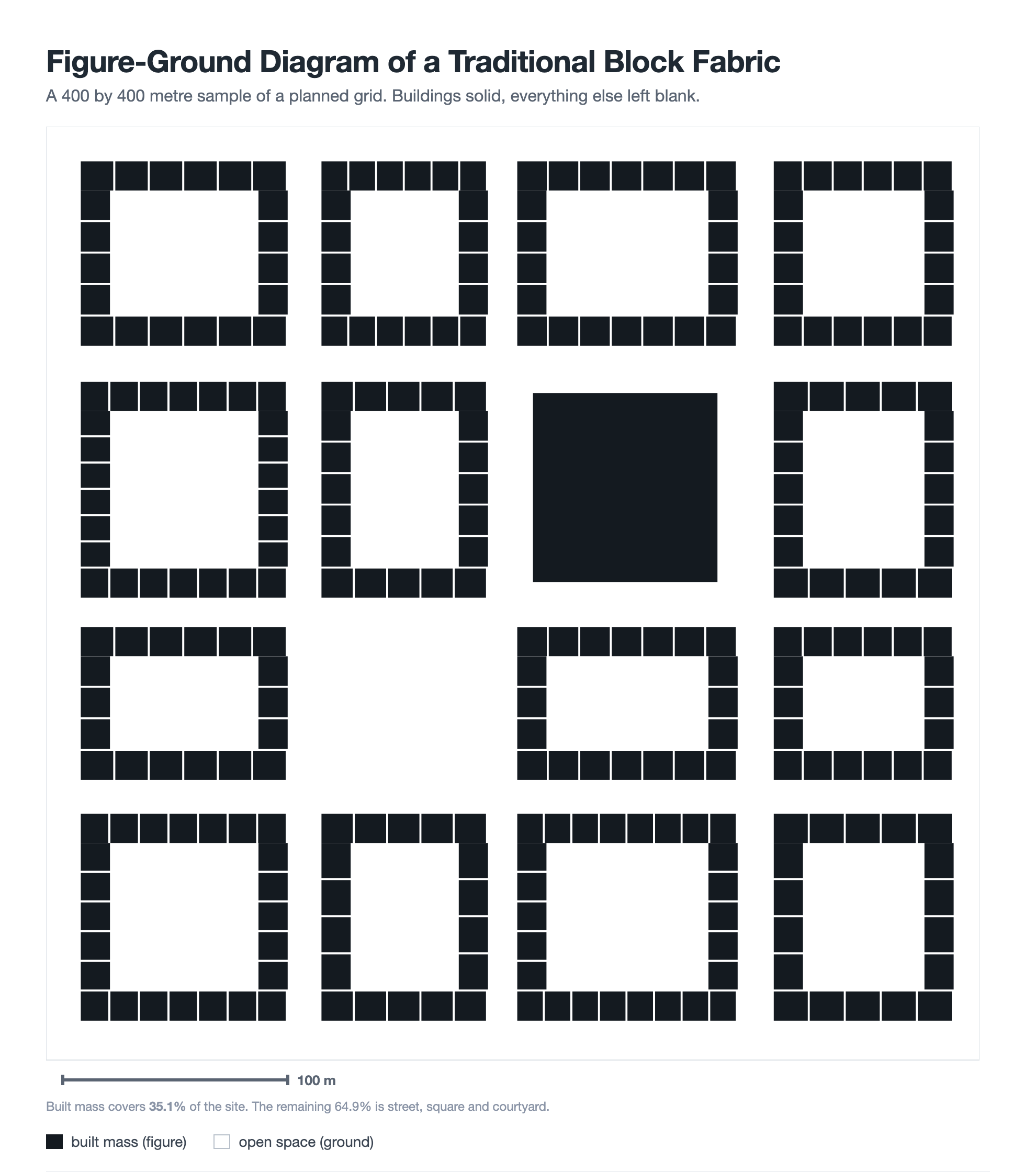
A 400 by 400 metre sample of perimeter block fabric. Buildings are solid, everything else is blank, and the street pattern appears without a single line being drawn for it.
What Is a Figure-Ground Diagram?
A figure-ground diagram is an urban plan reduced to two values. The figure is the built mass. The ground is everything else: streets, squares, gardens, yards, water. Nothing is labelled, nothing is shaded, and no distinction is made between a cathedral and a bike shed.
The term comes from Gestalt psychology, where figure and ground describe how the eye separates an object from its background. Urban designers borrowed it because a city plan can be read either way round. Look at the black and you see buildings. Look at the white and you see the public space, which in a well-made city is a connected sequence of outdoor rooms rather than leftover space.
📐 Technical Note
The drawing is a plan cut, not a footprint outline. Convention is to fill what a horizontal cut through the buildings would hit, usually at ground floor level. That means a covered arcade counts as solid in a strict figure-ground even though you can walk through it, which is exactly the limitation a Nolli plan was invented to fix.
How Do You Read a Figure-Ground Diagram?
There are four questions worth asking of any figure-ground, and they can all be answered by looking rather than measuring.
- Is the void continuous? Trace the white with your eye. In a walkable fabric it runs as an unbroken network from one edge of the drawing to the other.
- Does the void have edges? Streets and squares that read as clear shapes are being defined by building fronts. Open space that has no outline is residual, not designed.
- How grainy is the solid? Many small plots produce a fine grain that can change use and owner incrementally. A few large ones produce a coarse grain that can only change all at once.
- Where does the pattern break? A gap in a regular fabric is usually the interesting part: a square, a civic building, a railway, a demolition that never got rebuilt.
In the sample above, the void reads as a grid of connected streets with one square opened out of it, and the one solid block without a courtyard immediately announces itself as a different kind of building.
What Does Figure-Ground Show That a Site Plan Does Not?
Its real power is comparison. Draw two places at the same scale, the same extent and the same orientation, and differences that are hard to argue about in words become obvious in a second.

The same extent, drawn the same way. The left plan covers 35.1% of the site with buildings; the right covers 12.2%.
This is the comparison that made the technique famous in urban design teaching. The scheme on the right has nearly three times as much open space, and almost none of it is shaped. The white on the left forms streets and a square, held between building fronts. The white on the right is one continuous field that the blocks happen to sit in.
That is the argument in a nutshell: quantity of open space and quality of open space are not the same measurement, and figure-ground is the drawing that separates them. It says nothing about which scheme is better. It only makes the difference impossible to miss, which is why it belongs early in site analysis rather than as a presentation drawing at the end.
Can You Put a Number on It?
Yes, and it is worth doing. Ground coverage is the built area divided by the total site area, and it takes about a minute to calculate once the drawing exists. In the two samples above the figures are 35.1% and 12.2%.
Treat the number as a description rather than a target. A high figure can mean a dense, well-defined fabric or an over-built one with no daylight; a low figure can mean generous parkland or a scattered fabric with nothing holding it together. What the number is good for is honest comparison between options, and for checking that a scheme has landed where the designer intended. Read alongside the drawing it is useful; read alone it misleads.
📌 Did You Know?
The technique predates the name by two centuries. Giambattista Nolli’s Nuova Pianta di Roma of 1748 drew the city as solid mass against open space, and it is still the reference every urban designer reaches for. The phrase figure-ground entered urban design vocabulary much later, carried in largely by Colin Rowe and Fred Koetter’s Collage City in 1978.
What Grain Tells You About How a Place Can Change
Ground coverage is the obvious number. Grain is the more useful one, and figure-ground is the only drawing that shows it plainly. Grain is the size of the individual pieces the fabric is made from.

Count the two samples and the difference is not subtle. The perimeter block plan is made of 291 separate plots averaging around 190 square metres. The slab and tower plan is made of 15 buildings averaging about 1,300 square metres. That is roughly twenty times as many pieces in the first plan, while the average building in the second is about 6.8 times the size of the average plot.
That decides how a place can change. Fine grain can adapt one plot at a time: a shop becomes a workshop, a house is extended, a bad building is replaced without anyone else being involved. Coarse grain can only change wholesale, which means change waits for a single owner, a single budget and a single decision. Neither is automatically right, but a scheme that claims it will evolve over time has to be drawn in pieces small enough to evolve.
Figure-Ground or Nolli Plan?
They look similar and answer different questions. A figure-ground splits the world into built and unbuilt. A Nolli plan splits it into private and publicly accessible, which moves two things across the line.

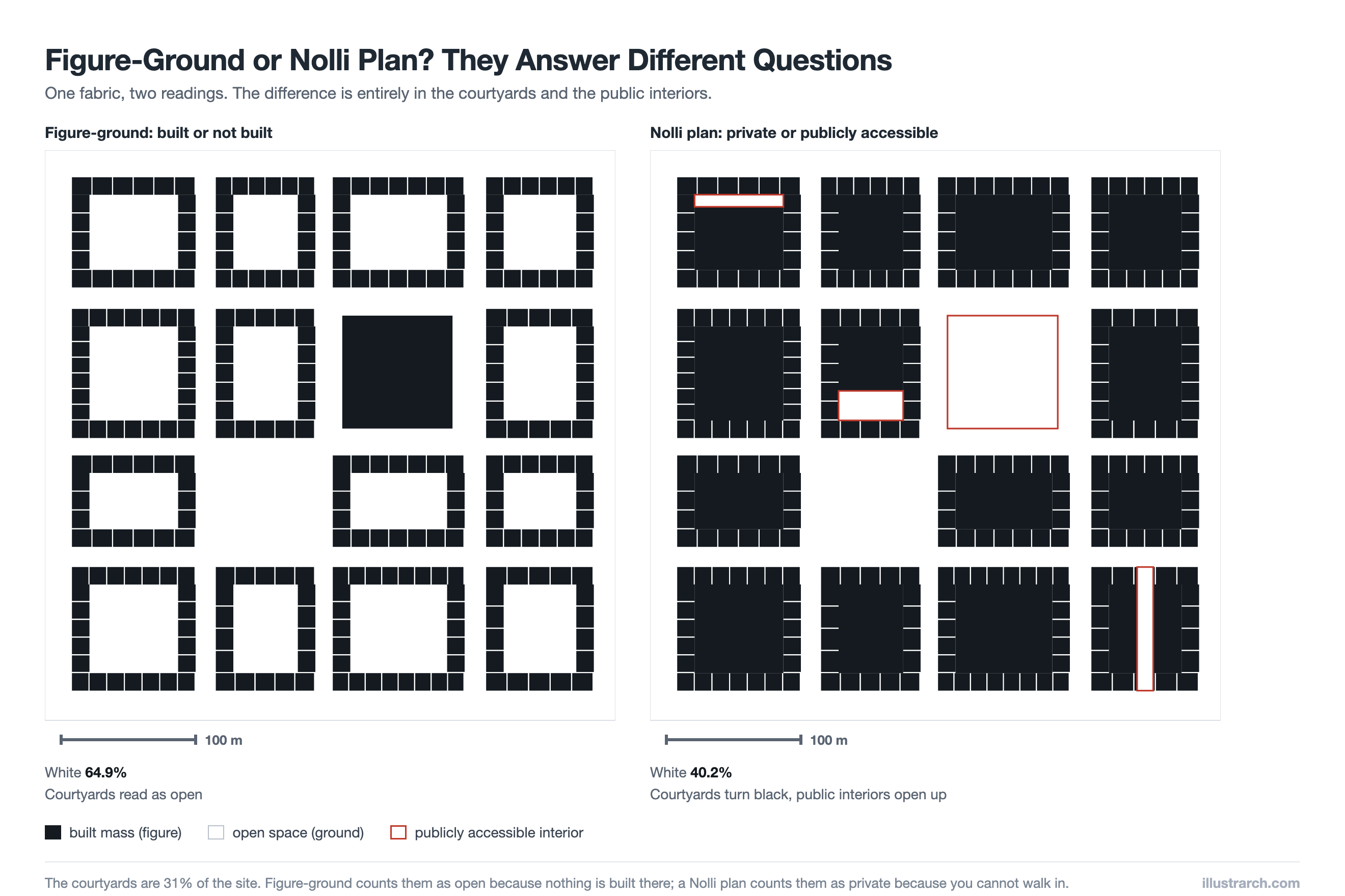
One fabric, two readings. Private courtyards turn black; the church, the market hall and the arcade open up.
The shift is larger than it looks. In this sample the courtyards are 31% of the site. A figure-ground counts every square metre of them as open, because nothing is built there. A Nolli plan counts them as private, because you cannot walk in. White drops from 64.9% to 40.2% without a single building moving.
| Aspect | Figure-ground | Nolli plan |
|---|---|---|
| Splits the city into | Built and unbuilt | Private and publicly accessible |
| Private courtyard | White, it is not built on | Black, you cannot enter |
| Church or station hall | Black, it is a building | White, anyone can walk in |
| Answers | What is the built pattern? | Where can the public actually go? |
| Data needed | Building footprints only | Footprints plus access rights |
Use figure-ground when the question is about form and grain. Use a Nolli plan when the question is about access, which is most ground-floor and public space work.
How Do You Draw a Figure-Ground Diagram?
- Fix the frame first. Choose a square extent and a scale, and keep both identical across every drawing you intend to compare. A 400 or 500 metre square is a common walkable sample.
- Get the footprints. OpenStreetMap carries building outlines for most cities, and Overpass Turbo will export just the buildings inside a bounding box, which drops straight into CAD or Illustrator.
- Fill and delete. Fill every building solid. Delete road centrelines, kerbs, labels, contours, trees and hatching. Resist the urge to keep any of it.
- Decide the edge cases once. Canopies, arcades, raised walkways and buildings under construction all need a rule. Write it down and apply it identically across the set.
- Add a scale bar and a north point. Without them the drawing cannot be compared with anything, and comparison is the point.
💡 Pro Tip
Print the set at the same size and lay them side by side on a table. A figure-ground that looks convincing alone often falls apart next to a fabric that works, and that comparison is far harder to fake than a rendered view. It is also the fastest way to test whether your own scheme sits in the family of places you claim to be learning from.

What Are the Limits of a Figure-Ground Diagram?
Because it deletes almost everything, it also deletes things that matter.
- No height. A two-storey terrace and a twenty-storey slab with the same footprint draw identically, so density cannot be read off it.
- No use. Housing, offices and warehouses are the same black.
- No topography. A steep site and a flat one look the same, though they walk very differently.
- No time. It is a snapshot, so a drawing made from old data can be confidently wrong.
- No access. This is the gap the Nolli plan fills.
Because of that, figure-ground is a first drawing, not a conclusion. It pairs naturally with a zoning diagram for use, a section for height, and movement analysis such as space syntax for how the network actually performs. The building typology behind the pattern is the next question it raises.
⚠️ Common Mistake to Avoid
Comparing drawings made at different extents or scales. A 200 metre sample of dense fabric next to a 600 metre sample of suburb proves nothing at all, however striking the pair looks on a board. Set the frame once, then keep it, even when a particular site would flatter you at a different size.
Frequently Asked Questions
It is used to read and compare urban structure. By drawing buildings solid and everything else blank, it shows whether streets and squares are shaped by building fronts, how fine the grain of development is, and how a proposal sits against the fabric around it.
A figure-ground separates built from unbuilt. A Nolli plan separates private from publicly accessible, so private courtyards become solid and public interiors such as churches and station halls become open. They answer different questions about the same city.
Choose a fixed extent and scale, export building footprints from a source such as OpenStreetMap, fill every building solid, and delete roads, labels and all other layers. Add a scale bar and north point so the drawing can be compared with others.
Bottom Line
A figure-ground diagram earns its place by what it refuses to draw. Two tones, one scale, no labels, and the structure of a place becomes arguable in a way that a photograph or a coloured land use plan never quite manages. Draw your site and two fabrics you admire at the same extent, put them side by side, and the brief tends to write part of itself.
Related Guides






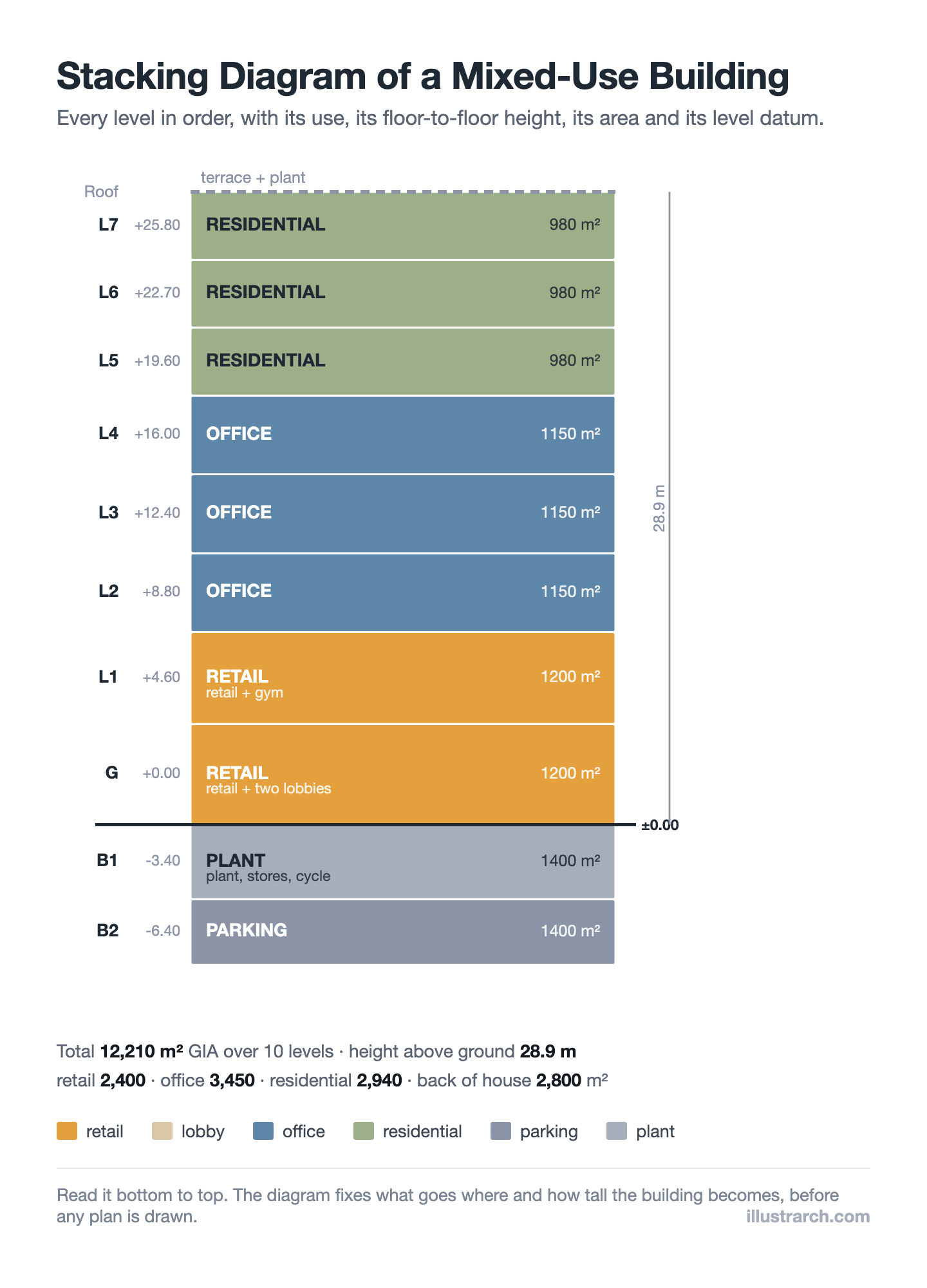
Stacking Diagram: How to Allocate Uses Floor by Floor
A stacking diagram assigns each use in a brief to a level,...
Sinan Ozen7 Mins read
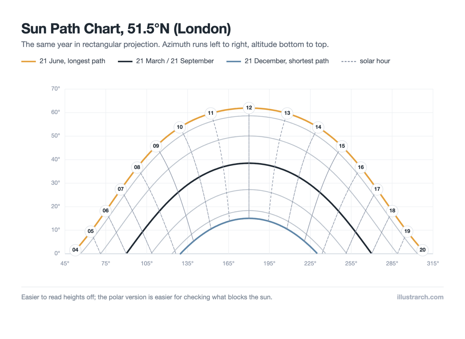
Sun Path Diagram: How to Read One and Use It in Design
A sun path diagram shows where the sun sits all year for...
Sinan Ozen8 Mins read
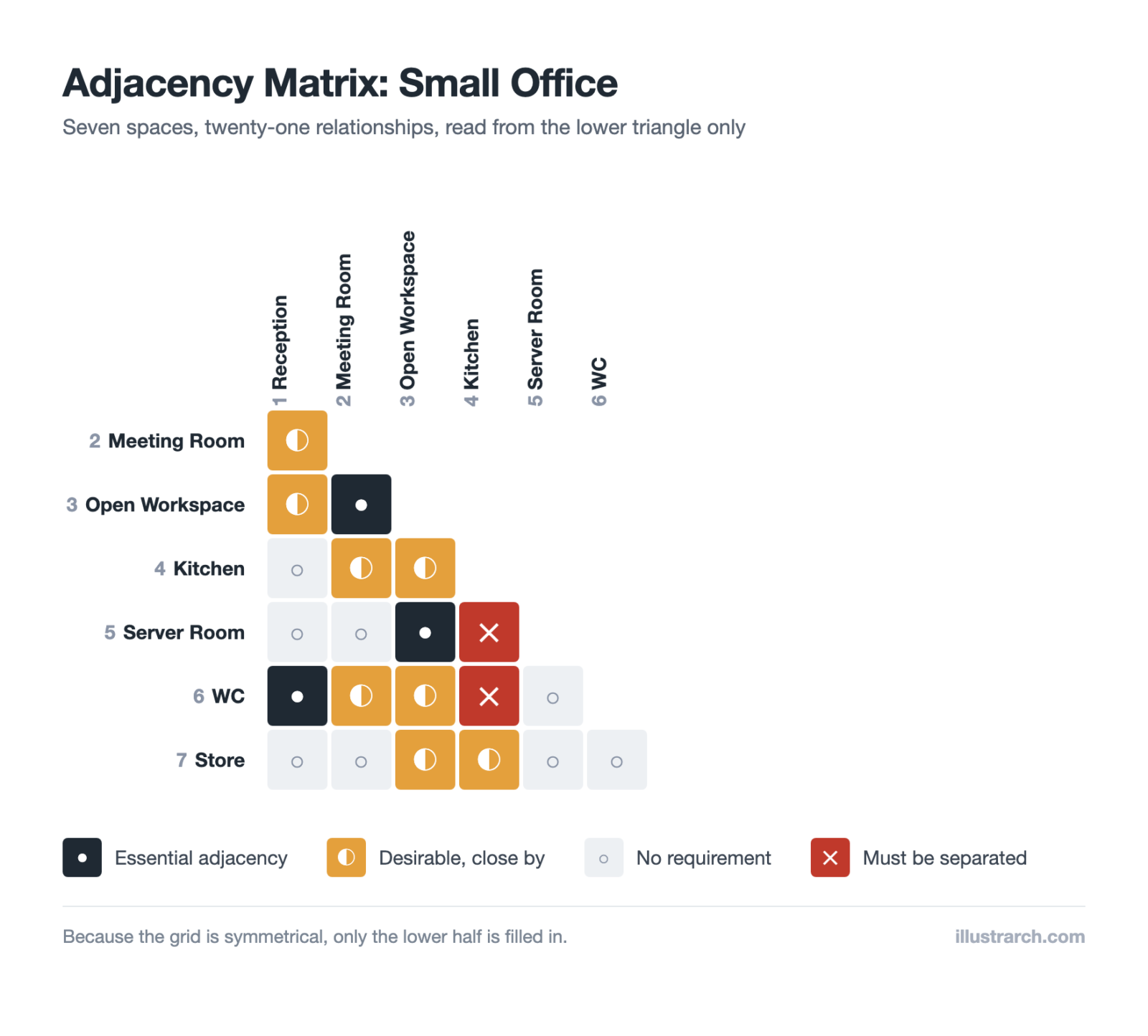
Matrix Diagram in Architecture: How to Map Space Adjacencies
A matrix diagram, or adjacency matrix, maps how every space in a...
Sinan Ozen8 Mins read

Shopping Mall Bubble Diagram: A Step by Step Retail Planning Guide
A practical guide to the shopping mall bubble diagram: placing anchors so...
 illustrarch Editoral Team8 Mins read


Leave a comment