

Sun Path Diagram: How to Read One and Use It in Design
A sun path diagram shows where the sun sits all year for one latitude. How to read it, plot obstructions, and size an overhang from the angles.
 Sinan Ozen7 September 20268 Mins read74
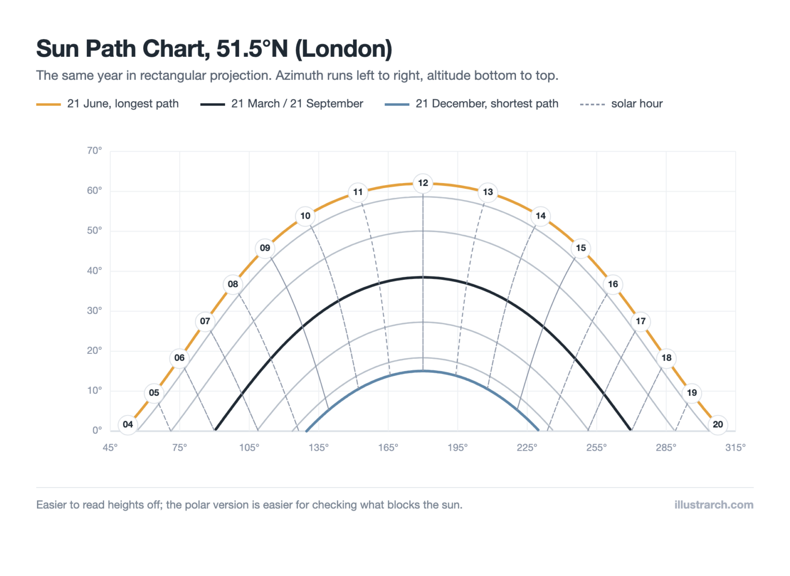
Table of Contents Show
Quick Answer: A sun path diagram plots where the sun sits in the sky across a whole year for one latitude. Curves show the sun’s track on key dates, rings show its height above the horizon, and the compass edge shows its direction. Architects read it to predict sunlight, shade and overheating before design begins.
Every site gets the same sun, but no two sites get it the same way. Latitude sets how high the sun climbs, the season sets how long it stays up, and whatever stands nearby decides how much of that reaches your building. A sun path diagram puts all three on one drawing, which is why it turns up in site analysis, passive design and daylight studies alike.
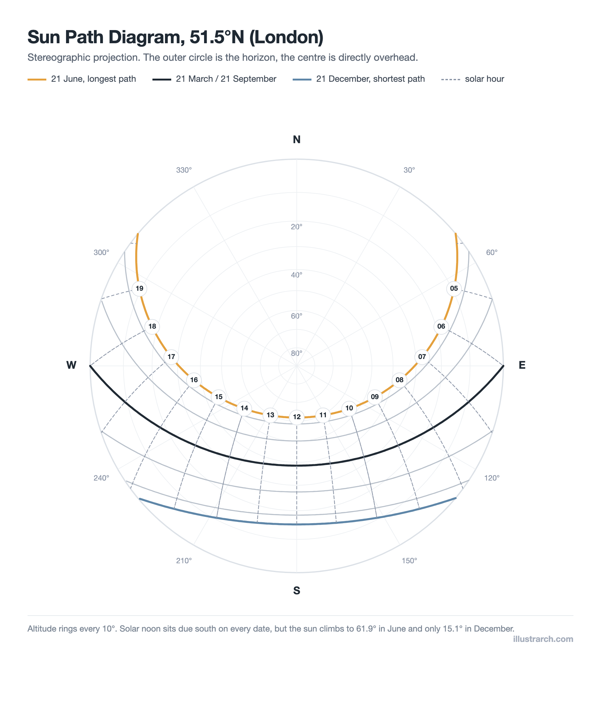
A sun path diagram for 51.5°N. The outer circle is the horizon, the centre is straight overhead, and every curve is one day of the year traced from sunrise to sunset.
What Is a Sun Path Diagram?
A sun path diagram is a chart of solar position over a year, drawn for one latitude. It answers two questions at once: how high the sun is, and which direction it comes from. Those two numbers are all you need to work out whether light reaches a window, whether a wall gets afternoon heat, or whether the building next door takes your winter sun away.

The chart above is drawn for 51.5° north. Three curves carry most of the meaning. The top one is 21 June, the longest path, running from a north-easterly sunrise to a north-westerly sunset. The middle one is the equinox, which starts due east and ends due west at every latitude on earth. The bottom one is 21 December, a short low arc that never leaves the southern sky. The dashed lines crossing them mark solar hours, so you can find the sun for any date and time by picking the curve and following it to the hour.
📐 Technical Note
Two terms do all the work. Altitude is the angle of the sun above the horizon, from 0° at sunrise to a maximum at solar noon. Azimuth is its compass bearing, usually measured clockwise from north, so 90° is due east and 180° due south. A sun path diagram is simply every altitude and azimuth pairing for a year, drawn in one frame.
How Do You Read a Sun Path Diagram?
Reading one is a four-step habit, and it is worth doing slowly the first few times.
- Find your date. Pick the curve for the month you care about. Most charts pair months that share a solar path, so April and August sit on the same line.
- Follow it to the hour. Where your date curve meets the hour line is the sun’s position at that moment.
- Read the altitude. On a polar chart, distance from the centre gives height: the centre is overhead, the rim is the horizon. On a rectangular chart, read it straight off the vertical axis.
- Read the azimuth. Take the compass bearing around the edge. That is the direction to look for the sun, and the direction any shadow will fall away from.
At 51.5°N the numbers are stark. The sun reaches 61.9° at midsummer noon but only 15.1° at midwinter noon, and the day shrinks from about sixteen and a half hours to under eight. That single fact drives most temperate-climate design decisions, from window size to overhang depth.
Stereographic or Cartesian: Which Projection Should You Use?
The same solar data gets drawn two ways, and both are worth knowing. The polar version above is a stereographic projection, looking straight up at the sky dome. The rectangular version below unrolls that dome into a graph.
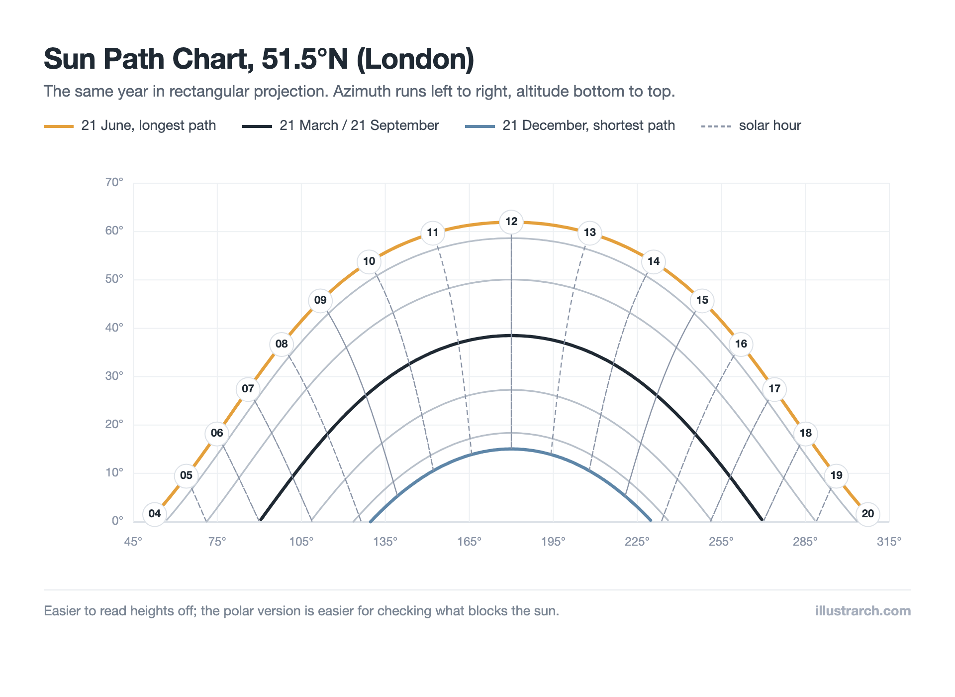
The same year at the same latitude, unrolled. Altitudes are easier to read off a straight axis, which is why this version suits shading calculations.
| Aspect | Stereographic (polar) | Cartesian (rectangular) |
|---|---|---|
| Looks like | The sky seen from below | A graph of altitude against direction |
| Best for | Plotting obstructions around a site | Reading exact angles for shading design |
| Reading altitude | Distance from the centre | Straight off the vertical axis |
| Reading direction | Compass bearing round the rim | Horizontal axis |
| Weak point | Angles distort near the centre | Harder to picture as real sky |
In practice most architects use both. The polar chart goes on site to record what blocks the view of the sky, and the rectangular chart goes on the drawing board to size a fin or a canopy.
How Much Does Latitude Change the Picture?
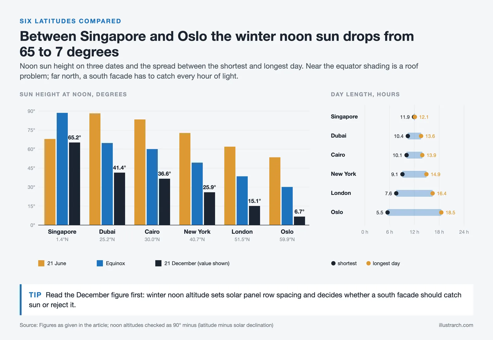
A sun path diagram is only valid for the latitude it was drawn for, and the difference between latitudes is larger than most people expect. These are noon altitudes and day lengths on the two solstices:
| Location | Noon, 21 June | Noon, equinox | Noon, 21 Dec | Longest / shortest day |
|---|---|---|---|---|
| Singapore, 1.4°N | 68.0° | 88.6° | 65.2° | 12.1 / 11.9 h |
| Dubai, 25.2°N | 88.2° | 64.8° | 41.4° | 13.6 / 10.4 h |
| Cairo, 30.0°N | 83.4° | 60.0° | 36.6° | 13.9 / 10.1 h |
| New York, 40.7°N | 72.7° | 49.3° | 25.9° | 14.9 / 9.1 h |
| London, 51.5°N | 61.9° | 38.5° | 15.1° | 16.4 / 7.6 h |
| Oslo, 59.9°N | 53.5° | 30.1° | 6.7° | 18.5 / 5.5 h |
Two things stand out. Near the equator the sun sits almost overhead at the equinox, which is why shading there is a roof problem rather than a wall problem. In Dubai it passes within two degrees of vertical in June. Move north to Oslo and midwinter noon barely lifts the sun above a two-storey building, so a south facade there is designed to catch light rather than reject it.
📌 Did You Know?
On the equinox the sun rises due east and sets due west from every point on the planet, from the equator to the Arctic Circle. Latitude changes how steeply it climbs after sunrise, never where it appears. It is the one day of the year you can set out a building’s east-west axis by watching the horizon.
How Do Architects Use a Sun Path Diagram?
The chart itself is astronomy. The value comes from what you lay over it.
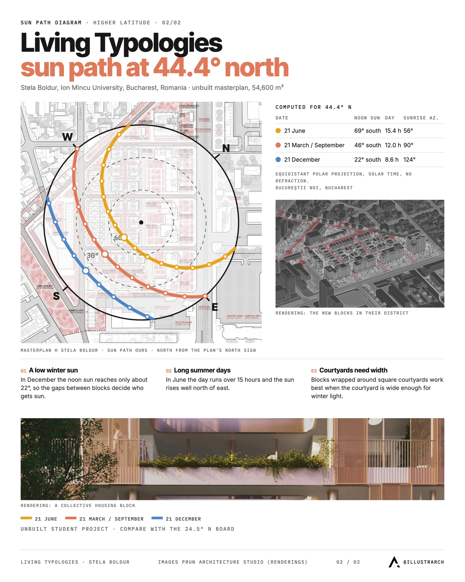
- Orientation. Knowing where the sun sits at noon on the solstices tells you which face gets the heat and which stays cold, which then drives the plan. Our guide to house orientation works through the trade-offs.
- Shading design. Altitudes at the times you want to exclude sun set the depth of an overhang or the spacing of fins.
- Overheating risk. Low late-afternoon sun on a west facade arrives at a shallow angle that horizontal shading cannot catch, which is why west glazing causes more summer discomfort than south glazing at temperate latitudes.
- Daylight and rights to light. Plotting neighbouring buildings shows exactly which hours of which months a proposal would take from its neighbours.
- Solar panels. Array tilt and row spacing both come from winter noon altitude, since that is when shadows are longest.
All of this belongs early, alongside the rest of your site analysis, while the plan can still respond to it.
How Do You Check Obstructions on a Sun Path Diagram?
This is the technique that makes the chart worth drawing. Anything around the site that blocks the sky gets sketched onto the diagram at its own bearing and angular height. Wherever a date curve runs behind that shape, the sun is blocked.
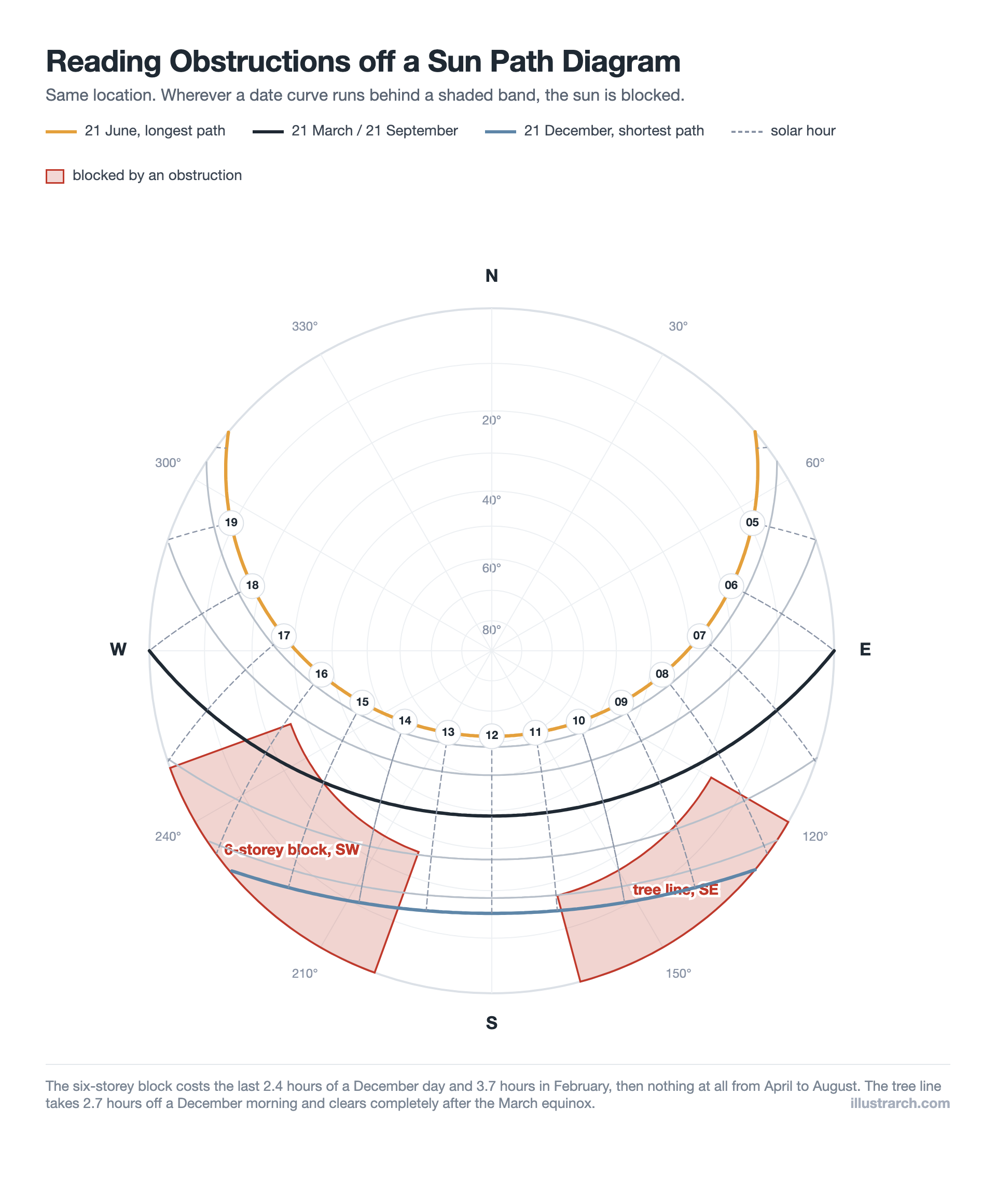
Two obstructions plotted on the same chart. The December curve passes through both, so it loses sun twice in one short day, while the June curve clears them completely.
The reading is precise enough to design with. The six-storey block to the south west sits 26° above the horizon across bearings 200° to 250°, and it takes the last 2.4 hours of a December day, 3.7 hours in February and nothing at all from April to August. The tree line to the south east costs 2.7 hours of a December morning and clears completely after the March equinox.
That February figure is the one that surprises people. The block steals more hours in February than in December, because in December the sun has already set before it would have spent as long behind the obstruction. Winter shading is not worst on the shortest day.
💡 Pro Tip
You can survey a site for this with a phone. Stand where the building will be, use a compass app for the bearing to each edge of an obstruction and a clinometer app for its angle above the horizon, then plot those pairs straight onto a blank chart. Half an hour on site gives you a shading study that no desktop model of the surroundings will match for accuracy.
Sizing an Overhang from the Diagram: A Worked Example
Take a south-facing window in London, 1.5 m tall, and suppose you want it fully shaded at midsummer noon and fully exposed in midwinter. The diagram gives you the two altitudes: 61.9° in June and 15.1° in December.

A horizontal overhang at the head of the window casts its shadow down the wall by its projection multiplied by the tangent of the solar altitude. To drop a 1.5 m shadow at 61.9° you need a projection of 1.5 divided by tan(61.9°), which is 0.80 m.
Now check that same 0.80 m overhang on the other dates. At the equinox it shades 0.64 m, leaving 0.86 m of glass in sun. At midwinter noon it shades only 0.22 m, so 1.28 m of the window is in full sun. One dimension, taken off a chart in a minute, and the window behaves differently in every season exactly as intended. This is the logic behind most passive design strategies in temperate climates, and the Whole Building Design Guide covers how it fits with glazing and thermal mass choices.
⚠️ Common Mistake to Avoid
Confusing solar time with clock time. Sun path diagrams run on solar time, where noon is the moment the sun crosses due south. Your watch runs on a time zone, adjusted for daylight saving and for how far east or west of the zone meridian you are. In London in late June, solar noon lands close to 13:00 on the clock. Design a shading device to the wrong noon and it will be an hour out all summer.
What Tools Draw Sun Path Diagrams?
You rarely need to plot one by hand any more. The NOAA solar position calculator gives altitude and azimuth for any coordinate and moment, which is enough to check any figure you read off a chart. Andrew Marsh’s 3D sun path tool is the one most students end up using, because it shows the sky dome and the chart together. Inside modelling software, Rhino with Ladybug, Revit’s solar study and SketchUp’s shadow settings all animate real sun positions once you set the location, and Autodesk Forma runs solar analysis directly on massing options.
Whichever you use, the underlying geometry is the same one described on the sun path reference: declination changing through the year, hour angle changing through the day, and latitude fixing how those two combine.
Frequently Asked Questions
It shows the sun’s altitude above the horizon and its compass direction for every hour of every day at one latitude. Curves represent dates, hour lines cross them, and the rings or axis give height, so you can find the sun for any moment of the year.
It changes with latitude, not longitude. A chart drawn for 51.5 degrees north works for London, Calgary or Kyiv, since they share a latitude. Longitude only shifts what the clock reads at solar noon, not where the sun appears.
Read the solar altitude at the date and hour you want to exclude, then size the shading device from it. For a horizontal overhang, divide the height of glass you want shaded by the tangent of that altitude to get the projection you need.
Key Takeaways
- A sun path diagram is fixed by latitude, so one chart serves every site on that parallel.
- Altitude and azimuth are the only two numbers you read off it, and they answer nearly every sunlight question.
- The polar version suits plotting obstructions on site; the rectangular version suits calculating angles.
- Obstruction shading is often worst in the shoulder months rather than at midwinter.
- The chart runs on solar time, which is not the time on your watch.
Related Guides







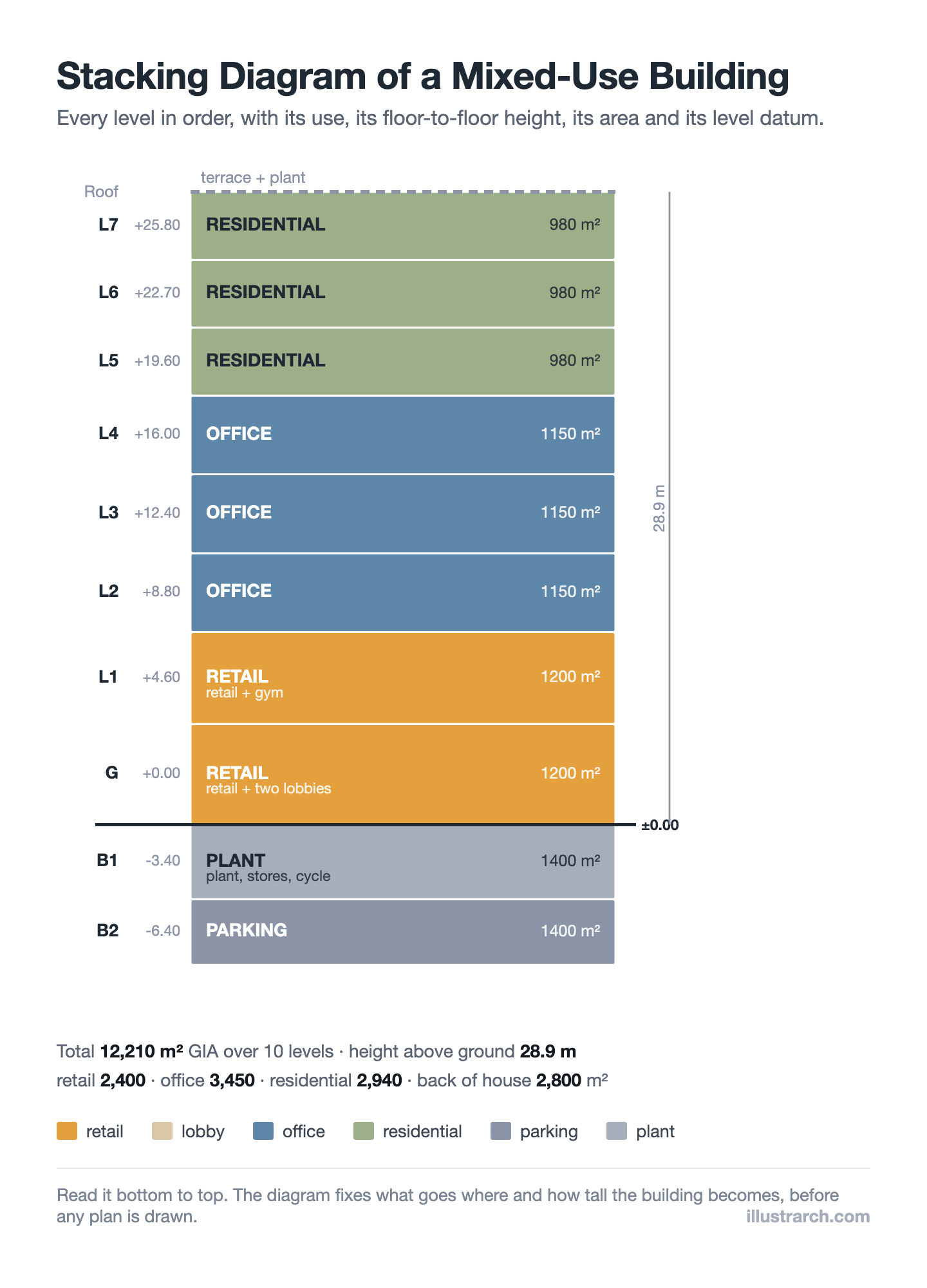
Stacking Diagram: How to Allocate Uses Floor by Floor
A stacking diagram assigns each use in a brief to a level,...
Sinan Ozen7 Mins read
Figure-Ground Diagram: How to Draw and Read Urban Fabric
A figure-ground diagram reduces a city to built mass against open space....
Sinan Ozen7 Mins read
Matrix Diagram in Architecture: How to Map Space Adjacencies
A matrix diagram, or adjacency matrix, maps how every space in a...
Sinan Ozen8 Mins read

Shopping Mall Bubble Diagram: A Step by Step Retail Planning Guide
A practical guide to the shopping mall bubble diagram: placing anchors so...
 illustrarch Editoral Team8 Mins read


Leave a comment