

Matrix Diagram in Architecture: How to Map Space Adjacencies
A matrix diagram, or adjacency matrix, maps how every space in a building should relate before you draw a plan. This guide covers what it is, how to create and read one, how it compares to a bubble diagram, and the best tools to build it.
 Sinan Ozen6 September 20268 Mins read131
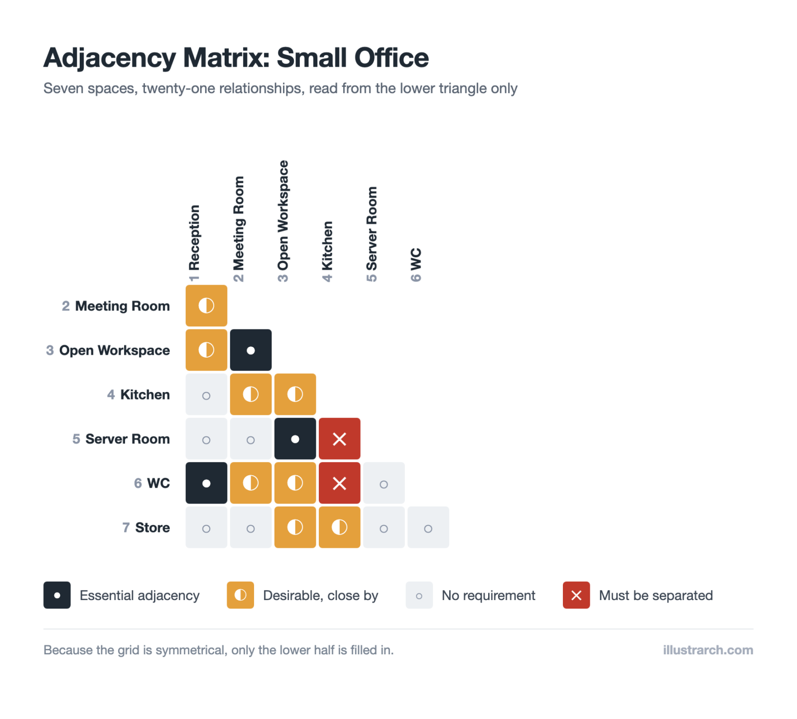
Table of Contents Show
Quick Answer: A matrix diagram, or adjacency matrix, is a grid that maps how every space in a building should relate to every other. Each row and column is a space, and each cell records whether the two belong next to each other, nearby, or apart. Architects use it during programming, before sketching a bubble diagram.
Before a single wall is drawn, architects need to decide which spaces belong together and which should stay apart. A matrix diagram turns that decision into an organized grid, giving the whole team one reference for every relationship in the building. It is one of the first programming tools a project produces, and it quietly shapes the floor plan that follows.
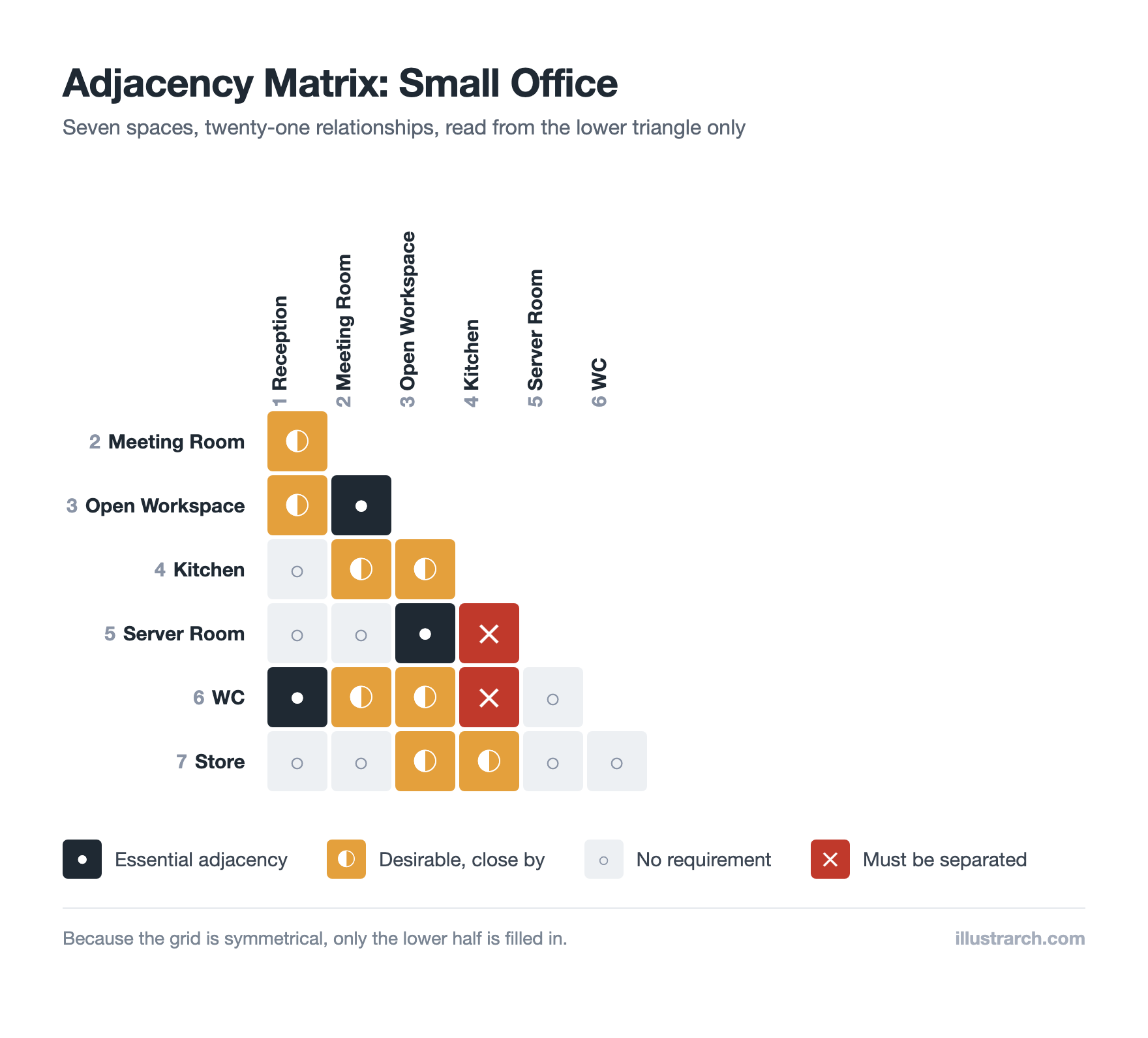
A finished adjacency matrix for a seven-space office. Every pair of spaces has one cell, and the four-level key turns the client conversation into a record anyone on the team can read.
What Is a Matrix Diagram in Architecture?
A matrix diagram is a chart that lists the same set of spaces along both its rows and its columns. Where a row and a column cross, a symbol or colour records the desired relationship between those two spaces. The idea comes from graph theory, where an adjacency matrix records connections between points, and architects borrow it to record connections between rooms.

Unlike a bubble diagram, which stays loose and visual, a matrix is systematic. Every possible pairing gets its own cell, so nothing slips through. On a project with thirty spaces, that means more than four hundred relationships are accounted for in one scannable grid. For an architect gathering requirements from a client, that completeness is what makes the tool so useful at the very start of a project.
📌 Did You Know?
The adjacency matrix is borrowed directly from graph theory in mathematics, where it records which points in a network are connected. Architects adopted the same structure to map relationships between rooms, which is why a building program and a network graph can look surprisingly similar on paper.
Why Use an Adjacency Matrix in Space Planning?
The strength of a matrix diagram is that it is both exhaustive and objective. Because every pair of spaces has its own cell, no relationship is overlooked, which matters most on large programs such as hospitals, schools and airports, where there are far too many spaces to hold in your head.
It also makes decisions easier to defend. Instead of debating a layout from memory, the team can point to an agreed grid: the operating theatre sits near sterile storage because the matrix marked that link as essential. The chart is quick to share with clients and consultants too, so everyone aligns on priorities before anyone starts drawing. That shared agreement saves hours of rework later in the design.
💡 Pro Tip
When you build the matrix with a client, fill it in during the meeting rather than afterwards. Asking “should these two be next to each other?” for each pair surfaces hidden requirements, like a service lift that must reach the kitchen, that clients rarely mention in a general brief.
Matrix Diagram vs Bubble Diagram: What Is the Difference?
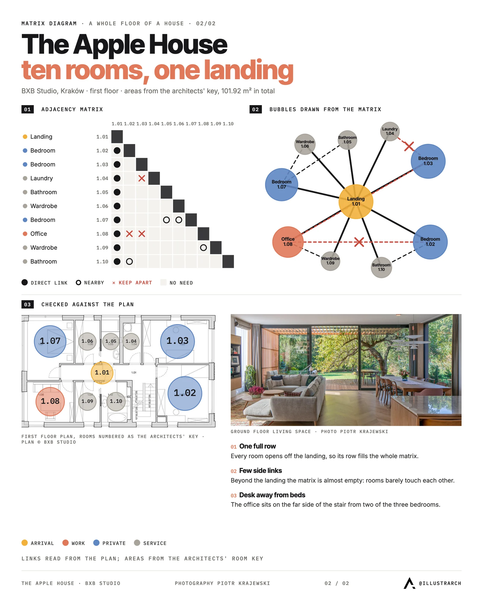
Both tools plan adjacencies, but they answer different questions. A matrix is a complete grid that records every relationship in a structured way, while a bubble diagram is a freehand sketch that shows the most important relationships in space. The matrix answers what should be near what, and the bubble diagram begins to answer where.
In practice the two work together. Architects often build the matrix first to set priorities objectively, then translate those priorities into a bubble diagram and, later, a floor plan. ArchDaily’s collection of architectural diagrams shows how often these analytical tools sit side by side in a project’s early pages.
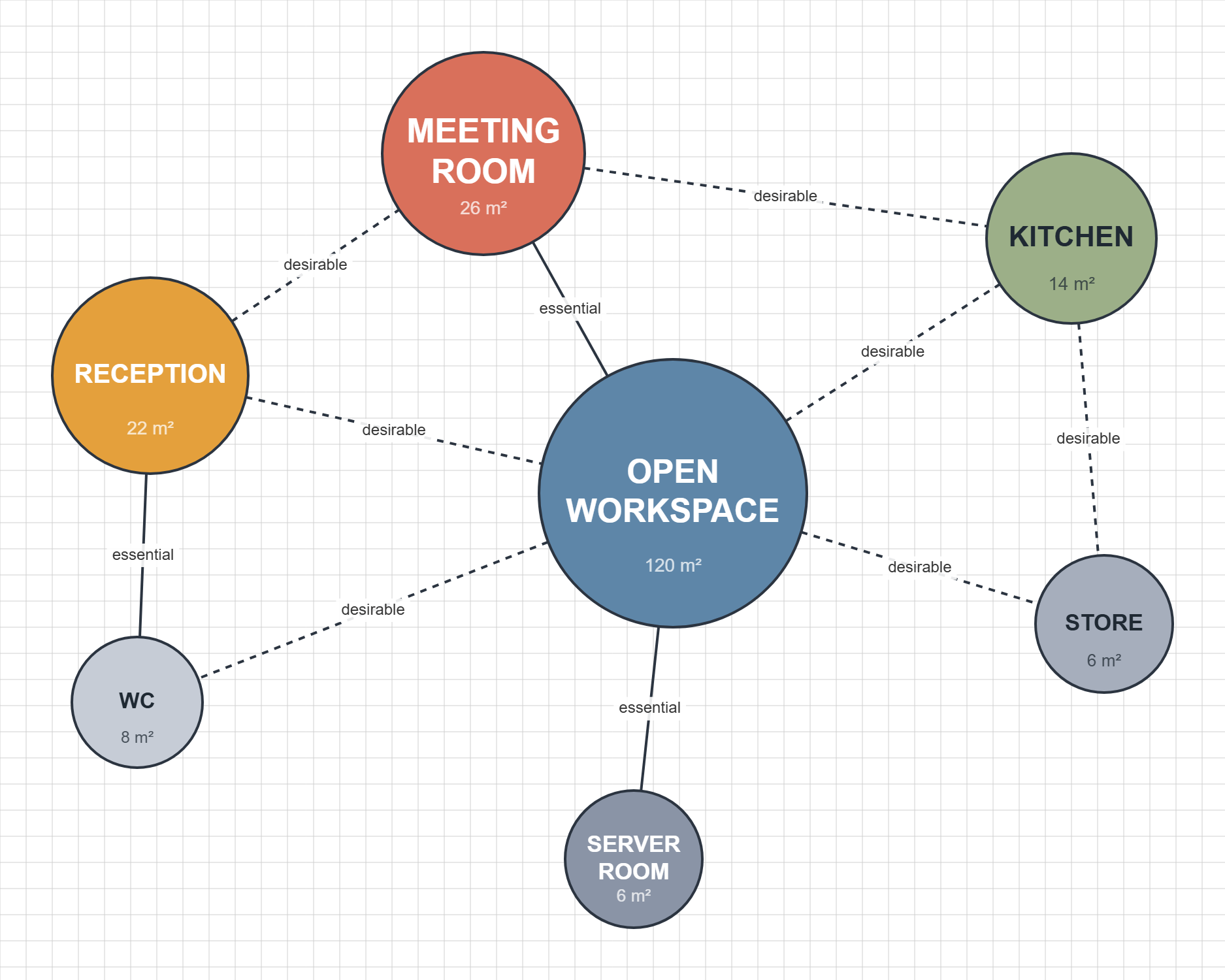
The same office, one step later. Solid lines carry the essential cells across from the matrix, dashed lines carry the desirable ones, and the separations become distance: the kitchen has no line to the server room or the WC, so it drifts to the far side of the plan.
Matrix Diagram vs Bubble Diagram at a Glance
| Aspect | Matrix Diagram | Bubble Diagram |
|---|---|---|
| Format | Structured grid or chart | Freehand sketch |
| Coverage | Every pair of spaces | Key relationships only |
| Strength | Systematic and objective | Visual and spatial |
| Best stage | Programming and requirements | Early concept layout |
| Output | A clear list of priorities | A first sense of layout |
How Do You Create a Matrix Diagram, Step by Step?
- List every space in the project, using the brief or program as your source.
- Place the same list of spaces along the top (columns) and the side (rows) of a grid.
- For each pair of spaces, decide how closely they should sit and mark the cell with your chosen symbol or colour.
- Use a small, consistent key, then add it beside the chart so anyone can read it.
- Review the finished grid with the team, adjust relationships, and use it to guide your bubble diagram and plan.
Most architects only fill in the triangular half of the grid, since the relationship between space A and space B is the same in both directions. That keeps the chart faster to build and easier to read. Our free adjacency matrix maker does exactly that, with the four levels described above and a PNG you can put straight into a report.

📐 Technical Note
Programming references usually sort relationships into three levels: mandatory adjacency (a pantry beside a kitchen), secondary adjacency (spaces that should be near but not touching), and mandatory separation (a quiet office away from a plant room). Keeping to three or four clear levels stops the matrix from becoming hard to read.
What Symbols and Colours Are Used in a Matrix Diagram?
There is no single global standard for matrix symbols, but most architects use a small, consistent set. A common approach uses filled and open circles, or a colour scale from dark to light, to show relationship strength from essential to neutral. Some teams add a separate mark, often an X or a red cell, for relationships that must be avoided. Numbers from one to four work just as well, as long as the key is clear. The exact notation matters less than consistency: pick a system, put the legend beside the grid, and use it the same way across every project so anyone can read the matrix at a glance. The two matrices on this page use four levels, and colour and symbol carry the same message twice, so the chart still reads when it is printed in black and white or seen by someone with colour vision deficiency.
How Do You Read an Adjacency Matrix?
Because the grid is symmetrical, you only need to read one triangular half. Scan for clusters of essential marks, which reveal groups of spaces that belong together, such as the public rooms near an entrance. Then look for separation marks, which flag spaces that must be kept apart, like a noisy mechanical room next to bedrooms. The key tells you what each symbol means, so a clear, consistent legend is what keeps the whole chart usable. For instance, in a clinic matrix, a tight cluster of essential marks around the nurses’ station tells you it should sit at the centre of the plan, within easy reach of the rooms it serves.
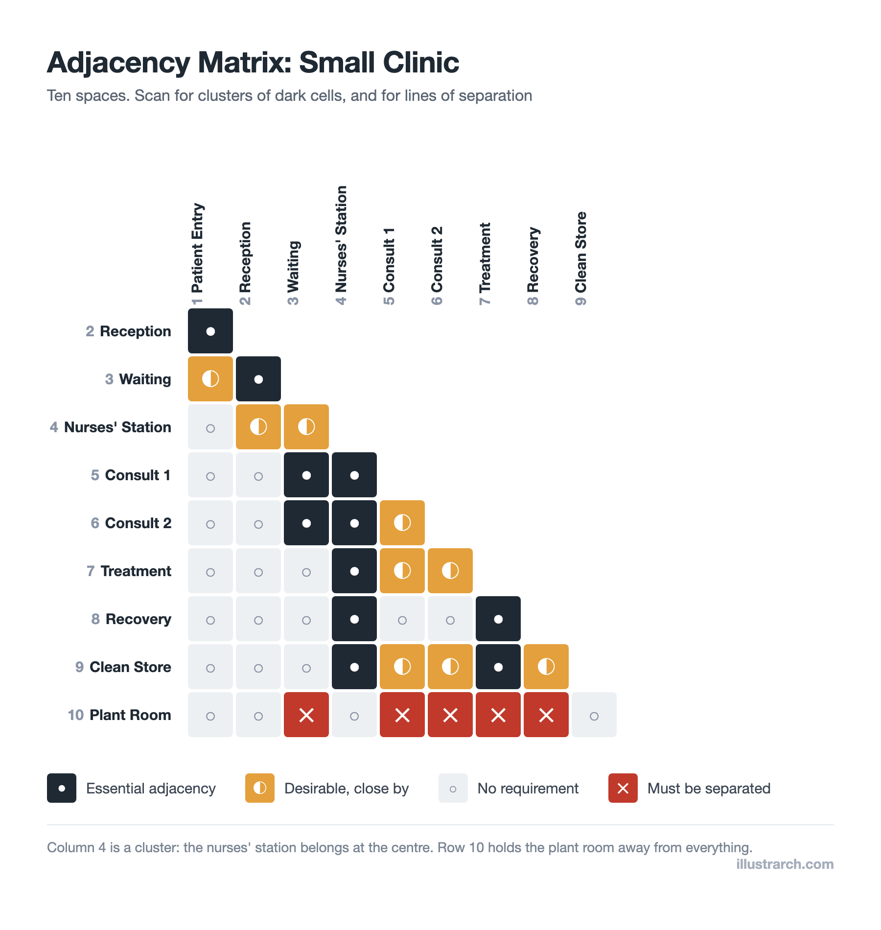
A ten-space clinic. The dark column under the nurses’ station is the cluster that tells you where it belongs, and the red row along the bottom keeps the plant room away from everything it would disturb.
A Matrix Diagram Example for a Small Office
Picture a small office with a reception, a meeting room, an open workspace, a kitchen and a server room. The matrix would mark reception and meeting room as a desirable adjacency, since visitors move between them. Open workspace and kitchen would be desirable too, giving staff an easy break area. The server room, though, would be marked for separation from the kitchen because of heat and moisture, while staying near the workspace for short cable runs. Filling in every pair this way surfaces the natural groupings, public spaces near the door and support spaces tucked away, long before any walls appear on a plan. That is exactly the grid at the top of this page: seven spaces produce twenty-one decisions, and each one is settled while it still costs nothing to change.
⚠️ Common Mistake to Avoid
Treating the matrix as a finished answer. The grid sets priorities, but it cannot account for site shape, structure or daylight on its own. Use it to inform your bubble diagram and plan, then expect some relationships to shift as those real constraints come into play.
How Does a Matrix Diagram Fit Into the Design Process?
The matrix diagram sits at the start of design, in the programming phase, right after the brief is gathered and before any form appears. Its job is to settle relationships while they are still cheap to change. Once the grid is agreed, those priorities flow into a bubble diagram, which gives the relationships a rough spatial shape, and then into a schematic plan, where real dimensions, structure and site take over. Each step adds constraint: the matrix is pure relationship, the bubble diagram adds approximate position, and the plan adds measurement. Keeping the matrix nearby through these stages gives you a fast way to check that the layout still honours the adjacencies everyone agreed on.

Where Are Matrix Diagrams Most Useful?
Matrix diagrams pay off most when a program is large or tightly regulated. In healthcare, they help separate clean and dirty routes while keeping clinical spaces close to support rooms, which is the kind of functional requirement the National Institute of Building Sciences treats as a core design objective in its guidance on functional and operational performance. In schools, they group classrooms by age and keep noisy halls away from quiet study areas. Laboratories and airports rely on them to manage strict separation and security zones. Even a single house benefits, where the matrix keeps private bedrooms apart from social living areas and service spaces near the entrance. The more relationships a project carries, the more a matrix earns its place.
What Are the Best Tools for Creating Matrix Diagrams?
You can build a matrix diagram in any spreadsheet, such as Excel or Google Sheets, using conditional formatting to colour the cells by relationship. Dedicated architecture software goes further: Vectorworks, for example, can generate an adjacency matrix directly from a space list and link it to the rest of the model. For early planning sessions, a printed grid filled in by hand is often the fastest way to think through relationships with a team. Our free adjacency matrix maker builds the grid in your browser with the four levels above, exports it as a PNG or a spreadsheet, and hands it straight to the bubble diagram maker when you are ready for the next drawing: the diagrams on this page were drawn in it, and every essential cell in the matrix becomes a solid line, every desirable cell a dashed one. If you want to compare options, our guide to the best diagram tools for architects covers programs that handle both matrices and bubble diagrams.
Frequently Asked Questions
A matrix diagram is used to plan how the spaces in a building should relate to one another. It records the desired adjacency for every pair of spaces, giving architects an objective basis for arranging a plan before they sketch a bubble diagram or lay out rooms.
An adjacency matrix is a complete grid that records every space-to-space relationship in a structured way, while a bubble diagram is a freehand sketch that shows the most important relationships visually. Architects often build the matrix first, then translate it into a bubble diagram.
Most matrices use a small, consistent set of levels such as mandatory adjacency, secondary adjacency, and mandatory separation. Each level is shown with a symbol or colour so the chart stays easy to read at a glance.
Where to Go From Here
Your Next Step: take your current project brief and list every space on a simple grid, then fill in only the essential and separate relationships first. Those two columns alone will show you the backbone of your plan, and you can refine the softer relationships from there.
Related Guides







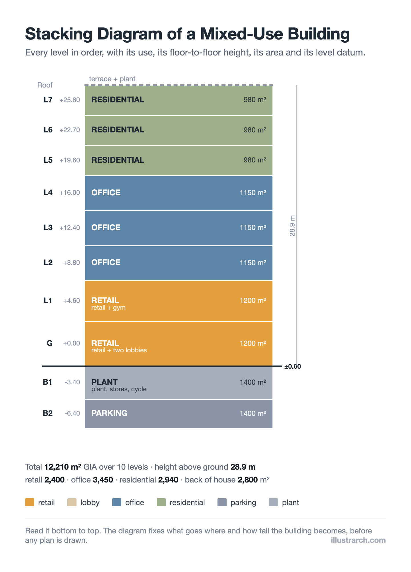
Stacking Diagram: How to Allocate Uses Floor by Floor
A stacking diagram assigns each use in a brief to a level,...
Sinan Ozen7 Mins read
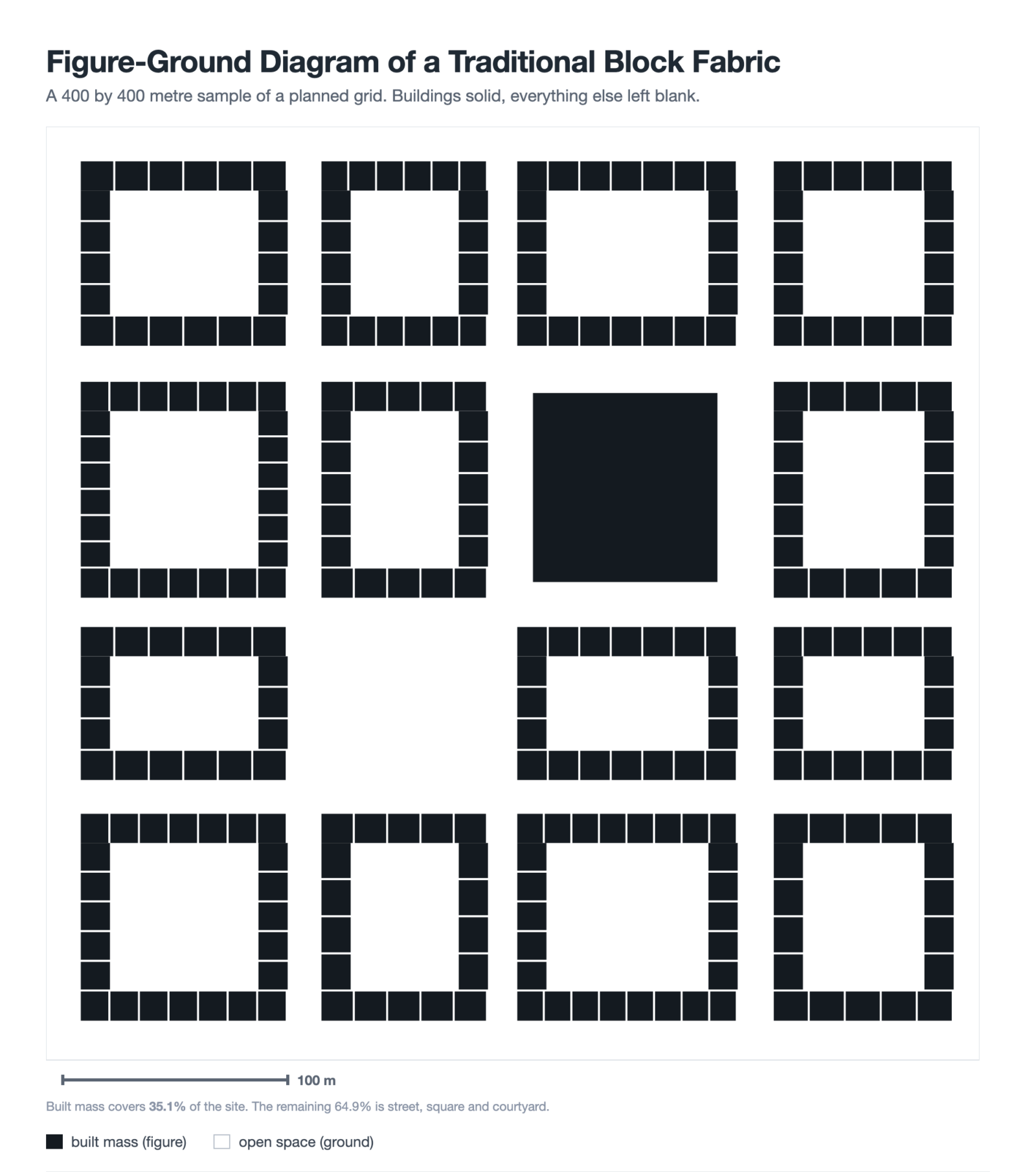
Figure-Ground Diagram: How to Draw and Read Urban Fabric
A figure-ground diagram reduces a city to built mass against open space....
Sinan Ozen7 Mins read
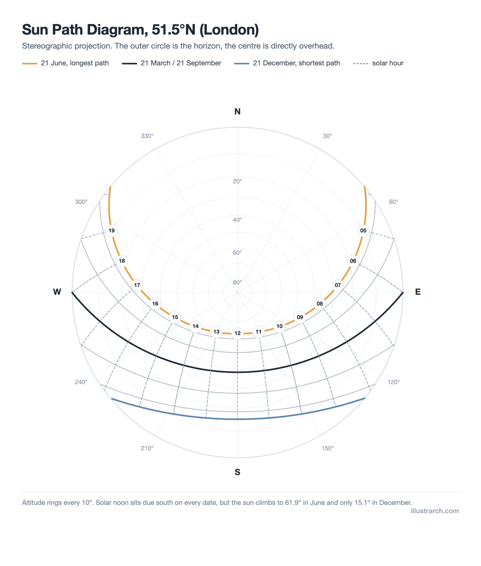
Sun Path Diagram: How to Read One and Use It in Design
A sun path diagram shows where the sun sits all year for...
Sinan Ozen8 Mins read

Shopping Mall Bubble Diagram: A Step by Step Retail Planning Guide
A practical guide to the shopping mall bubble diagram: placing anchors so...
 illustrarch Editoral Team8 Mins read


Leave a comment