

10 Adobe InDesign Tips for Presentation Boards
Ten essential tips for using Adobe InDesign effectively in creating presentation boards for architecture, focusing on layout, image quality, and text legibility.
 Furkan Sen24 June 20226 Mins read824
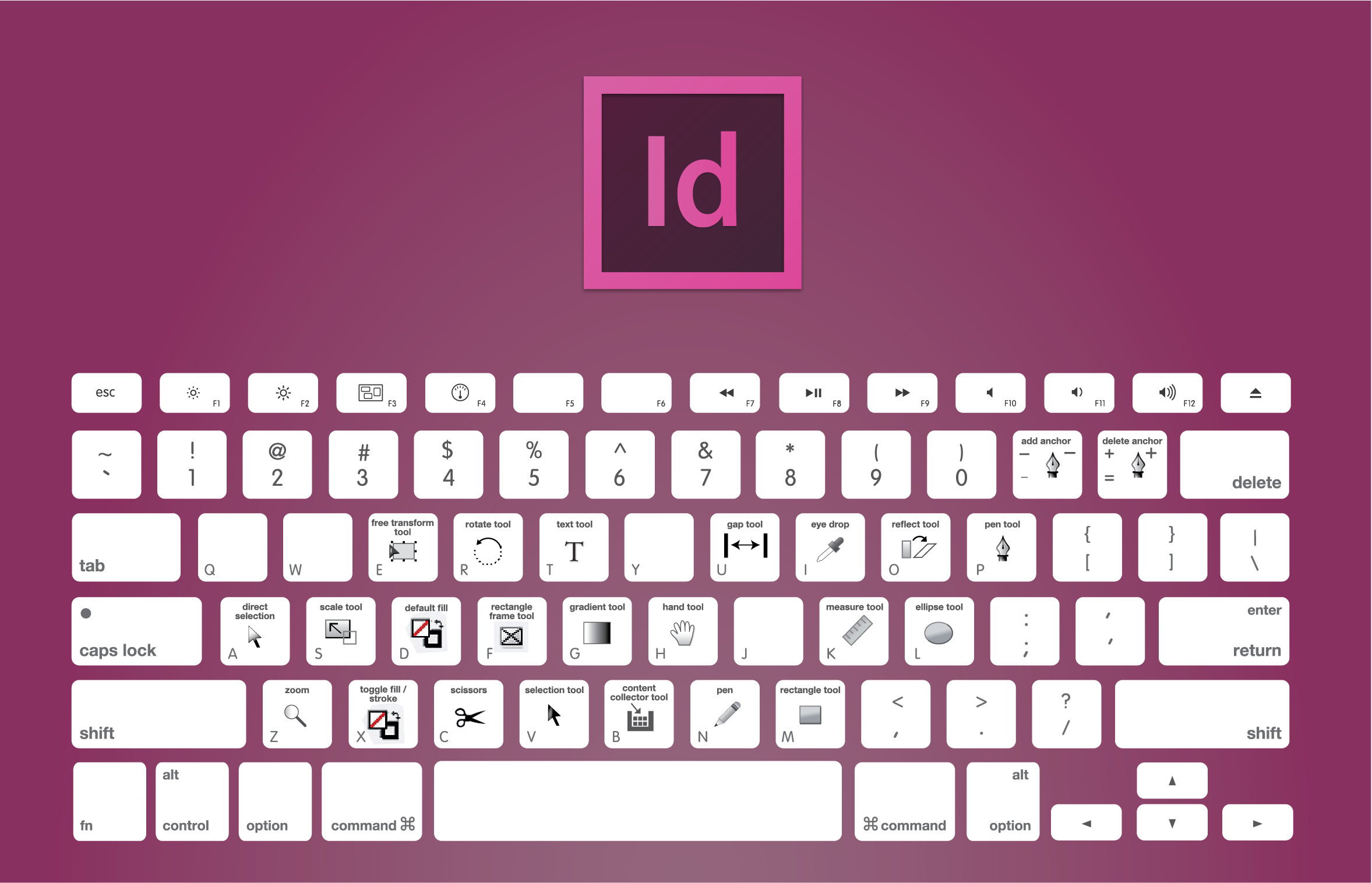
Table of Contents Show
Architects use a lot of drawings, images and diagrams to explain their ideas. InDesign gives you one place to manage all of those graphics together with the text, check the whole set of sheets at once, and export or print the final document without surprises. This guide starts with the file setup a beginner should get right on day one, then goes through ten practical Adobe InDesign tips for Presentation boards in architecture, and ends with export settings for print and screen and the ways students can get access to the software.


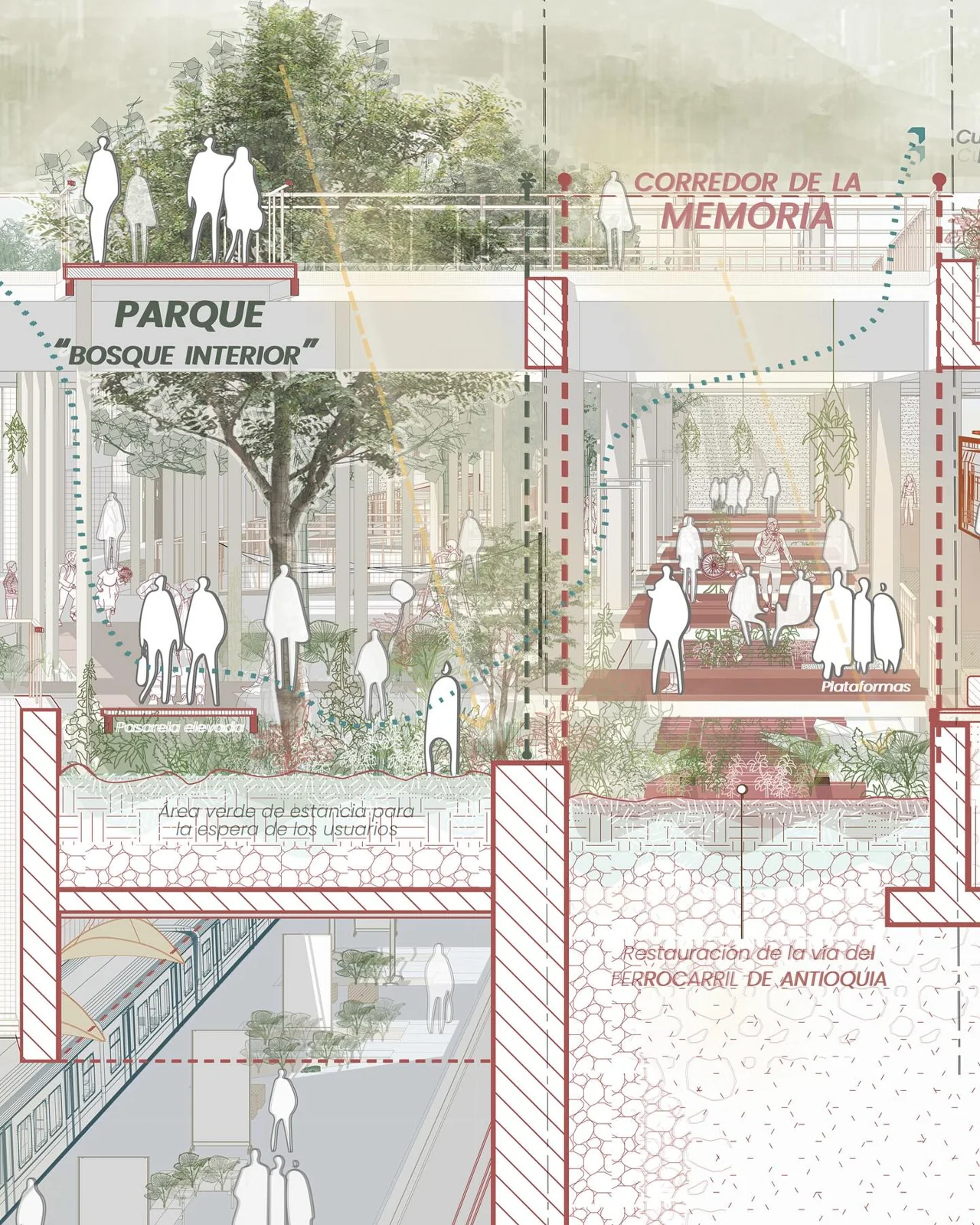
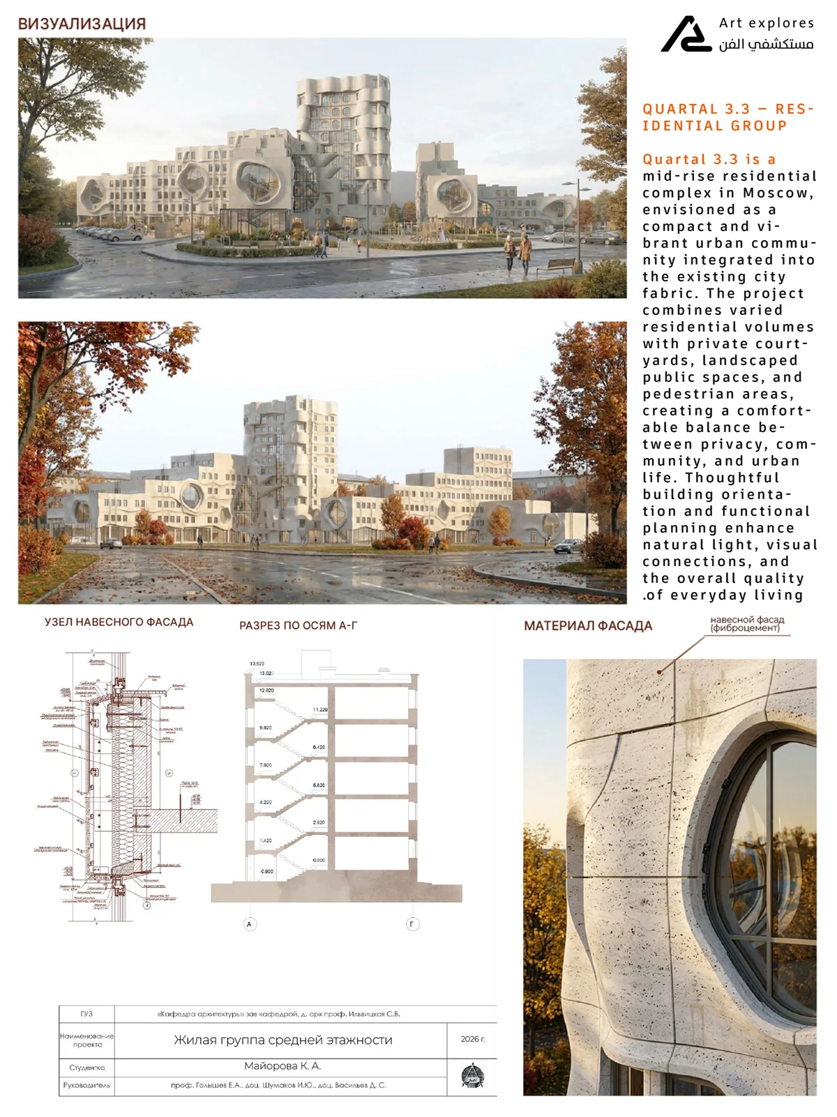
Set Up Your Board File Before You Start
Most layout problems on review day start with a rushed setup. Spend ten minutes on these points before you place a single drawing:
- Board size: use the exact sheet size your brief or printer asks for. A1 is 594 x 841 mm in the ISO A series, and US schools often ask for ARCH D (24 x 36 inches). Set the size in the New Document dialog rather than scaling a smaller file up later.
- Orientation and number of boards: decide portrait or landscape and how many boards the review needs, then create them as pages in one document so they share styles and grids.
- Margins and grid: set generous margins and a column grid so text and drawings line up across every board. A consistent grid is what makes a set of boards read as one project.
- Bleed: if any image or color runs to the edge, add bleed in the same dialog. A standard bleed is about one eighth of an inch or 3 mm, and large-format posters often get 0.25 inches on all sides, according to Wikipedia’s entry on print bleed. Ask your print shop which value it wants.
- Master pages: put the title strip, project name, student name, board number and logo on the master page once, as described in the first tip below.
- Linked images: place drawings with File > Place so they stay linked to the original Photoshop, Illustrator or PDF files. Keep all links in one project folder next to the InDesign file.
- Packaging: before you send the file to a printer or move it to another computer, use File > Package. It copies the document, the linked graphics and the fonts into one folder, so nothing goes missing on the plotter computer. Keep font licensing in mind when you share packaged fonts.
10 InDesign Tips for Presentation Boards
Make use of the master page
Often in architecture schools or offices, we are producing larger presentation boards. We update the drawings after each weekly review, so the layout has to survive many changes. Master pages let you add boards while keeping the same format on every sheet: bleed, page size, page numbers, dates and title strip. When the final presentation is ready to print, you change the format once on the master page and every board follows.

Don’t forget the bleed
Bleed is the margin of error when the document is trimmed after it is printed. Never skip it. By including a bleed in your InDesign documents you can help to make your final print product look flawless, and minimize the visibility of any trimming errors. If you’re creating a single-page document you can set a bleed all the way around the document.
But if you’re creating a document with facing pages, you don’t need to include a bleed on the inside edge.

Link multiple files
As architects and architecture students, we continuously change plans, yet we have to present them on presentation boards. InDesign saves you from rebuilding the board every time a plan changes, because Photoshop files of drawings can be linked directly into the layout. Linked plans, Photoshop files, Illustrator files and PDFs update throughout the project: edit the source file, then refresh the link in the Links panel.
Maximize the legibility of text
Type size is the most important aspect of a presentation board. An illegible presentation, however good-looking, will be off-putting to a reader. Choose font size according to the font style and the size of the presentation. The font should be read easily by a casual reader.

Check for high-quality resolution
Photographs often cause the most misery when producing print layouts. And vector graphics, on the other hand, do not get pixelated even when it is resized. But as long as the image quality is high (300 DPI or more at the printed size), there’s no reason why both bitmap and vector graphics can’t work equally well in your print layouts.
Image quality vs Image size
An additional tip for high-resolution photographs is knowing the difference between image quality and image size. Though the file size is a good indicator of quality, it is not determined by the size of the file or even the size of the image. It is determined by the DPI (Dots Per Inch) of the image, If the DPI of the image is high, so is the quality of the image and if the DPI of the image is low, then the quality of the image is low.

Render in CMYK
A combination of colored inks makes up a presentation board. There are rules for printing colors and it makes your presentation board look as same as on the computer screen. The first rule for printing color is to render the InDesign file in CMYK. Do not render in RGB. RGB is only suitable for the digital or online format.

Export to Reader’s spread
In case of presentation boards arranged sequentially, do not forget to export them to Reader’s spread. The printer’s spread is suitable for a book in which two print pages are combined into a spread. Reader’s spread is what readers read sequentially from page 1, page 2, to so on.
Pick the right printing method
Choosing the right printing method is as important as working on your presentation boards in Indesign. Once you’ve completed your InDesign work, and feel ready to go to print, you can export your design as a print-ready file. Export the file as PDF in press quality. Ensure the bleed around the sheet before print. And you can also include printer marks for crop or trim and page information.
Use keyboard shortcuts
Using shortcuts is the most important time-saver tip of any software, and it becomes a crucial need in a program like Adobe Indesign with so many tools. Remember shortcuts and use them very often. Here are some of the keyboard shortcuts for Indesign.
PDF Export Presets: Print vs Screen
InDesign ships with PDF presets, and picking the wrong one is a common reason for a blurry print or a file too large to upload. A Graduate School USA guide to optimizing InDesign PDFs recommends Press Quality for print-ready files and Smallest File Size for review copies, and notes that most presets do not add bleed or printer marks automatically.
| Use | Export as | Preset | Bleed and marks |
|---|---|---|---|
| Plotting final boards | Adobe PDF (Print) | Press Quality, or PDF/X-1a if the print shop asks for it | Turn on Use Document Bleed Settings; add crop marks if requested |
| Uploading to a review portal or emailing a tutor | Adobe PDF (Print) | Smallest File Size (images are downsampled, often to around 100 PPI) | Leave bleed and marks off |
| Boards designed as pairs or spreads | Adobe PDF (Print) with the Spreads option on | Press Quality for print, Smallest File Size for screen | As for the matching row above |
Save your own preset once the settings work, for example “Press Quality + Bleed”, so you do not have to tick the same boxes the night before every review. If your boards will also go into a portfolio, our guide to software for creating an architecture portfolio compares the main layout tools.
How Students Can Get Adobe InDesign
InDesign is sold by subscription. Adobe offers a Creative Cloud Pro plan for students and teachers that includes InDesign; according to Adobe’s student page, buyers must be at least 13 years old and currently enrolled at an accredited school, college, university or qualified online program. The discounted price changes after the first year, so check Adobe’s student page for the current figure before you subscribe.
Before paying, ask your school whether InDesign is already installed in the computer labs or licensed for student laptops; many students only need it for a few weeks around each review. If a subscription does not fit your budget, our list of InDesign alternatives for architects covers tools that handle portfolios and boards, and our overview of the best software in architecture school shows where layout fits among the other programs you will learn.
Architecture Students Hub
This guide is part of Drawing and Presentation, stage 3 of our student roadmap from the first diagram to the first internship. Next stage: Software, Rendering and Gear, or browse every free tool and guide in the Architecture Students Hub.


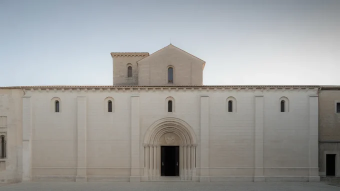



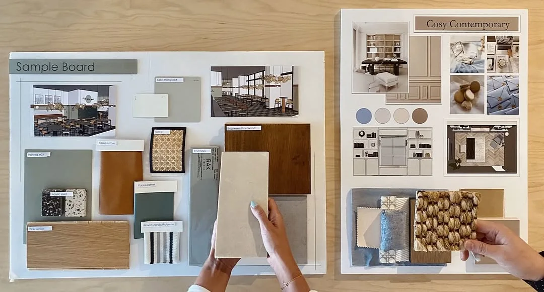
Interior Design Presentation Boards: 8 Layout Examples and What to Include
Eight real interior design presentation boards, from a KMITL wellness centre in...
 illustrarch Editorial Team15 Mins read
How to Optimise Architectural Videos for Better Design Presentations and Online Sharing
Walkthroughs and animations help architects explain a design, but large files are...
illustrarch Editorial Team5 Mins read

Why Captions Belong in Every Architecture and Design Video
Most people watch design reels with the sound off. Captions make architecture...
illustrarch Editorial Team4 Mins read

Architecture Crit Presentation: How to Present Your Project With Confidence
The crit is where a good project can fall apart and an...
 Sinan Ozen6 Mins read






Leave a comment