

Architecture Portfolio Layout: Designing Pages with Grid and Typography
A focused look at architecture portfolio layout, from setting up a column grid and choosing margins to pairing typefaces and building a readable type hierarchy that holds your project pages together across print and digital formats.
 Elif Ayse Sen8 July 20268 Mins read412
Table of Contents Show
A strong architecture portfolio layout depends on two quiet systems working together: a grid that aligns every image, caption, and block of text, and a type hierarchy that moves the reader through each project. Get both right and your drawings, diagrams, and renders read as one confident document instead of a stack of unrelated pages.
Most students obsess over which projects to include and forget that presentation carries half the weight. A reviewer spends seconds on a first spread, and a messy grid or clashing fonts reads as careless design before they look at a single plan. This guide breaks down the grid and typography decisions that shape a clean architecture portfolio, with specific numbers you can apply in your next document.
What Makes a Portfolio Page Layout Work?

A portfolio page layout works when alignment, spacing, and type are consistent enough to disappear, letting the work take focus. The reader should never notice the grid; they should only feel that the pages are calm and easy to follow. Consistency across spreads signals design control, which is exactly the skill a portfolio is meant to prove.
Three things separate a polished page from a busy one. First, every element sits on a shared grid, so images and text share the same left and right edges. Second, white space is treated as a material, not as empty filler to crowd. Third, the type sizes follow a fixed scale, so a project title on page 4 matches the one on page 20. If you want a wider view of what reviewers expect before you start, this guide to building a strong architecture portfolio sets the groundwork.
Start With the Grid, Not the Images

The grid is the skeleton under every page, a set of invisible columns and rows that decide where things can sit. Designers reach for grids because they remove guesswork: instead of nudging an image by eye on each page, you snap it to a column and move on. The same logic that organizes a newspaper or a gallery wall organizes a portfolio spread.
Choosing a Column Count
For an A3 landscape portfolio, a 12-column grid gives you the most flexibility, since 12 divides cleanly into halves, thirds, quarters, and sixths. That lets one project run full bleed across all 12 columns while the next breaks into a 4-8 split for a drawing beside a short text block. A 6-column grid is simpler and works well for image-heavy layouts with fewer captions. Start with one system and hold it across the whole document.
Margins, Gutters, and the Baseline
Margins protect your content from the page edge and from a binding that eats the inner edge. On an A3 spread, an outer margin around 15 to 20 mm and a slightly larger inner margin near the gutter keeps text from vanishing into the fold. Gutters, the gaps between columns, usually sit between 4 and 6 mm so images never touch. A baseline grid, the horizontal ruling that text sits on, locks your captions to a shared rhythm so body text lines up across columns. For deeper background on why these horizontal rules matter, the team at InVision explains spacing, grids, and layouts in clear terms.
📐 Technical Note
Standard portfolio page sizes follow ISO 216: A3 measures 297 by 420 mm and A4 measures 210 by 297 mm. US offices often expect 11 by 17 inch (tabloid) or letter size instead. Set your document size and bleed (typically 3 mm) before you build the grid, because changing page dimensions later shifts every margin and column you placed.
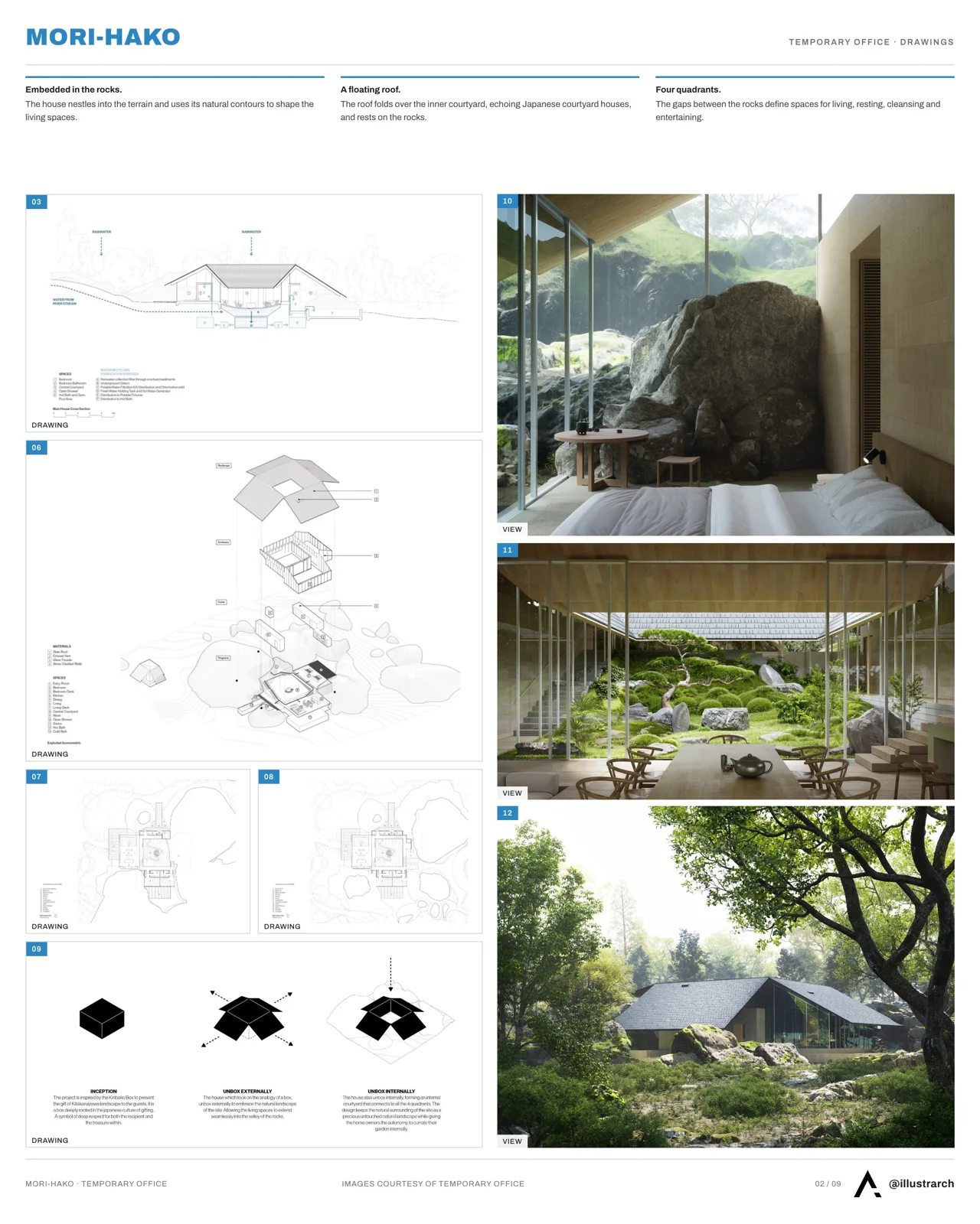
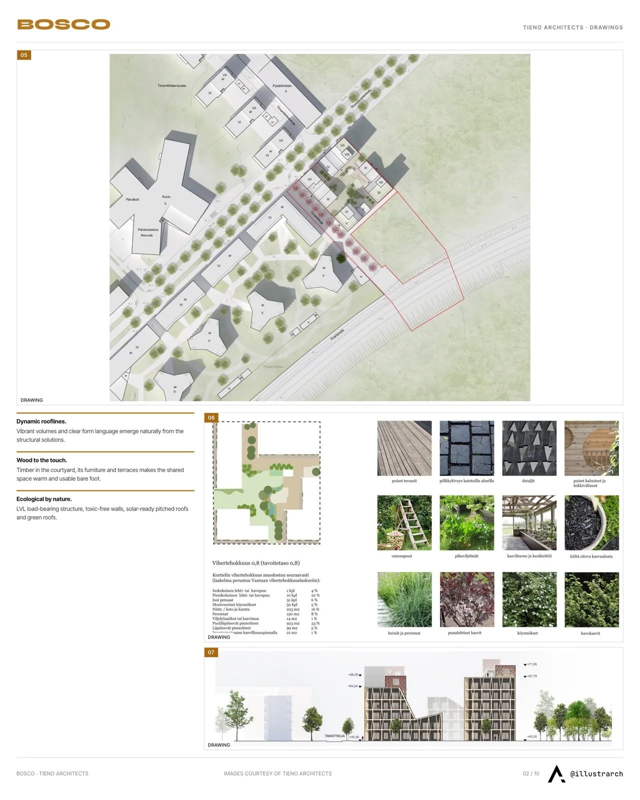
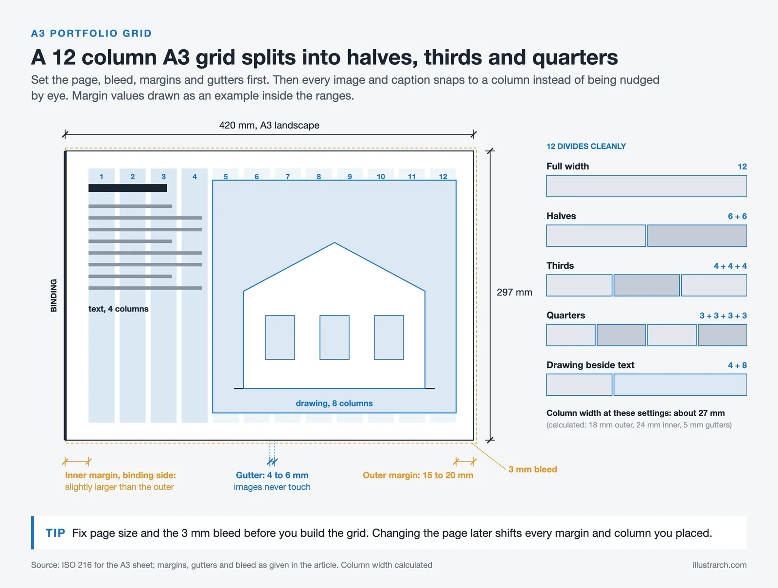
Once the grid is set as a master page, you apply it to every spread at once, and new pages inherit the same structure automatically. That single setup step is what keeps a 30-page document visually consistent. If you are still deciding on dimensions and orientation, this breakdown of architecture portfolio size and format covers the trade-offs.
Typography for Architecture Portfolios

Typography in a portfolio does two jobs: it has to be readable at small sizes, and it has to stay out of the way of your drawings. Architecture work is already visually dense, so the type needs to feel quiet and ordered. The fonts you choose, and the way you size them, shape how professional the whole document looks.
How Many Typefaces Should You Use?
One or two typefaces is the right answer for almost every architecture portfolio layout. A single clean sans-serif handling everything, from project titles to captions, reads as disciplined and modern. If you want contrast, pair one sans-serif for headings with a second for body text, but keep the families limited so the document feels coherent. You can browse and test free options through Google Fonts Knowledge, which also explains how typefaces behave at different sizes.
💡 Pro Tip
Avoid the typeface that ships as your software default and avoid anything decorative. A reviewer who sees the same neutral grotesk on hundreds of portfolios will not penalize you, but a quirky display font in your body text reads as a beginner choice. Pick one neutral family early and define paragraph styles so you never set type by hand again.
Building a Clear Type Hierarchy
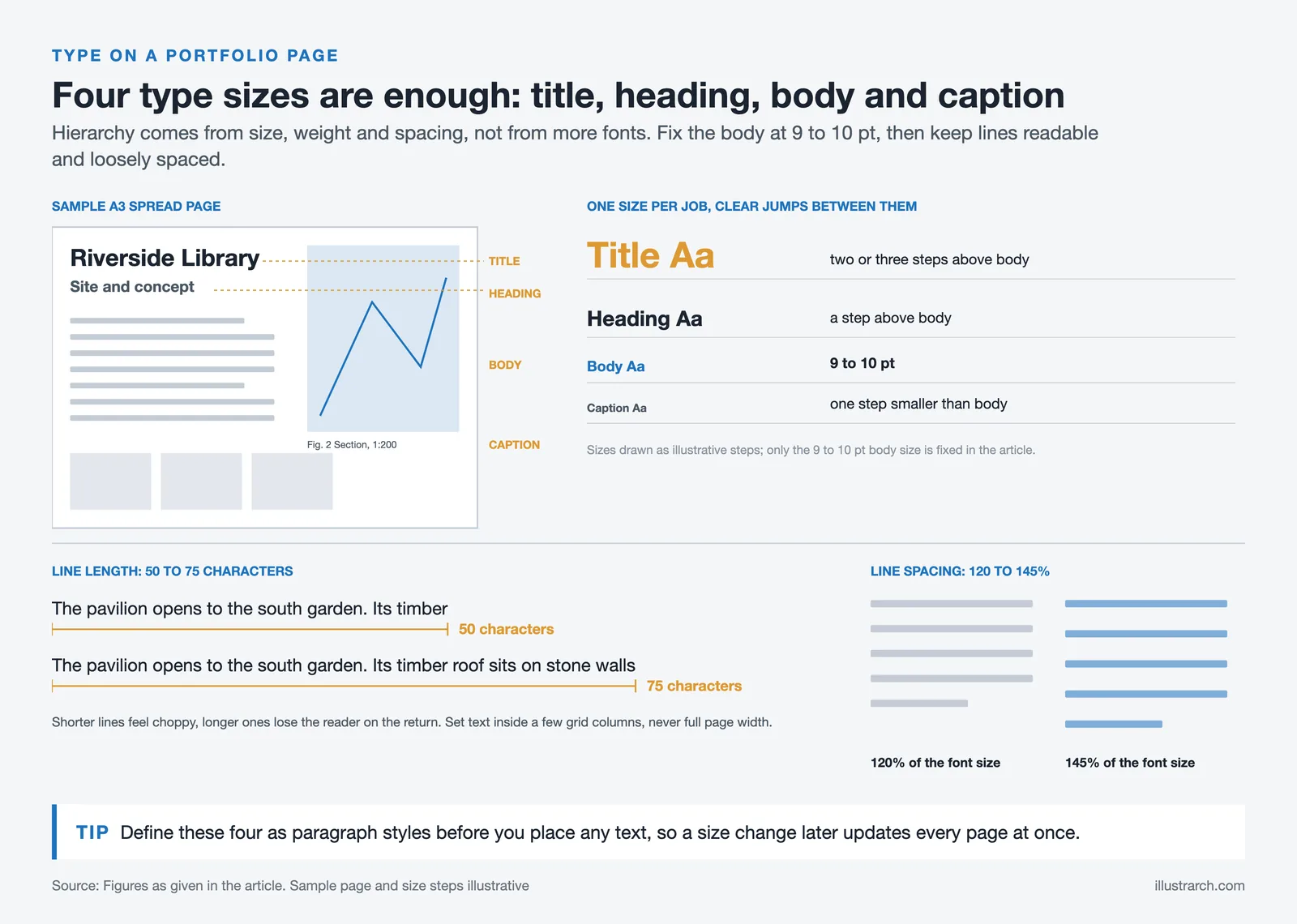
Hierarchy is the order that tells a reader what to look at first. You build it with size, weight, and spacing, not with five different fonts. A practical scale uses one size for project titles, one for section headings, one for body text, and one for captions, with enough jump between each that the difference is obvious. A common starting point is 9 to 10 point body text with captions a step smaller and titles two or three steps larger.
Keep line length comfortable. Text that runs the full width of an A3 page is exhausting to read, so set your text inside a few columns to land near 50 to 75 characters per line. Generous line spacing, often 120 to 145 percent of the font size, keeps captions from feeling cramped against your images. The academic reading on typography from MIT course 6.813 goes deeper on legibility and spacing if you want the reasoning behind these numbers.
Putting the Pieces Together on a Page

With a grid and a type system in place, each project page becomes a matter of arrangement rather than invention. Decide how many spreads a project deserves, lead with your strongest image, and let supporting drawings and diagrams fall into the columns around it. The first architecture portfolio examples worth studying tend to repeat a small set of page templates rather than reinventing the layout every spread.
Portfolio Layout Elements at a Glance
The table below summarizes the core layout decisions and the reason each one matters on the page.
| Layout element | Recommendation | Why it matters |
|---|---|---|
| Grid columns | 12 columns on A3, 6 for image-heavy spreads | Divides cleanly so images and text share edges |
| Outer margin | 15 to 20 mm, larger near the gutter | Keeps content off the edge and out of the fold |
| Typefaces | One or two neutral families | Reads as coherent and lets the work stand out |
| Body text size | 9 to 10 pt, captions one step smaller | Stays readable without crowding the images |
| Line length | 50 to 75 characters per line | Comfortable reading rhythm for short text blocks |
| White space | Protect generous empty areas on every page | Gives drawings room and signals design control |
💡 Pro Tip
Build two or three reusable page templates and repeat them across projects: a full-bleed hero image, a two-column drawing-plus-text page, and a grid of smaller process images. Repetition across spreads is what makes a portfolio feel designed. Reviewers want to read variety in your projects, not variety in your page formats.
Hold the same caption position, the same title placement, and the same image alignment from one project to the next. When the structure repeats, the reader stops decoding the layout and starts reading the architecture. The way you order and write those captions matters too, and this piece on writing architecture portfolio text pairs well with the visual side.
Print and Digital Portfolio Layout

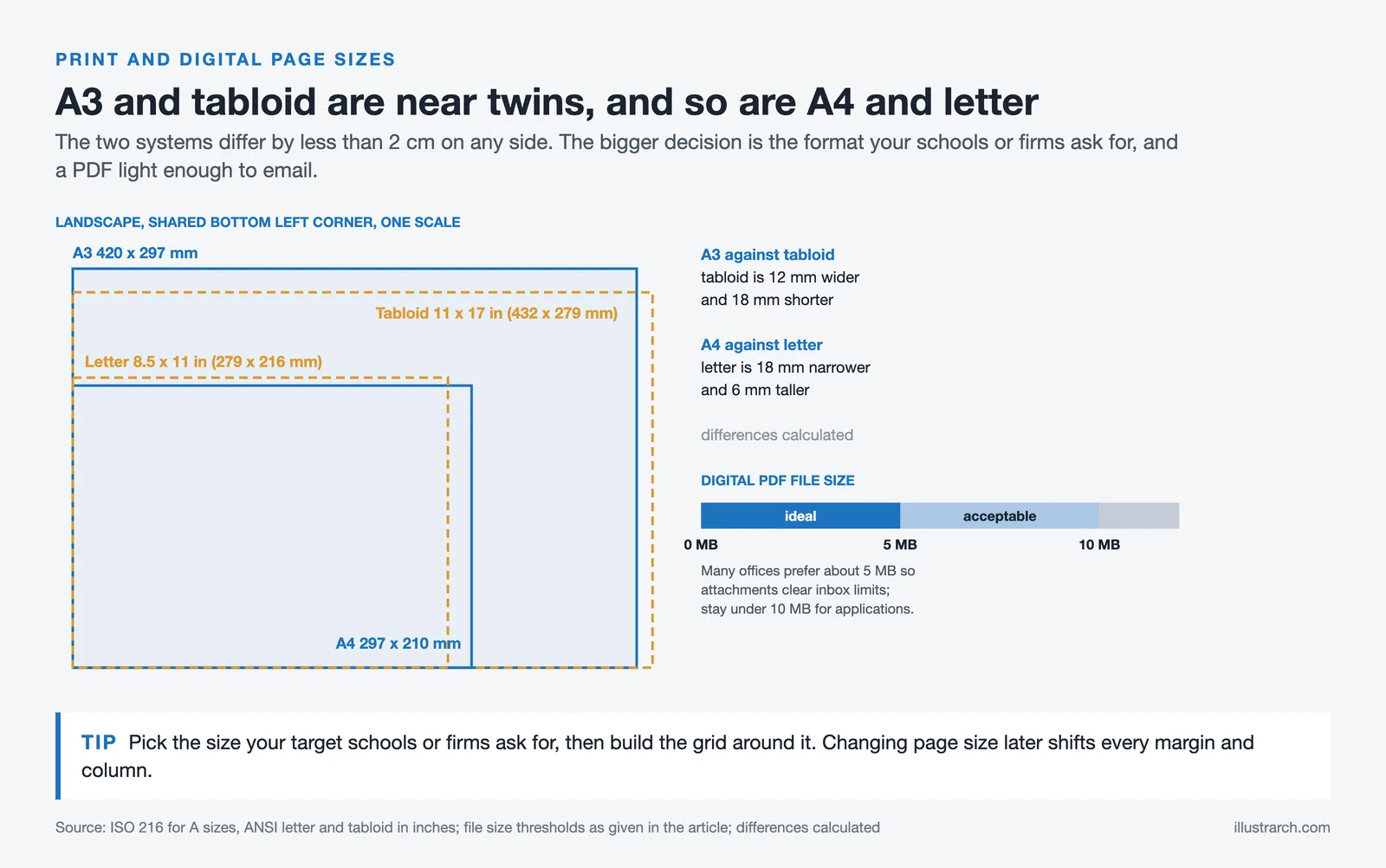
The same grid serves both a printed booklet and a screen PDF, but the details shift. Print needs bleed, generous inner margins for binding, and a color profile suited to paper, while a digital file needs landscape pages that fit a laptop screen and a file size small enough to email. A digital PDF for applications usually performs best under 10 MB, and many offices prefer files closer to 5 MB so attachments clear inbox limits.
Reading habits differ as well. A printed portfolio is held and flipped at the reader’s pace, so dense spreads can work. A screen portfolio is often skimmed quickly, so a strong opening image on each project earns its place. If you are weighing tools and output formats, this overview of portfolio presentation tools and the longer set of portfolio tips compare your options.
Setting Up Your Layout in InDesign

Adobe InDesign remains the standard for multi-page portfolio work because it gives precise control over grids, paragraph styles, and image placement across dozens of pages. Begin by setting the document size and bleed, then define your column grid and baseline grid on a master page. Create paragraph styles for titles, headings, body, and captions before you place a single image, so every text block stays consistent. Smashing Magazine has a clear walk-through on building better designs with layout grids that translates directly to print pages.
⚠️ Common Mistake to Avoid
Many students place every caption and title by hand instead of using paragraph styles, then spend hours fixing inconsistent sizes before a deadline. Define styles once and apply them everywhere. When you decide a caption should be a half point larger, you change it in one place and the whole document updates, instead of editing fifty text boxes by hand.
This setup discipline pays off most for students assembling a first document. Working from a clean grid and a fixed type scale turns a stressful assembly into a repeatable process, which the broader story of the architecture student portfolio shows clearly as work moves from paper to screen.
Where to Go From Here

Your Next Step: Open a fresh document, set your page size and bleed, and build a single master page with a 12-column grid and four paragraph styles before you import any images. Once that frame is in place, drop your strongest project onto it first and let the grid show you how the rest of the pages want to fall.
Frequently Asked Questions
What is the best page size for an architecture portfolio layout?
A3 landscape (420 by 297 mm) is the most common choice because it gives wide spreads for drawings, while A4 suits a portable, easy-to-email format. US offices often expect 11 by 17 inch or letter size. Pick the size your target schools or firms ask for, then build the grid around it.
How many fonts should a portfolio use?
One or two typefaces is plenty. A single neutral sans-serif can handle titles, body text, and captions if you vary size and weight for hierarchy. Add a second family only when you want clear contrast between headings and body text, and keep both families consistent across every page.
What grid should I use for portfolio pages?
A 12-column grid offers the most flexibility on an A3 spread because it divides into halves, thirds, and quarters, letting images and text share the same edges. A 6-column grid is simpler for image-led layouts. Set the grid on a master page so every spread inherits it automatically.
How do I keep my portfolio looking consistent?
Consistency comes from reusing structure. Set a master grid, define paragraph styles for each text level, and build two or three repeatable page templates. Hold caption positions, title placement, and image alignment steady from one project to the next so the reader focuses on the work rather than the layout.
- Architectural Portfolio
- architectural portfolio sample
- architectural portfolio templates
- architectural portfolios
- architecture portfolio
- Architecture Portfolio Design
- architecture portfolio examples
- architecture portfolio layout
- architecture portfolio template
- architecture portfolio website
- Architecture Student Portfolio








Concept Diagram Architecture: Hand-Rendered vs Digital Diagrams in a Portfolio
Hand-rendered and digital diagrams send different signals to portfolio reviewers. This piece...
 Furkan Sen5 Mins read
Hand-Rendered vs Digital Diagrams: What Works Better in a Portfolio?
A practical breakdown of hand-rendered and digital diagrams in architecture portfolios, covering...
 Sinan Ozen6 Mins read
How to Present Your Work in an Architecture Portfolio Interview
Reaching the interview means your work earned a closer look, but presenting...
Furkan Sen7 Mins read

Best Presentation Tools for Architecture Portfolios: A Practical Guide
A breakdown of the top presentation tools used by architects and architecture...
Sinan Ozen8 Mins read


Leave a comment