

Hand-Rendered vs Digital Diagrams: What Works Better in a Portfolio?
A practical breakdown of hand-rendered and digital diagrams in architecture portfolios, covering how reviewers read each style on screen, which types suit pen and paper, which need vector precision, and how to combine both under one visual system.
 Sinan Ozen21 July 20266 Mins read222
Table of Contents Show
Hand-rendered vs digital diagrams is not a style contest, it is a legibility contest. Hand-drawn diagrams read as thinking in progress and suit concept, site, and parti work. Digital diagrams read as resolved and suit circulation, program, and systems. Strong portfolios usually carry both, held together by one visual language.
Every studio has the argument. One tutor says a hand-drawn parti proves you can think. Another says it looks like you skipped the software week. The decision gets made somewhere else, in the few seconds a reviewer spends on your spread.
The medium is not what gets judged. Clarity is. A shaky graphite section that explains a courtyard in one glance beats a flawless vector axonometric that explains nothing. What follows is where each method earns its place, and how to run both in one document without the pages falling apart.

What Reviewers Actually Look for in Architecture Portfolio Diagrams
Reviewers are not grading your pen. They are looking for proof that you can take a messy problem and reduce it to something readable. The Harvard Graduate School of Design describes the purpose of a portfolio as showing creativity, design aptitude, and the ability to think and design in three dimensions, and it accepts freehand drawing and painting as evidence of that aptitude from applicants with no architecture training.
A diagram earns its page when it answers one question fast: how the building works, where the idea came from, how people move through it. Anything that needs a paragraph of explanation underneath has already failed.
Three things get read in the first pass:
- Hierarchy: does the eye land on the main move first, or on decoration?
- Legibility at small size: does it survive a laptop screen rather than a printed A3 sheet?
- Consistency: do the diagrams across five projects look like one designer made them?
If you are still choosing which diagrams belong in the document at all, this breakdown of architectural diagram types and examples is a good starting point, and the wider guide to building a strong architecture portfolio covers what sits around them.

Hand-Rendered Diagrams: What Drawing by Hand Still Does Best
Hand-rendered diagrams carry something vector work rarely does: visible evidence of a decision being made. A line that thickens where the pen pressed harder, a corrected arc, a note in the margin. All of it says a person was thinking, not just executing. For concept, parti, and early site analysis, that reads as process rather than packaging.
Speed is the second argument. You can put down twenty rough options in the time one clean digital version takes to build, and portfolios that show that range land better than portfolios that only show outcomes. Concept sketches sit in a different category from finished technical drawings, and this overview of architectural drawing types sets out the distinction.
🏗️ Real-World Example
Chapel of St. Ignatius (Seattle, 1997): Steven Holl developed the governing idea, seven bottles of light in a stone box, through watercolor studies made before any technical drawing existed. The concept is still explained through those paintings on the practice’s own project page, and the chapel later won the AIA Twenty-five Year Award. Hand work was not a warm-up here, it was the argument.
Hand rendering has hard limits. It does not scale, it does not revise cleanly, and it exposes weak drafting in public. A wobbly circulation diagram does not read as expressive. It reads as careless, and nobody gives you the benefit of the doubt.
Digital Diagrams: Where Software Pulls Ahead
Digital diagrams in an architecture portfolio win on control. Line weights hold across thirty pages, a program color stays identical from the site plan to the exploded axonometric, and one change updates everywhere. Reviewers register that consistency as design discipline even when they never name it.
Revision is the larger advantage. A vector diagram can be recut, recolored, and exported at print resolution for a booklet or screen resolution for a PDF without redrawing a line. BIG built an entire monograph, Yes Is More, on the argument that a run of small, simple diagrams carries a reader through a design story faster than one dense image can.
The failure mode is the mirror image of hand work. Digital diagrams slide into looking generic. Default swatches, the same exploded isometric everyone posts, flat icons with no point of view: clean and forgettable. If the process needs tightening, this step-by-step guide to creating architecture diagrams covers the sequence from purpose to final graphic.

Hand-Rendered vs Digital Diagrams Compared
The choice comes down to what a specific diagram has to do on a specific page. Format shapes that as much as taste, since a drawing that reads on an A3 print can collapse on a laptop, and this guide to architecture portfolio size and format covers those constraints.
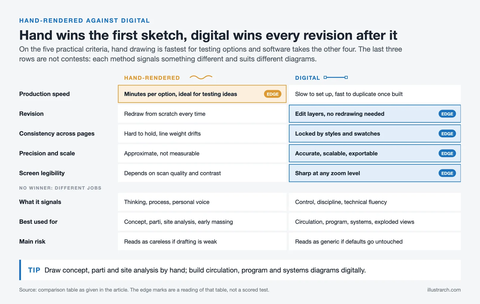
Comparison Table: Hand-Rendered vs Digital Diagrams
The table below sets the two methods against the criteria that decide whether a page works.
| Criterion | Hand-Rendered | Digital |
|---|---|---|
| Production speed | Minutes per option, ideal for testing ideas | Slow to set up, fast to duplicate once built |
| Revision | Redraw from scratch every time | Edit layers, no redrawing needed |
| Consistency across pages | Hard to hold, line weight drifts | Locked by styles and swatches |
| Precision and scale | Approximate, not measurable | Accurate, scalable, exportable |
| Screen legibility | Depends on scan quality and contrast | Sharp at any zoom level |
| What it signals | Thinking, process, personal voice | Control, discipline, technical fluency |
| Best used for | Concept, parti, site analysis, early massing | Circulation, program, systems, exploded views |
| Main risk | Reads as careless if drafting is weak | Reads as generic if defaults go untouched |
What Is the Best Diagram Style for an Architecture Portfolio?
There is no single best diagram style for an architecture portfolio. The working answer is a hybrid: hand work where thinking is shown, digital work where systems are explained, one visual system holding both. That is what most practices do anyway, sketching on trace and finishing in Illustrator or Rhino.
The hybrid is not a compromise, it is a signal. It tells a reviewer you know which tool answers which question, a more useful skill than being excellent with only one. Software sits directly on that seam now: an iPad app such as Morpholio Trace lets you draw by hand over a scaled plan and export to CAD, as covered in this Morpholio Trace review.
⚖️ Pros & Cons at a Glance
✔️ Pros of the hybrid: shows range without padding the page count, mirrors how practices actually work, lets each diagram use the method that suits it
✖️ Cons of the hybrid: harder to keep consistent, doubles the style decisions, falls apart if the two visual languages are never reconciled
The hybrid fails in one way: when the hand pages and the digital pages look like two different people made them. Everything below prevents that.
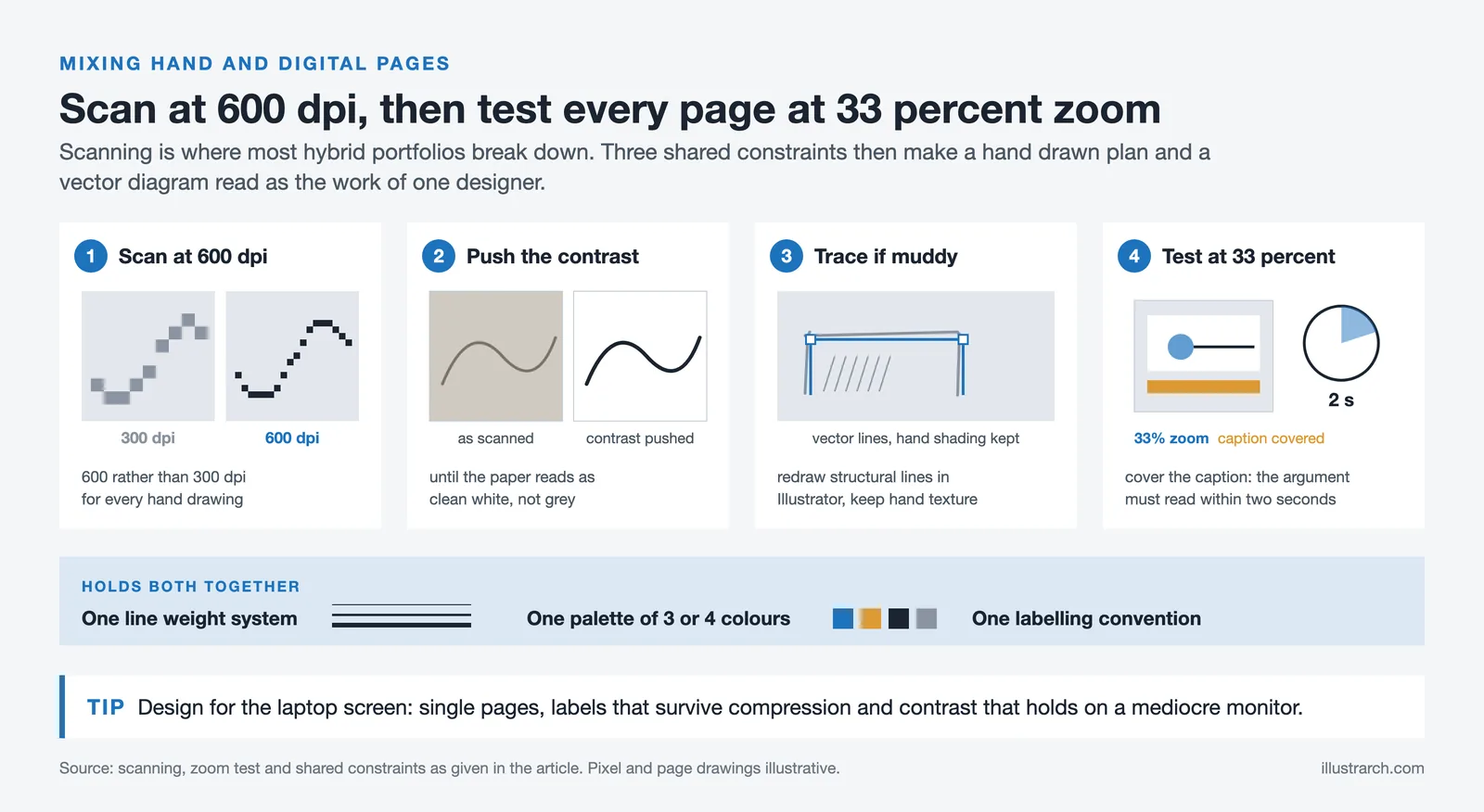
How to Mix Hand-Drawn and Digital Presentation Without Losing Consistency
Consistency comes from constraints, not from talent. Choose one line weight system, one palette of three or four colors, and one labelling convention, then apply them to every diagram regardless of how it was made. Once a hand-drawn site plan and a vector circulation diagram share a palette and a caption style, the eye stops noticing the change in medium.
Scanning is where most hybrid portfolios break down. Scan hand work at 600 dpi rather than 300, then push the contrast until the paper reads as clean white instead of grey. If a drawing still looks muddy, trace the structural lines in Illustrator and keep the hand-drawn texture only where it works, such as shading or annotation.
Screen review decides the rest. Harvard GSD tells applicants that faculty read portfolios on laptop screens and rarely open them as spreads, because fine detail becomes hard to read, and it advises putting side-by-side content on one page instead, as set out in the school’s application FAQ. Design for that: single pages, labels that survive compression, contrast that holds on a mediocre monitor.
💡 Pro Tip
Before you export the PDF, view every diagram page at 33 percent zoom and cover the caption with your hand. If you cannot tell what the diagram is arguing within two seconds, the diagram is the problem, not the viewer. Reviewers work at that distance, and this one test catches more failures than any restyling.
Page structure carries the rest. A fixed column grid and a stable type hierarchy pull mixed media into one document, which this portfolio layout guide covers in detail, and the strongest architecture portfolio examples are the ones that apply that structure most stubbornly.
What This Means for Your Next Project
Your Next Step: Take the three diagrams you are proudest of, print them at postcard size, and hand them to someone outside architecture. If they cannot tell you what each one shows within ten seconds, redraw it before you touch anything else.









Concept Diagram Architecture: Hand-Rendered vs Digital Diagrams in a Portfolio
Hand-rendered and digital diagrams send different signals to portfolio reviewers. This piece...
 Furkan Sen5 Mins read
Architecture Portfolio Layout: Designing Pages with Grid and Typography
A focused look at architecture portfolio layout, from setting up a column...
 Elif Ayse Sen8 Mins read
How to Present Your Work in an Architecture Portfolio Interview
Reaching the interview means your work earned a closer look, but presenting...
Furkan Sen7 Mins read

Best Presentation Tools for Architecture Portfolios: A Practical Guide
A breakdown of the top presentation tools used by architects and architecture...
Sinan Ozen8 Mins read


Leave a comment