

Free Online Parti Diagram Maker for Architecture
Everything this parti diagram maker does, free, no account, nothing to install
- Solid and void: masses, voids, circles and free shapes, filled solid, hatched, cross hatched, dotted or drawn as an outline.
- Order and movement: axes, entry and movement arrows that can bend and curve, edges, focal points and structural grids.
- Thirteen parti templates: courtyard, spine, cluster, grid, radial, two bars and a gap, box in a box, served and servant, axial, object in a field, L-shape, a three step sequence and a blank board.
- Four styles for the whole sheet: poche, line drawing, soft colour and blueprint.
- Concept steps: up to four steps exported next to each other on one sheet, each with its own name, and one legend underneath.
- PNG, SVG, PDF and JSON export, plus a share link that opens a copy of your diagram.
- Nothing is uploaded. The diagram lives in your browser and keeps itself there between visits.
Parti diagrams in brief
A parti is the one idea a building is organised around, drawn so plainly that it reads in a second: a solid block with a court cut out of it, two bars with a gap between them, a row of rooms hung on a spine. The word comes from the French prendre parti, to take a position, and from the teaching of the École des Beaux-Arts, where a student was expected to commit to one organising decision before drawing anything in detail. The parti is that decision. For the background and a set of built examples, read what a parti diagram is in architecture and interior design.
Because it is a reduction, a parti diagram leaves almost everything out. There are no doors, no wall thicknesses, no furniture and usually no dimensions. What remains is figure and ground (what is built and what is open), a direction (how you arrive and move through) and an order (an axis, a grid, a centre). If a diagram needs a paragraph of explanation, it is not yet a parti. This tool is built around that discipline: a small set of marks, a board with a grid, and a legend that only lists the kinds of marks you actually used.
How to use this parti diagram maker
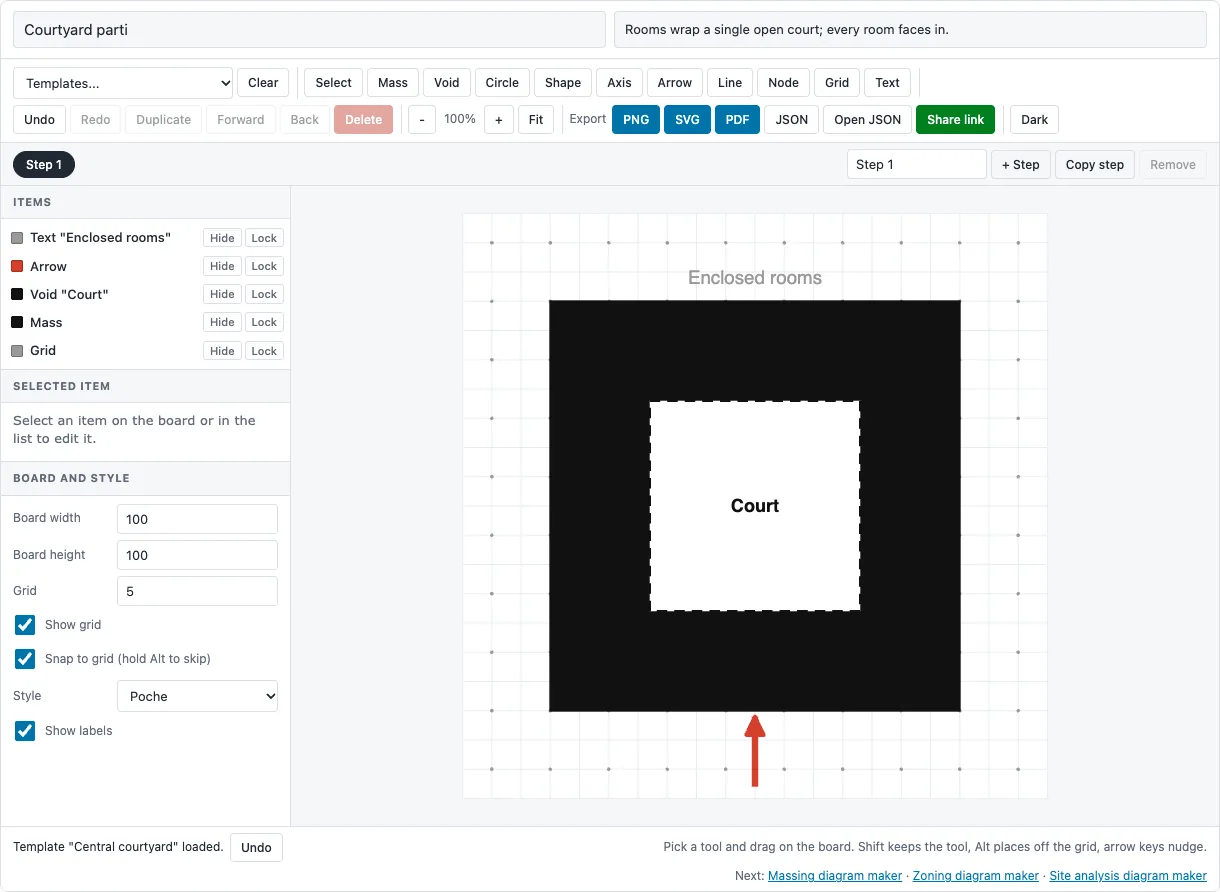
Start from a template if one is close to your idea, or from the blank board if it is not. Every template is an ordinary drawing: move, resize, delete or restyle any part of it.
- Block the mass. Pick Mass and drag on the board. Hold Shift for a square. Drag a corner handle to resize, and the round handle above the shape to rotate in 15 degree steps (hold Alt for free rotation).
- Cut the void. Pick Void and drag over the mass. A void is drawn in the paper colour with a dashed edge, so it reads as space carved out of the solid. Use Shape for L, T or irregular figures: click each corner, then click the first corner or the last one again to finish.
- Give it an order. Add an Axis through the scheme, a Grid under it, or a Node at the point everything turns towards.
- Show the way in. Draw an Arrow from the street to the entrance. Drag the small dot halfway along it to add a bend, and tick Smooth curve for a flowing route.
- Name only what matters. Labels sit on the shape they belong to. Two or three words are plenty; switch Show labels off for a wordless parti.
- Export. PNG for slides, SVG to keep refining in Illustrator or Inkscape, PDF for a sheet, JSON to come back later.
The list on the left holds every item on the board, top to bottom. Hide an item to compare versions without deleting it, lock it so a stray drag cannot move it, and use Forward and Back to change what sits on top. Undo and redo cover every change, the arrow keys nudge the selected item by one grid step, and the drawing is saved in your browser as you work.
The marks of a parti, and what each one says
Each tool is one kind of statement. The legend on the exported sheet lists only the kinds you used, so a drawing with three marks gets a three line key.
| Mark | What it says | Typical use |
|---|---|---|
| Mass | Built volume | Solid black for the main building, hatch or dots for a second kind of built space |
| Void | Open space defined by the mass | Courtyard, light well, atrium, gap between buildings |
| Circle | A centred volume or space | Rotunda, core, round court, hub |
| Axis | A line the composition is measured from | Symmetry, a view line, a ceremonial route |
| Arrow | Movement | Main approach, entry, a route through the scheme |
| Line | An edge that matters | Street line, boundary, a long retaining wall |
| Node | A focal point | The stair everything turns around, an altar, a tree in the court |
| Grid | A structural or planning field | Column grid, planting field, a frame the rooms are carved from |
Colour works in three roles. Main is the strongest reading, soft is for secondary parts and context, and accent marks the one thing the parti is about, usually the route or the focal point. Pick Custom colour on any item to pin it to a colour of your own; when two marks of the same kind use different roles, the legend names the role next to each.
Poche, line, colour or blueprint
The style switch under Board and style changes the whole sheet at once. Poche fills masses in solid black on white, the classic figure-ground reading and the clearest at small sizes. Line drawing turns solid masses into hatching, which suits a parti that sits next to plans and sections in a presentation. Soft colour uses a muted blue and orange on warm paper for boards and portfolios. Blueprint draws white on blue, which reads well projected in a dark room and sets a concept sheet apart from the technical drawings around it.
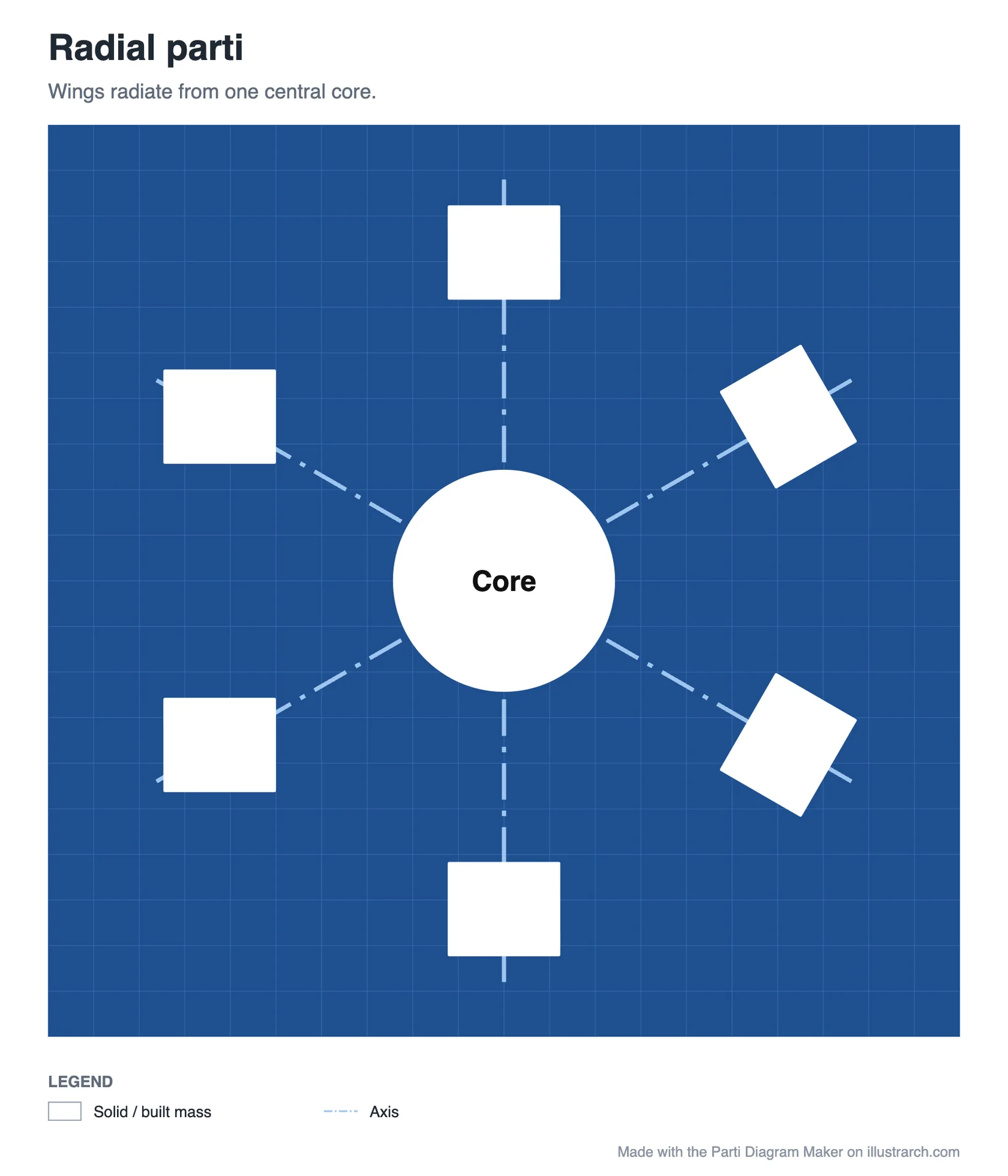
Choose the style for where the diagram will be seen, not for how it looks on screen. A poche parti survives being printed at thumbnail size in a portfolio grid; a blueprint parti does not photocopy well. Because the style is a setting rather than a property of each shape, you can export the same diagram in two styles in a few seconds.
From one diagram to a sequence
A parti is often easier to understand as a short story than as one image: start with the whole volume, carve the court, then thread the route. Add a step with + Step, or copy the current one with Copy step and change only what moves on. Rename steps in the box next to the tabs. When there is more than one step, the export places every step next to the others on one sheet, each with its name above it, and a single legend underneath.
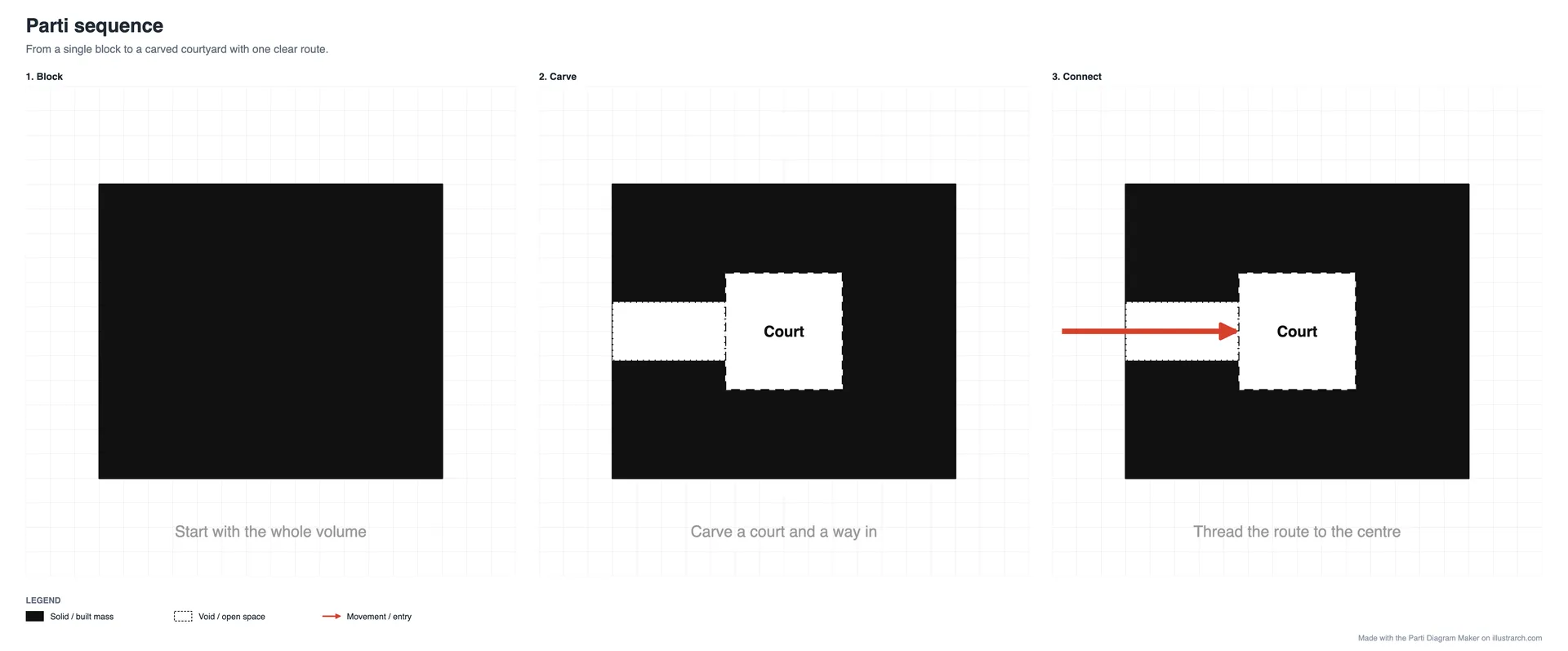
Keep the board the same size for every step and change as little as possible between them. A sequence reads because the eye compares neighbouring frames; if the mass moves as well as the court, the reader cannot tell which change is the point. Three or four steps are the limit for one sheet. If the story needs more, it is probably two partis.
Eleven partis worth knowing
The templates are starting points drawn from organising ideas that recur across building types and periods. Each one below is an export from the tool, so what you see is what you get when you open the template.
Central courtyard
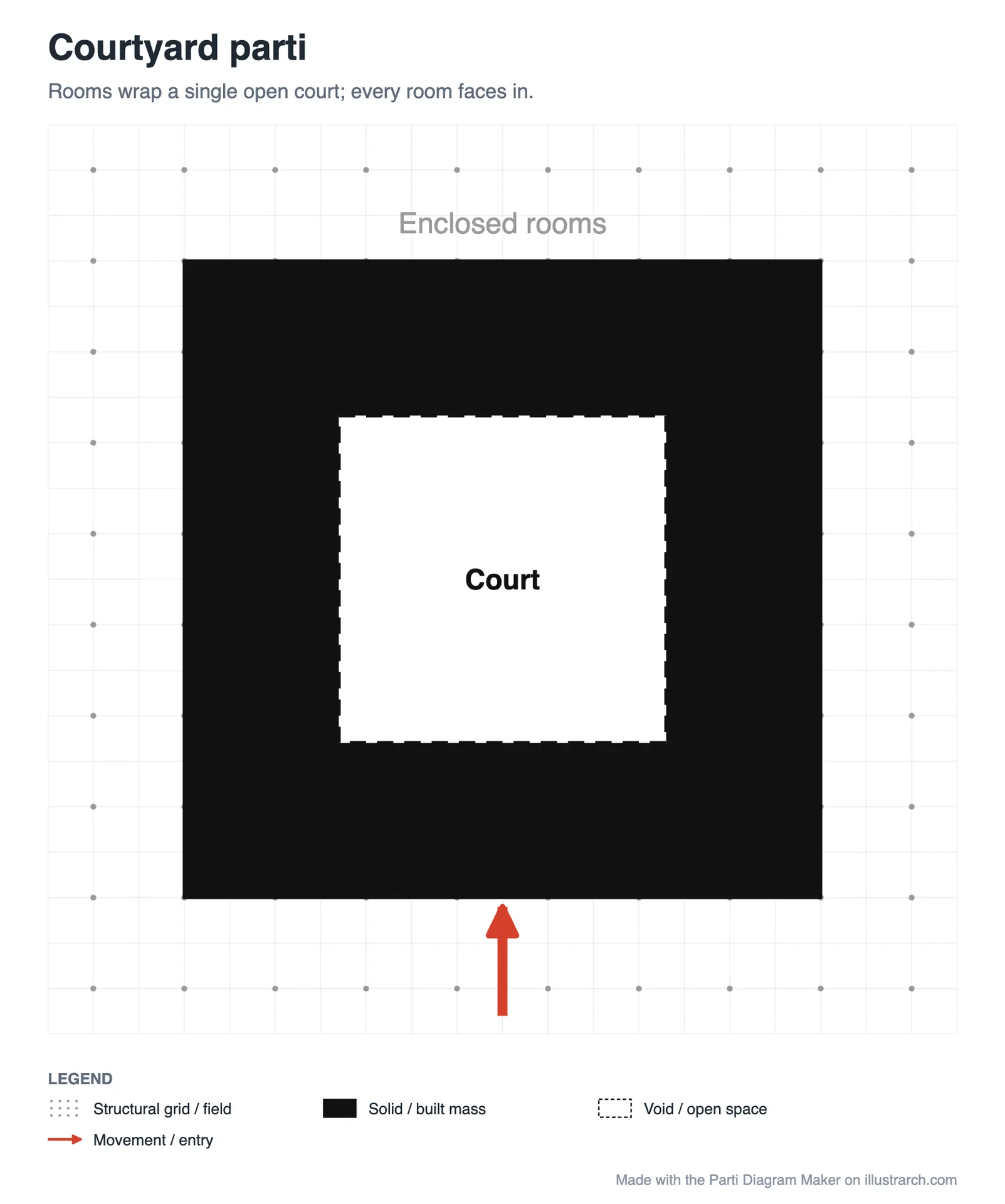
Rooms wrap a single open court and look into it. The court gives every room light and a protected outlook, and the outer walls can stay closed to a noisy or hot street. The parti works from a single house to a college quadrangle; what changes is the depth of the ring and the number of ways into the court. Draw it with one large mass and one void on top of it, then decide where the entrance cuts through the ring.
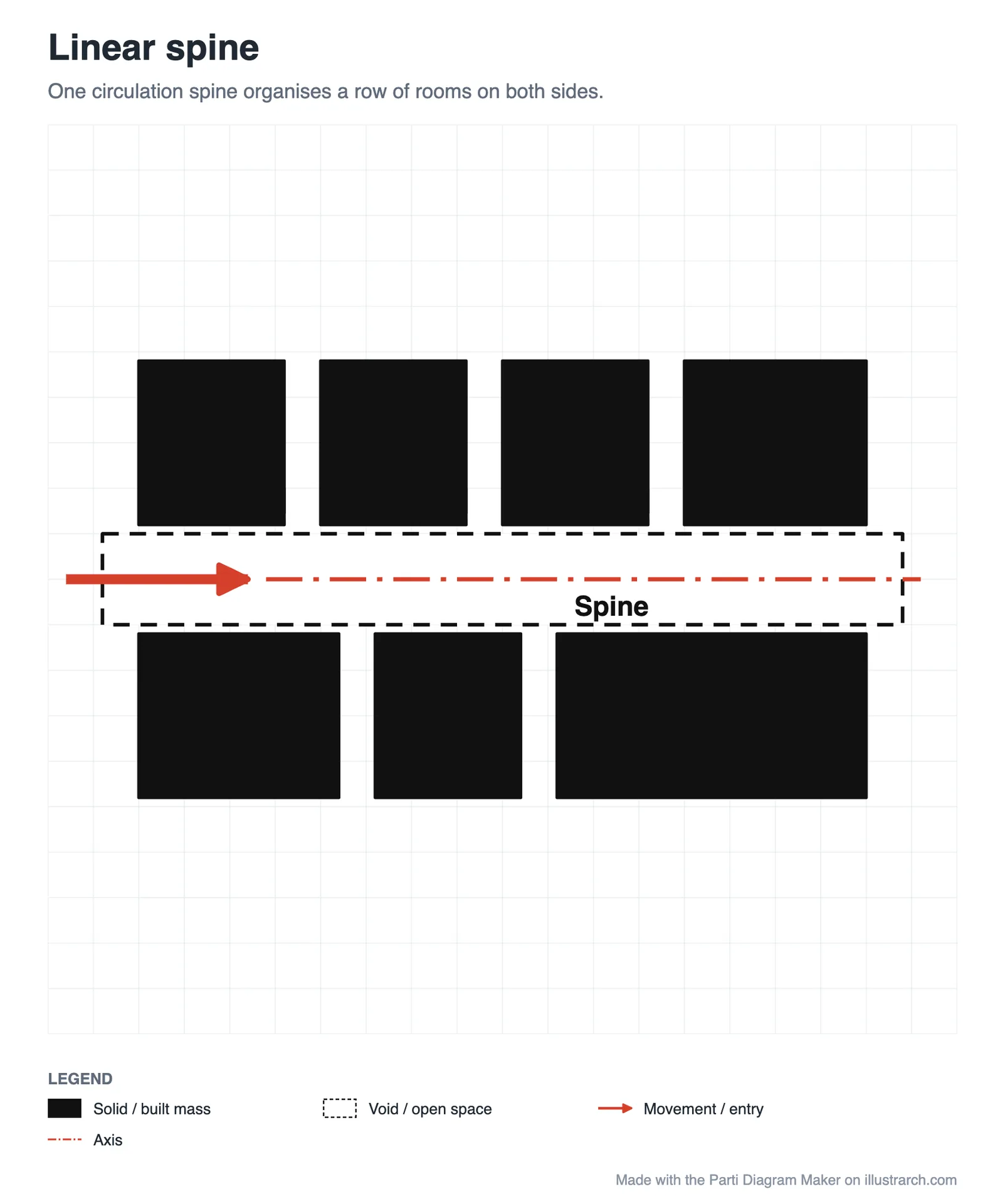
Linear spine
One route organises everything, and rooms hang off both sides. Wayfinding is obvious, the building can grow at either end, and every room has the same relationship to circulation. The risk is monotony, which is why many spine buildings vary the rooms along it or widen the spine into a hall at one point.
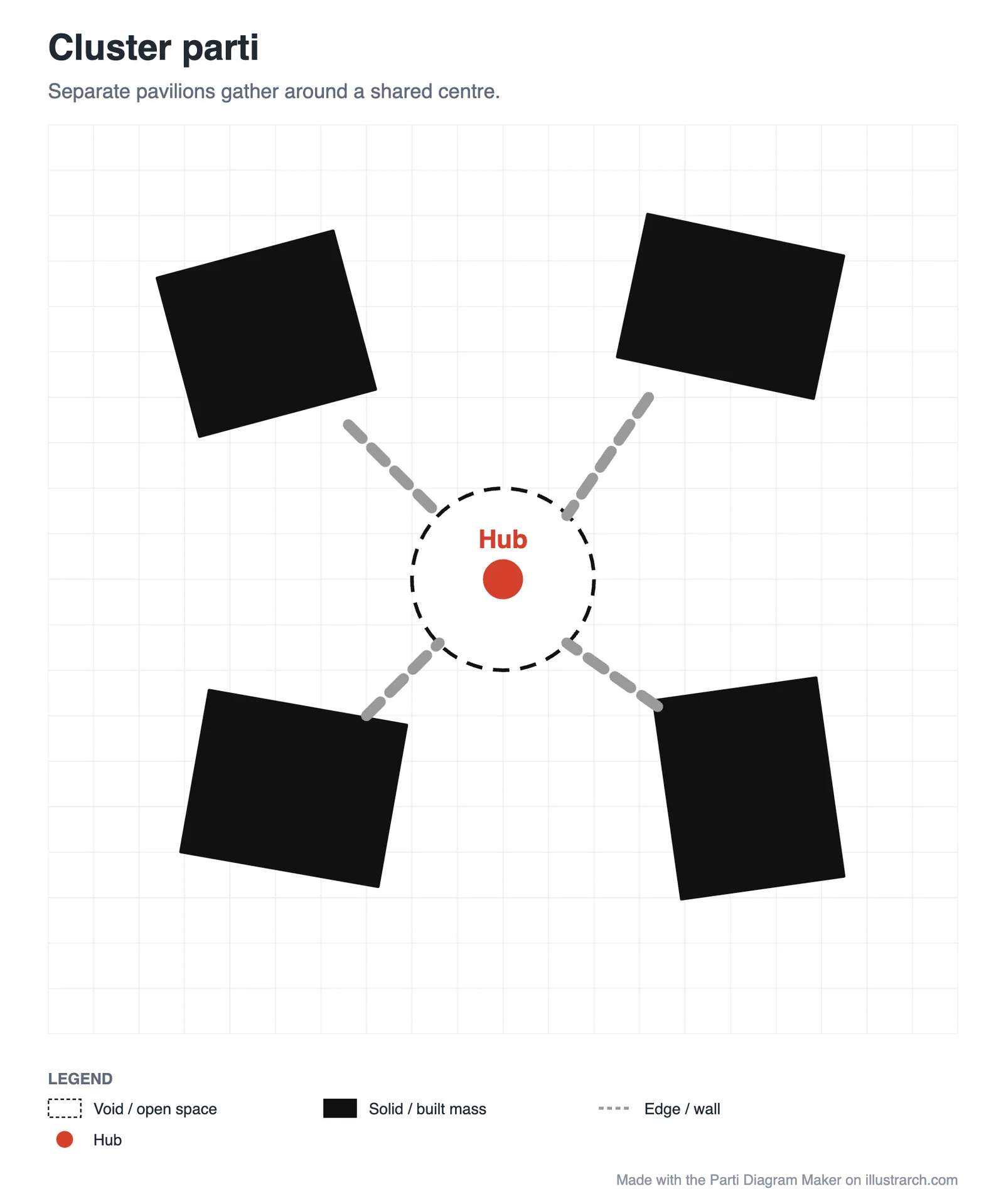
Cluster around a hub
Separate pavilions gather around a shared centre. Each part keeps its own identity, light on several sides and a direct link to the hub, which becomes the social heart of the scheme. In the template, dashed lines connect each pavilion to the centre: they are relationships, not corridors, and you can turn them into arrows when the movement matters.
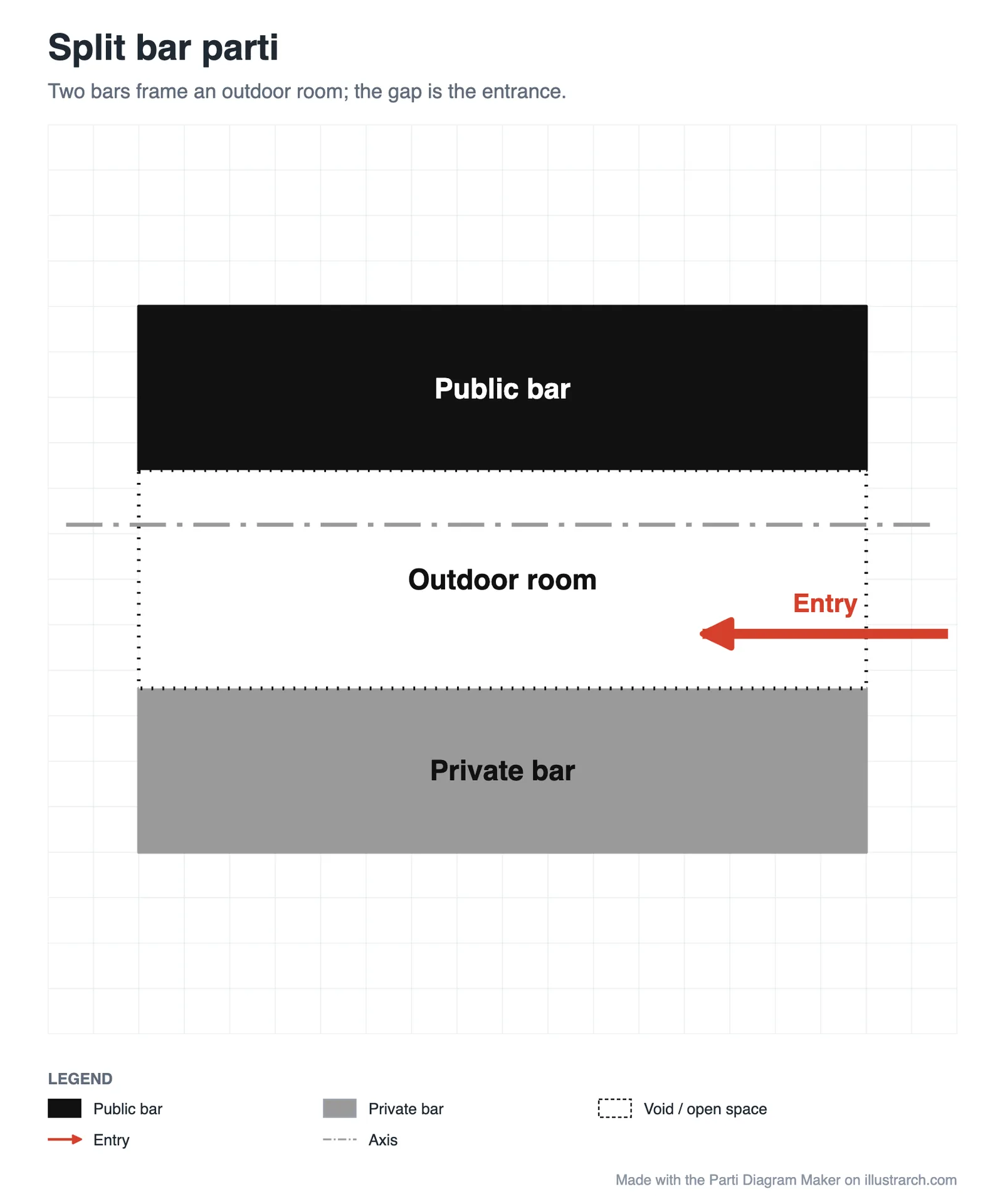
Two bars and a gap
A public bar and a private bar face each other across an outdoor room, and the gap between them is where you enter. The parti separates two kinds of use without a corridor and gives both an outlook onto the shared space. Notice that the entry arrow comes in through the open end, not through either bar: the void is the threshold.
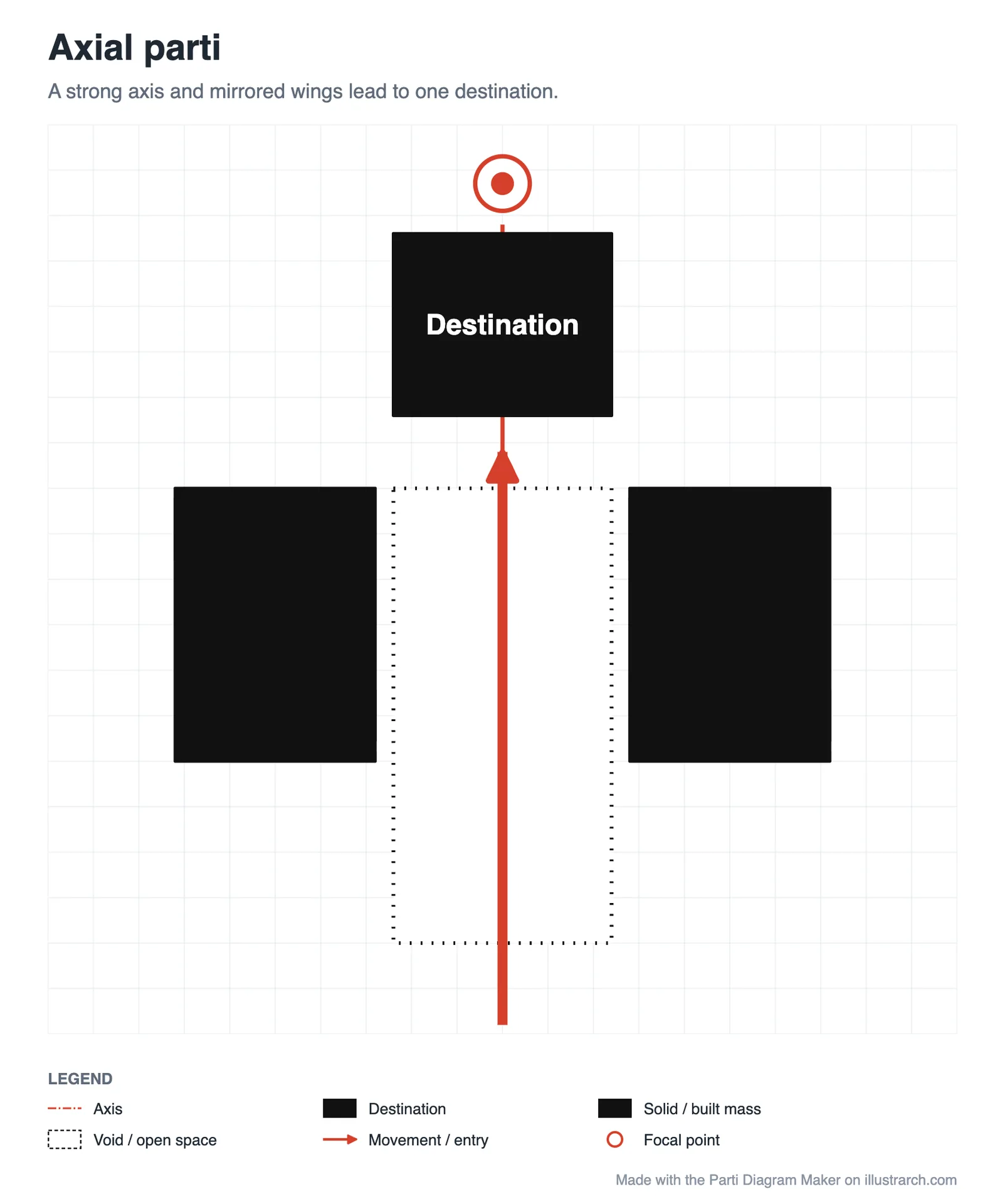
Axial symmetry
A strong axis and mirrored wings lead to one destination. The approach is long, framed and ceremonial, which is why the parti is common in civic buildings, memorials and places of worship. Draw the axis first, then the destination at its end, and only then the wings, so that the symmetry follows from the route rather than the other way round.
Served and servant
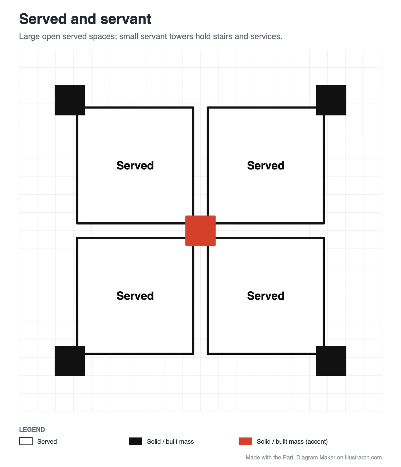
Louis Kahn distinguished between large open spaces and the small towers of stairs and services that support them, and made the difference visible in buildings such as the Richards Medical Research Laboratories in Philadelphia. In the template, four outlined served spaces are held by solid servant towers at the corners and a central core in the accent colour.
Grid, radial, box in a box, object in a field and L-shape
The grid parti lays down a regular structure first and carves rooms out of it, so the plan can change without the order changing. The radial parti sends wings out from a core, which makes the centre the place of control or of gathering. The box in a box wraps a precious inner room in a buffer of secondary space, for acoustics, climate or ceremony. The object in a field sets one clear volume free in an open landscape, and the L-shape shelters a garden from the street with two wings. All five are in the template list, ready to adapt.
Parti, concept diagram, zoning and massing
These drawings overlap, so it helps to be strict about what each one is for.
| Drawing | Answers | Leaves out |
|---|---|---|
| Concept diagram | Any idea behind the project: a story, a material, a view | Usually the plan itself |
| Parti | How the building is organised: figure and ground, order, movement | Uses, areas, heights |
| Zoning diagram | Which uses go where, and how much area each takes | Form and height |
| Massing diagram | How much volume, how high, and the shadows it casts | Interior organisation |
Working order is usually parti first, then zoning, then massing, with the parti revisited whenever a later drawing stops agreeing with it. Uses and areas go into the zoning diagram maker; for the theory of volumes, see the guide to massing diagrams in architecture. When you are ready to give the parti height, block it out in the massing diagram maker.
Common mistakes in parti diagrams
- Drawing the plan instead. If walls, doors and room names appear, the drawing has stopped being a parti. Remove everything that does not change the reading.
- Two ideas at once. A courtyard and a spine and a grid compete. Pick the one that decides the others, and show the rest as a second step if it matters.
- Weak contrast. Grey on grey does not read. Keep the main mass in the main colour and use soft only for secondary parts.
- Arrows everywhere. One clear approach says more than five routes. Dash the minor ones or leave them out.
- Labels on top of lines. A label crossed by an axis or covered by an arrow is the first thing a reviewer notices. Move the label, or move the line by a grid step.
- Too much text. Labels are for the two or three parts a reader cannot guess. The subtitle is for the concept statement in one sentence.
What to export, and when
PNG is the quickest for slides, pin-ups and messages; it is rendered at high resolution for sharp printing. SVG keeps every shape as a vector, so you can recolour it or combine it with other drawings in Illustrator, Affinity or Inkscape. PDF places the sheet on an A4 or A3 page for printing and submissions. JSON is the editable file: open it later with Open JSON to continue exactly where you stopped. Share link copies a link that opens a copy of your diagram in someone else’s browser; your own copy is not changed by what they do with it.
Every export carries the title, the concept statement, the steps with their names, the legend and a small credit line. If you want the drawing alone, export SVG and delete what you do not need.
Frequently asked questions
Is this parti diagram maker free?
Yes. There is no account, no trial and no watermark. The diagram is kept in your own browser and is still there when you come back to this page.
What is the difference between a parti and a concept diagram?
A concept diagram can explain any idea behind a project. A parti explains how the building is organised in space: what is solid, what is open, what the order is and how you move through it.
Can I draw a parti in plan and in section?
Yes. The board does not assume a view. Draw the plan parti as one step and the section parti as another, and both export on the same sheet.
How do I show a sequence of steps?
Use Copy step to duplicate the current step, change it, and repeat for up to four steps. The export lays them out from left to right with their names above them.
Can I edit the export in Illustrator?
Yes. Export SVG: every mass, void, arrow and label stays a separate vector shape that you can recolour, move or combine with your other drawings.
What happens to my work if I close the tab?
It is saved in your browser automatically and reloads when you come back. Save it as JSON if you need it on another computer or want to keep several versions.
Does it work on a phone or tablet?
Yes. Drag items with your finger, use the handles to resize, and tap Finish when you draw a free shape. A larger screen is still more comfortable for detailed work.
Keep going
Once the parti holds, give it uses and areas in the zoning diagram maker, or work out which rooms belong together first with the adjacency matrix maker and the bubble diagram maker. To test the idea against the real plot, start with the site analysis diagram maker; to give it height, the massing diagram maker. For other ways of reading a plan, see spatial organization diagrams and the figure-ground diagram. Every free tool is listed on the illustrarch tools page, and the whole diagram family is in the architectural diagrams hub.
Rate this tool
Was Free Online Parti Diagram Maker for Architecture useful? One tap, no sign-up.