

Mid-Century Modern vs Contemporary Minimalism: Retro Warmth or Cool Restraint?
How do mid-century modern architecture and contemporary minimalism actually differ in practice? This side-by-side comparison breaks down their origins, defining materials, spatial strategies, and signature details so you can decide which direction fits your next residential or commercial project.
 Sinan Ozen25 June 20265 Mins read221

Table of Contents Show
Mid-century modern vs contemporary minimalism represents a choice between two related but distinct architectural directions. Mid-century modern architecture, rooted in the postwar decades of 1945 to 1970, favors organic curves, warm wood tones, and bold color accents. Contemporary minimalism, by contrast, strips design down to pure geometry, neutral palettes, and near-invisible detailing. Both reject ornament, yet they produce spaces that feel entirely different to inhabit.
Origins and Historical Context
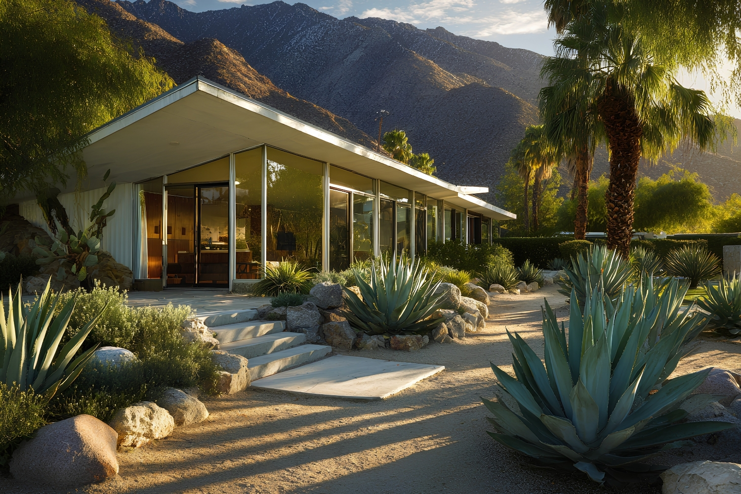
Mid-century modern architecture grew out of the postwar building boom in the United States, Scandinavia, and Brazil. Designers like Charles and Ray Eames, Eero Saarinen, and Richard Neutra combined industrial materials with organic shapes, responding to a society eager for affordable, functional homes that still felt optimistic. The movement borrowed from Bauhaus principles but softened them, adding warmth through natural wood, angled rooflines, and floor-to-ceiling glass that connected indoors with outdoors.
Contemporary minimalism developed later, gaining momentum in the 1980s and 1990s through architects such as Tadao Ando, John Pawson, and Alberto Campo Baeza. Its intellectual roots trace back to the Japanese concept of ma (negative space) and the earlier “less is more” ethos of Mies van der Rohe. Where mid-century modern design celebrated the joy of new materials and mass production, contemporary minimalist design pursues silence, reduction, and the careful editing of every element in a room.
🏗️ Real-World Example
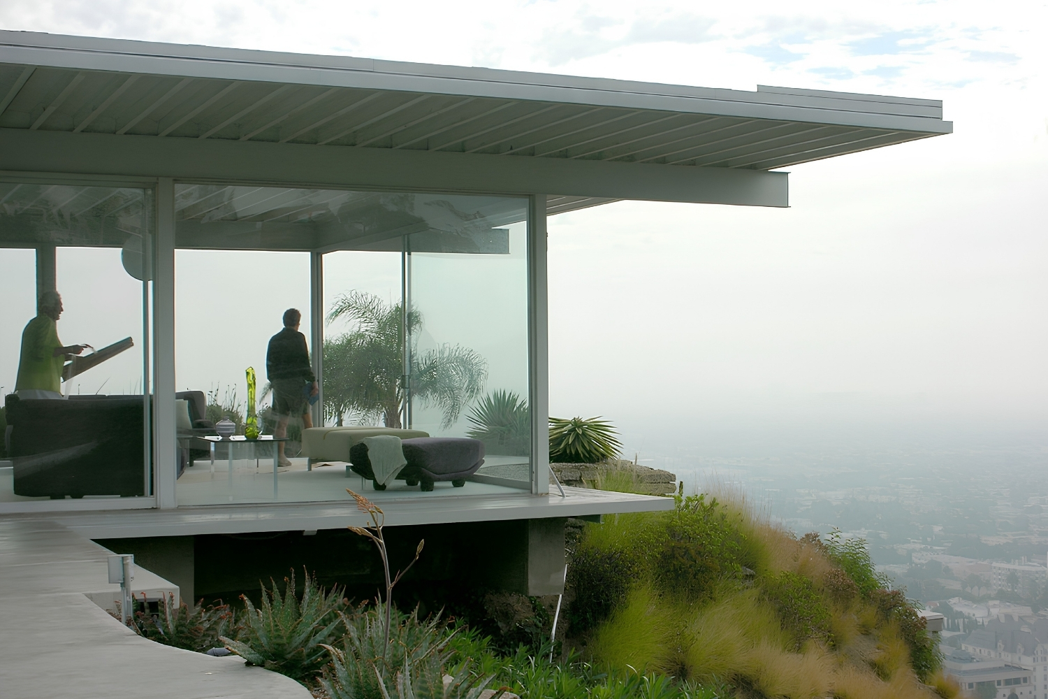
Case Study House #22 (Los Angeles, 1960): Pierre Koenig’s iconic Stahl House sits on a cliff above the city, using steel framing, open floor plans, and generous glazing. It perfectly illustrates mid-century modern architecture’s desire to merge structure with landscape. Compare this to Tadao Ando’s Koshino House (Ashiya, 1984), where smooth concrete walls and narrow light slits create a contemplative atmosphere through material restraint rather than panoramic views.
Defining Materials and Forms
The most visible gap between mid-century modern design and contemporary minimalist design shows up in material choices. Mid-century interiors rely on teak, walnut, molded plywood, and colorful upholstery fabrics. Brass hardware, terrazzo floors, and stacked-stone fireplaces add layers of texture. Furniture often stands on tapered legs, creating visual lightness even in heavily furnished rooms.
Contemporary minimalism leans toward exposed concrete, white plaster, large-format stone, and frameless glass. Color is usually restricted to whites, greys, and blacks, with occasional single-tone accents. Furniture tends toward monolithic shapes with flush surfaces, hidden hardware, and integrated storage that keeps belongings out of sight.
Comparison of Mid-Century Modern vs Contemporary Minimalism
The following table summarizes the core differences between these two modern architecture styles:
| Feature | Mid-Century Modern | Contemporary Minimalism |
|---|---|---|
| Active Period | 1945 to 1970 | 1980s to present |
| Primary Materials | Teak, walnut, plywood, brass, terrazzo | Concrete, steel, glass, white plaster, stone |
| Color Palette | Warm neutrals with bold accents (mustard, teal, orange) | Monochromatic neutrals (white, grey, black) |
| Form Language | Organic curves, tapered legs, angled rooflines | Flat planes, sharp geometry, flush surfaces |
| Relationship to Nature | Large windows framing landscape views | Controlled openings directing specific sightlines |
| Emotional Tone | Optimistic, playful, inviting | Calm, contemplative, restrained |
| Ornament | Minimal but present (geometric patterns, wood grain) | Almost entirely absent |
💡 Pro Tip
If you are blending mid-century modern furniture into a minimalist interior, limit accent pieces to two or three per room and pick items with exposed wood grain that adds warmth without competing with the clean backdrop. A single Eames lounge chair against a white plaster wall can anchor an entire living room without cluttering the space.
How Each Style Handles Space and Light
Both retro architecture and modern minimalism prize open floor plans, but they handle light differently. A mid-century modern home typically features expansive glass walls on the garden side, low horizontal windows on the street side, and clerestory glazing that washes ceilings with daylight. The goal is to dissolve the boundary between inside and outside, inviting the surrounding landscape into the living area.
In a minimalist house, light becomes a controlled design element. Narrow slots carved into concrete walls, recessed skylights, and carefully positioned openings direct beams across surfaces at specific times of day. The effect is almost theatrical. Tadao Ando’s Church of the Light in Osaka is a well-known example: a cruciform slit in the concrete wall projects a cross of sunlight onto the altar, turning a simple material into an emotional experience.
This difference in approach shapes furniture layout too. Mid-century rooms tend to group seating around a focal point (a fireplace, a view, a sunken conversation pit), while minimalist interiors distribute sparse furniture across an open plane, giving each piece room to breathe. Understanding these spatial strategies helps when studying how interior architecture has evolved from postwar optimism to contemporary restraint.
Where Mid-Century Modern and Minimalism Overlap
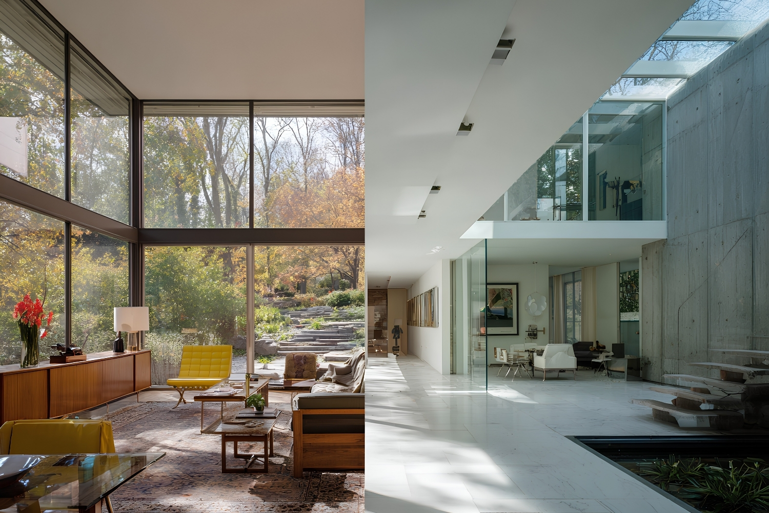
Despite their differences, mid-century modern vs minimalist comparisons often reveal shared DNA. Both movements reject ornament for its own sake. Both prefer honest expression of structural materials over applied decoration. And both draw from the modernist principle that a building should respond to how people actually live rather than to historical precedent.
That shared foundation explains why the two styles mix so well in practice. A growing number of residential projects pair 2026 interior design trends in warm minimalism with vintage mid-century furniture, creating spaces that feel restrained but not cold. Walnut credenzas, sculptural pendant lights, and leather lounge chairs soften concrete floors and white walls without adding visual noise. The result sits somewhere between both camps, proving that modern and contemporary architecture categories overlap more than rigid labels suggest.
⚖️ Pros & Cons at a Glance
✔️ Mid-Century Modern Pros: Warm material palette, timeless furniture market, strong resale appeal for residential buyers
✖️ Mid-Century Modern Cons: Original pieces can be expensive, wood detailing requires regular maintenance, bold colors risk dating a space
✔️ Contemporary Minimalism Pros: Clean aesthetic ages well, lower furniture costs when kept sparse, easier to maintain clutter-free
✖️ Contemporary Minimalism Cons: Spaces can feel sterile without careful detailing, exposed concrete and plaster require skilled labor, limited color risks monotony
Which Style Works Best for Residential Projects?
Choosing between mid-century modern design and contemporary minimalist design depends on climate, budget, and the emotional atmosphere a client wants. In warmer regions with generous outdoor views, mid-century strategies like floor-to-ceiling glazing and indoor-outdoor flow remain practical and appealing. The residential projects featured on Dwell show how this approach still attracts buyers decades after the movement’s peak.
For urban sites with limited views or clients who prefer a quieter visual environment, a minimalist approach often works better. Controlled light, simple surfaces, and hidden storage help compact apartments feel larger. Firms like John Pawson’s studio demonstrate how restraint in material and form can produce residential spaces that feel spacious regardless of actual square footage.
The mid-century modern vs contemporary minimalism debate also matters for renovations. Adding period-appropriate walnut paneling and a Saarinen dining table to a 1950s ranch house strengthens its original character. Stripping a newer concrete frame back to bare walls and installing flush detailing pushes it toward a minimalist identity. Either direction works, but mixing them carelessly, like pairing a busy geometric wallpaper with poured concrete floors, can produce visual tension that serves neither style. You can find additional guidance on how major architectural styles relate to each other and where they diverge.
The Bigger Picture
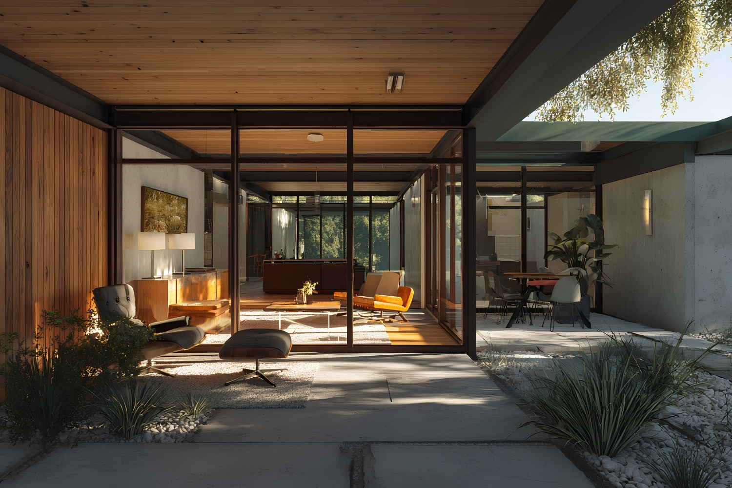
The real takeaway from comparing mid-century modern vs contemporary minimalism may be that warmth and restraint are not opposites. They are dials on the same board. The most memorable residential projects of the past decade tend to set both dials deliberately rather than defaulting to one extreme. A concrete shell gains soul when a single walnut shelf runs its length; a wood-paneled room gains clarity when everything except the grain is edited away. The tension between retro warmth and cool restraint is not a problem to solve. It is a resource to use.




Futuro House Production Revived in Finland After Decades-Long Hiatus
A Facebook listing for abandoned moulds led to the first new Futuro...
 illustrarch Editoral Team3 Mins read
Building Your Dream Home in NSW: What You Should Know About Montgomery Homes
Montgomery Homes has been building across Sydney, Newcastle, the Hunter, Wollongong and...
illustrarch Editoral Team4 Mins read
Designing a Home Theater: Where Drapery Fits Into the Plan
In a media room the curtains are a performance layer, not decoration....
illustrarch Editoral Team3 Mins read

Oscar Niemeyer’s Cathedral of Brasília: The Hyperboloid Concrete Hymn
The Cathedral of Brasília reads as a single gesture, yet it stood...
 Furkan Sen7 Mins read


Leave a comment