

Section Perspective Drawings: 12 Examples from Students and Studios
Twelve real section perspectives, from an 1868 dimensioned lithograph in Haguenau to Paul Rudolph's Chorley school, RSHP in Shenzhen and student boards from the Bartlett and the AA, with what each cut reveals and how to draw one step by step.
 illustrarch Editoral Team6 November 202619 Mins read1
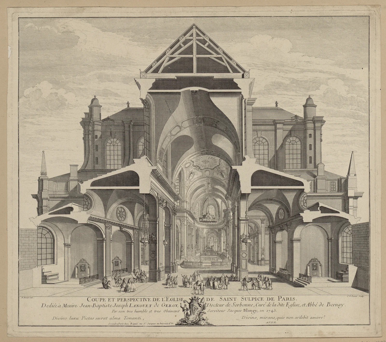
Table of Contents Show
A section perspective is a drawing that cuts through a building like a section and then shows the space behind the cut in perspective, usually with a single vanishing point. The cut stays measurable, while the depth beyond it shows rooms, people and light, which is why architects use it to explain how a space works and feels.
The drawing goes by several names. Some offices call it a perspective section, schools often say sectional perspective, and the French engravers of the 18th century wrote “coupe et perspective” on their plates. Whatever the label, the question it answers is the same: what would you see if you sliced the building open and stood in front of the cut? The twelve examples below are real drawings, from a 1711 engraving of Les Invalides to student boards shared in 2025 and 2026, chosen because each one puts the cut where the design argument is. After the list, a short step-by-step section shows how to construct one yourself.
What Is a Section Perspective?
A section perspective combines two drawings that are usually kept apart. The front plane is an orthographic section: walls, slabs and ground are cut, filled in solid and drawn at scale. Everything behind that plane is drawn in perspective, so floors, ceilings and side walls recede to a vanishing point. The result reads like a photograph of a building with its front half removed.
That makes it different from a plain section, which stays flat and fully measurable. Our guide to section drawings in architecture covers the conventions of the flat cut, and the examples in our collection of architectural section drawings show how much a good orthographic section can carry on its own. It also differs from a sectional axonometric, which cuts the building but keeps parallel lines parallel; the axonometric diagram guide explains that projection. If what you need is an abstract diagram of levels and uses rather than a drawing of real space, see our separate guide to the architectural sectional diagram.
⚖️ Pros & Cons at a Glance
✔️ Pros: shows structure and lived space in one image, keeps the cut plane measurable, reads quickly for juries and clients who do not read plans
✖️ Cons: depth beyond the cut cannot be scaled, takes far longer than a section or a quick render, and is easily buried under entourage
1. Église Royale des Invalides (1711) – Paris, France
Architect: Jules Hardouin-Mansart | Dome height: 107 m | Print: Gérard Scotin after Ferdinand Delamonce, 45.7 x 56.7 cm
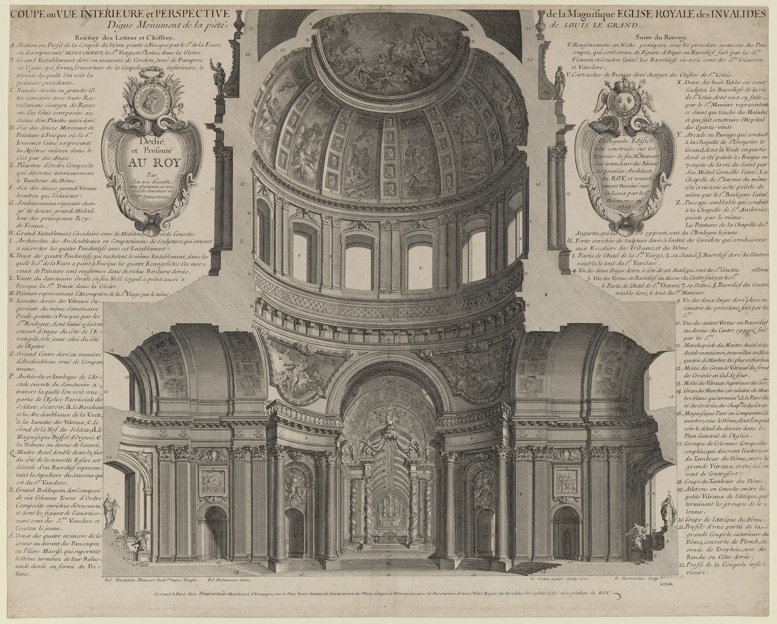
The oldest drawing in the main list is also one of the clearest about what it is. Its title reads “Coupe ou vue intérieure et perspective”, a section or interior view in perspective, of the royal church of Les Invalides. The Musée Carnavalet credits the etching to Gérard Scotin after a drawing by Ferdinand Delamonce and dates it to 1711, five years after Jules Hardouin-Mansart finished the dome church in 1706.
The reason to cut this building open is its height. According to the Les Invalides entry on Wikipedia, the dome reaches 107 metres, the tallest church building in Paris, yet from the floor a visitor sees only the inner shell. With the front half removed, the eye travels down the nave to the altar while also reading the dome, the drum windows that light it and the side chapels in a single image. A flat section would give the same heights but lose the depth of the nave; an interior view without the cut would hide the thickness of the structure.
The sheet is also a piece of royal publicity. The museum describes the print as a tribute to Louis XIV’s patronage, and the plate gives a large, ornate cartouche to its dedication to the king, right beside the numbered legend that explains the building. Read it as a record of the design and of the image the crown wanted, not as a neutral survey.
2. Saint-Sulpice (1745) – Paris, France
Drawn by: Antoine Hénon | Engraved by: C. L. Lucas | Dedication: Jacques Blangy, 1745 | Print: 43.5 x 49.8 cm
The Musée Carnavalet also holds this etching, “Coupe et perspective de l’église de Saint Sulpice de Paris”, drawn by Antoine Hénon and engraved by C. L. Lucas. The dedication on the plate is signed by Jacques Blangy in 1745, and the date matters. According to the history of the church, Gilles-Marie Oppenord and Giovanni Servandoni supervised the nave and side chapels from 1719 to 1745, so the print records the year the nave was complete.
This is a textbook one-point section perspective. The vanishing point sits on the high altar at the far end, the cut runs across the nave and both aisles, and the timber roof trusses above the stone vault are drawn in section at the top of the sheet. That last detail is the best argument for the drawing type: no visitor ever sees the roof structure hidden above the vault, yet the cut shows both in one view, together with the crowd on the nave floor for scale.
The print also shows a finished, ordered church that the building never quite became. Construction continued until 1870, and the south tower of the west front was never rebuilt after the Revolution; it is 5 metres shorter than the north tower and its stonework is still unfinished. A section perspective can show a building before it exists, so check the date on any historic sheet before treating it as a record of what was built.
📌 Did You Know?
The Paris printmakers named the drawing type on the plate itself. The 1711 Invalides print is titled “Coupe ou vue intérieure et perspective”, the 1745 Saint-Sulpice print “Coupe et perspective”, and Jacques-François Blondel’s 1739 Hôtel de Ville print a “coupe vue en perspective”. Section and perspective were treated as two halves of one drawing long before English settled on the term section perspective.
3. St. George’s Church (1868) – Haguenau, France
Lithograph: Veuve Berger-Levrault et Fils, Strasbourg | Nave width: 9.00 m | Total height: 13.72 m | Interior: 61 x 19.6 m
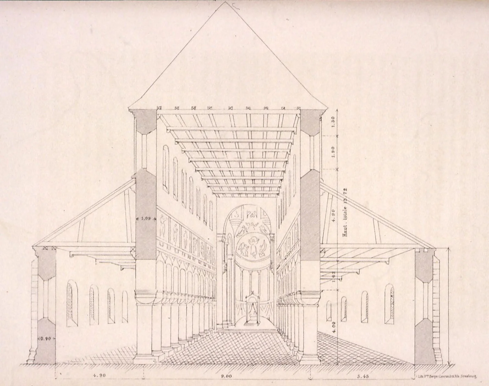
This lithograph from the collections of the Bibliothèque nationale de France, printed in Strasbourg by the Berger-Levrault press, is a rare section perspective that carries enough numbers to check against the building. Every key dimension is written on the cut: aisles of 4.90 and 5.45 metres either side of a 9.00 metre nave, outer walls 0.90 metres thick, aisle walls of 4.00 metres, and a chain of heights that adds up to a total of 13.72 metres.
The title calls it the basilica of St George “(12e siècle)”, and that is the key to reading it. According to Wikipedia’s entry on the church, the original design was a flat-roofed basilica with columns, and the nave vault was only built in 1609 to 1611. The drawing leaves the later vault out and shows a flat beamed ceiling under an open roof. It is a reconstruction of the Romanesque church, drawn with the authority of measured dimensions.
The perspective does a specific job here. Floor tiles and column bases recede to a single point at the apse, so the reader can count the bays and feel the length of a church whose interior measures 61 by 19.6 metres. The weakness comes from the same place as the strength: because the numbers look like a survey, it is easy to forget that the ceiling they frame was not the one visitors to Haguenau saw in 1868.
4. J. W. Chorley Elementary School (1964) – Middletown, New York, USA
Architect: Paul Rudolph | Built: 1964 to 1969 | Floor area: 77,335 sq ft | Instructional spaces: 37
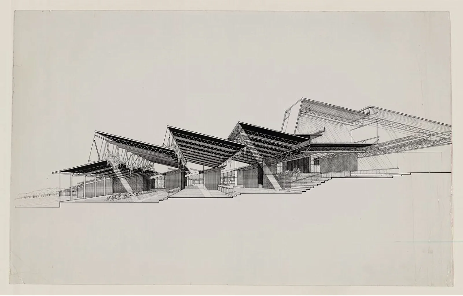
Paul Rudolph is the architect most closely tied to the modern section perspective, and this 1964 sheet for a school in Middletown shows why. The Library of Congress catalogues it simply as a perspective section. The line drawing cuts across the school and pushes the eye along a run of sawtooth roofs that climb the slope, with the ground drawn as a thin stepped line.
The Paul Rudolph Institute records a building of 77,335 square feet in four wings with 37 instructional spaces, lit through sawtooth clerestory windows that recall the factory buildings along the Hudson River. According to the school’s Wikipedia entry, classrooms were defined by levels stepping up the hill rather than by walls, and it was the only building Rudolph designed to serve children. A plan cannot explain that idea, because on plan the classrooms are simply open areas. The perspective section shows the change of level and the light from the clerestories at once, which is the argument for the whole building.
The drawing has outlived the school. In December 2008 voters approved a new, larger school on adjacent land, with the Chorley building to be replaced by a parking lot; the Preservation League of New York State put it on its 2010 Seven to Save list, and it was demolished anyway. The items Rudolph left to the Library of Congress are in the public domain, so this sheet is now one of the few places where the section can still be read.
5. Shenzhen Bao’an International Airport, Terminal 3 (2013) – Shenzhen, China
Architect: Studio Fuksas | Area: 5.4 million sq ft | Gates: 63 contact, 15 remote | Opened: November 2013
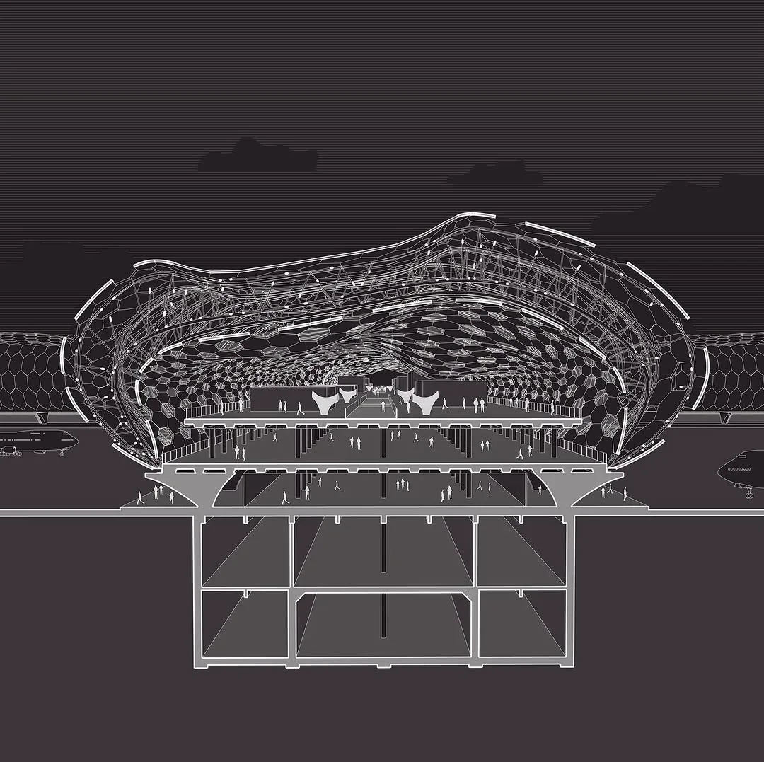
Massimiliano and Doriana Fuksas won the 2008 international competition for Terminal 3, and the building opened in November 2013. Studio Fuksas describes a double skin with a honeycomb motif that wraps the whole structure. According to Architectural Record, the terminal covers 5.4 million square feet and runs nearly a mile, with roof spans of up to 260 feet engineered by Knippers Helbig and capacity for up to 45 million passengers a year.
At that size a plan barely explains the space, and an exterior render only shows a long shell. This section perspective, shared on Instagram by the repost account @pfolio__, cuts across the main hall. The honeycomb roof wraps over the departures level like a vault, aircraft stand faintly on either side, and the levels below the concourse are drawn as a separate grid of grey rooms under the ground line. A central vanishing point turns the lattice into a tunnel of light, which is the experience the design promises travellers.
The sheet is also a lesson in what to leave out. Baggage handling, services and the steelwork are reduced to plain planes, so the drawing explains the idea and the stacking of levels but says nothing about the 52,000 tonnes of steel Architectural Record reports behind it. That is a fair choice for a competition image, and a reminder that a section perspective is an argument, not a construction document.
6. (Don’t) Dwell on the Past: The Rebirth of Yuanming Yuan (2022) – Beijing, China
Designer: Muyun Qiu | Programme: Bartlett School of Architecture, Unit PG13, Year 5 | Site: Fanghu Shengjing ruins, Fuhai Lake
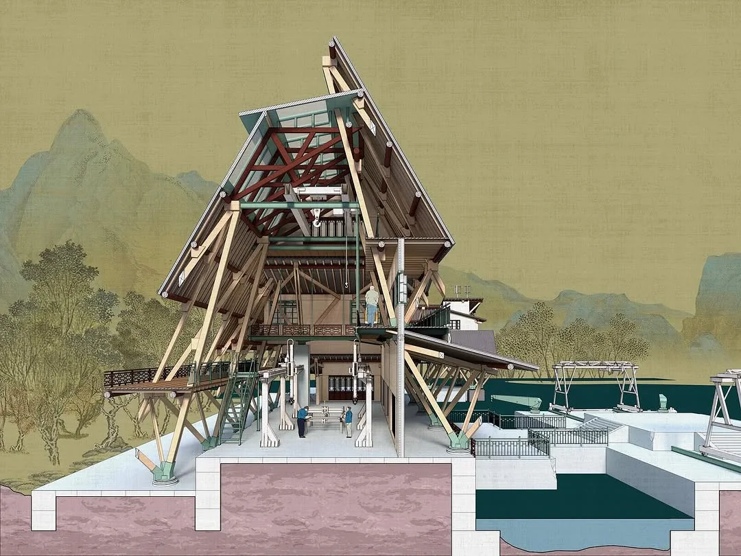
Muyun Qiu’s Year 5 project at the Bartlett School of Architecture is sited in Yuanming Yuan, the former imperial summer palace in Beijing destroyed in 1860 during the Second Opium War. The palace grounds covered about 3.5 square kilometres, and on 18 October 1860 the 8th Earl of Elgin ordered their destruction, an operation that took 3,500 to 4,000 troops three days.
The project proposes returning the ruins to local people through active reuse. According to Qiu’s caption, the workshop in this drawing stands at the ruins of Fanghu Shengjing on the northern shore of Fuhai Lake, is the first structure to be erected, and is built from recycled components. The section perspective suits that idea: the cut runs through the pale base and the new timber frame above it at the same time, so one image separates what is old from what is added, and the figures inside show the frame in daily use.
The site is politically loaded, and the project knows it. The Bartlett text argues that since the 2000s the meaning of Yuanming Yuan has been monopolised by the party-state for anti-foreign propaganda, and proposals to rebuild on the grounds have long met opposition from people who see the ruins themselves as the monument. Set against a painted blue-green mountain landscape, a drawing this attractive risks some of the romance it sets out to question.
7. Qianhai SZHK Youth Innovation and Entrepreneur Hub (2023) – Shenzhen, China
Architect: RSHP | Buildings: 16 | Height: 24 m, landmark building 47.6 m | Gross floor area: 138,200 m²
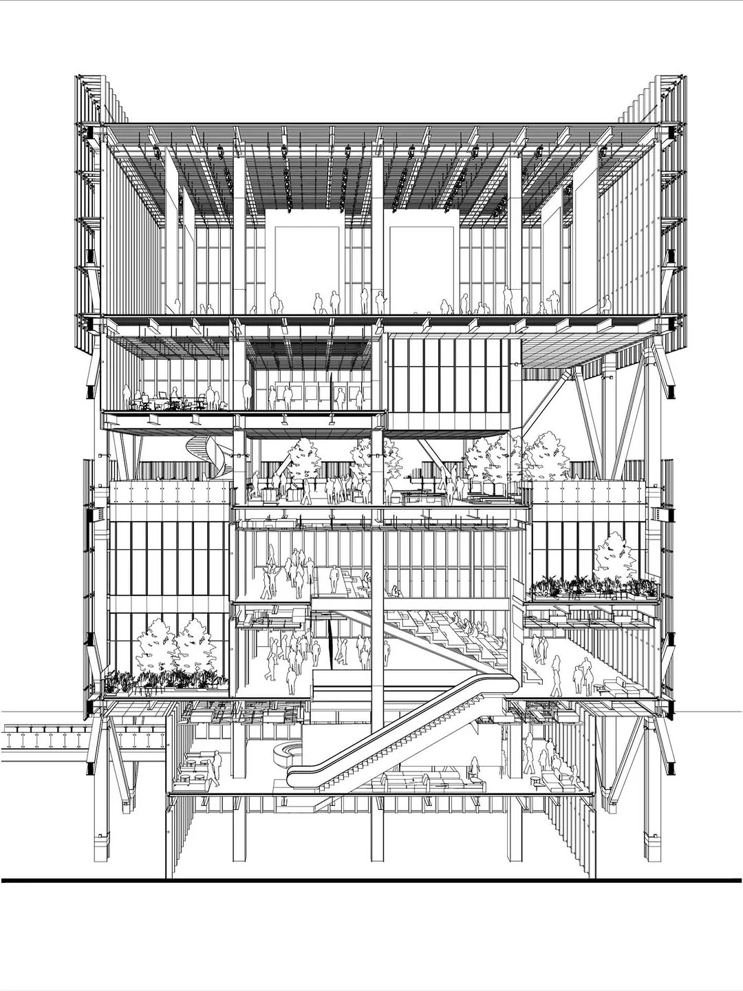
RSHP describes the hub as “super low rise”, a deliberate contrast to the super high rise towers going up around it in Qianhai. Sixteen buildings on a 90,634 square metre site are linked by a raised sky deck with landscaped gardens; most are 24 metres high with typically six floors, and the cultural landmark building reaches 47.6 metres. Richard Rogers was one of the project directors, and our profile of Richard Rogers’ architectural career explains where the habit of exposed structure comes from.
The section perspective shows why the low-rise argument works. The cut runs through the steel frame, the diagonal bracing and the sky deck, with escalators, planted terraces and dozens of small figures on every level. Instead of one tall lobby, the drawing reads as a stack of outdoor rooms, and the central vanishing point pulls the reader into the middle of the block, which is what RSHP means by an urban living room.
The project came in at £167 million and is rated BEAM Plus Excellent in Management and Energy Use, according to RSHP, and it won Best Mixed-Use Project at the 2023 Dezeen China Awards. The drawing earns its place by making the sky deck legible: on plan it is a thin line between buildings, in section perspective it is the floor everyone is standing on.
8. Towards New Care Ecologies on River Lea (2024) – London, UK
Designer: Antorip Choudhury, with @annaschoice | Programme: AA Housing and Urbanism | Site: Clapton Common, Hackney
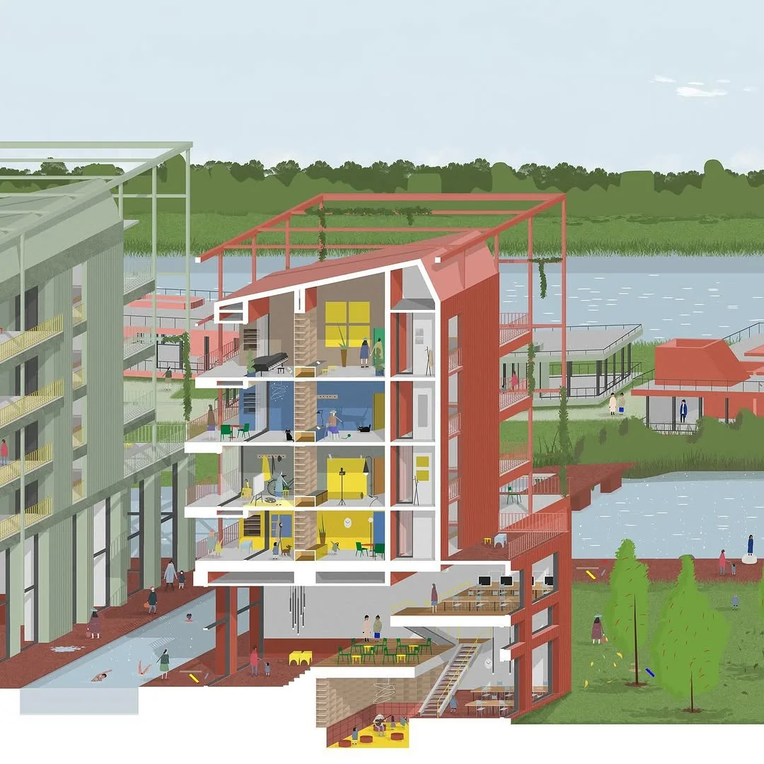
Antorip Choudhury’s project, published in the AA Projects Review 2024 for the Architectural Association‘s Housing and Urbanism programme, asks how housing can also become a place for care and learning in under-resourced inner-periphery neighbourhoods. The site is Clapton Common in Hackney, beside the River Lea, which runs 68 km from Luton to the Thames and passes Clapton on its lower course.
This is a two-point section perspective rather than the classic one-point type, and that choice suits a long block set at an angle to the river. The red frame is cut open in the middle to show stacked homes with yellow interiors and a vertical stair, while the ground floor opens to work spaces, dining tables and the water’s edge. The project text names its tools, a thickened facade and the dynamic use of galleries to blur civic and domestic space, and the cut lets you see the depth of that facade, which an elevation would flatten.
The weaker part of the sheet is the setting. The neighbouring blocks and the river landscape are drawn as flat colour, so the wider care ecology the text promises is asserted more than shown. The cut is convincing at the scale of one building and much less so at the scale of the neighbourhood.
9. TeRRa Agroforestry Refuge – Sonsón, Colombia
Designer: Kenery Mosquera Cataño | School: Universidad Pontificia Bolivariana | Scale: 1:25 | Greenhouse area: 28.0 m²
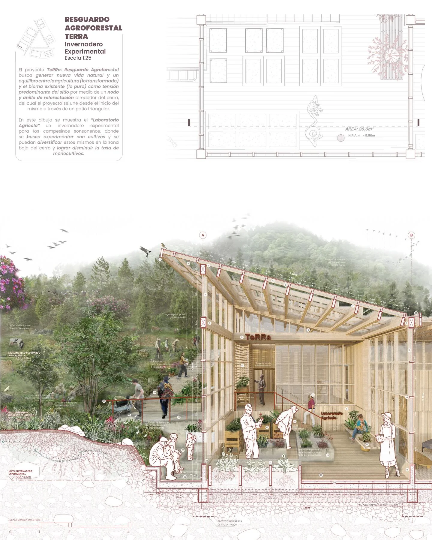
Kenery Mosquera Cataño’s TeRRa project at the Universidad Pontificia Bolivariana proposes a node and a ring of reforestation around a hill in Sonsón, a municipality in eastern Antioquia that sits at 2,475 metres and lives on crops such as potato, corn, tomato and coffee. The sheet calls this building the “Laboratorio Agrícola”, an experimental greenhouse where local farmers can test crops, diversify them in the lower part of the hill and reduce monoculture.
Drawn at 1:25, the perspective section shows a 28.0 square metre timber greenhouse with its plan placed directly above the cut, and the plan marks a floor level of minus 5.50 metres. At that scale the figures are large enough to show what they are doing with their hands: tending planting beds, carrying trays, sitting at the entrance. The ground is cut too, with stones and roots drawn below the floor, so the greenhouse reads as part of the slope rather than an object placed on it.
Placing the plan above the section at the same width is the classic way to construct this kind of drawing, and the step-by-step section below uses it. The trade-off is density: the foreground planting outside the cut is so thick that part of the left-hand bay disappears, and a lighter layer of vegetation would have let the second row of beds read.
10. FUTUREWORKS Retrofit – Barnsley, UK
Designer: Ben Morgan | Studio: Year 3, Semester 2, FUTUREWORKS | Town population: 71,599 (2021 census)
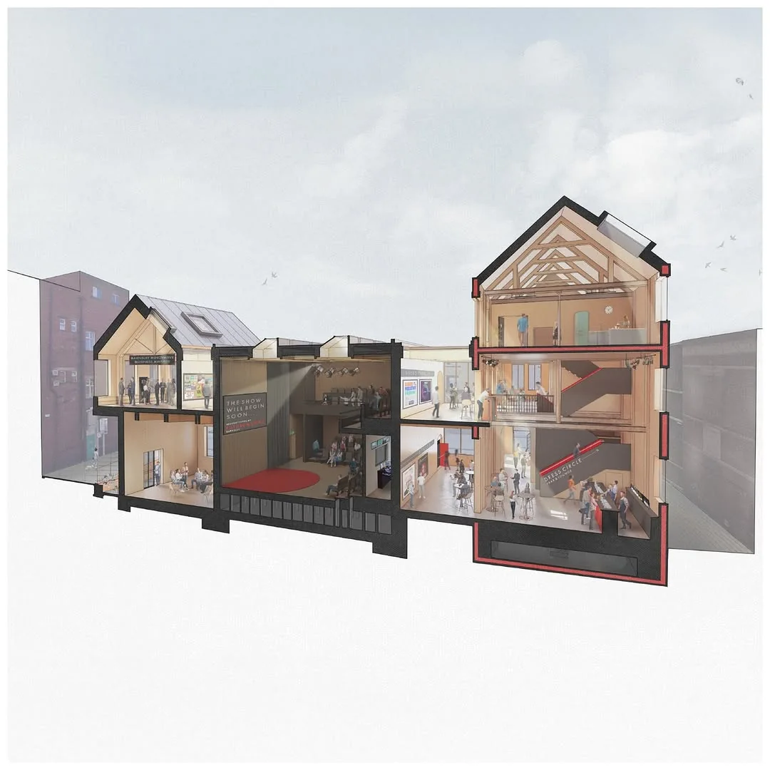
Ben Morgan’s third-year project reworks existing buildings in Barnsley, a South Yorkshire market town of 71,599 people at the 2021 census. The town once had 70 collieries within a 15-mile radius; the last mine closed in 1994, and regeneration since then has included The Glass Works, completed in 2021. Morgan’s own caption, shared on Instagram, describes a retrofit designed to support the growth of the town and its people.
The drawing cuts through a row of gabled buildings and the new rooms set inside them: an exposed timber roof, a dark performance space with a red floor, a café, and a stair hall with red steel stairs. Retrofit is where the section perspective earns its keep, because the interesting part of the design is the junction between old shell and new structure. The red outline separates new work from retained walls in a way a plan could only hint at with hatching.
The two-point view has a cost. Depth recedes in two directions, so the floor plates cannot be compared or measured, and the sheet gives no levels or dimensions. It works well as a portfolio image that explains the atmosphere of the scheme; as design evidence it needs a flat section next to it.
11. Edificio Camacol – Medellín, Colombia
Designers: @juandiegzr and team | School: Universidad Nacional de Colombia, Medellín | Programme: headquarters with a Center for Sustainable Design and Construction
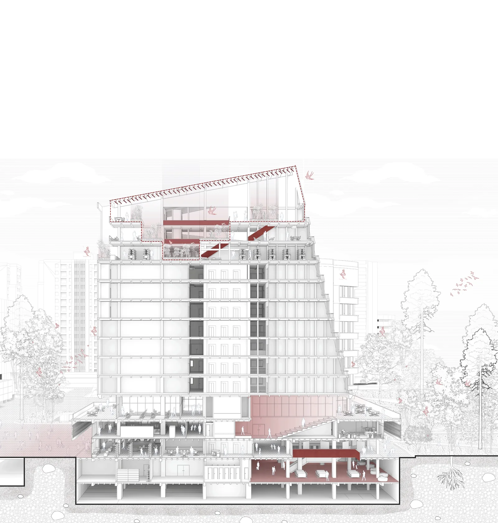
This student team from the Faculty of Architecture of the Universidad Nacional de Colombia in Medellín designed a headquarters for Camacol, the construction industry association, combined with a center for sustainable design and construction. The curator account @entre.estilos shared it as a Salón de Octubre winner. Camacol Antioquia describes itself as the main trade association of the construction sector in the department, with more than 60 years of experience and 400 affiliated companies, so the brief mixes offices with rooms where those member firms meet and learn.
The section perspective is built to show that mix. The tower is drawn in pale grey, while the shared spaces are picked out in dark red: a glazed level under the sloping roof at the top, terraces and meeting rooms on the podium, and occupied rooms in a basement dug into hatched ground. The vanishing point sits low and central, so the ground floor, the podium and the basement read most clearly.
The price of that focus is the middle of the building. The typical office floors become a repeating stack of empty white bays, and the reader learns little about the workplace, the part of the headquarters the association’s staff would use every day.
12. Three Houses on One Lot – Bellingham, Washington, USA
Architect: SRS Architecture | Homes: 3 plus a guest suite | Shared courtyard: 740 sq ft
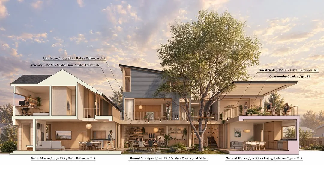
SRS Architecture, a Seattle office that specializes in middle housing, posted this rendered section perspective of three houses sharing one Bellingham lot. The labels give the brief: an Up House of 1,015 sq ft with three bedrooms, a Front House of 1,190 sq ft with three bedrooms, a Ground House of 700 sq ft with one bedroom, a 270 sq ft guest suite, a 460 sq ft amenity room and a 300 sq ft community garden on the second level, all around a 740 sq ft shared courtyard.
The context is new state law. According to the City of Bellingham, Washington passed middle housing legislation in 2023, and the city now allows up to four units on most residential lots, or six within half a mile of major transit or when two units are affordable. A drawing like this sells the idea to neighbours and buyers: by cutting all three houses in one view, it shows that the courtyard, with its long dinner table and string lights, works as the shared front room.
It is also the most heavily rendered drawing in the list, with warm evening light and fully furnished rooms, and it gives no heights, setbacks or levels. It persuades well, but it needs a dimensioned section beside it before anyone can check it against the code it is meant to illustrate.
Honorable Mentions
Oratorio della Santa Croce (c. 1540 to 1560) – Rome, Italy
An anonymous French draughtsman drew this section perspective of the Oratory of the Holy Cross at the Lateran in ink and chalk; the sheet is now in the Metropolitan Museum of Art. The oratory, built under Pope Hilarius in the fifth century, was swept away under Sixtus V, so the drawing records a lost building. It stays out of the main list because it shows only one corner of the interior.
Hôtel de Ville Ball (1739) – Paris, France
Jacques-François Blondel engraved this “coupe vue en perspective” of the Hôtel de Ville on the night of 30 to 31 August 1739, when the courtyard was turned into a ballroom for the marriage of Louise Élisabeth of France to the Infante Philip of Spain. It documents a decoration and an event more than a building, which is why it sits here.
A Bird’s-eye View of the Bank of England (1830) – London, UK
Joseph Gandy‘s famous view of the Bank that John Soane worked on for 45 years is often filed under section perspectives. Sir John Soane’s Museum describes it as a cutaway axonometric, so it appears here as a reminder that cutting a building open does not by itself make a perspective.
Patterns Across the 12 Section Perspectives
The cut goes where the argument is
None of these drawings is cut at random. Rudolph cuts the Chorley school across the slope because the stepped levels are the design; Ben Morgan cuts Barnsley through the junction of old and new; Muyun Qiu cuts the Yuanming Yuan workshop through ruin and frame together. Move any of those cuts a few metres and the drawing loses the reason it was made.
Numbers turn a picture into evidence
The Haguenau lithograph and the TeRRa sheet are the two drawings in the list you could check against a real building, one with a chain of heights adding up to 13.72 metres, the other with a 1:25 scale, a 28.0 square metre area and a floor level. The Bellingham rendering and the Bao’an section are more persuasive at first sight and much harder to verify. The best boards pair the two kinds.
Every client gets a flattering view
The Invalides print flatters Louis XIV, the Saint-Sulpice print shows a church more complete than it ever became, and the Bellingham rendering lights its courtyard for a dinner party. A section perspective is the most persuasive drawing in the set precisely because it looks like a photograph, which is why it should be read with the same caution as a photograph.
One vanishing point is the default, not the rule
Saint-Sulpice, Haguenau and the Qianhai hub all use a single central vanishing point, which suits long, symmetrical interiors. The River Lea housing and the Barnsley retrofit switch to two-point views for buildings set at an angle to the street or the water. The second vanishing point adds atmosphere but takes away the measurable depth that makes the one-point version so useful.
How to Draw a Section Perspective
Nearly every drawing above follows the same construction, whether it was engraved by hand or set up in Rhino. The steps below describe the one-point version, which is the easiest to build and the easiest to read.
1. Choose a cut that crosses the main space
Cut across the longest view, not along it. Saint-Sulpice is cut across the nave so the vanishing point can sit on the altar at the far end. If your section runs along the length of a room, the perspective will have almost no depth to show.
2. Draw the section at scale first
Start with an ordinary orthographic section: ground line, walls, slabs and roof, cut elements filled in solid. This is the only part of the drawing that stays measurable, so set its scale properly. If you need a refresher, our guide to drawing an architectural section in seven steps covers the flat cut.
3. Set the horizon and the vanishing point
Draw the horizon at the eye height of a person standing on the main floor, then place the vanishing point on that line inside the cut. Every receding edge of floors, ceilings and side walls will run to this point, as the floor tiles do in the Haguenau lithograph.
4. Project the depth from the plan
Place the plan directly above or below the section at the same scale and width, as the TeRRa sheet and the Spatial Praxes drawing below both do. Lines drawn from the plan positions of back walls, columns and openings give you the depth of each element along the lines running to the vanishing point.
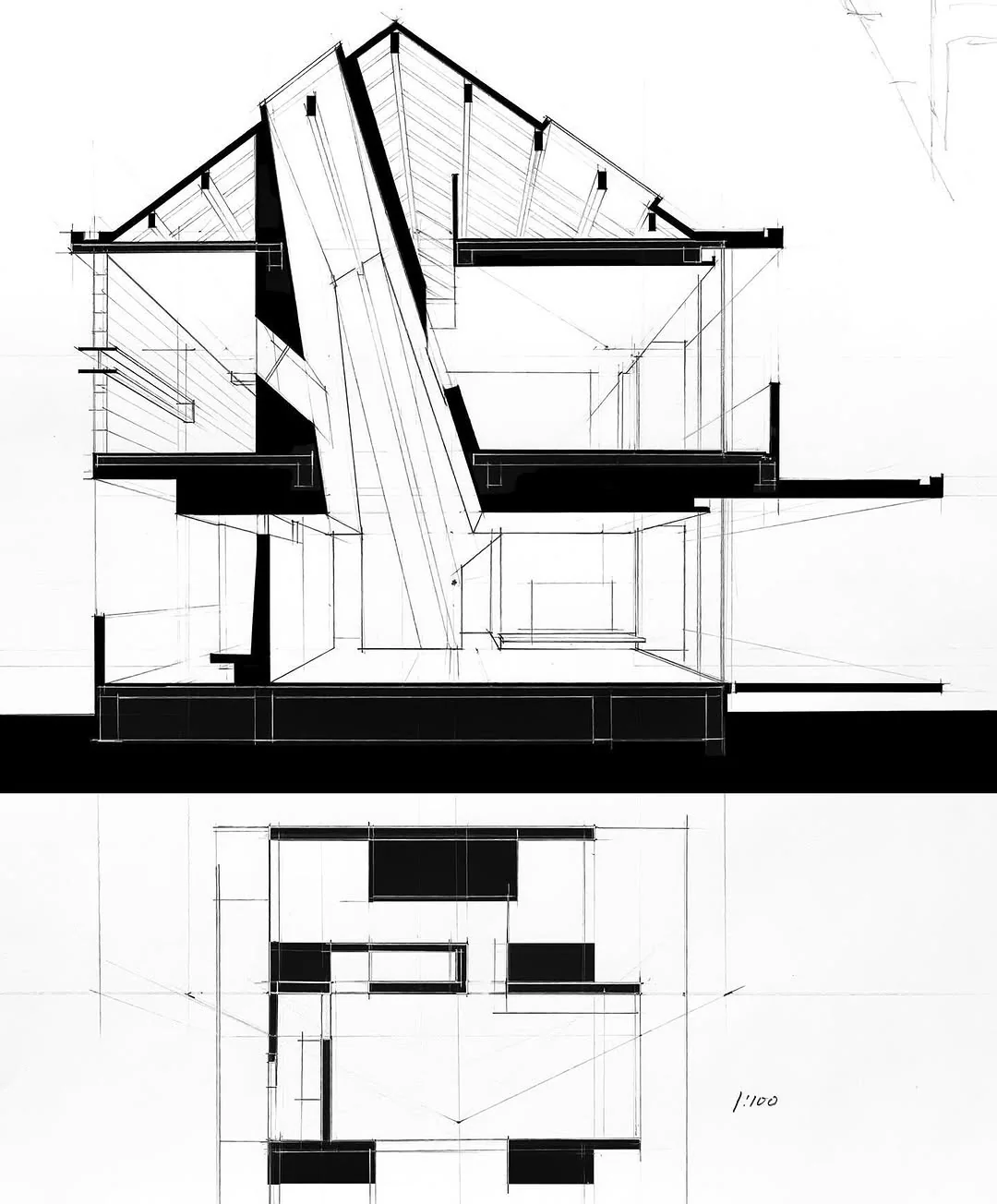
Spatial Praxes, a practice working on a rural house conversion in Shanghai, shows the method in its construction lines: the plan sits under the section perspective at 1:100, and the dark cut walls stay crisp while the depth lines remain visible.
5. Set a clear line weight hierarchy
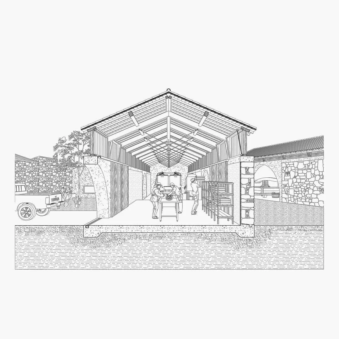
The cut is heaviest, the back wall lightest, and everything in between steps down with distance. The 1:50 section through the grape delivery bay from the diploma project “Basalt & Vines” keeps the cut walls and ground solid and draws the roof, stonework and machinery beyond in thin line, so the cut never gets lost.
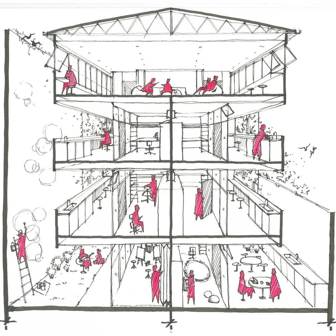
6. Add people, furniture and light last
Figures give scale and show use, but they belong to the final layer. In the hand sketch below, colour is spent only on the figures, so the reader sees at once that every floor is occupied, while the structure stays in black line.
💡 Pro Tip
A common mistake on first boards is putting the vanishing point dead centre. Move it one bay to the side: one side wall becomes steeply foreshortened and the other opens up almost like an elevation, so you can show a long run of rooms without losing depth. Keep it at standing eye height unless you have a reason, such as a basement, to look from above or below.
The Six Steps at a Glance
The table sums up the decisions and points to the drawing in this article that shows each one best.
| Step | Decision | Best example in this article |
|---|---|---|
| 1. Cut | Across the main space, where the design argument is | Chorley Elementary School |
| 2. Section | Orthographic cut at scale, solid poché | St. George’s Church, Haguenau |
| 3. Vanishing point | Standing eye height, inside the cut | Saint-Sulpice |
| 4. Depth | Projected from a plan at the same scale | TeRRa Agroforestry Refuge |
| 5. Line weight | Cut heaviest, lighter with distance | Basalt & Vines diploma section |
| 6. Entourage | Figures and light added last, kept behind the cut | Qianhai SZHK Youth Innovation Hub |
Frequently Asked Questions
Which is the oldest section perspective in this list?
In the main list, the 1711 print of the Église Royale des Invalides, followed by the 1745 Saint-Sulpice print. Among the honorable mentions, the anonymous drawing of the Oratorio della Santa Croce at the Lateran is older still, dated about 1540 to 1560.
Which example carries the most dimensions?
The 1868 lithograph of St. George’s Church in Haguenau. It writes the 9.00 metre nave, the 4.90 and 5.45 metre aisles, the 0.90 metre walls and a total height of 13.72 metres on the cut. The TeRRa sheet comes second, with its 1:25 scale, 28.0 square metre area and marked floor level.
Which of the 12 examples are student projects?
Five: Muyun Qiu’s Yuanming Yuan workshop at the Bartlett, Antorip Choudhury’s River Lea housing at the AA, Kenery Mosquera Cataño’s TeRRa greenhouse at the Universidad Pontificia Bolivariana, Ben Morgan’s Barnsley retrofit, and the Edificio Camacol team at the Universidad Nacional de Colombia in Medellín.
Where to Go From Here
Your Next Step: Take a section you already have for your current project, place its plan directly above it as the TeRRa sheet does, and project a single vanishing point at standing eye height. A quick pencil version will tell you whether the cut is in the right place long before you spend hours rendering it for your presentation boards.


Stacking Diagram: How to Allocate Uses Floor by Floor
A stacking diagram assigns each use in a brief to a level,...
 Sinan Ozen7 Mins read

Figure-Ground Diagram: How to Draw and Read Urban Fabric
A figure-ground diagram reduces a city to built mass against open space....
Sinan Ozen7 Mins read
Sun Path Diagram: How to Read One and Use It in Design
A sun path diagram shows where the sun sits all year for...
Sinan Ozen8 Mins read
Matrix Diagram in Architecture: How to Map Space Adjacencies
A matrix diagram, or adjacency matrix, maps how every space in a...
Sinan Ozen9 Mins read


Leave a comment