

Interior Design Presentation Boards: 8 Layout Examples and What to Include
Eight real interior design presentation boards, from a KMITL wellness centre in Pranburi to a Crown Perth lobby sketch and a Dubai sample board, with what each layout does well, where it falls short and the drawings every board needs.
 illustrarch Editorial Team11 November 202615 Mins read4
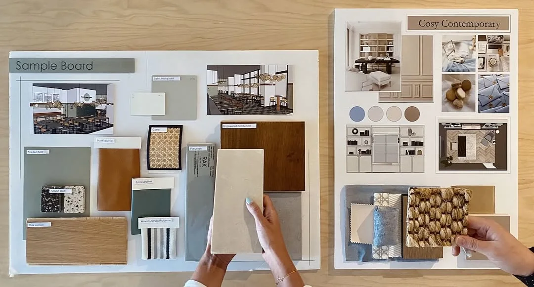
Table of Contents Show
An interior design presentation board is a single sheet, usually A1 or A2, that puts a room’s furniture layout, ceiling plan, sections or elevations, material palette and perspective views side by side, so a client or jury can understand the whole scheme at once. The best boards pair every image with the drawing that explains it.
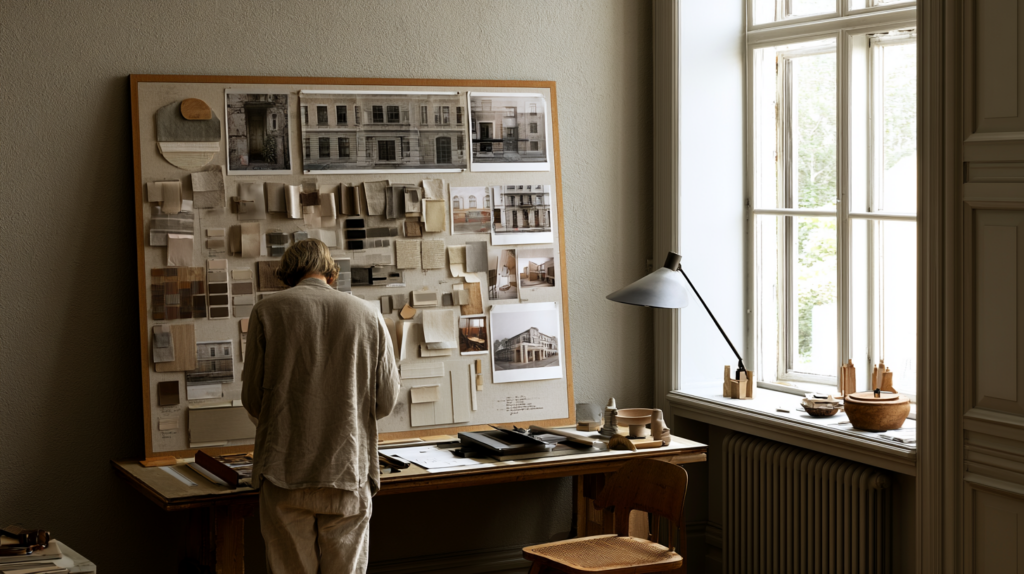
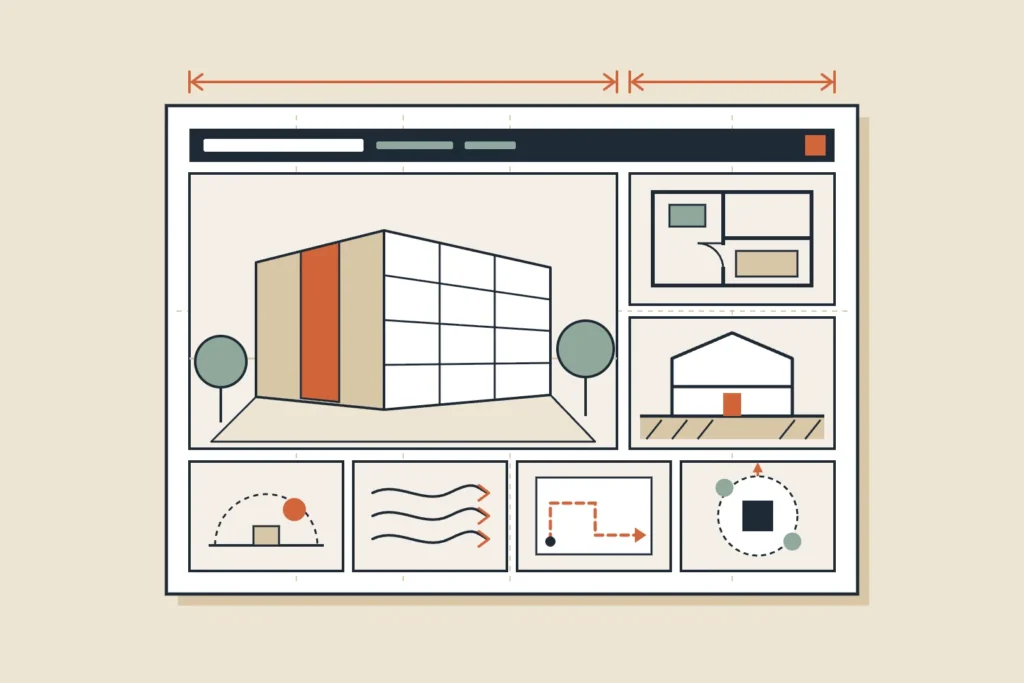
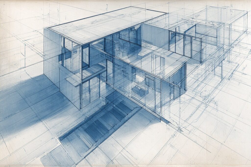
The eight boards below are real student and studio sheets from Thailand, Hong Kong, Dubai, England, Türkiye, Australia and the United States. Each one was chosen because its layout makes one decision visible: where the drawings sit against the renders, how physical samples are handled, or how a concept turns into the structure of the page. Three of them also show what goes wrong when a board leans too hard on pictures. If you have only seen the polished templates sold online, these interior presentation boards will look denser and more practical, because they were made to be read by tutors, clients and juries, not scrolled past.
What Is an Interior Design Presentation Board?
It is the final communication sheet of an interior project. It sits after the concept stage and before construction drawings, and its job is to show that the look of a space and the way it works have been resolved together. Unlike a mood board, it has to carry measured drawings. If you are still collecting references, our guide on how to make an architecture mood board covers that earlier stage.
The Eight Boards at a Glance
| Board | Place | Drawings on the sheet | Layout lesson |
|---|---|---|---|
| VE-LA Wellness Centre | Pranburi, Thailand | Plans, ceiling plans, isometrics, section | One A1 sheet for a whole building |
| HKIS Repulse Bay lobby | Hong Kong | Zone views, bubble diagrams, hand plan | Numbered zones for a real client |
| Mid-Century Fusion Bedroom | Dubai, UAE | Layout, reflected ceiling plan, 3D view | Legend next to the ceiling plan |
| Sample and Cosy Contemporary boards | Dubai, UAE | Physical samples, joinery elevation, plan | Real materials, labelled one by one |
| The Moore Family wall and flooring | Nottingham, UK | Floor plan outline, numbered images | A key that names every product |
| Casa del Sol | Antalya, Türkiye | Day and night renders, elevations | Concept built into the page split |
| Crown Perth lobby concept | Perth, Australia | Plan sketch, two perspective sketches | Hand notes doing the explaining |
| Bellevue College Cafe Project | Bellevue, USA | Hand floor plans, render, study model | A board set shown with a model |
Most of the composition rules that apply to architecture sheets also apply here, and our guide to presentation board layout and composition covers grids and hierarchy in general terms. The examples below stay with interiors, where furniture, ceilings and finishes carry the weight that facades carry in a building project.
1. VE-LA Wellness Centre (2024) – Pranburi, Thailand
Designer: Chanisara Saelai | School: KMITL School of Architecture, Art and Design | Format: A1 presentation
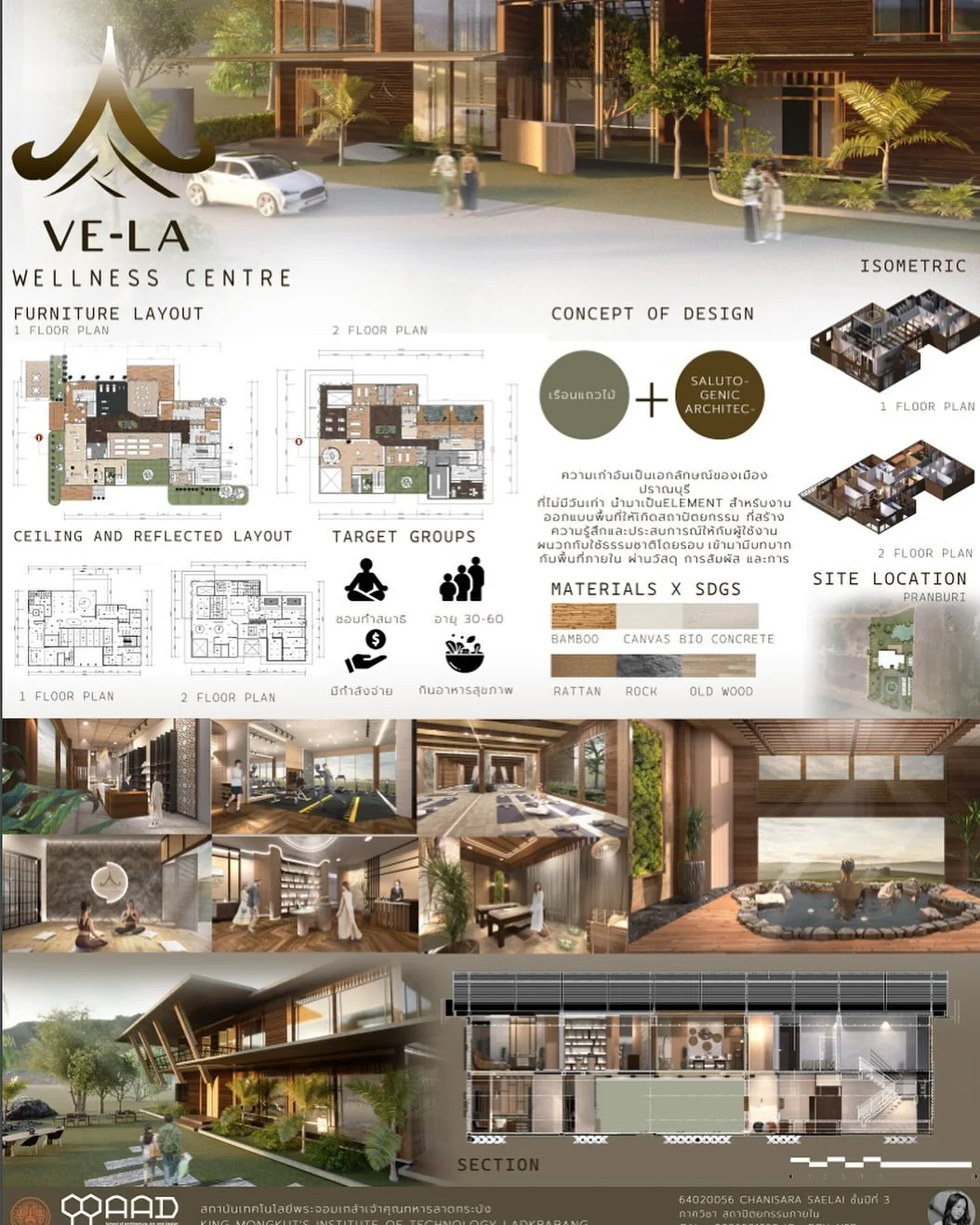
Chanisara Saelai’s A1 sheet for a wellness centre in Pranburi packs a whole two-storey building onto one page. Across the upper half sit a furniture layout for each floor, a ceiling and reflected layout for each floor, an isometric of each floor and a site location map labelled Pranburi. The lower third is a strip of perspectives, from the reception and gym to a yoga room, a massage room and an outdoor hot pool, with a long section running beside the exterior view. The board comes from the interior architecture programme at King Mongkut’s Institute of Technology Ladkrabang, a five-year Bachelor of Architecture that the university describes as the first such curriculum opened in the country.
The concept panel explains the layout. It pairs the old wooden row houses of the town with salutogenic architecture, the approach built on Aaron Antonovsky’s question of what keeps people healthy rather than what makes them ill. A row of six materials, bamboo, canvas, bio concrete, rattan, rock and old wood, is labelled “Materials x SDGs”, and a target group panel fixes the users at ages 30 to 60. That age band is why the plans show treatment rooms and a gym rather than a family pool. The site, Pran Buri district, lies on the Gulf of Thailand coast with Hua Hin to its north.
The weakness is reading distance. An ISO 216 A1 sheet is 594 by 841 millimetres, and with two plans, two ceiling plans, two isometrics and a site map sharing the upper half, each floor plan ends up smaller than the largest perspective. A juror two metres away reads the renders first and the plans last. For more on the drawing type used here, see our explainer on isometric drawings in architecture.
2. Hong Kong International School Repulse Bay Lobby (2016) – Hong Kong
Designers: students of Insight School of Interior Design | Client: HKIS administration | Space: Repulse Bay campus lobby
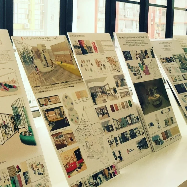
This photograph shows a row of at least five interior boards standing on a window ledge on the day students presented them to a real client. According to the school’s caption, the students showed their final projects “to their client, administration for their new Repulse Bay campus lobby” at Hong Kong International School. A real brief changes what a board has to do: the people reading it will pay for the result and walk through it every day.
The nearest board is organised by numbered zones. Readable labels include Reception, Popsicle Castle, Skylight and Art Space, each with its own small perspective, while two bubble diagrams and a hand-drawn plan tie the zones together. A short strip of swatches is split into floor, wall and ceiling, which is the most useful way to present finishes for a client who will not read a specification. The timing explains the urgency. The Wikipedia entry on HKIS notes that the Repulse Bay campus houses the Lower and Upper Primary divisions, and that the renovated Lower Primary campus was completed in 2017, a year after these boards were shown.
The problem is density. Five boards, each with ten or more small images, compete for attention in one line, and from a standing position the thumbnails blur into a pattern. The zone numbering helps, but a client comparing five schemes needs one large image per board to remember which was which.
3. Mid-Century Fusion Primary Bedroom (2025) – Dubai, UAE
Designer: Saba Malik | School: The Designers’ Studio | Board: Residential Final Board
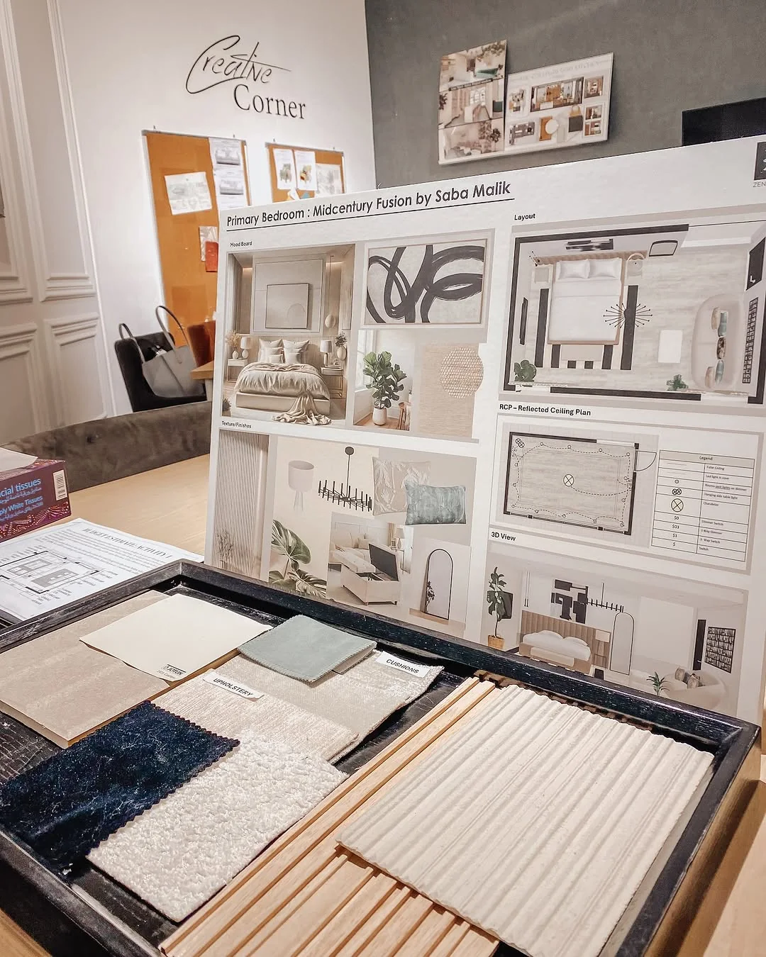
Saba Malik’s Residential Final Board is the clearest example in this list of a board that treats lighting as a design layer. Her school, The Designers’ Studio in Al Quoz, Dubai, describes the board as combining a planned layout, a reflected ceiling plan with balanced lighting, textures and materials, elevations and furniture placement, and 3D visualisation. In the photograph the left half carries the mood board and a texture and finishes panel, while the right column stacks the layout, the reflected ceiling plan and a 3D view of the bed wall.
The ceiling plan is what lifts the board. A dashed line traces a cove around a false ceiling, recessed spots ring the room and a chandelier marks the centre, and a legend beside the drawing lists nine symbols: false ceiling, LED light in cove, recessed spot lights on dimmer, hanging side table light, chandelier, dimmer switch, 3-way dimmer, 3-way switch and switch. Those nine entries are what an electrician needs to price the job. In front of the board sits a tray of physical samples tagged for upholstery and cushions, with a fluted panel and fabric swatches, so the client can touch what the textures panel only shows.
The board’s weak point is balance. The mood and texture panels take up as much space as the drawings, and most of their images are references rather than the designer’s own work. Our article on lighting as a narrative tool in interior architecture explains why the ceiling plan deserves the larger share.
💡 Pro Tip
Place the lighting legend directly beside the reflected ceiling plan, not in a shared legend at the bottom of the sheet. Reviewers check a ceiling plan symbol by symbol, and every glance across the board to find a key is a moment they stop reading the design.
4. Sample Board and Cosy Contemporary Board (2024) – Dubai, UAE
School: The Designers’ Studio | Boards: physical sample board and “Cosy Contemporary” design board
This photograph from the same Dubai school puts two board types side by side. On the left, a board titled Sample Board carries ten labelled physical samples: satin finish paint, painted MDF, two faux leathers, cane, acrylic solid, oak veneer, woven acrylic and polyester, engineered hardwood and a porcelain tile from RAK Ceramics. Two printed views of a dining room with sculptural pendant lights sit at the top, so every sample can be matched to where it will be used.
On the right, the “Cosy Contemporary” board does the opposite job. It has four colour dots, a joinery elevation of a shelving wall, a rendered plan with a herringbone floor, and a block of photographs and fabric swatches, including a chunky woven sisal held up by a hand at the bottom edge. One board answers “what is it made of”, the other answers “what will it feel like”.
The labels are the strength: each sample has a printed tag, which is what turns a pile of offcuts into a specification. The weakness is that neither board shows dimensions, and the design board’s plan has no furniture names, so the two halves only work while the designer stands there explaining them.
5. The Moore Family Wall and Flooring Board (2020) – Nottingham, UK
Designer: Zoe Smith | Course: Professional Interior Design, National Design Academy | Brief: Moroccan-inspired multi-purpose room
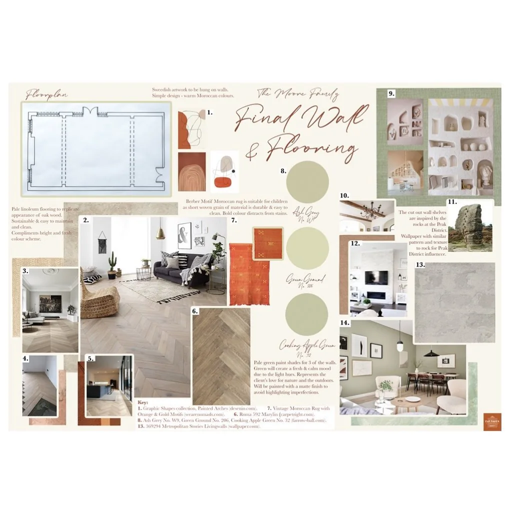
Zoe Smith made this landscape board for a module of her Professional Interior Design course at the National Design Academy, whose studio is at Rufford Hall in Nottingham and whose diploma includes producing presentation boards. Titled “The Moore Family: Final Wall & Flooring”, it covers only two surfaces of a Moroccan-inspired room, and that narrow brief is why it works. A floor plan outline sits top left, fourteen numbered images fill the sheet, and short notes explain each choice: pale linoleum to look like oak, a Berber-motif rug chosen because its short woven grain is durable and easy to clean for children, and cut-out wall shelves inspired by the rocks of the Peak District.
The key along the bottom is the real lesson. It names each product and supplier, including three paints from Farrow & Ball: Ash Grey No. W9, Green Ground No. 206 and Cooking Apple Green No. 32, which the maker describes as a fresh green that feels brighter in well-lit rooms. The note beside the swatches says the green will go on three of the walls in a matte finish to avoid highlighting imperfections. A contractor could order every finish from that one line.
The floor plan is the gap. It is an empty outline with no furniture, dimensions or rug position, so the board says what the surfaces are but not where the rug and shelves sit in the room.
💡 Pro Tip
Write paint and finish names the way the maker writes them, with the colour number, as Zoe Smith does with Cooking Apple Green No. 32. “Sage green” on a board becomes a phone call to the designer; a maker’s name and number can be ordered straight from the sheet.
6. Casa del Sol (2025) – Antalya, Türkiye
Designer: Yasemin Öz | Course: IAED 3001 Interior Design Studio V | Semester: 2024-25 Spring
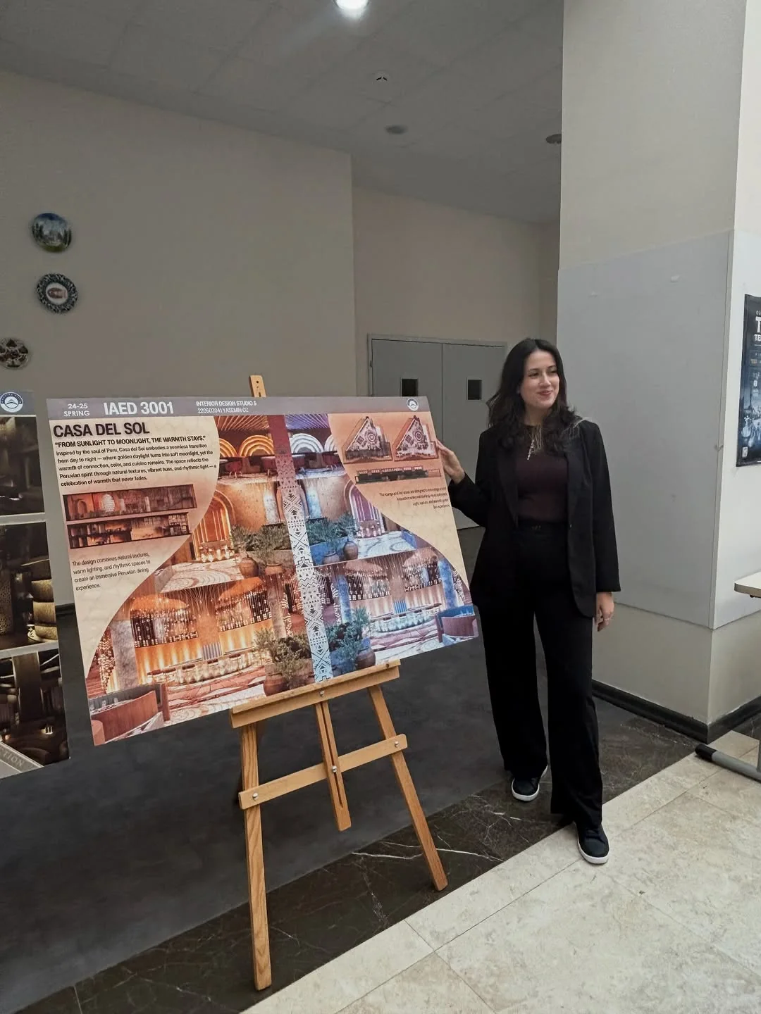
Casa del Sol is a Peruvian restaurant scheme by Yasemin Öz, presented on an easel at Antalya Bilim University, whose Department of Interior Architecture and Environmental Design lists IAED 3001 as Interior Design Studio V. The header strip gives the semester, course code, student number, name and university logo, a simple title block that every student board should copy.
The layout is the concept. The board’s tagline, “From sunlight to moonlight, the warmth stays”, is drawn literally: the left half shows the dining hall in warm golden light, the right half shows the same space in blue night light, and a vertical strip of geometric textile pattern splits them. The text describes natural textures, warm lighting and rhythmic spaces creating a Peruvian dining experience, while two triangular elevations and a long elevation strip in the top right corner show the seating walls in drawing form. The department’s current curriculum gives this studio 10 ECTS, the largest single share of a third-year semester worth 33, which is why this one sheet carries so much.
The board is also the most render-heavy in the list. No floor plan is visible in this photograph, so a reviewer cannot check the bar position or the circulation against the beautiful day and night views. Our piece on wellness design principles is a reminder that light and comfort claims need a plan behind them.
7. Crown Perth Hotel Lobby Concept (2021) – Perth, Australia
Designer: vazuedesign | Site: Crown Perth, Burswood | Stage: first initial concept
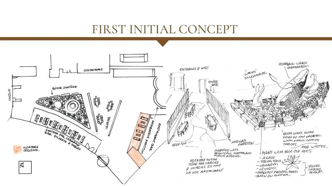
Not every board is rendered. This “First Initial Concept” sheet by vazuedesign for a lobby at Crown Perth uses only black pen, one orange marker and handwriting. On the left, a plan sketch places a triangular planted island with bench seating between the casino and a restaurant, a curved champagne bar with “24 seats & 6 tables”, high tea tables and a decorative partition, with orange marking a floating ceiling. On the right, two perspective sketches show the entrance with tinted glass and modular partitions, and the garden island crowned by a humpback whale sculpture.
The designer’s caption explains the decision: the feature was meant to capture Perth through its flora and fauna, and the whale won over other candidates. The notes carry the planting palette, silver-leaved plants with blue-ish hues such as agave, silver king, licorice plant, Japanese painted fern and snow in summer, and a carpet “with beautiful Australian flora design”. The seat count is the useful number, because 24 seats at 6 tables tells an operator straight away whether the bar earns its floor area. The complex is large: Crown Perth sits in Burswood near the Swan River, and its Crown Towers hotel opened in December 2016 with 500 rooms, taking the site to 1,200 hotel rooms.
As a concept sheet it has the usual limits: no scale, no north point and no indication of how big the whale is relative to the benches. It is a sheet for agreeing an idea, not for pricing it.
8. Bellevue College Cafe Project (2019) – Bellevue, USA
Designer: zanmiinteriors | Course: INDES 172 Interior Design Studio II | Project: Cafe Project
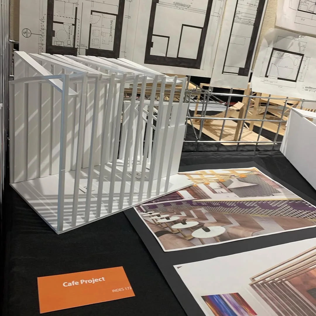
The last example is a board set rather than a single sheet. An exhibition table carries an orange label reading “Cafe Project, INDES 172”, a white study model of tilted slatted frames, a printed render of cafe seating with round tables and, pinned behind, a row of hand-drawn floor plans with solid black walls. The designer’s caption names the three parts: renders, an abstract model and hand floor plans.
The course code matches INDES 172 Interior Design Studio II at Bellevue College in Bellevue, Washington, a 5-credit studio in which students apply design processes to basic interior projects while learning “graphic tools, techniques, and standards for effective design communication”. That description explains the mix on the table: at this stage the hand plans prove scale and layout, the model proves the idea in three dimensions, and the render proves the mood.
Shown this way, the set asks the viewer to do the assembling. Nothing on the table links the slatted model to a line on the plan, so a visitor has to guess which wall the frames belong to. A single board with a small plan key next to the model photo would have closed that gap.
Honorable Mentions
House for an Art Lover Competition (1901) – Darmstadt, Germany
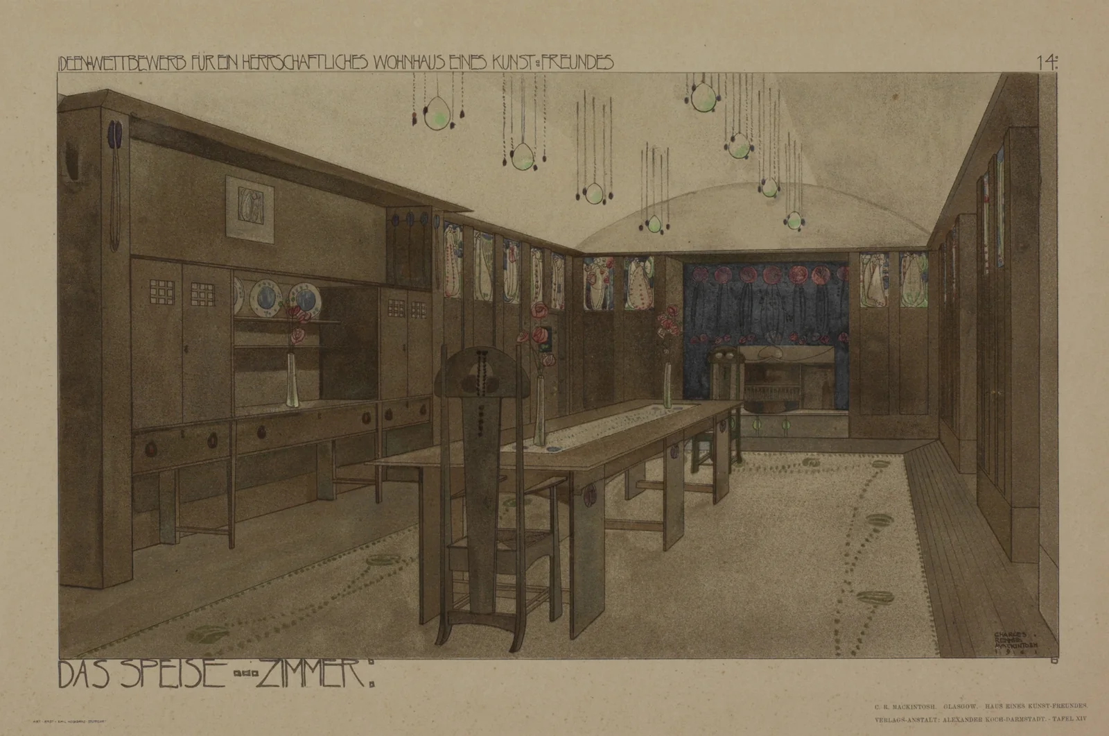
Charles Rennie Mackintosh’s entry for the competition run by Alexander Koch’s magazine Zeitschrift für Innendekoration is a well-known early set of interior presentation plates. The House for an Art Lover portfolio of fourteen drawings, including this dining room plate with its lettered title band and plate number, is a historic sheet rather than a modern board, so it stays outside the main list.
📌 Did You Know?
Mackintosh’s 1901 entry was disqualified for arriving late with unfinished sketches, yet the jury still gave his fourteen drawings a prize for the uniform configuration of interior and exterior. The house was finally built from those boards between 1989 and 1996 in Glasgow’s Bellahouston Park, nearly 90 years after the competition.
Design for a Library in a Glasgow House (c. 1894) – Glasgow, Scotland
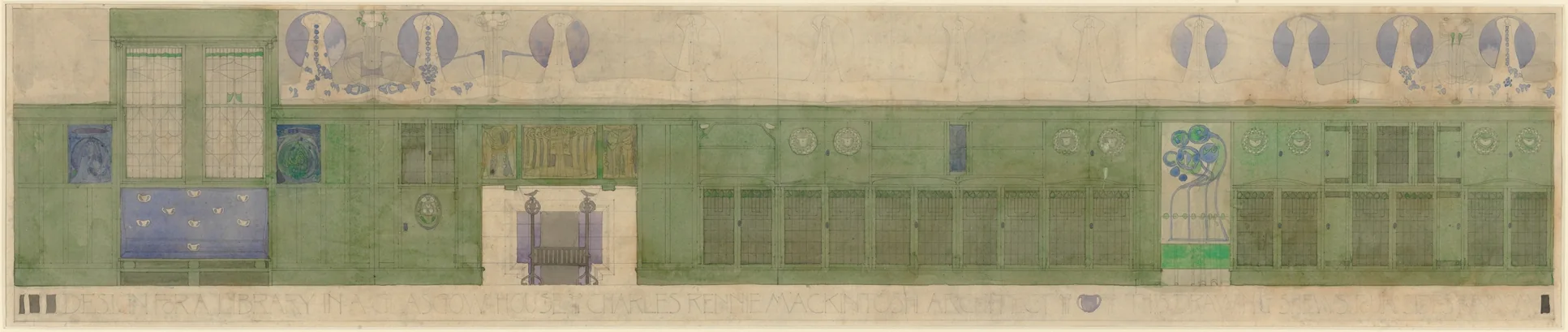
Long before digital boards, Mackintosh unrolled all four walls of a library into one watercolour strip, with the window, fireplace, fitted cabinets and frieze running in sequence and the title lettered along the bottom. It is left out of the main list because no client or site has ever been identified.
Charles Collier House Room Elevations (1938) – Falls Church, Virginia, USA
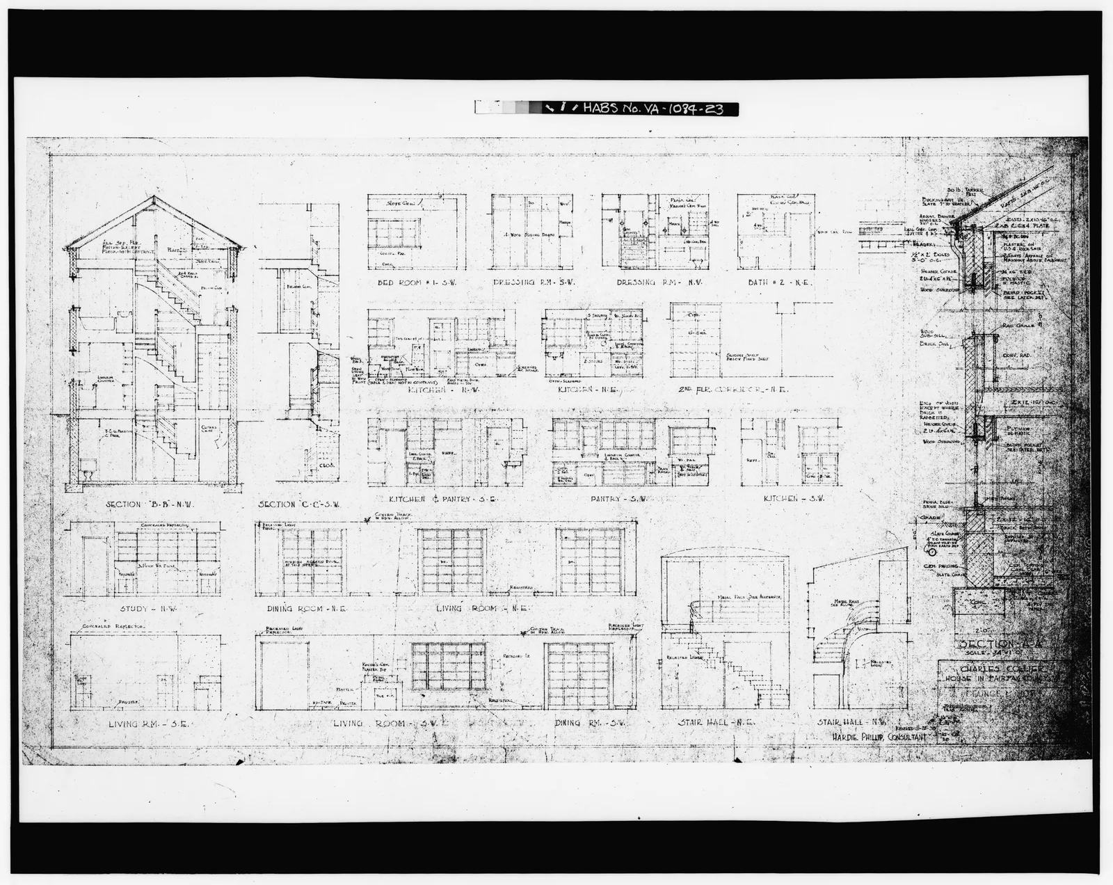
George Locke Howe’s sheet of sections and room elevations, recorded by the Historic American Buildings Survey, fits two sections and nearly twenty room elevations, from the kitchen and pantry to the stair hall, onto a single page. It is a working drawing rather than a presentation board, but it shows how much interior information one sheet can hold.
What These Eight Boards Have in Common
The plan sits next to the picture it explains
The strongest sheets put a measured drawing beside every render. VE-LA places a floor plan and ceiling plan above its perspectives, and Saba Malik stacks her layout, ceiling plan and 3D view in one column. Casa del Sol and the Moore Family board show the cost of skipping this: one has no visible plan, the other an empty outline, and both leave the reviewer unable to check the pictures.
Real samples need labels to count
The Dubai sample board, the tray in front of Saba Malik’s board and the Moore Family paint key all treat materials as a specification, not a texture collage. What separates them from a mood board is the label: a printed tag on each sample in Dubai, a maker and colour number in Nottingham. Our guide to creating mood boards covers the looser, earlier version of the same idea.
A concept works best when it shapes the layout
Casa del Sol splits the sheet into day and night, the Crown Perth sketch builds its island around a whale, and the HKIS board numbers its zones like a route through the lobby. In each case you can understand the idea from the arrangement of the page before reading a word, which is exactly what a jury walking along a row of boards does.
Some projects need a set, not a sheet
HKIS and Bellevue College both present a series rather than one board. The HKIS row shows the risk of five equally busy sheets, and the Bellevue table shows the risk of loose parts with no key. A set works when each sheet has one dominant image and a shared title strip, the way the Casa del Sol header does.
What to Include on an Interior Design Presentation Board
Every board above draws from the same short list. You will rarely need all six on one sheet, but a board missing the first three will struggle in any review. For general rules on hierarchy and spacing, see our article on successful architectural presentation boards.
Floor plan with furniture layout
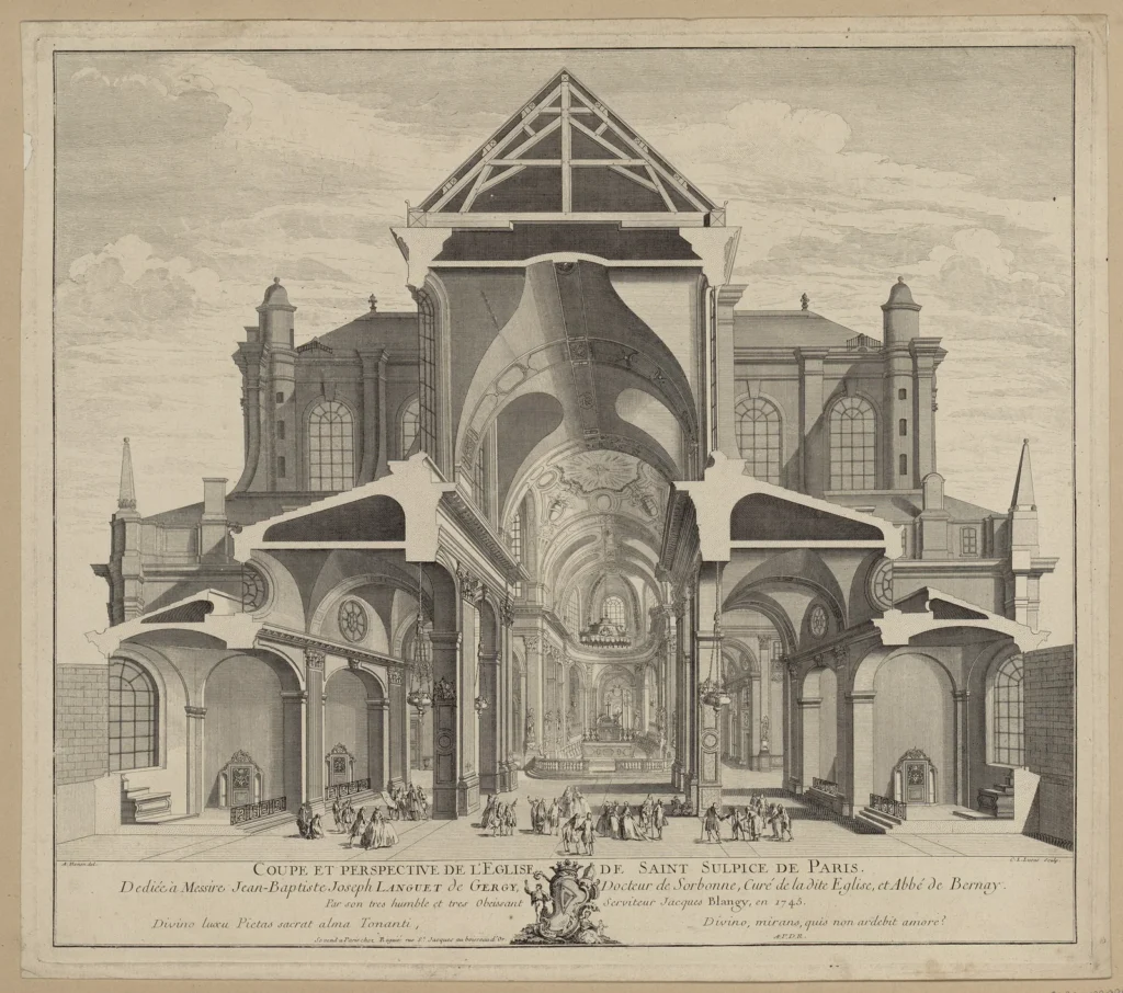
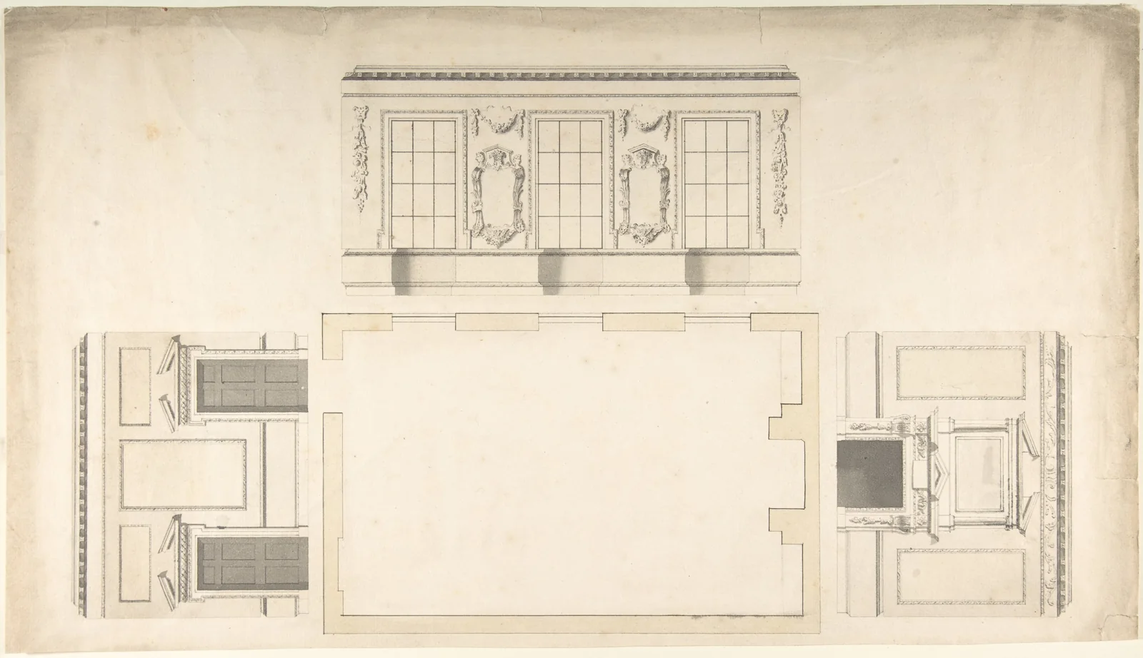
The furniture plan is the anchor. Show the furniture at scale, label rooms, and add a north point. The 18th-century room design below, with its plan surrounded by unfolded wall elevations, shows a convention that still works: a reader can connect each wall to its place on the plan at a glance.
Reflected ceiling plan
A reflected ceiling plan shows lights, ceiling levels and switches as if seen in a mirror on the floor. VE-LA and Saba Malik both include one, and both pair it with the floor plan at the same scale so features line up.
Sections and interior elevations
Elevations explain joinery, wall finishes and heights. Casa del Sol uses small elevations of its seating walls, and the Cosy Contemporary board uses one of a shelving wall. The 1938 Collier House sheet shows how many can share a page when each is labelled by room and direction.
Material and finish palette
List finishes by surface, as the HKIS board does with floor, wall and ceiling, and name each one by maker and code, as the Moore Family key does. Physical samples are worth bringing when the client is in the room.
Perspective views
One large view should dominate, with smaller views supporting it. The VE-LA strip and the Casa del Sol split both show that perspectives carry the mood, but only when the drawings above them carry the facts.
Title block
Project name, designer, course or client, date and sheet number belong in a consistent strip. Casa del Sol’s header is a good model, and our list of fonts for presentation boards helps with the lettering.
Frequently Asked Questions
Which boards in this list include a reflected ceiling plan?
Two of them. The VE-LA Wellness Centre board shows a ceiling and reflected layout for each of its two floors, and Saba Malik’s Mid-Century Fusion bedroom board pairs its reflected ceiling plan with a nine-symbol lighting and switch legend.
Which board relies most on physical material samples?
The Dubai Sample Board, which carries ten labelled samples from painted MDF to a RAK Ceramics porcelain tile. Saba Malik’s board, from the same school, is presented with a separate tray of upholstery and cushion samples in front of it.
Which is the oldest board in the main list?
The Hong Kong International School lobby boards, presented in May 2016. The newest is Casa del Sol, from the 2024-25 spring semester at Antalya Bilim University, while the oldest sheet in the article is Mackintosh’s library design from about 1894.
What This Means for Your Next Project
Your Next Step: Before you lay out your next interior design presentation board, list the drawings it must contain, a furniture plan, a ceiling plan, at least one elevation and a labelled finish key, and place those first. Add the renders into the space that remains, not the other way round.



How to Optimise Architectural Videos for Better Design Presentations and Online Sharing
Walkthroughs and animations help architects explain a design, but large files are...
illustrarch Editorial Team5 Mins read

Why Captions Belong in Every Architecture and Design Video
Most people watch design reels with the sound off. Captions make architecture...
illustrarch Editorial Team4 Mins read
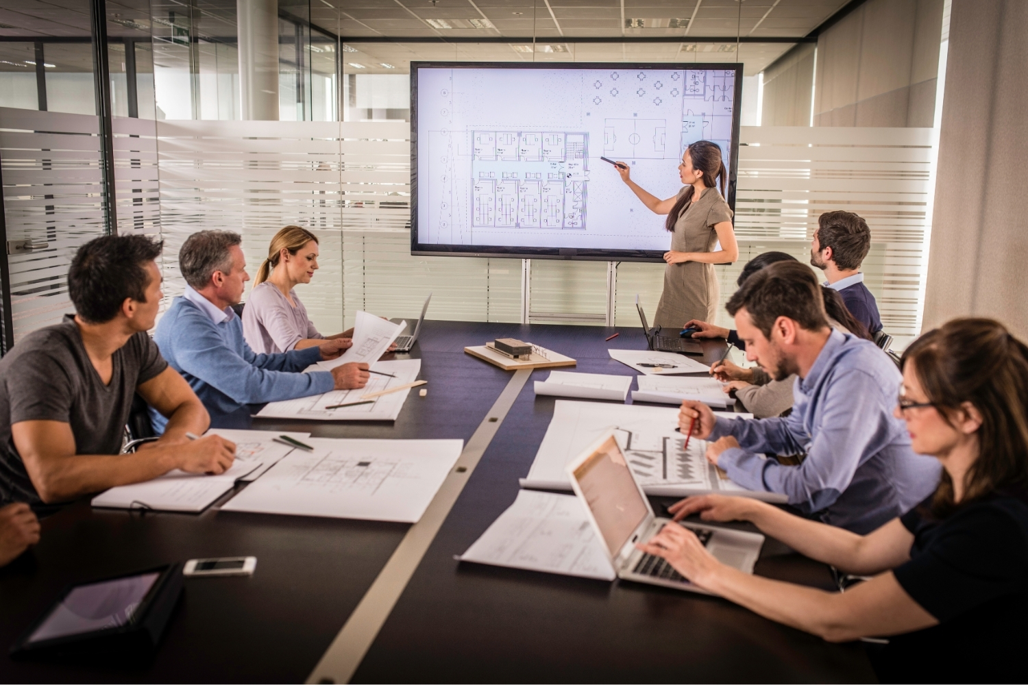
Architecture Crit Presentation: How to Present Your Project With Confidence
The crit is where a good project can fall apart and an...
 Sinan Ozen6 Mins read
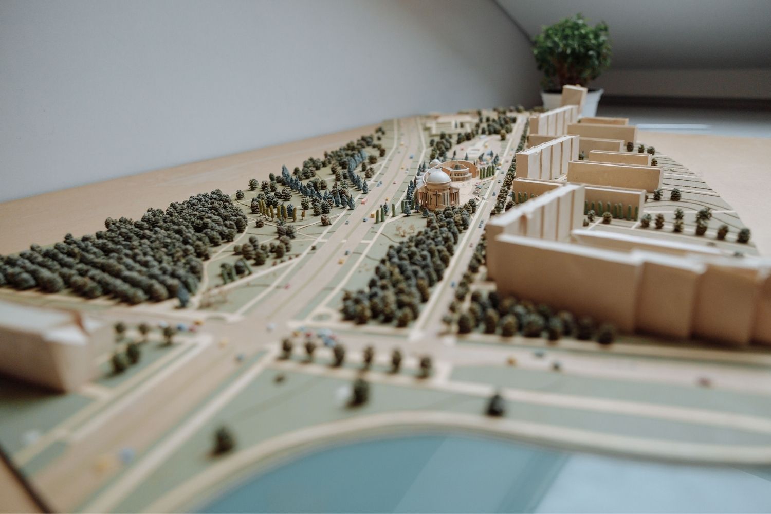
Why Do Architects Use Architectural Models Instead of Just Drawings?
Physical architectural models remain a core tool even in a digital studio....
 Furkan Sen6 Mins read



Leave a comment