

Michelangelus Turns Michelangelo’s Handwriting Into a Free Font for Microsoft 365
Commissioned by the Fabbrica di San Pietro and designed by studiogusto®, Michelangelus is a free 500-glyph typeface based on Michelangelo's letters and signatures.
 illustrarch Editorial Team16 November 20262 Mins read1
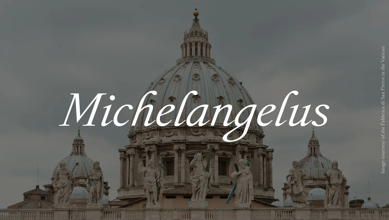
Michelangelo’s handwriting has been turned into a digital typeface. Michelangelus, commissioned by the Fabbrica di San Pietro, the Vatican body that has looked after St Peter’s Basilica since the 16th century, was designed by the Italian studio studiogusto® for Microsoft 365 and released on 8 October 2026 as a free download for anyone to use.
 Office for Future’s Dvir Turns a Former School in Stavyshche Into 42 Homes for Displaced Ukrainian Families
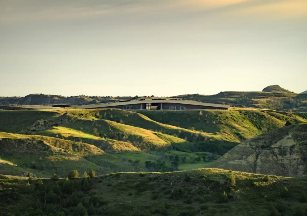 2026 Architecture MasterPrize Winners: Snøhetta Takes Design of the Year
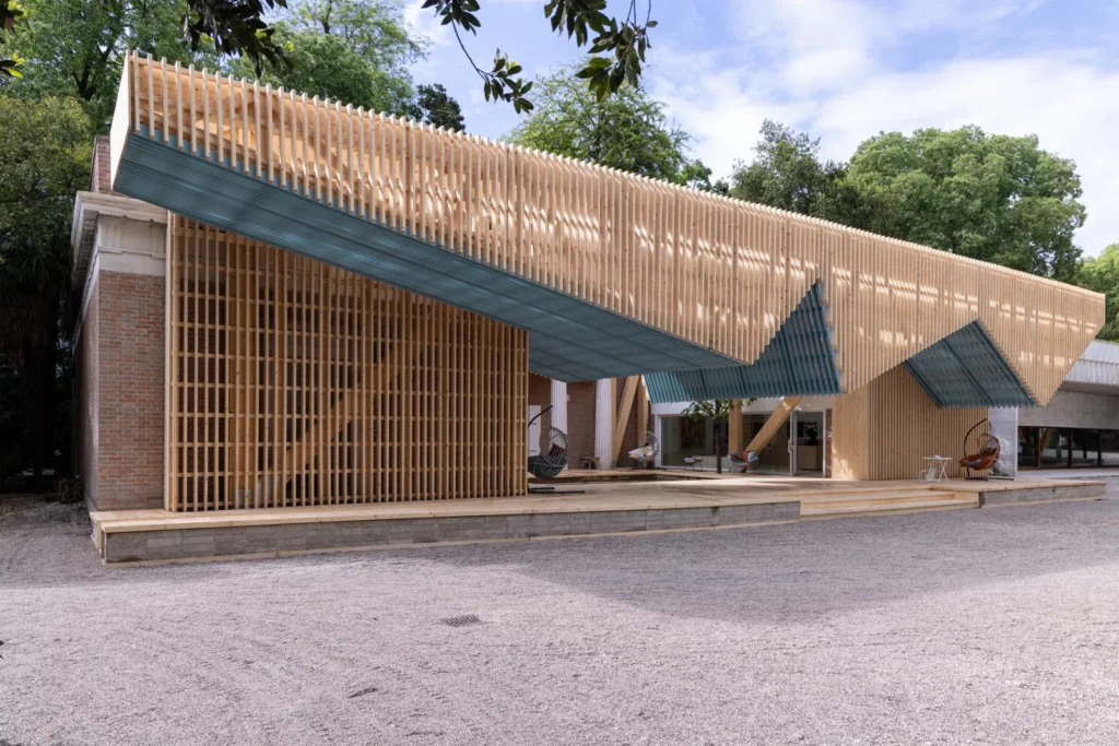 Marlon Blackwell Architects’ Porch From the 2025 US Pavilion in Venice Will Be Rebuilt at Crystal Bridges
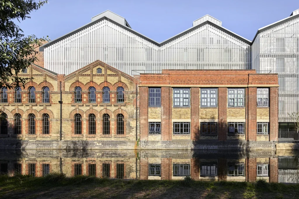 John McAslan + Partners Turns Oxford’s 1892 Osney Power Station Into a Global Leadership Centre
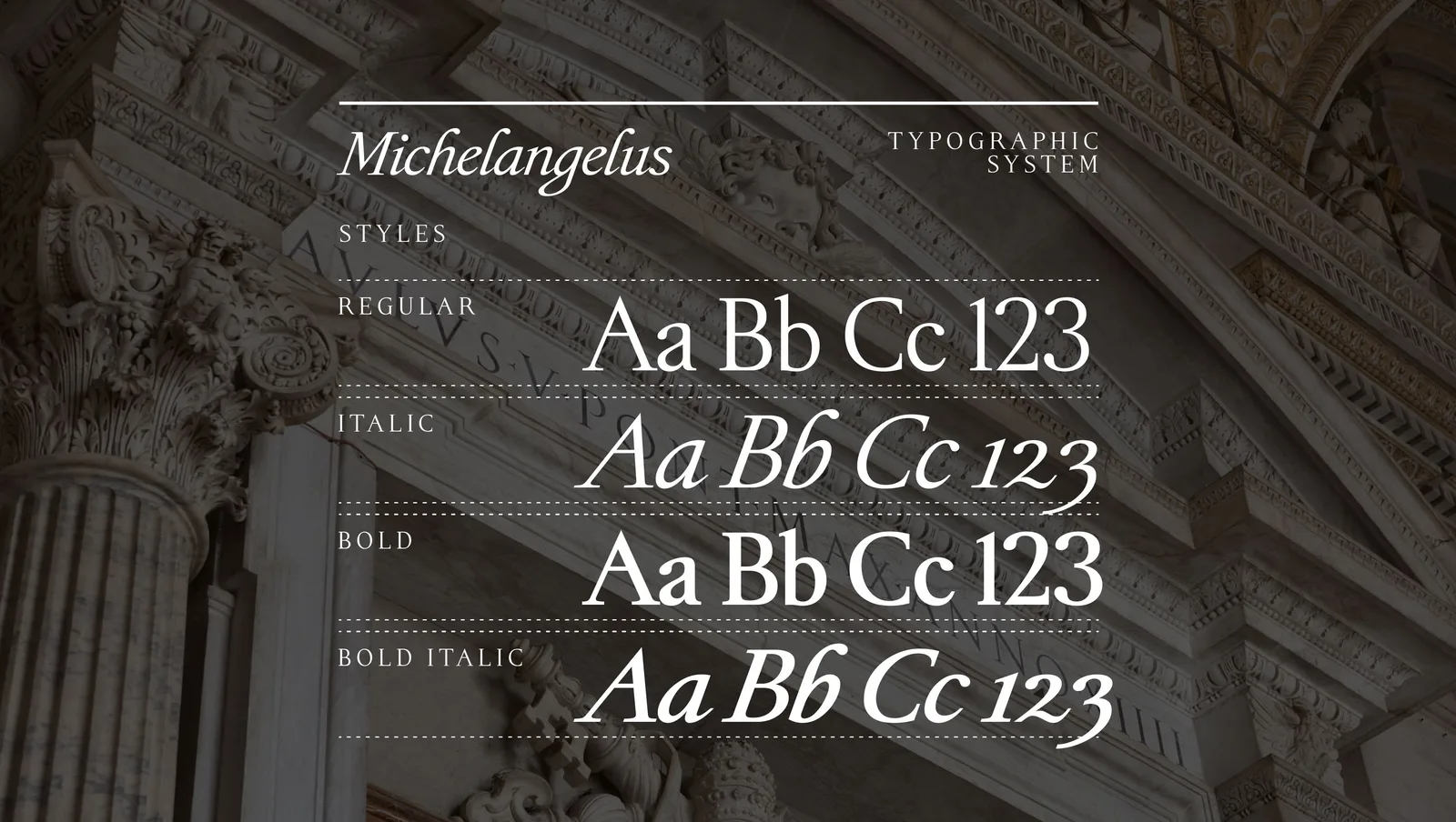
The family covers more than 500 glyphs across four styles: Regular, Regular Italic, Bold and Bold Italic. It joins the Microsoft 365 font collection and can also be installed directly, with a licence intended to protect the integrity of the design while keeping it free of charge. The Fabbrica describes the project as one of several digital initiatives it has entrusted to Microsoft to promote the basilica’s heritage.
From letters and signatures to the Michelangelus typeface
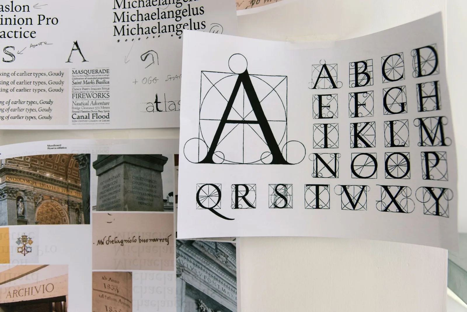
The designers did not set out to copy the artist’s script stroke by stroke. They studied original documents in the archives of the Fabbrica, the Vatican Apostolic Archives and Casa Buonarroti in Florence, starting from Michelangelo’s signature, and tried to pin down the recurring rules behind his hand: the slant, the shape of the terminals, the balance of black and white and the rhythm of a line of text.
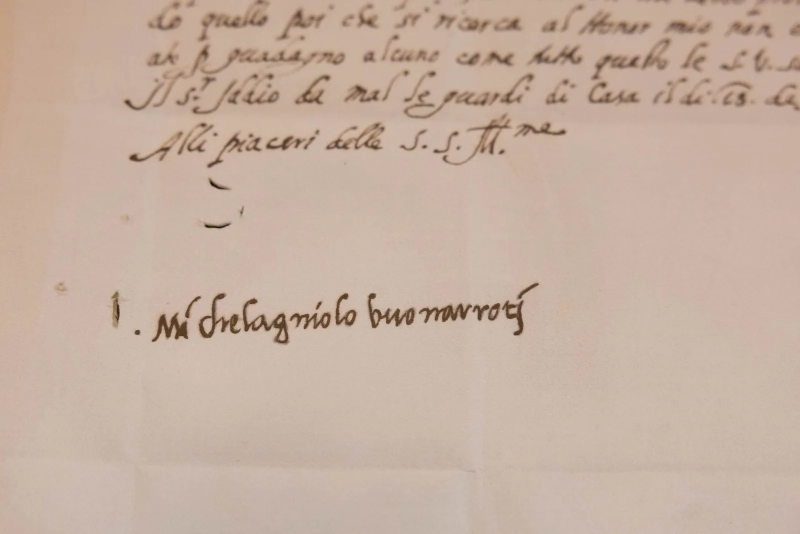
The two halves of the alphabet come from two different sources. Lowercase forms follow the personal handwriting of the letters and notes, while the capitals are drawn to recall the monumental scale of his public work, from the Pietà to the dome of St Peter’s. According to the Fabbrica, the research revealed an “invisible grid” under the apparently spontaneous script, a structure the designers describe as almost architectural.
A Renaissance architect’s hand in everyday software
For architects the link is direct: Michelangelo’s hand produced not only letters but also the drawings and notes behind the dome of St Peter’s, which he took charge of after Antonio da Sangallo the Younger died in 1546. Turning that hand into a working font for word processing and presentations puts a piece of that heritage into the tools used daily by millions of people, a goal the Fabbrica states openly.
The press material also recalls Michelangelo’s own impatience with poor handwriting. In a letter to his nephew Lionardo he complained that each of the young man’s letters gave him a fever from the effort of reading it, an irony not lost on a project built around legibility.



Office for Future’s Dvir Turns a Former School in Stavyshche Into 42 Homes for Displaced Ukrainian Families
The 1,900 square metre school keeps its place in town life with...
illustrarch Editorial Team1 Mins read
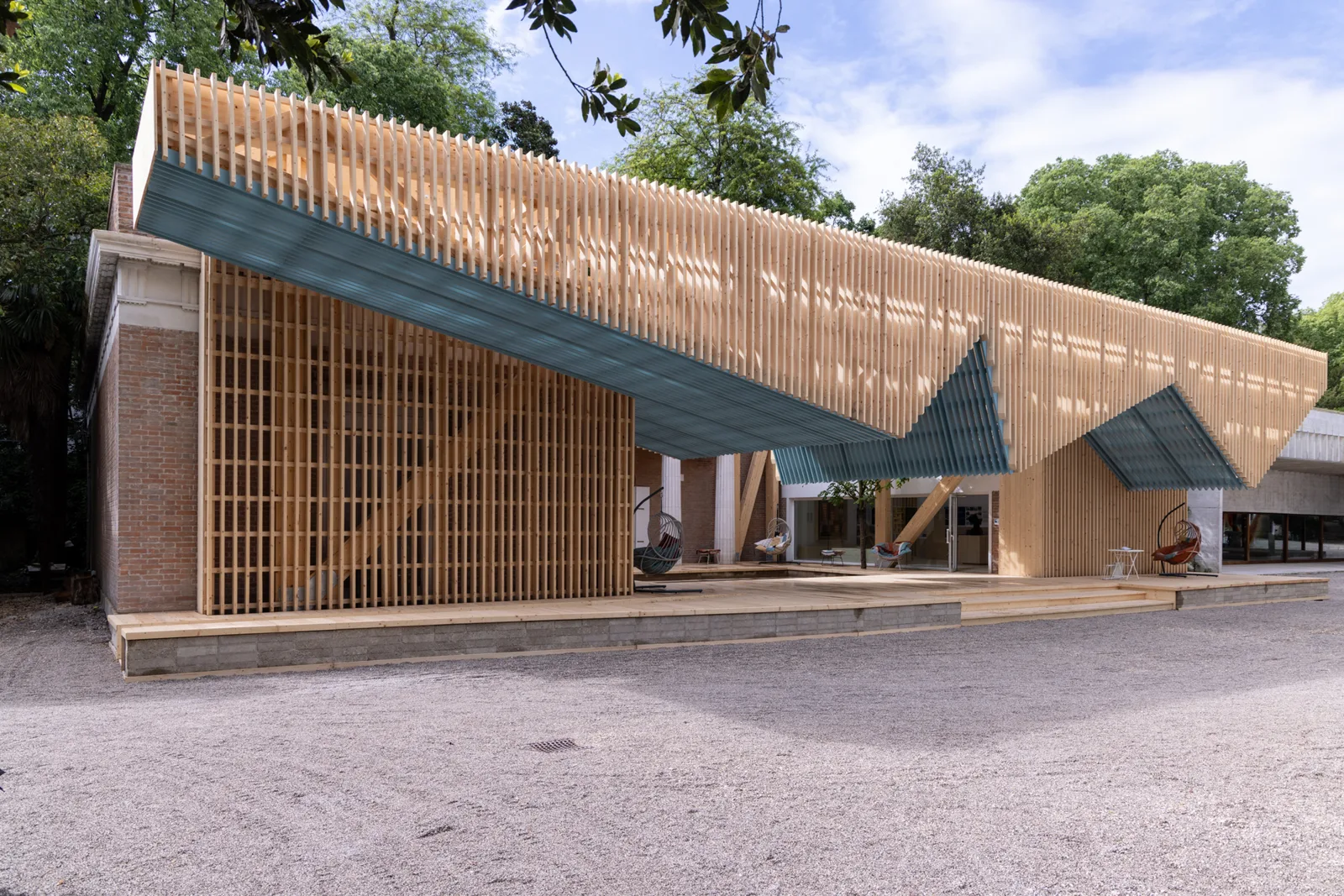
Marlon Blackwell Architects’ Porch From the 2025 US Pavilion in Venice Will Be Rebuilt at Crystal Bridges
Dismantled after the Biennale and stored in Arkansas, the timber canopy designed...
illustrarch Editorial Team2 Mins read
John McAslan + Partners Turns Oxford’s 1892 Osney Power Station Into a Global Leadership Centre
Oxford's first power plant, in use from 1892 to 1968, now houses...
illustrarch Editorial Team2 Mins read
Bronze Seal Ring From the Sunken Palace of Antirhodos Shows the Lighthouse of Alexandria
Divers working with Franck Goddio's IEASM found the ring on Antirhodos in...
illustrarch Editorial Team2 Mins read




Leave a comment