

Museum Cafes: 7 of the World’s Most Stunning Places to Sit Down
7 museum cafes where the architecture does the work: Victorian refreshment rooms in London, a listed hotel dining room in Paris, a Kuma glass pavilion in Tokyo, an atrium under a 45 metre window in Doha, and the design logic behind them.
 Elif Ayse Sen23 August 20269 Mins read243
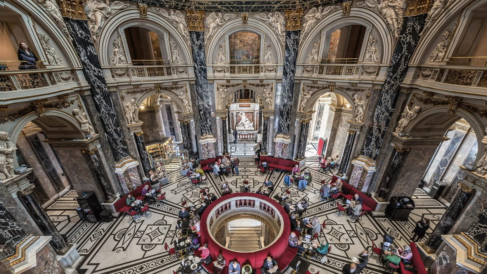
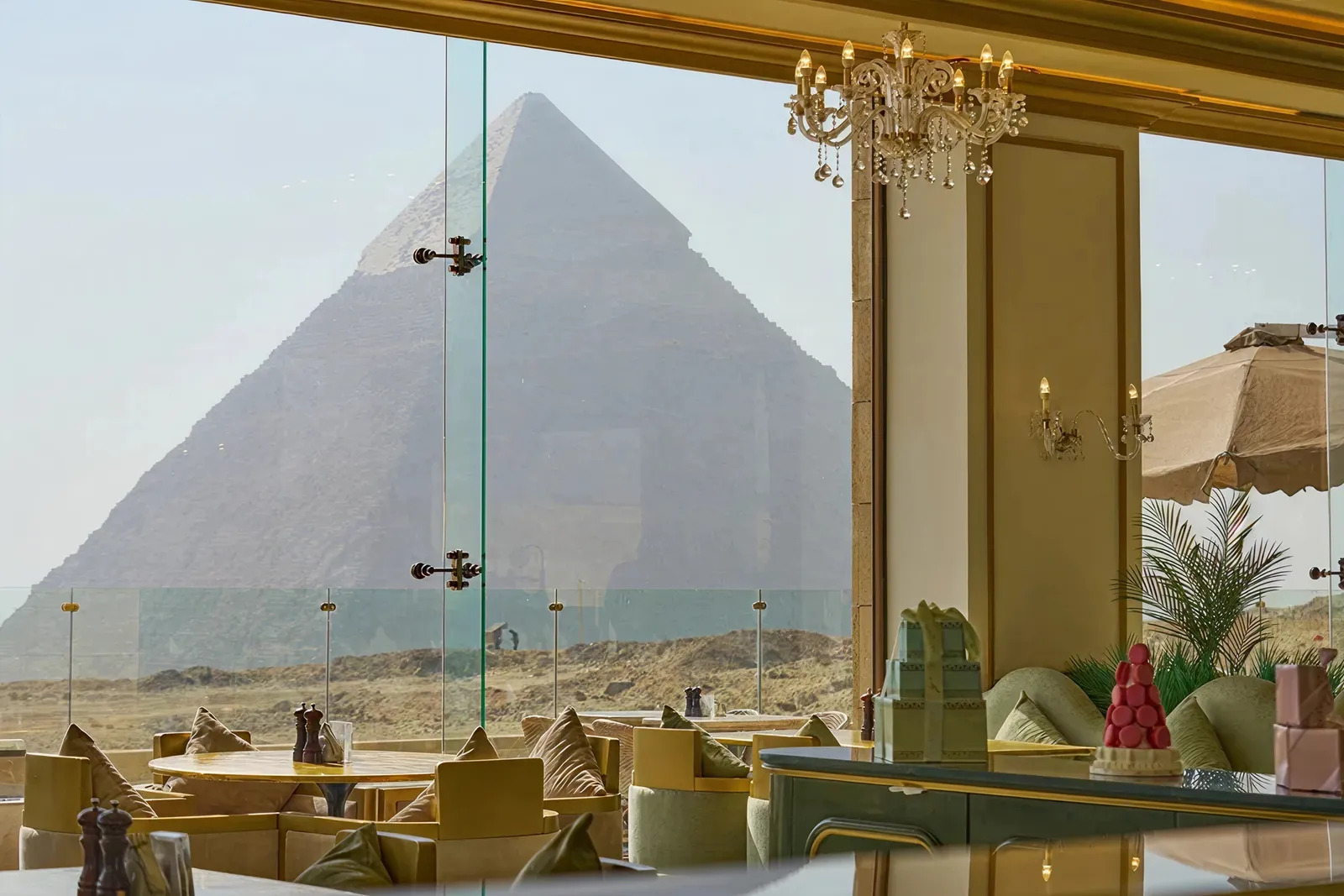


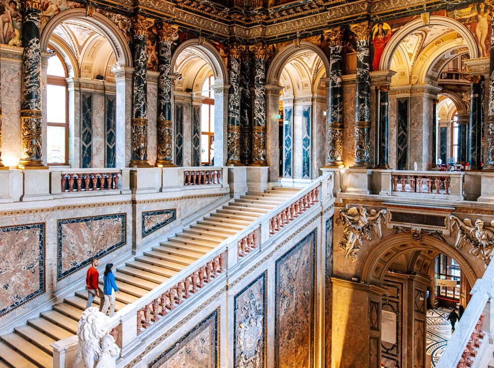


Table of Contents Show
Museum cafes are dining rooms that sit inside architecture worth visiting on its own. The best of them, from the Victoria and Albert Museum’s 1868 refreshment rooms in London to Kengo Kuma’s glass pavilion at the Nezu Museum in Tokyo, treat the room as the main attraction and keep the service design quiet enough to let it speak.
Most rankings of the most beautiful museum cafes stop at the photograph. That leaves out the part architects and designers actually want: why a ceramic wall, a 45 metre window or a rooftop terrace ended up in a place where people eat sandwiches. Every space below was built or inserted for a reason, and the reasons are still useful for anyone working on a hospitality insert inside a cultural building.
Seven rooms follow, on four continents, with the design decision that carries each one and the practical detail that rival lists tend to miss.
What Makes Museum Cafes Different From Ordinary Cafes?
A museum cafe answers to a plan that was never drawn around it. Galleries are kept dark to protect works on paper and pigment, so the cafe is often the first daylit room a visitor reaches after an hour indoors, which is why so many of them face a window, a garden or a roofline. It also sits at a fixed point in a route somebody else designed, either as a mid visit pause or as the reward at the end.
The commercial logic differs too. A high street cafe lives on turnover and street frontage. A museum cafe usually cannot advertise from the pavement, often cannot be entered without a ticket, and has to serve a crowd that arrives in waves tied to exhibition openings and school groups. That mix rewards durable surfaces, generous circulation and seating that can empty fast, the same fundamentals covered in our guide to cafe design, lighting and flow.
There is a curatorial argument as well. As museums shift from sealed treasure houses toward civic buildings, food service moved from the basement to the plan’s best rooms, a change we traced in our look at museum architecture in the 21st century. The cafe is now part of how an institution presents itself, not an afterthought bolted onto the exit.
The Best Museum Cafes in the World, and What Makes Each One Work
V&A Cafe, London: The Room That Invented the Idea
The Victoria and Albert Museum did not just build an attractive tea room. It built the first one. Founding director Henry Cole, who had learned what visitors needed while running the Great Exhibition of 1851, wanted refreshment inside the museum so that culture could compete with the pub. The V&A’s own account of the refreshment rooms records the first attempt in 1856 as a temporary timber structure by Francis Fowke that the press called ugly and that was pulled down in 1867.
Its replacement is what visitors sit in today: three linked rooms opened in 1868 and named after James Gamble, Edward Poynter and William Morris, whose firm decorated one of them. The surfaces were an argument as well as a display of British manufacturing. Ceramic tile, enamelled iron and glass could be washed down, resisted steam and cooking smells, and made the space effectively fireproof at a time when South Kensington was a long ride from the nearest fire station. A Victorian answer to a problem every food and beverage designer still has.
📌 Did You Know?
The V&A opened the world’s first museum restaurant. Its original refreshment room dates from 1856, and the three surviving rooms opened in 1868, decorated over the following years. According to the museum’s own history of the project, most other institutions did not invest in catering until the 20th century, which makes this cafe roughly fifty years ahead of the idea it started.
Restaurant du Musee d’Orsay, Paris: A Station Hotel Dining Room

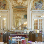
The Orsay restaurant was not designed for a museum at all. It is the dining room of the Hotel du Palais d’Orsay, the hotel attached to the railway station built for the 1900 Exposition Universelle, and it survived the building’s conversion intact. The ceilings carry paintings by Gabriel Ferrier and Benjamin Constant, and the room is listed as a historic monument, which fixes the gilding, the chandeliers and the proportions in place.
What makes it interesting now is the contrast the museum allowed. Against that 1900 shell sit contemporary chairs by Jacopo Foggini, a deliberate collision rather than a period pastiche. One floor structure above, the museum runs a second and completely different room: Cafe Campana, designed by the Campana brothers beside one of the station’s great clocks, with organically shaped seating and scaled chandeliers that read as an underwater reworking of Art Nouveau. Two rooms, one institution, opposite strategies.
Kunsthistorisches Museum, Vienna: Coffee Under the Cupola
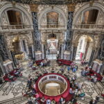
Vienna’s Kunsthistorisches Museum opened in 1891 as a purpose built home for the Habsburg collections, and its Cupola Hall was always the ceremonial centre of the plan. Putting the cafe there was a decision to hand the building’s most theatrical space to the public rather than to the collection. White marble panelling, gold detailing and the dome overhead do all the decorative work, so the furniture stays low and soft and the high tables sit at the windows facing Maria Theresien Platz.
The staircase alongside carries spandrel paintings by Gustav Klimt, his brother Ernst and Franz Matsch, which means the walk to your table passes early Klimt at close range. One practical catch that photo led lists omit: the museum’s visitor information confirms the cafe is open throughout museum hours but sits inside the ticketed zone, so there is no dropping in for a coffee without admission.
NEZUCAFE, Tokyo: A Glass Pavilion in a Private Garden
Kengo Kuma’s 2009 rebuild of the Nezu Museum in Aoyama is best known for its long bamboo lined approach, which pulls visitors off one of Tokyo’s busiest shopping streets before they reach the door. The cafe is a separate move: a freestanding pavilion set in the garden between the new building and the old wing, glazed on its long sides so that the room is effectively surrounded by planting.
The lighting logic is the lesson. Galleries holding pre modern Japanese and East Asian works are kept dark for conservation, while the cafe pavilion is filtered daylight, with broad eaves shading the glass and translucent sections of roof softening what comes through. The sequence is deliberately calibrated: dark, then green and bright. It is a small building doing a big job, and it sits comfortably within the wider body of Kengo Kuma’s material driven work. Details of the scheme are published on the practice’s own project page. Admission to the museum is required, and entry runs on timed online slots.
MIA Cafe, Doha: Under a 45 Metre Window
I. M. Pei came out of retirement for the Museum of Islamic Art and spent years travelling before settling on the sabil of the Ibn Tulun Mosque in Cairo as his reference. The result stands on a purpose built island off the Corniche, and its cafe occupies the ground of the atrium, at the foot of the curved double staircase.
Two elements make the room. Above, a faceted dome with an oculus throws a shifting pattern of light down the tower, with a large circular chandelier hanging below it. To the north, the museum’s architecture page describes a 45 metre glass wall facing the bay and the West Bay skyline. Sitting there is closer to sitting in a lobby of a cathedral scale than in a cafe, and the seating is arranged to keep sightlines to both. The formal restaurant, IDAM, sits on the top floor with interiors by Philippe Starck.
The Wright, New York: A Curve Answering a Curve
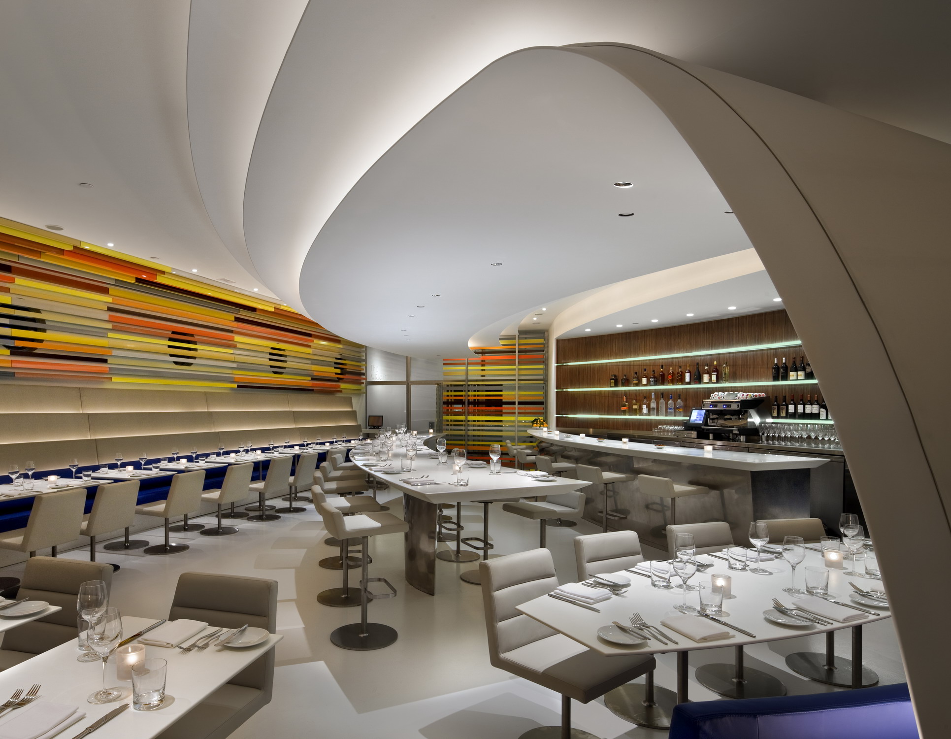
The Guggenheim’s restaurant opened in December 2009 for the 50th anniversary of Frank Lloyd Wright’s building. Andre Kikoski Architect had roughly 1,600 square feet and 58 covers to work with, tucked off the rotunda, and chose not to imitate the spiral but to echo its sense of movement: a curving walnut wall threaded with fibre optics, a white Corian bar with no visible joints, and a gallery white palette so that the room reads as a continuation of the museum rather than a themed tribute to Wright’s organic architecture.
🎓 Expert Insight
“an incredible honor and an exhilarating challenge” is how Andre Kikoski, Andre Kikoski Architect, described designing inside Wright’s building.
The remark points at the real constraint of this job. Working inside a landmark means every move is read against the original, so the safest design strategy is often restraint plus one strong gesture, which is exactly what the walnut wall provides.
Art was written into the brief. The room first held a commissioned installation by Liam Gillick, and in January 2017 the museum installed a site specific group of works by Sarah Crowner that entered the permanent collection. Architectural coverage of the project, including Architectural Record’s review of the scheme, notes that Kikoski designed the furniture as well. Service here has been irregular since 2020 and the museum has leaned on a separate cafe for daily operation, so confirm before making the trip.
Mucem, Marseille: A Rooftop Behind a Concrete Lattice
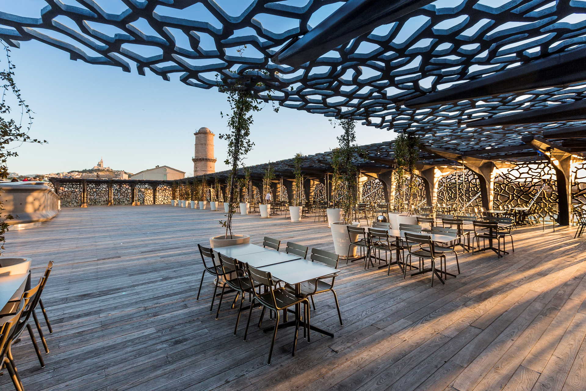
Rudy Ricciotti, with Roland Carta, built the Mucem’s J4 building as a 72 metre square wrapped in an ultra high performance concrete lattice, with a second 52 metre square inside it holding the galleries. Between the two skins run ramps, and on top sits the roof terrace, linked to the seventeenth century Fort Saint Jean by a slender footbridge. The museum’s architecture page describes that bridge as a plain line of black concrete suspended 19 metres above the ground, with no arches or cables.
Eating there means eating behind that lattice, with the Mediterranean filtered through it. The screen was never only decorative: it cuts sun and admits air, which matters on a Marseille rooftop in August. The operator has changed since opening, and the rooftop restaurant now serves cuisine by Alexandre Mazzia over a short midday service, closed on Tuesdays, rather than the multi hour gastronomic format the building opened with in 2013.
The Seven Rooms Compared: Setting, Designer and Access
The seven rooms differ less in style than in where they sit inside the building and how you get to them. The table below sets them side by side.
| Cafe | Museum, City | Setting | Designer, Year | Access |
|---|---|---|---|---|
| V&A Cafe | Victoria and Albert Museum, London | Three decorated Victorian rooms | Gamble, Poynter, Morris, 1868 | Free museum entry |
| Restaurant du Musee d’Orsay | Musee d’Orsay, Paris | Listed 1900 hotel dining room | Ferrier and Constant ceilings, 1900 | Museum ticket |
| Cafe im Kunsthistorischen Museum | Kunsthistorisches Museum, Vienna | Marble Cupola Hall under the dome | Museum building of 1891 | Museum ticket required |
| NEZUCAFE | Nezu Museum, Tokyo | Glazed pavilion in the garden | Kengo Kuma, 2009 | Ticket, timed online entry |
| MIA Cafe | Museum of Islamic Art, Doha | Atrium beside a 45 m window | I. M. Pei building, 2008 | Inside the museum |
| The Wright | Solomon R. Guggenheim Museum, New York | Curved insert off the rotunda | Andre Kikoski, 2009 | Check status before visiting |
| Mucem rooftop restaurant | Mucem, Marseille | Roof terrace behind concrete lattice | Ricciotti and Carta, 2013 | Short midday service, closed Tuesdays |
Museum Cafe Design Ideas Worth Borrowing
Strip away the settings and the same four decisions keep appearing. They translate t
o art gallery cafes, hotel lobbies and any hospitality insert placed inside a building somebody else designed.
Let the Existing Room Carry the Design
Vienna, Paris and London all work because nobody tried to compete with the shell. Where the room is loud, the inserted layer stays quiet: low seating, restrained tables, no additional pattern. Kikoski applied the same logic in reverse at the Guggenheim, using gallery white so his curves read as circulation rather than decoration. The failure mode is a themed interior that repeats the building’s motifs at a smaller scale, which flattens both.
Treat Daylight as the Feature the Galleries Cannot Have
Conservation limits keep galleries dim, which makes the cafe the release point in the sequence. Nezu glazes three sides toward a garden. Doha aims the room at a 45 metre window. Vienna puts high tables at the windows over the square. Marseille goes to the roof. In each case daylight is not a bonus, it is the programmatic reason the room is where it is.
Specify for Food Service, Not for the Photograph
The V&A rooms have survived more than 150 years of food service partly because their surfaces were chosen to be washed. Ceramic, glass and enamelled metal do not absorb grease or steam, and they take cleaning that a soft finish would not. That principle still decides which cafe interiors age well, a point that runs through current cafe design trends as much as through Victorian ones.
Place the Cafe Inside the Route, Not Beside It
Position determines use. A cafe at the foot of a staircase, as in Doha, catches people mid visit and turns over quickly. A rooftop or a garden pavilion becomes a destination and holds guests longer, which changes seat counts, kitchen size and service pattern. Deciding which of the two you are building should come before any material board, and it links directly to how ambience shapes the guest experience in any dining space.
For anyone building a longer itinerary around this, our list of museums worth visiting for the architecture pairs well with these rooms, and the design principles behind them are set out in more depth in our piece on contemporary museum architecture. Institutions outside Europe and North America are catching up quickly, as our look at MALBA in Buenos Aires shows.
The oldest room on this list is still the sharpest argument. Henry Cole put a restaurant inside a museum because he thought people would stay longer and come back if the building fed them, and 150 years later every institution on the list has reached the same conclusion by a different route. The room where visitors sit down is not the interval between the galleries. For a good number of people, it is the part of the building they remember.




India Art, Architecture & Design Biennale 2026: Ministry of Culture Opens Delhi Monuments
Delhi's monuments, including Purana Quila and the Red Fort, will host the...
 illustrarch Editoral Team2 Mins read
Vitra Museum Stages First Major Geoffrey Bawa Retrospective in Decades
Vitra Design Museum opens the first major Geoffrey Bawa retrospective in 20...
illustrarch Editoral Team2 Mins read
Ai Weiwei Installs 500 Cast-Iron Helmets Outside Sydney Museum
Ai Weiwei's 500 cast-iron helmets opened outside Sydney's MCA on 25 September,...
illustrarch Editoral Team2 Mins read
Isamu Noguchi at Lever House Traces Sculptor’s Decades-Long Collaboration with Bunshaft
Lever House's new exhibition pairs Noguchi sculptures with unbuilt garden designs made...
illustrarch Editoral Team2 Mins read


Leave a comment