

Basics Coffee by archicraft
Basics Coffee approached us to build a café chain brand from scratch. Rather than treating the architecture and the branding as two separate projects handed off in sequence, we saw an opportunity to develop them…
 illustrarch Editoral Team14 September 20262 Mins read34
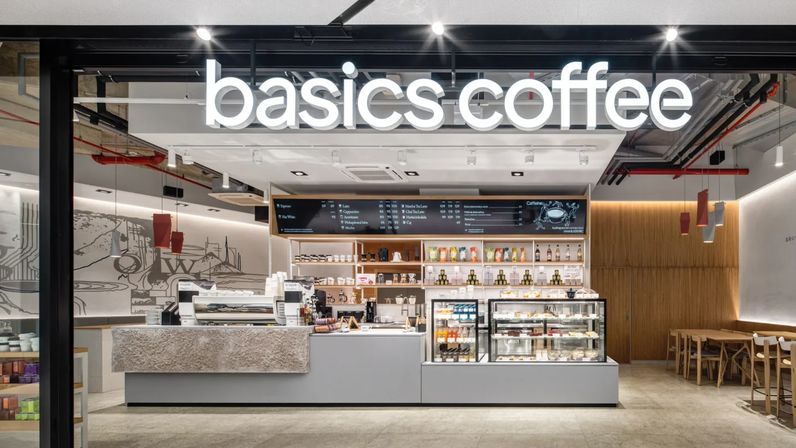
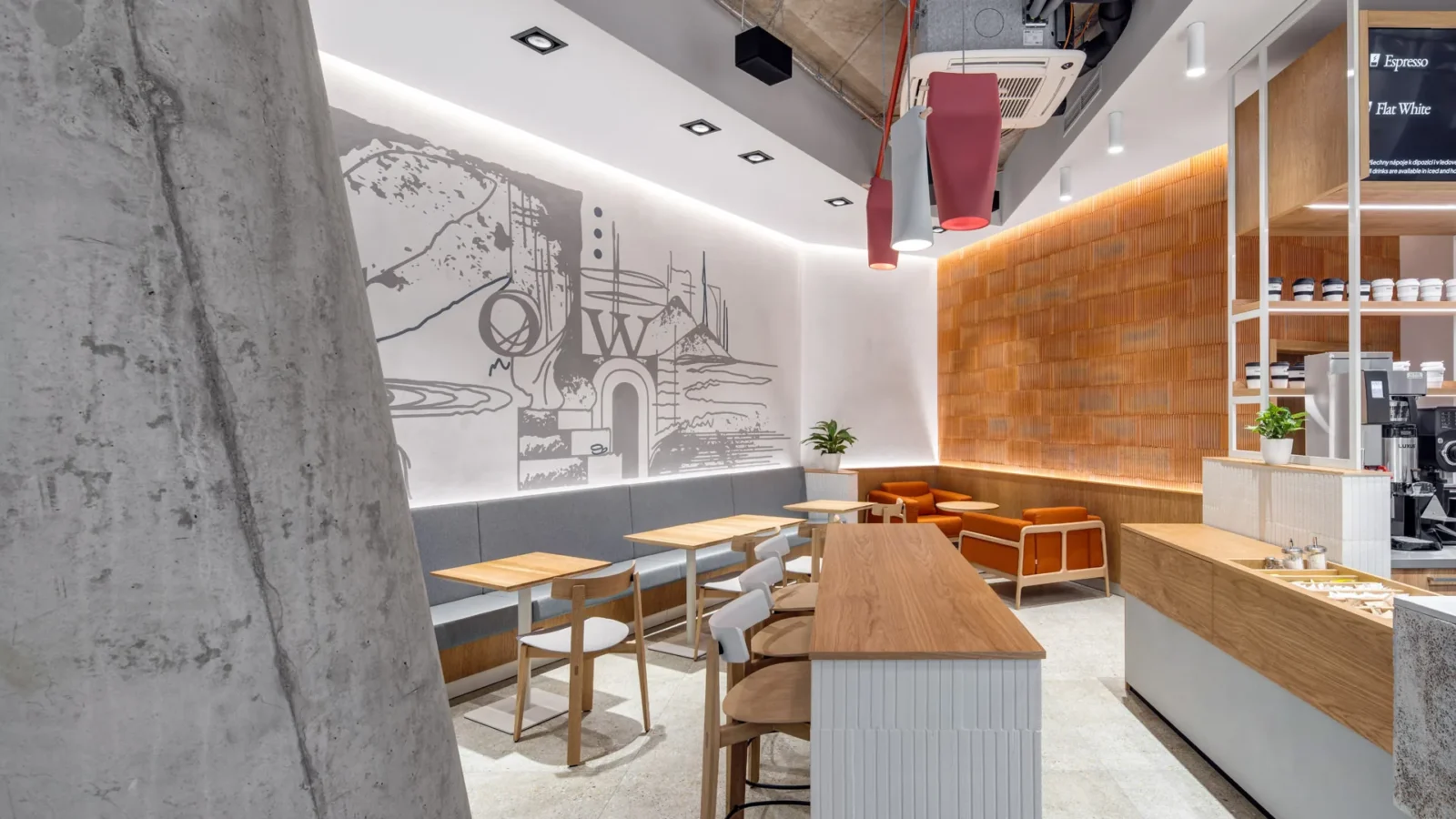
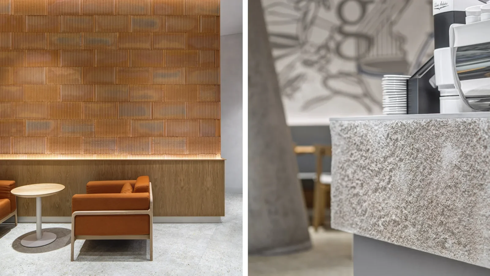
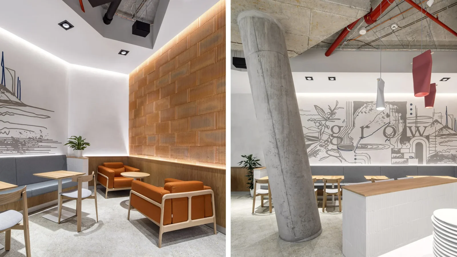
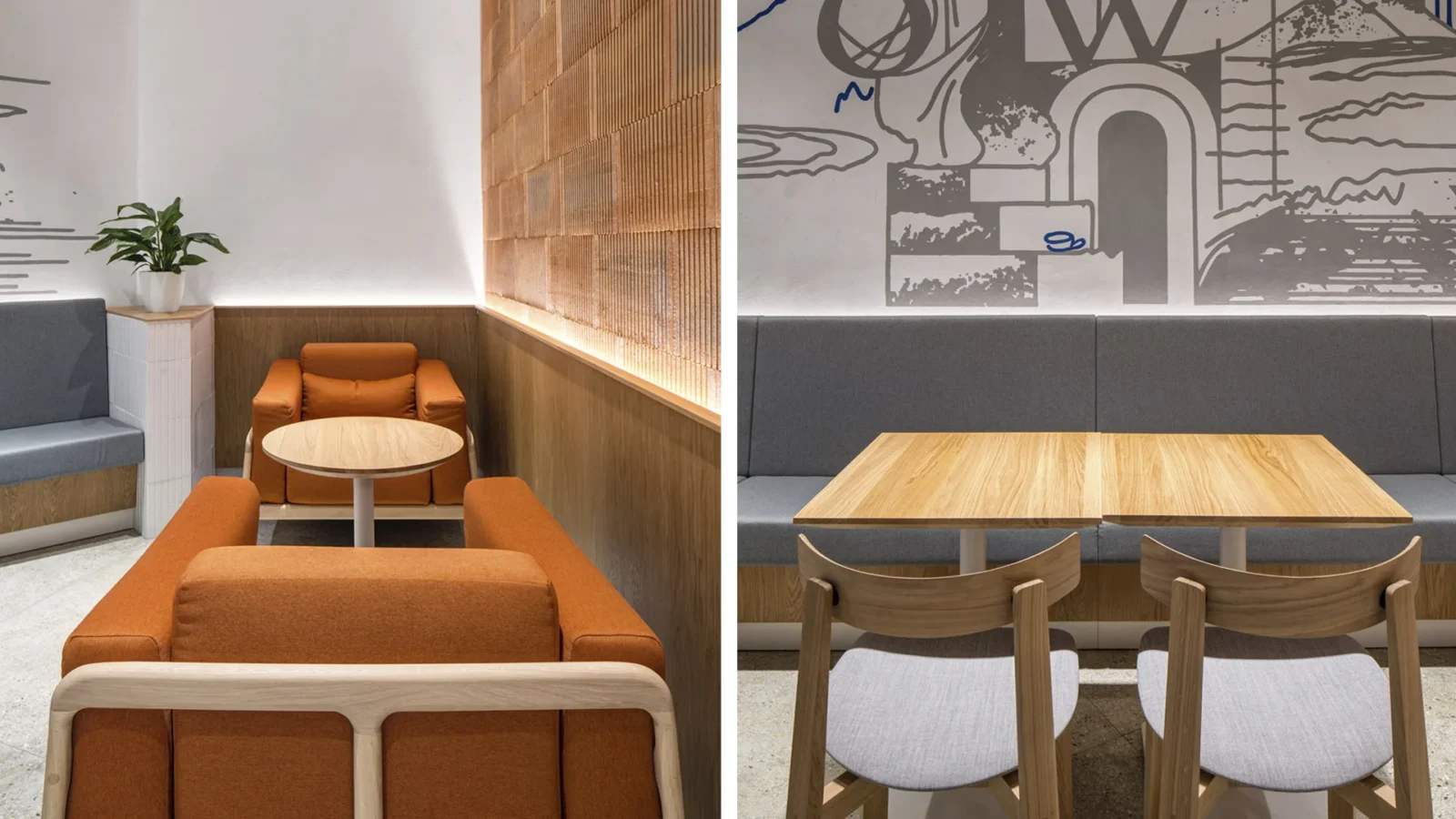
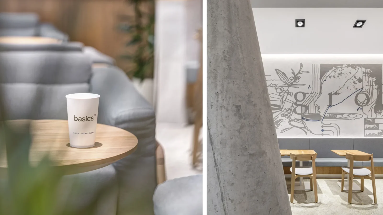
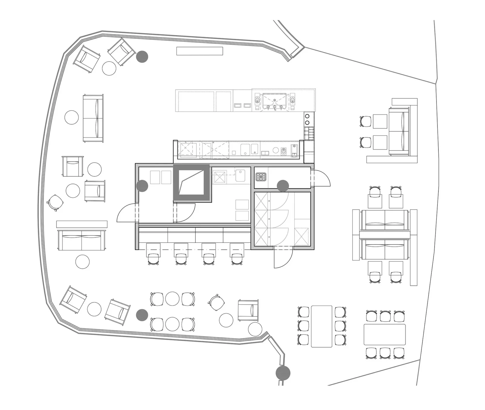
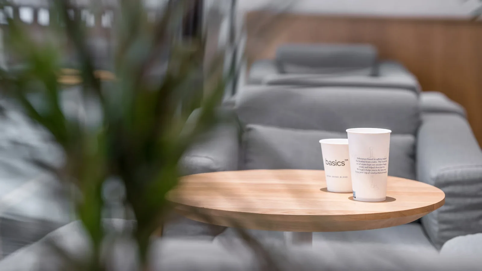
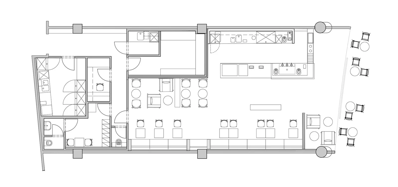
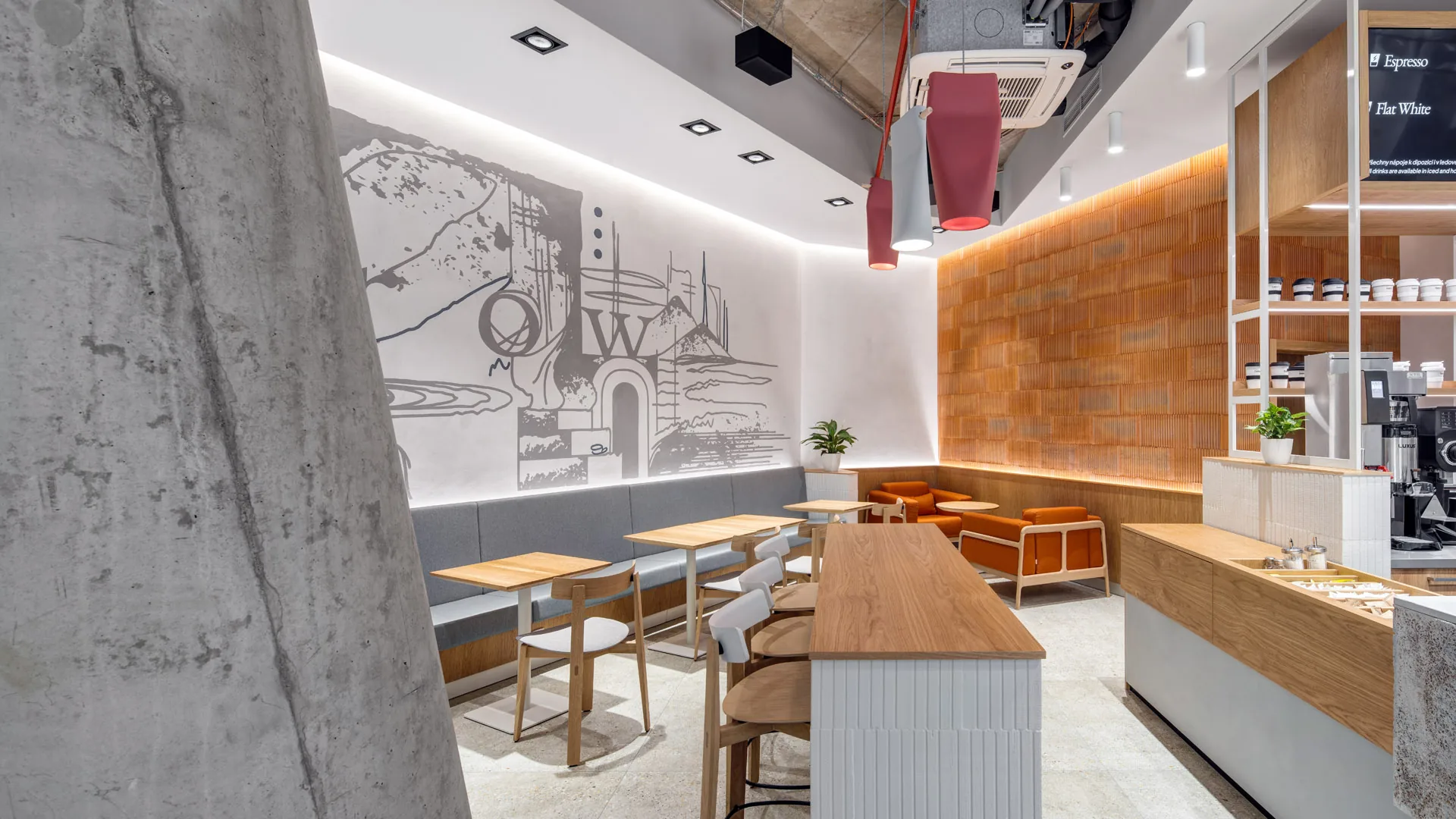
Basics Coffee asked archicraft to build a cafe chain brand from scratch. Rather than treating the architecture and the branding as two separate projects handed off in sequence, the studio developed them together from the first sketch. Working alongside the client’s graphic designers from day one, it proposed a single design process that could carry one idea from the shell of the space down to the cup on the table. The result reads as one continuous concept rather than a fit out with a logo applied once construction is finished.
A cafe occupies an unusual position among hospitality spaces. It has to work as a fast, functional counter for people passing through and, within the same square footage, as a slow and comfortable room for people who plan to stay for an hour. Lighting, acoustics and seating carry most of that weight. Warm rather than bright light, hard surfaces broken up enough to keep the room quiet, and a spread of seating running from tall counter stools to low armchairs let one space serve both kinds of visit, which is where most coffee shop design decisions are actually made.
Materials left in their own form
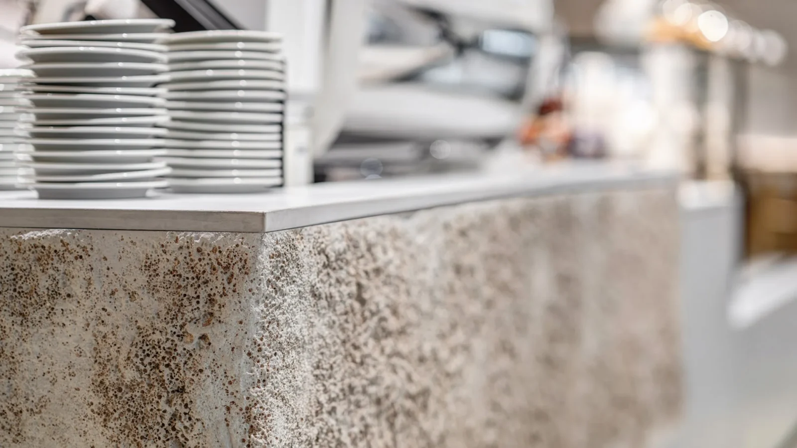
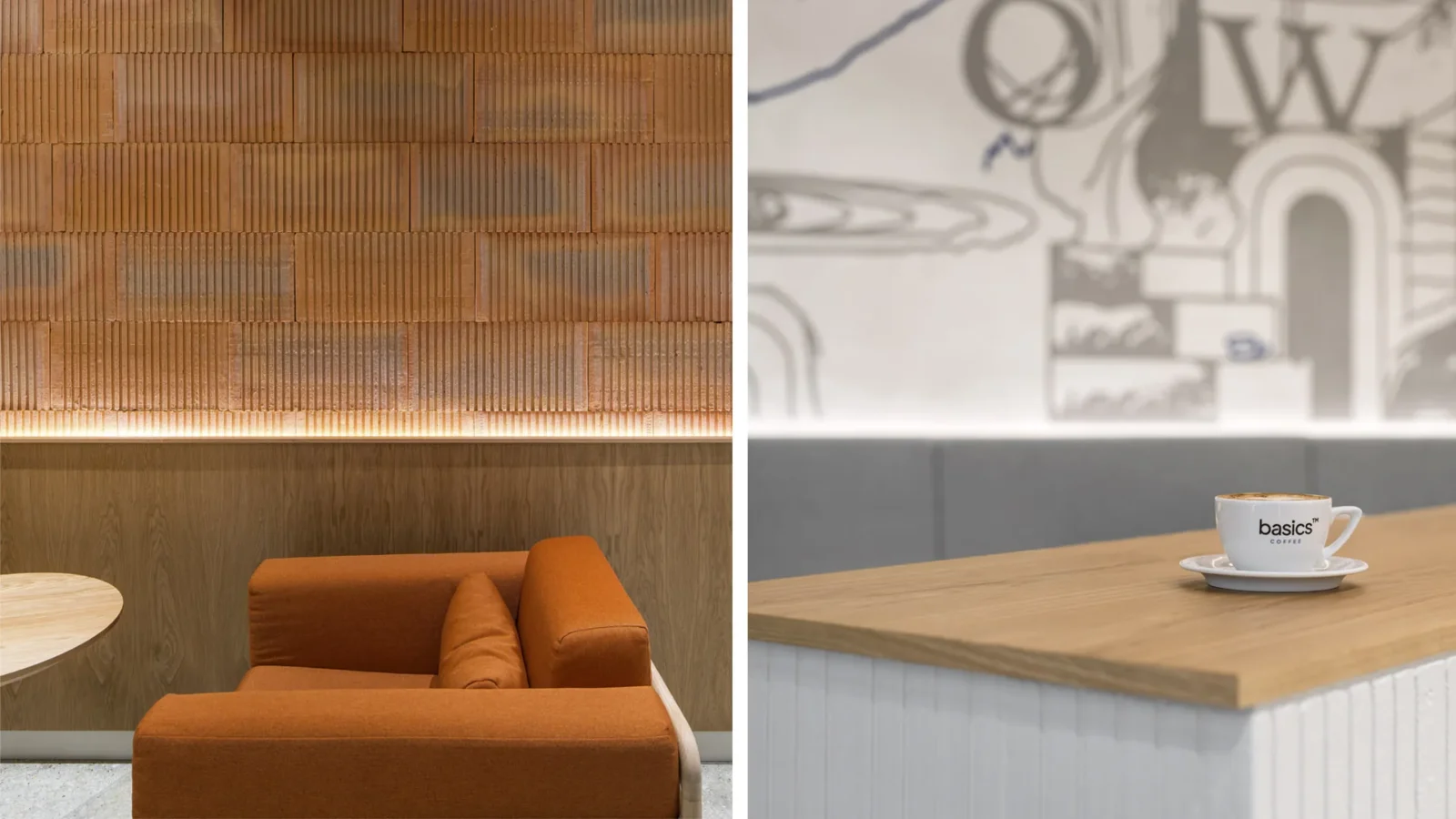
The material palette follows the same simplicity that governs the concept. Every surface is used in its pure form, without one finish layered over another and without applied decoration standing in for a material’s own texture. A raw concrete column and a rough, mineral textured counter sit directly against oak panelling and warm terracotta style tile, and each finish is left to read as exactly what it is. This disciplined approach gives the space a quality that will outlast whatever happens to be trending in cafe design by the time it opens.
Graphics treated as architecture
The graphic identity was developed as fully as the architecture rather than added at the end. A large hand drawn mural runs the length of one wall, weaving coffee plants, brewing equipment and the letters of the brand into a single continuous illustration built to reward slow, repeated reading rather than one glance in passing. The same graphic language continues onto branded cups, saucers and packaging, carrying the identity from the walls onto the table in front of every visitor.
Beyond the design itself, the project reflects how a well considered cafe can anchor the rhythm of daily life around it. A good coffee shop becomes a fixed point that people build small routines around, and that loyalty depends as much on how a room feels as on what is in the cup. The studio applied the same thinking to its own workspace, where the plan follows how the team actually uses the room.
For Basics Coffee, the project delivers a concept distinctive enough to build a brand around and consistent enough to repeat across future locations. For visitors, it offers a room that rewards attention, with comfortable seating and a mural and material palette that keep revealing detail the longer someone stays.


Modern Earthy Sanctuary House by PENTARCH designers
The Modern Earthy Sanctuary is a 10 Marla house in Sheikhupura, Pakistan,...
illustrarch Editoral Team2 Mins read

Zašová Health Center by AOSI
AOSI's winning competition design for a public health center in Zašová reinterprets...
illustrarch Editoral Team3 Mins read
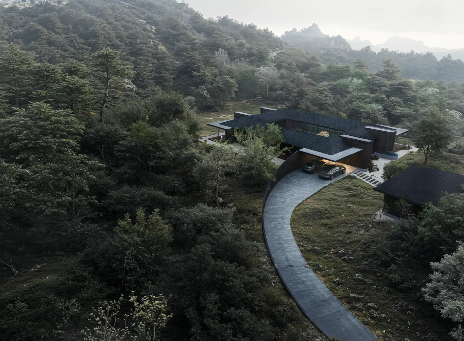
Casa Paisaje by TAP Arquitectura
Casa Paisaje is TAP Arquitectura's unbuilt 2025 competition proposal for a 302...
illustrarch Editoral Team2 Mins read

SENA Tunja Training Center by TAP Arquitectura
TAP Arquitectura's unbuilt competition proposal for SENA in Tunja wraps a 4,400...
illustrarch Editoral Team2 Mins read


Leave a comment