

Good Habits Smoothie Bar by XN32 Studio
XN32 Studio turns a 55 m² smoothie bar in Mexicali into a dreamlike interior of mineral plaster, circular niches and a vivid blue plane that runs across the floor and up the walls.
 illustrarch Editoral Team13 October 20263 Mins read9
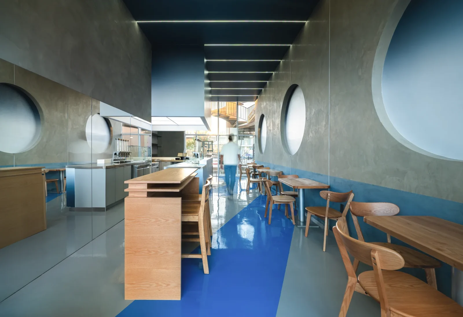
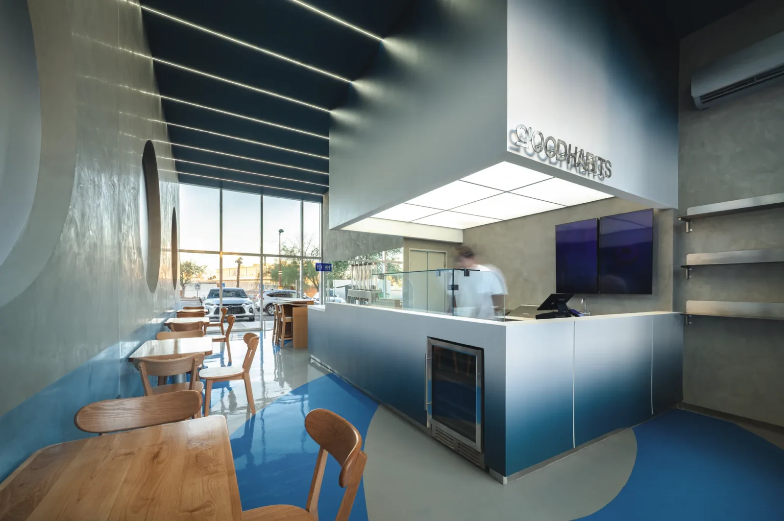
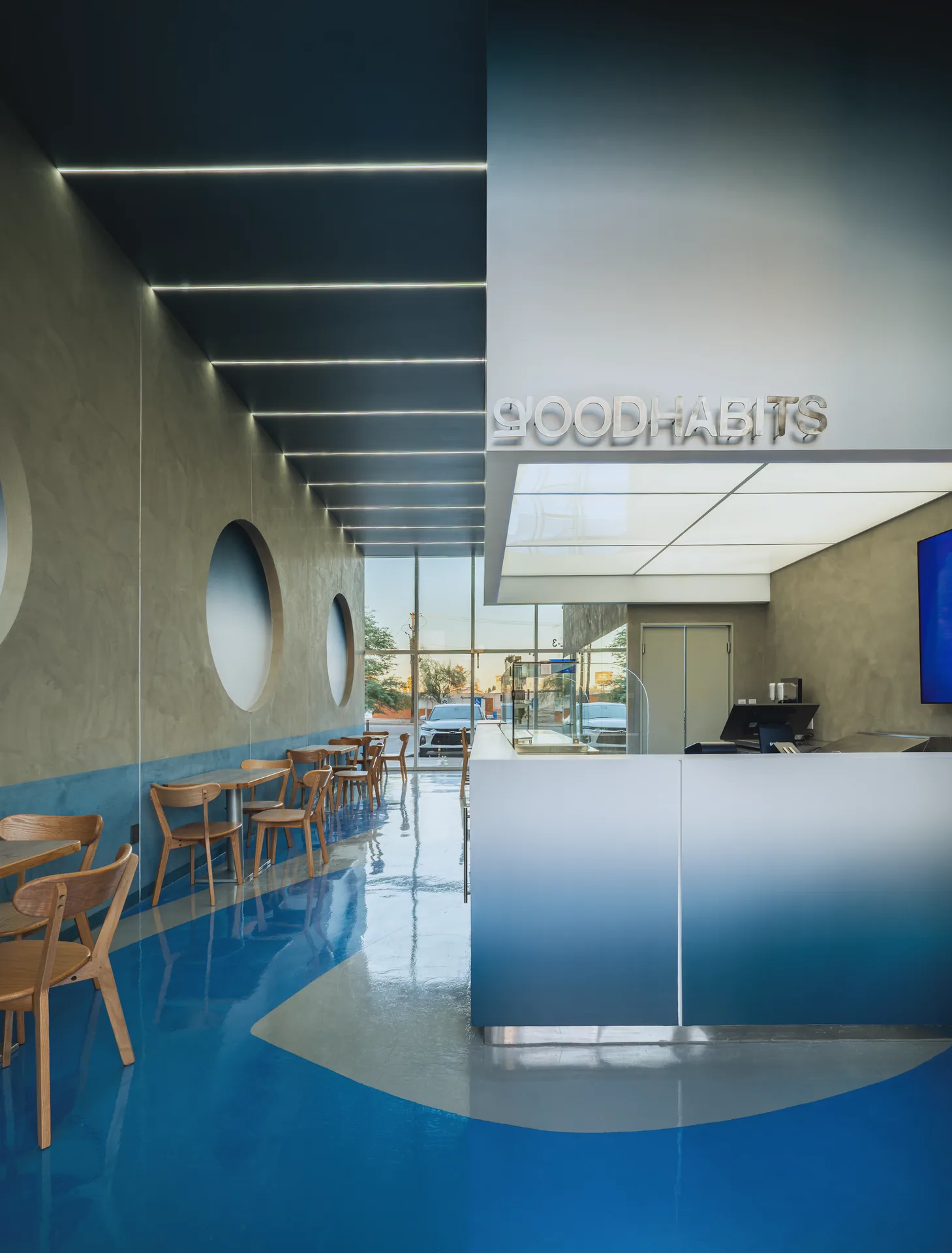
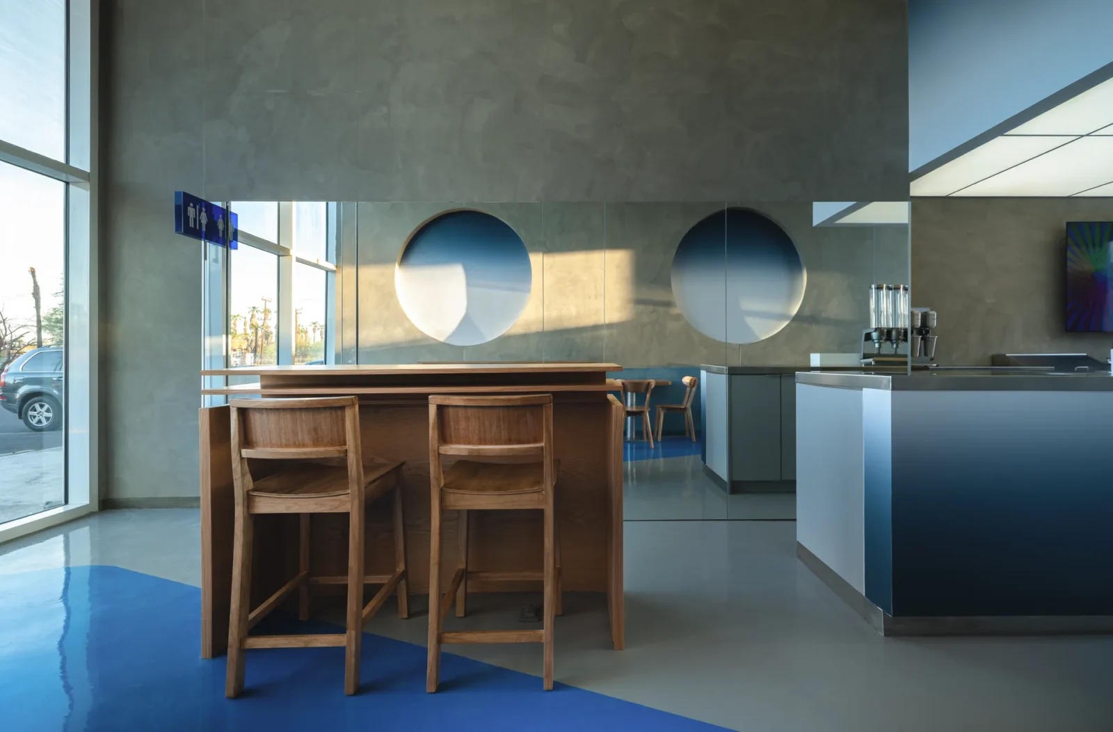
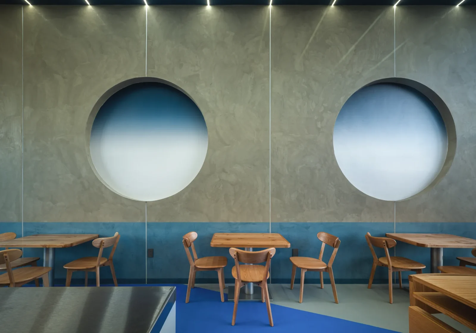
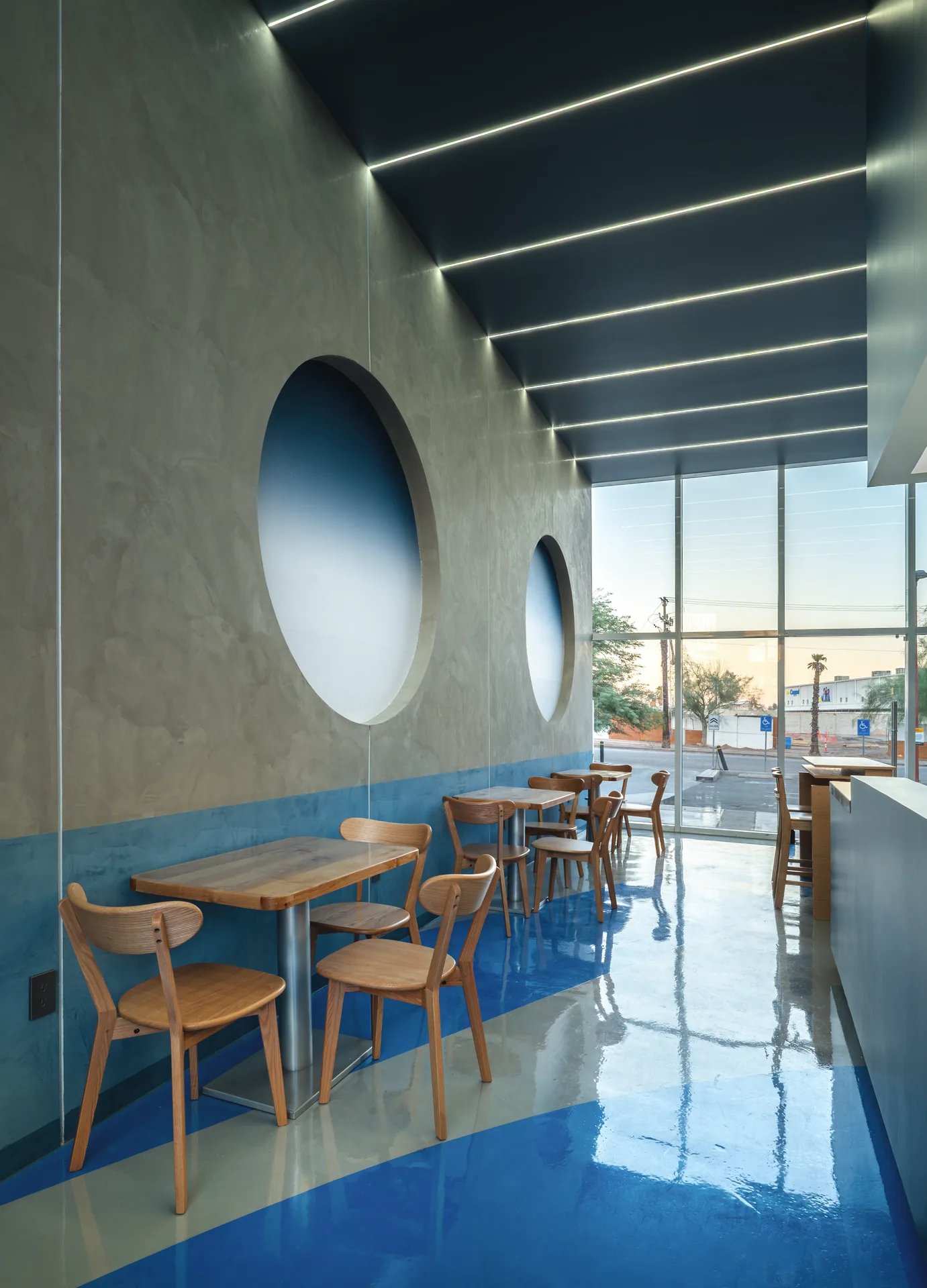


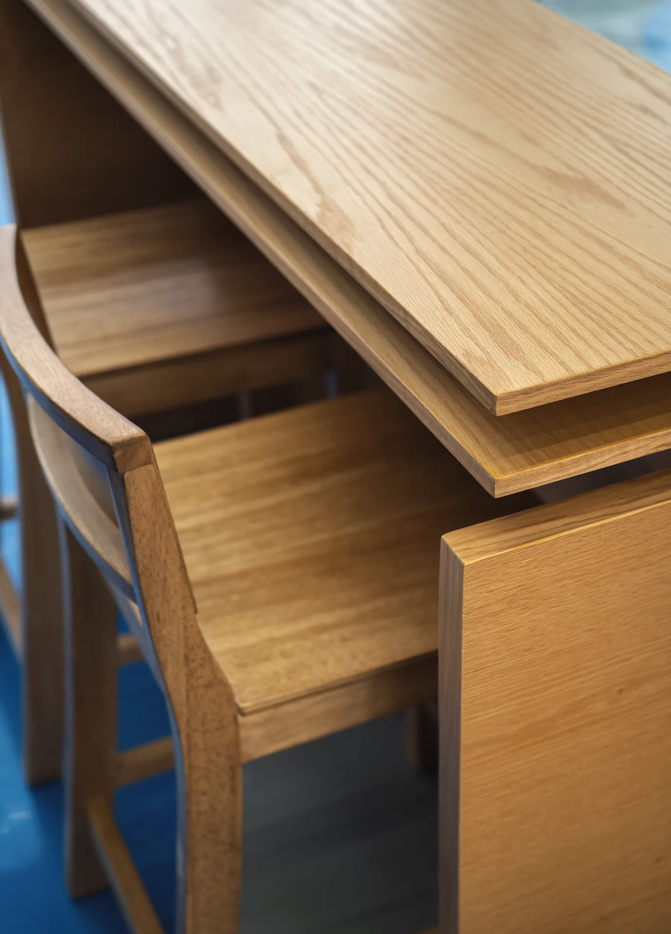

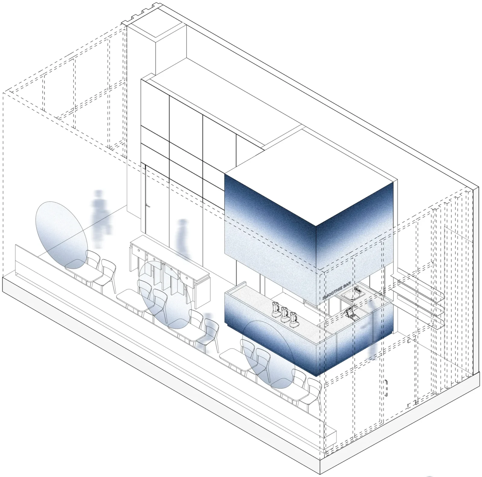
Table of Contents Show
Good Habits smoothie bar by XN32 Studio is a 55 square metre commercial interior in Mexicali, Mexico, completed in 2026 for the Goodhabits brand. The Mexicali practice, working with a design team of Abraham Martinez, Kenia Luna and Neyre Santacruz, built the project on a single idea: what would it feel like to step inside a dream? The answer is a small shop where geometry, material and colour do the storytelling, so that buying a drink becomes a short pause from the street outside.
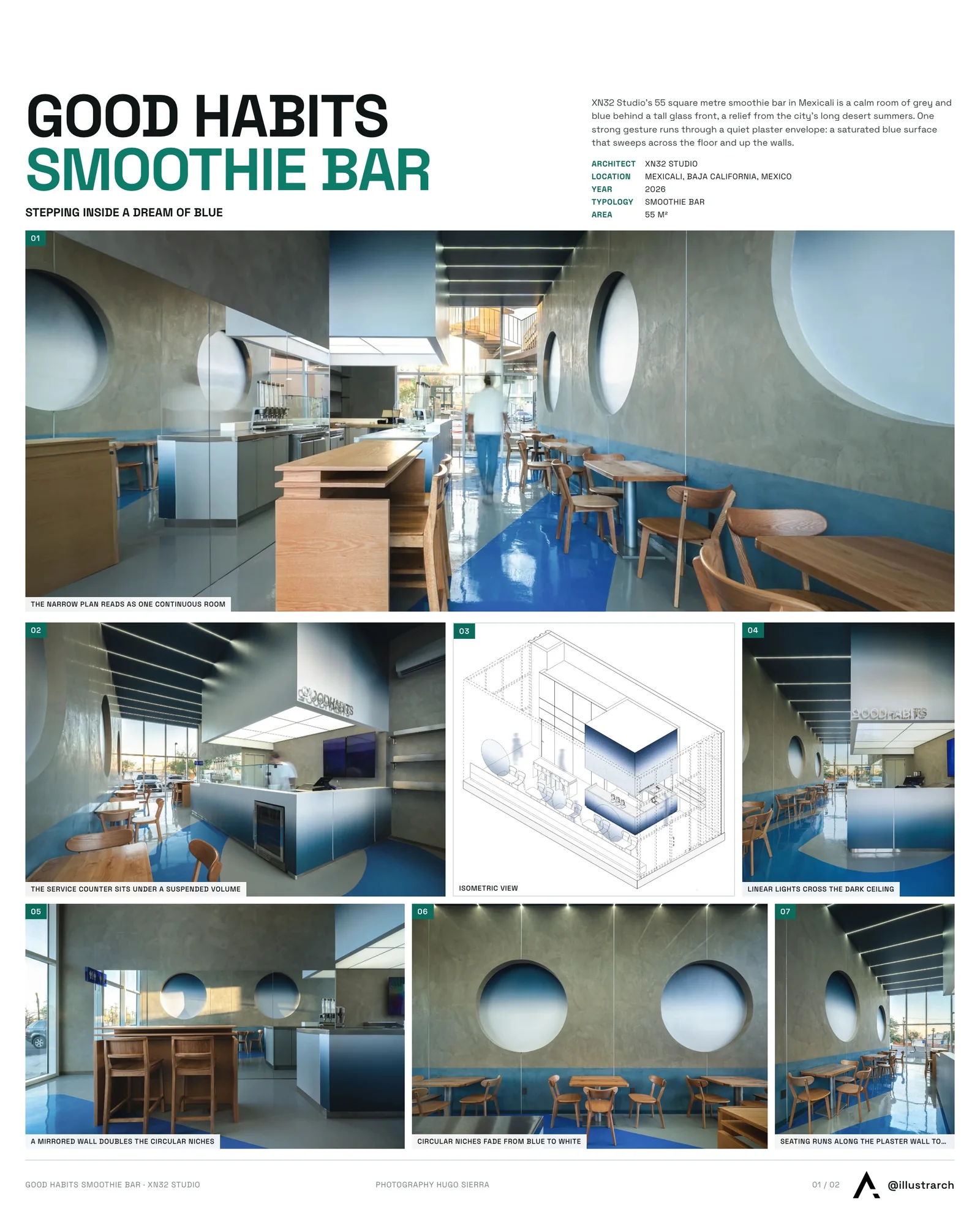
Mexicali, the capital of Baja California on the border with the United States, is known for its long, harsh desert summers. Against that context, the cool palette of the interior reads almost as relief: a calm, shaded room of grey and blue behind a tall glass front.
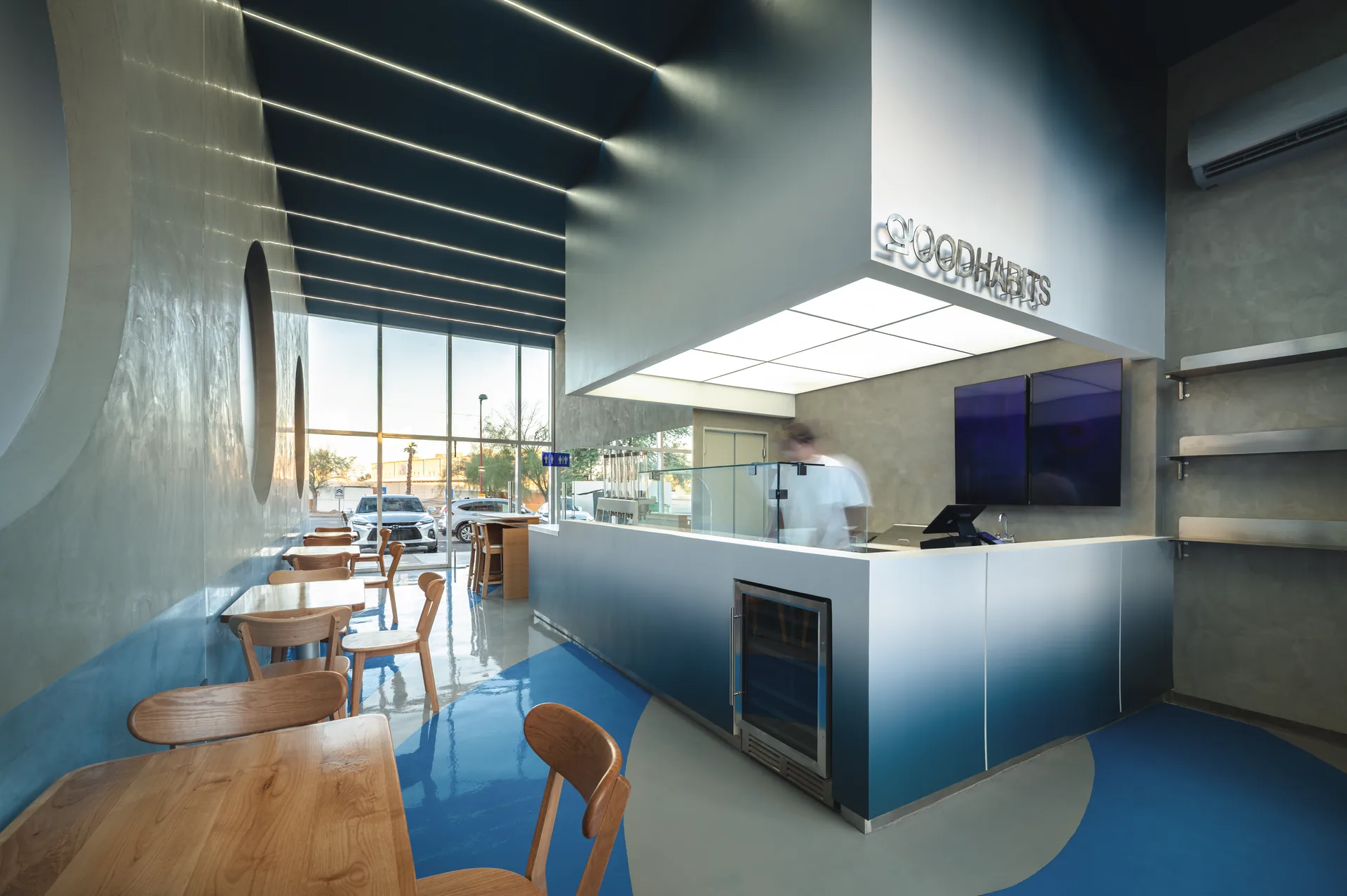
A muted shell and a moving blue plane
The base of the scheme is quiet. Walls are finished in a mottled, mineral toned plaster that changes with the light, and the ceiling is painted dark so it almost disappears. Into this restrained envelope the studio introduces one strong gesture: a saturated blue surface that runs across the glossy grey floor in wide curves and then climbs the lower part of the walls as a continuous band.
Because the blue never stops at a corner, floor and wall stop behaving like separate elements. The colour sweeps under tables, wraps around the base of the counter and bends past the seating, giving the long, narrow room a sense of movement that the plan alone could not provide. It is also the most recognisable element of the brand identity, readable from the pavement through the glazing.
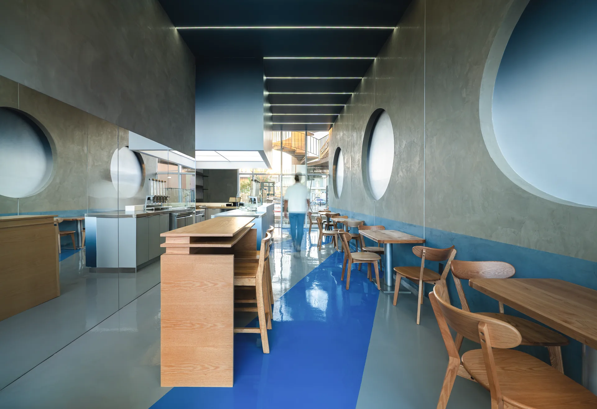
Circles, gradients and reflections
Along the main wall, large circular niches are cut into the plaster. Each one is lined with a gradient that fades from deep blue at the top to almost white at the bottom, so the openings look less like recesses and more like portholes onto a distant sky. The same gradient returns on the faces of the service counter, linking furniture and architecture through one graphic language.
Opposite the seating, a mirrored wall picks up the circles and the counter and repeats them, stretching the perceived depth of a compact plan. Above, linear light strips cross the dark ceiling at regular intervals and lead the eye toward the street, while the glossy floor catches their reflections and doubles them underfoot.

A floating counter for the brand
The bar is organised around a single service island. Over it hangs a white volume with backlit ceiling panels and the Goodhabits name in metal letters, a box that seems to float within the double height space. The isometric drawing shows how this volume anchors the plan: seating lines the long wall, and the counter, with its blenders, display fridge and stainless steel worktops, sits as an object in the middle of the room rather than against a wall.
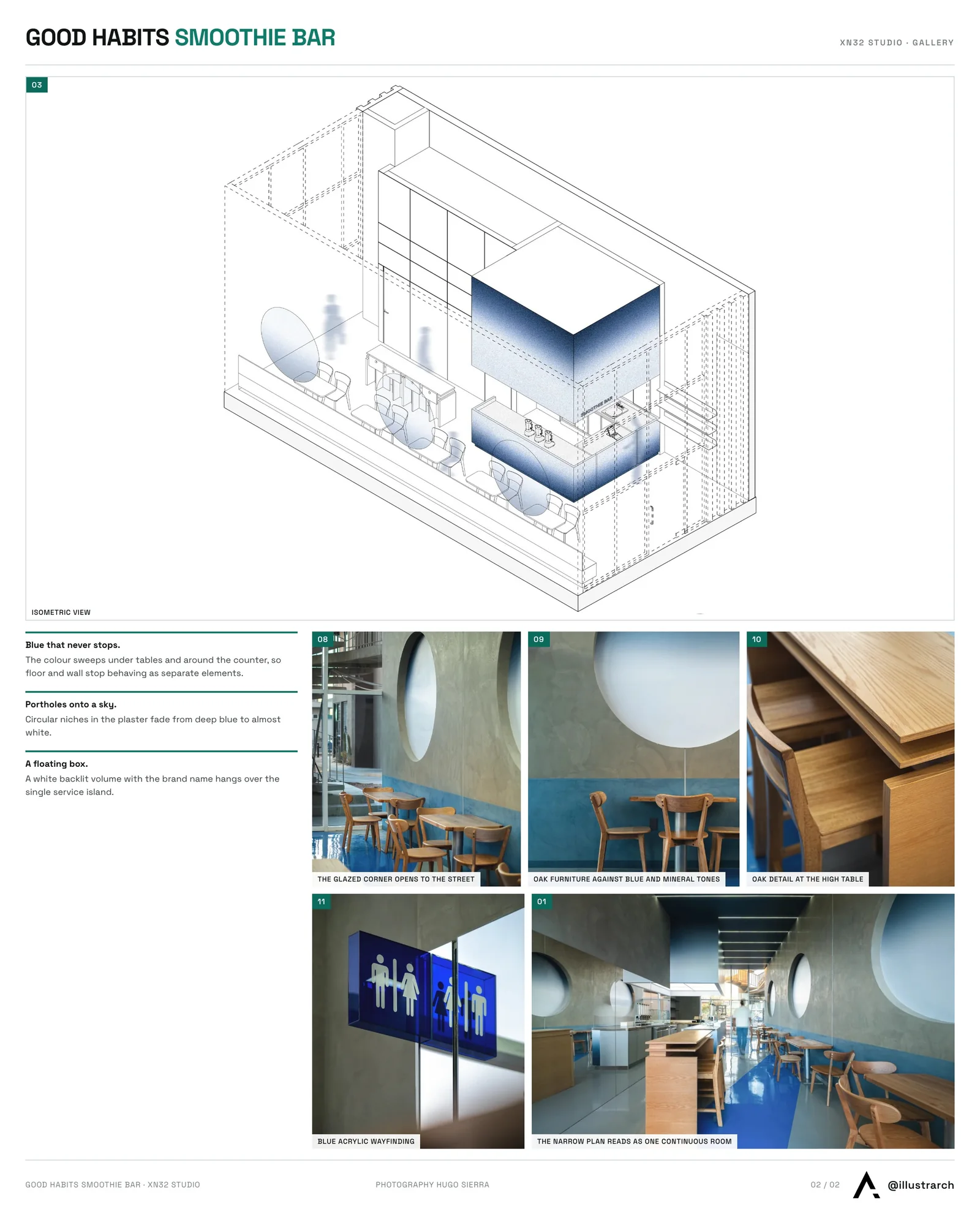
Warmth comes from the furniture. Oak tables on steel pedestal bases and simple oak chairs line the wall beneath the niches, and a solid oak high table with matching stools stands near the entrance. A few small details, such as the blue acrylic restroom sign set against a glass partition, carry the palette into the smallest elements of the shop.
Surreal through space, not decoration
What makes Good Habits interesting is its restraint. The studio does not lean on dreamlike imagery, murals or playful objects. Instead it lets proportion, unexpected colour relationships and the play between solid surfaces and light create the feeling of being somewhere slightly unreal. In a small food and beverage space, this turns the architecture itself into the brand, a strategy that our article on restaurant design and customer experience explores in more depth. For more on how a limited palette can shape a room, see our guide on how to use color in interior design.



Cottage by archicraft
The most interesting architectural opportunities often emerge from the strictest constraints. This...
illustrarch Editoral Team2 Mins read
Living Typologies by Stela Boldur
Living Typologies by Stela Boldur is a student masterplan for the former...
illustrarch Editoral Team2 Mins read

Modern Earthy Sanctuary House by PENTARCH designers
The Modern Earthy Sanctuary is a 10 Marla house in Sheikhupura, Pakistan,...
illustrarch Editoral Team2 Mins read

Zašová Health Center by AOSI
AOSI's winning competition design for a public health center in Zašová reinterprets...
illustrarch Editoral Team3 Mins read


Leave a comment